The CSS filter property applies graphical effects such as blurs or color shifts to an element. Filters are often used to adjust the rendering of images, backgrounds, and borders.
Supported functions
Function | Meaning | Default value | Value range |
grayscale() | Image Grayscale A value of 100% makes the image completely grayscale. | 0 | 0% to 100% |
opacity() | The transparency level of the image. | 1 | 0% to 100% |
invert() | Inverts the image. A value of 100% completely inverts the image. | 0 | 0% to 100% |
sepia() | Converts the image to sepia. A value of 100% makes the image completely sepia. | 0 | 0% to 100% |
saturate() | The saturation of the image. A value of 0% makes the image completely unsaturated. A value of 100% leaves the image unchanged. Other values are linear multipliers for the effect. Values over 100% provide higher saturation. | 1 | 0% to +∞ |
contrast() | The contrast of the image. A value of 0% renders the image completely black. A value of 100% leaves the image unchanged. Values over 100% lower the image contrast. | 1 | 0% to +∞ |
brightness() | Applies a linear multiplier to the image, making it appear brighter or darker. A value of 0% creates a completely black image. A value of 100% leaves the input unchanged. Other values are linear multipliers for the effect. A value greater than 100% provides a brighter result. | 1 | 0% to +∞ |
Unsupported functions
Compound functions and the blur, drop-shadow, hue-rotate, or url functions are not supported.
Example
<template>
  <div class="root">
    <text>normal</text>
    <image
      class="image-normal"
      src="https://pic49.photophoto.cn/20181202/0021033888940147_b.jpg"
    ></image>

    <text>grayscale:100%</text>
    <image
      class="image-gray"
      style="bg"
      src="https://pic49.photophoto.cn/20181202/0021033888940147_b.jpg"
    ></image>
  </div>
</template>
<script>
export default {
  data: {},
  methods: {},
};
</script>
<style>
.root {
  display: flex;
  align-items: center;
  justify-content: center;
}
.image-normal {
  flex-direction: column;
  flex-shrink: 0;
  align-content: auto;
  width: 350rpx;
  height: 350rpx;
}
.image-gray {
  flex-direction: column;
  flex-shrink: 0;
  align-content: auto;
  width: 350rpx;
  height: 350rpx;
  filter: grayscale(100%);
}
</style>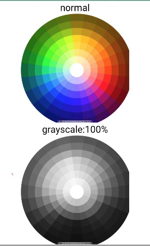
Click detailImageFilter.zip to download the complete sample code.