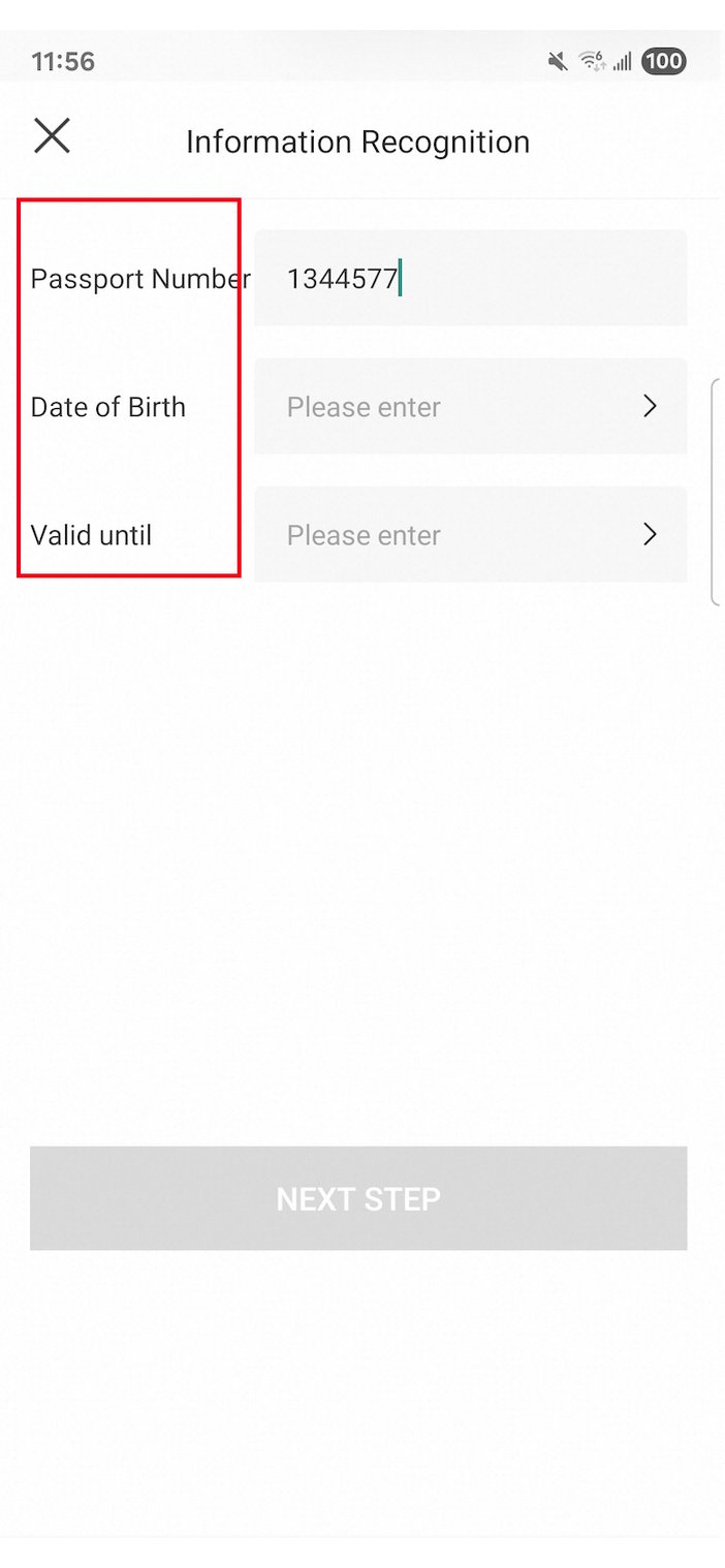
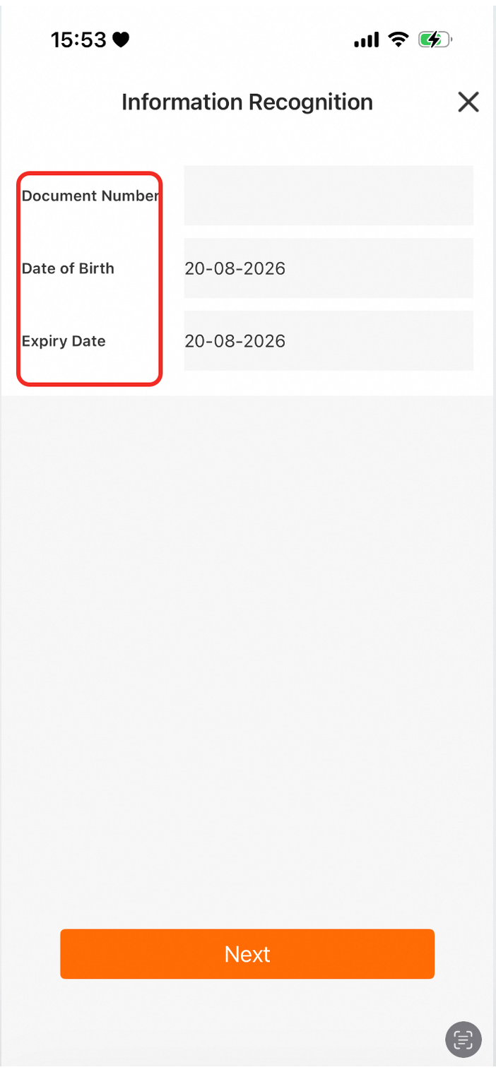
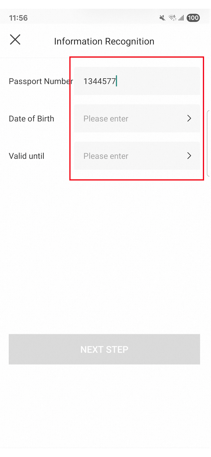
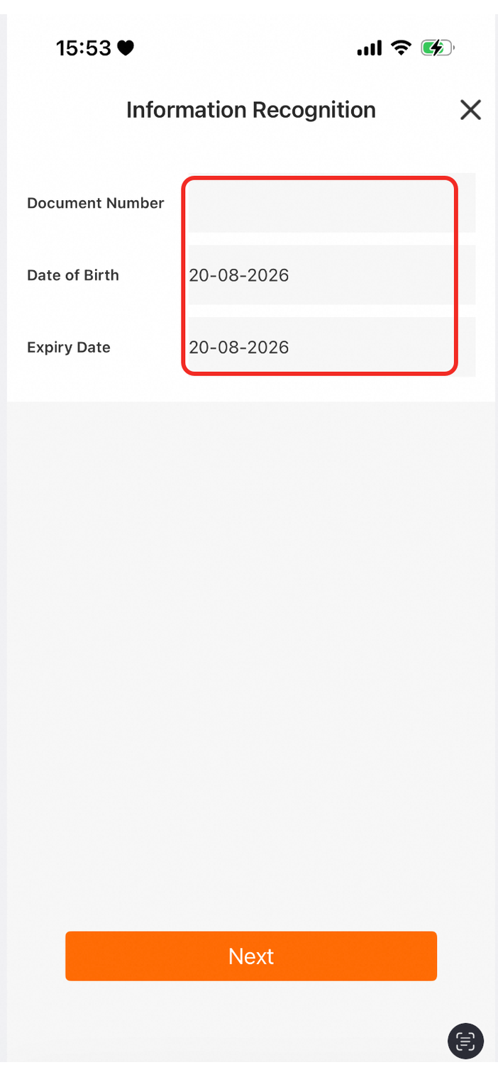
The Identity Verification Native SDK lets you customize UI colors and icons. You can use the setCustomUIConfig interface to pass a UI configuration as a file or in JSON format. This topic describes the interface parameters and provides code samples.
Some custom configurations are dependent on the SDK version. Please upgrade the SDK to the latest version before use.
If the UI custom configuration conflicts with the extended parameters of the verification API, the UI custom configuration takes precedence.
Configuration guidelines
Minimum SDK version: 1.4.0 or later.
Default inheritance: If you do not pass a configuration item or its style properties, the system falls back to the default value.
Handling invalid configuration items:
Color values must be in the
#RRGGBBor#AARRGGBBformat. If you pass an invalid value, the system falls back to the default value and returns an error message.A Base64 icon must be a Base64 image string with a valid prefix, such as
data:image/png;base64,.... If you pass an invalid value, the system falls back to the default value and returns an error message.
Incremental configuration: To simplify configuration, pass only the configuration items you need to modify, and leave the others at their default values.
API
Android
API definition
The Android SDK provides the setCustomUIConfig API for customizing UI colors and icons. Call this method with the required parameters to apply your custom UI settings.
    /**
     * Sets custom UI colors and icons.
     *
     * @return A string containing any exception information detected in the configuration file.
     * @description This API is used to set the custom UI.
     * @paramType paramType The parameter type {@link IDTFacade}. Valid values are
     * {@link IDTFacade#EXT_PARAMS_CONFIG_JSON} or {@link IDTFacade#EXT_PARAMS_CONFIG_ASSETS_NAME}.
     *
     * @param param The parameter value, which corresponds to the specified paramType.
     */
    public String setCustomUIConfig(@IDTFacade int paramType, String param) {
     // ...
    }
Parameters
Parameter | Type | Description |
paramType | int | Configure the type of the custom input parameter. The available values are as follows: |
param | String | The configuration data. The content depends on the value of |
Return value
Returns a String containing details about any error or exception encountered while parsing the param content. Check this value for specific error information if your configuration is invalid.
Example
// Method 1: Pass the assets file name
String customUIErrMsg = IdentityPlatform.getInstance()
    .setCustomUIConfig(IDTFacade.EXT_PARAMS_CONFIG_ASSETS_NAME, "DTCustomUIConfig.json");

// Method 2: Pass a JSON string
String customUIErrMsg = IdentityPlatform.getInstance()
    .setCustomUIConfig(IDTFacade.EXT_PARAMS_CONFIG_JSON, jsonConfig);

// We recommend that you print the return value during integration testing.
Log.d("CustomUI", "errMsg: " + customUIErrMsg);
iOS
The iOS SDK provides the setCustomUI API for customizing UI colors and icons. Call this method with the required parameters to apply your custom UI settings.
    /**
     * Sets custom UI colors and icons.
     *
     * @completeBlock A callback that reports the result of the configuration.
     * @configuration The JSON string for the custom UI.
     */
   - (void)setCustomUI:(nonnull NSString *)configuration
           complete:(void(^_Nullable)(BOOL success, NSError * _Nullable error, NSDictionary *warningDict))completeBlock {
    ......
}
Parameters
Parameter | Type | Description |
configuration | String | The JSON string for the custom UI. |
completeBlock | block | A callback that reports the result of the configuration:
|
Return value
This method has no direct return value. Instead, results are returned asynchronously via the completeBlock callback. The warningDict parameter of the callback is an NSDictionary that contains configuration warnings, such as the use of deprecated fields. While these warnings do not cause the setup to fail, we recommend that you review them.
Example
[[AliyunIdentityPlatform sharedInstance] setCustomUI:customUIJSON complete:^(BOOL success, NSError * _Nullable error, NSDictionary *warningDict) {
    if (!success) {
        NSLog(@"Failed to parse custom UI: %@", error.localizedDescription);
    } else if (warningDict.count > 0) {
        NSLog(@"Custom UI warnings: %@", warningDict);
    }
}];
Configuration structure
This configuration uses six top-level directories, each containing detailed field settings:
{
  "commonConfig": { },
  "dialogConfig": { },
  "guideConfig": { },
  "ocrConfig": { },
  "faceConfig": { },
  "nfcConfig": { }
}
Parameter | Description |
| General settings for all pages, including the primary action button, Back/Close icons, and loading text color. |
| SDK-wide alert dialogs: colors for the title, body text, and button text |
| guide page: main title and body text colors |
| OCR recognition page and result page |
| face recognition page: title, prompt text, background, and progress bar |
| NFC reading page, reading status modal, and information entry page |
Default configuration
The following JSON contains the SDK's default color values, with placeholders for the Base64-encoded icons. You can copy this code and modify it as needed:
{
  "commonConfig": {
    "loadingMessageColor": "#000000",
    "btnBGColor": "#FF6A00",
    "btnDisableBGColor": "#D5D5D5",
    "btnMessageColor": "#F9F9FA",
    "btnDisableMessageColor": "#F9F9FA",
    "exitIconBase64": "data:image/png;base64,..."
  },
  "dialogConfig": {
    "titleColor": "#000000",
    "messageColor": "#888888",
    "primaryActionColor": "#FF6A00",
    "secondaryActionColor": "#000000",
    "singleActionColor": "#FF6A00"
  },
  "guideConfig": {
    "titleColor": "#3D3D3D",
    "contentColor": "#333333"
  },
  "OCRConfig": {
    "borderColor": "#ffffff",
    "titleColor": "#ffffff",
    "albumLabelColor": "#ffffff",
    "takePhotoLabelColor": "#ffffff",
    "submitTitleColor": "#ffffff",
    "floodLightBase64": "data:image/png;base64,...",
    "unFloodLightBase64": "data:image/png;base64,...",
    "autoScanBase64": "data:image/png;base64,...",
    "takeShootBase64": "data:image/png;base64,...",
    "albumBase64": "data:image/png;base64,...",
    "takePhotoBase64": "data:image/png;base64,...",
    "submitBase64": "data:image/png;base64,...",
    "resultTitleColor": "#000000",
    "resultTipColor": "#000000",
    "resultTipBgColor": "#EDEDED",
    "resultErrorTipColor": "#C80000",
    "resultErrorTipBgColor": "#FFE0DC",
    "resultErrorTipIconBase64": "data:image/png;base64,...",
    "resultInfoTitleColor": "#333333",
    "resultInfoContentColor": "#999999",
    "resultInfoContentBgColor": "#F7F7F7",
    "resultInfoBorderColor": "#FF6A00"
  },
  "faceConfig": {
    "titleColor": "#000000",
    "tipColor": "#000000",
    "bgColor": "#ffffff",
    "progressStartColor": "#80ffffff",
    "progressEndColor": "#FF6A00"
  },
  "NFCConfig": {
    "titleColor": "#3D3D3D",
    "contentColor": "#3D3D3D",
    "readStatusTextColor": "#3D3D3D",
    "readStatusExitBase64": "data:image/png;base64,...",
    "inputTitleColor": "#262626",
    "inputLabelColor": "#333333",
    "inputEditColor": "#333333",
    "inputEditHintColor": "#999999"
  }
}
Minimal configuration example
This example modifies only the primary button and title colors. All other configuration options use the SDK default values:
{
  "commonConfig": {
    "btnBGColor": "#FF6A00",
    "btnMessageColor": "#FFFFFF"
  },
  "ocrConfig": {
    "titleColor": "#FFFFFF"
  },
  "faceConfig": {
    "titleColor": "#000000"
  }
}
Field reference and default values
commonConfig
Parameter | Description | Default color | Android preview | iOS preview |
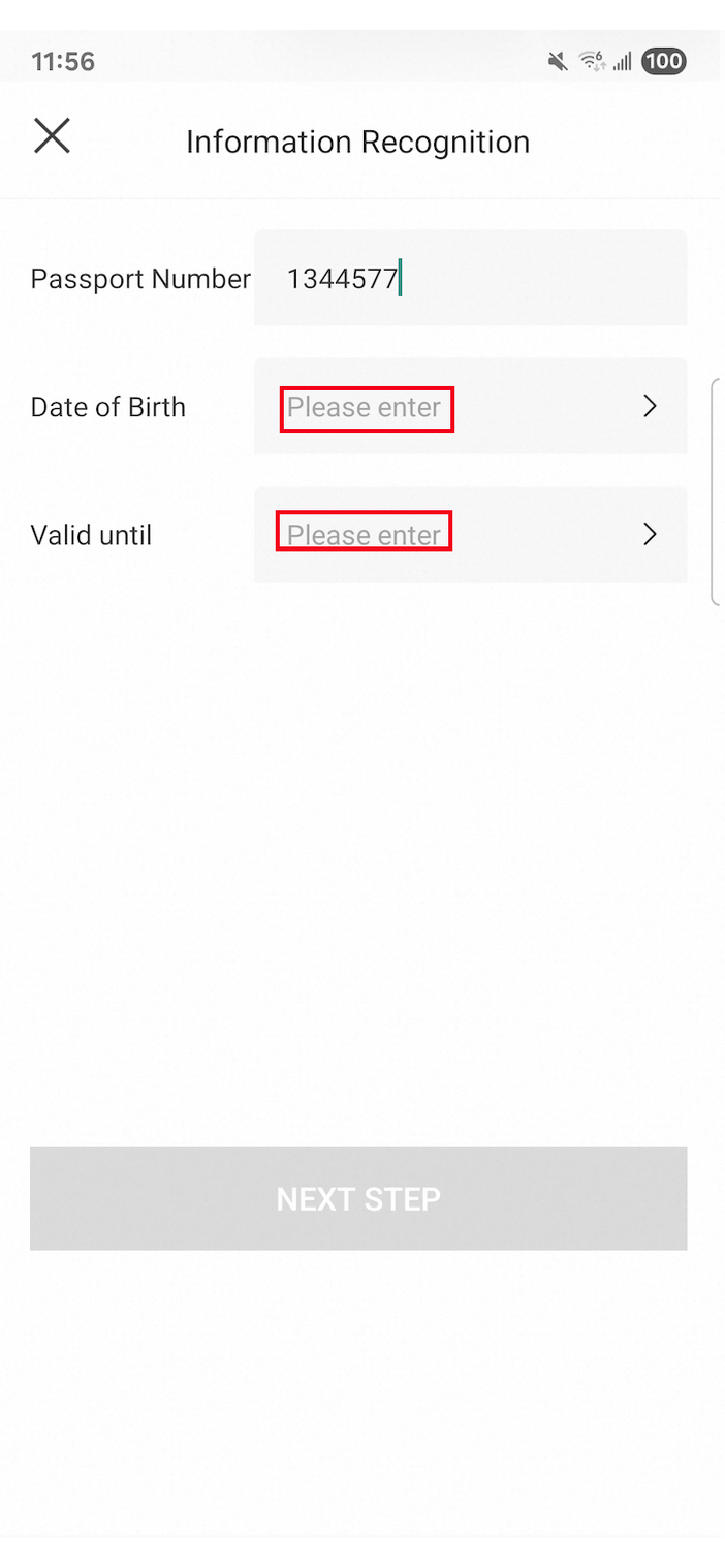
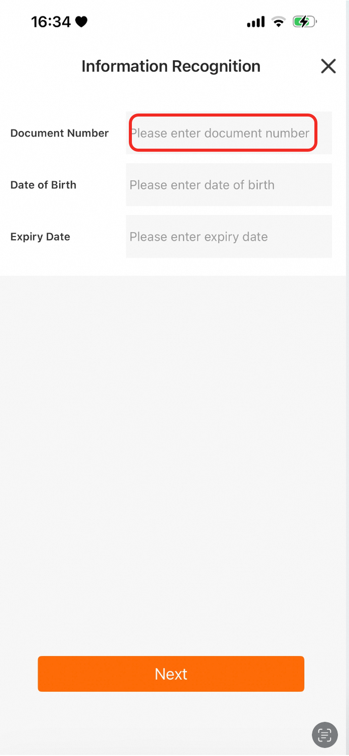
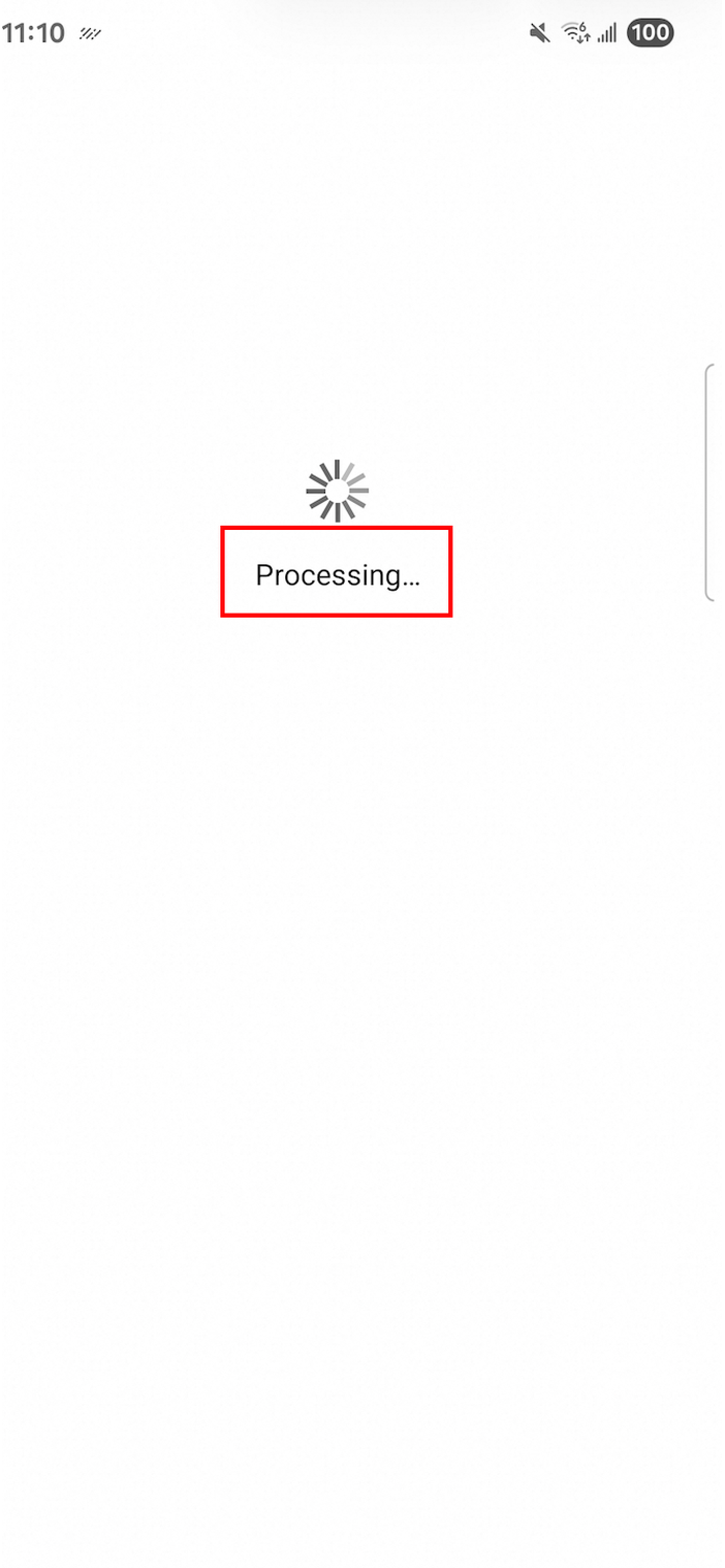
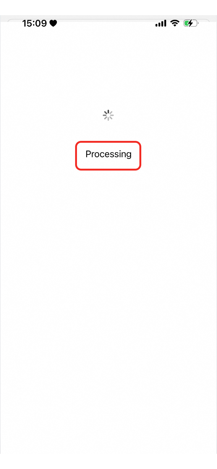
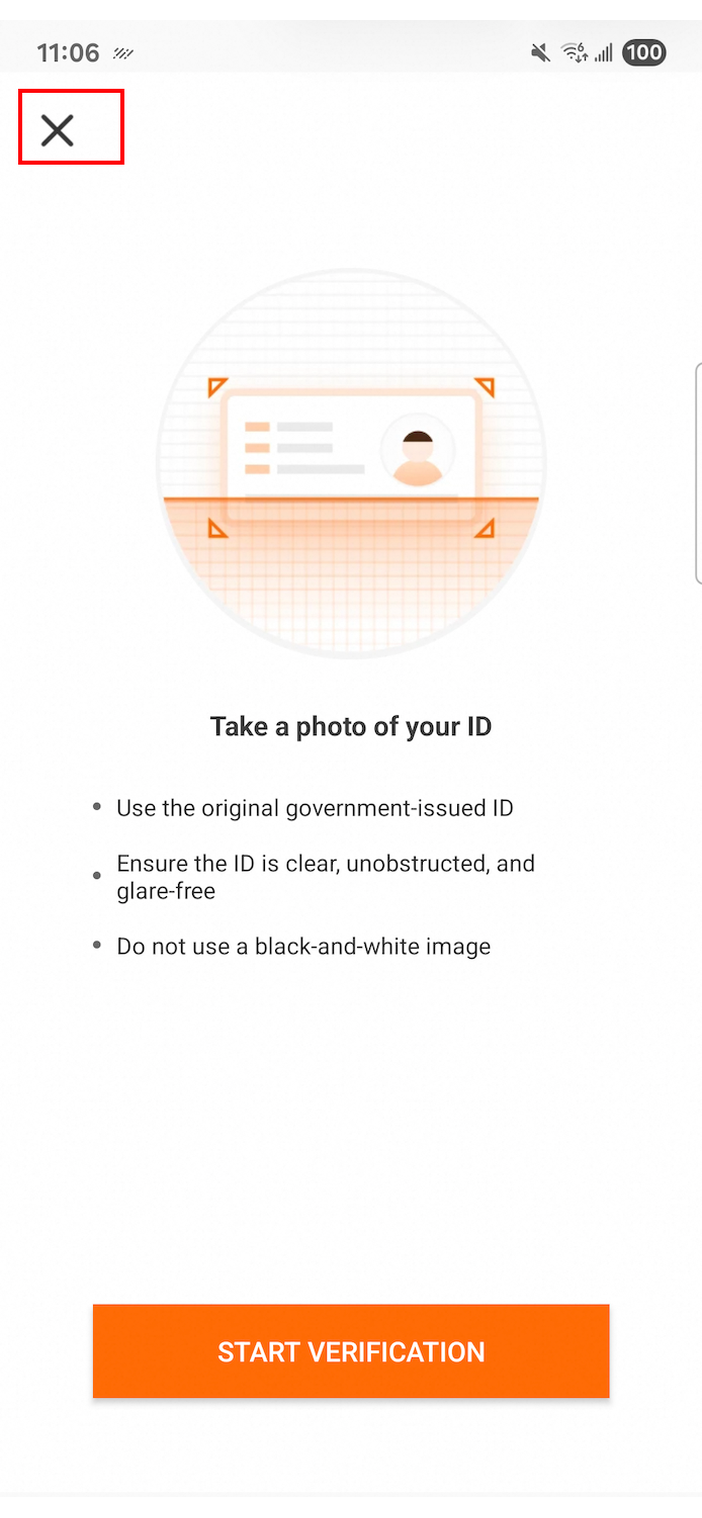
| The loading message color is specified by |
|
|
|
| The primary action button background color (enabled state). |
|
|
|
| The primary action button background color (disabled state). |
|
|
|
| The primary action button text color (enabled state). |
|
|
|
| The primary action button text color (disabled state). |
|
|
|
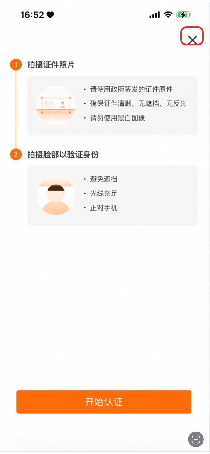
| The page back/close button icon. |
|
|
|
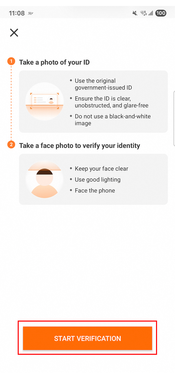
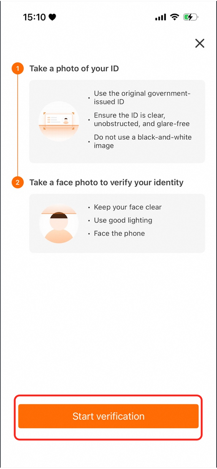
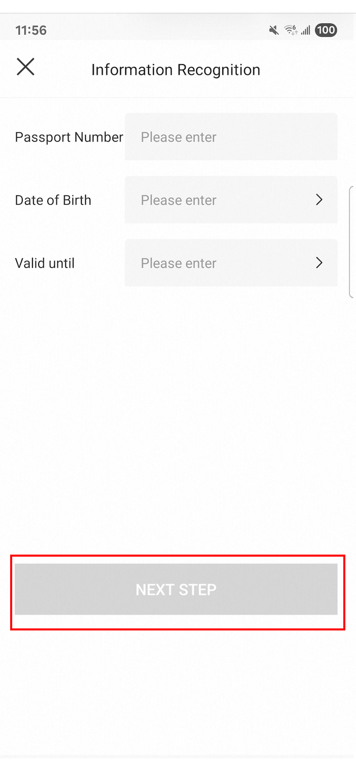
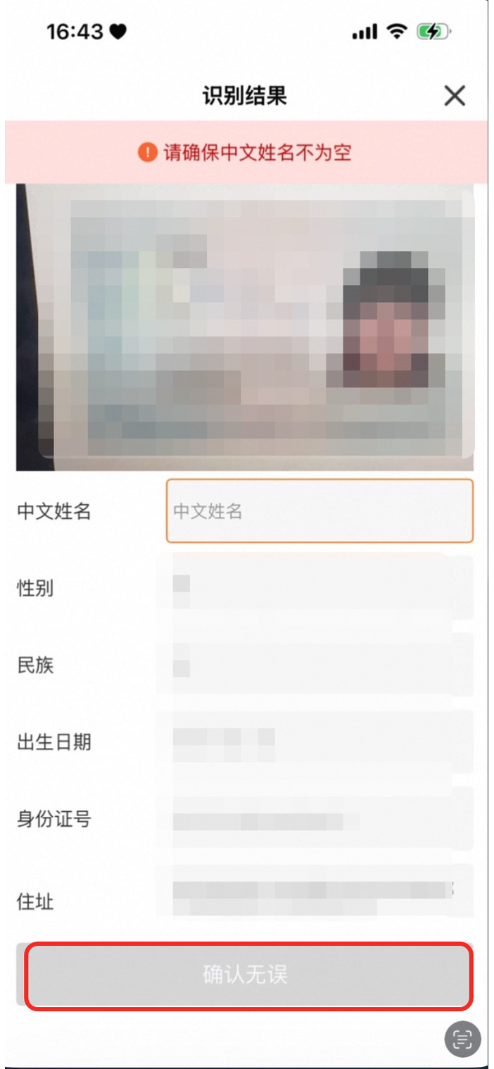
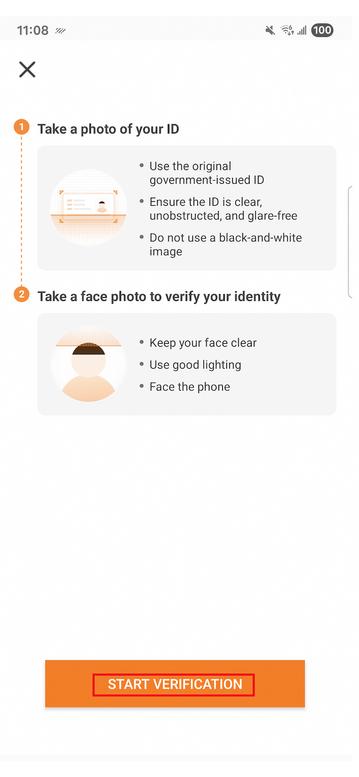
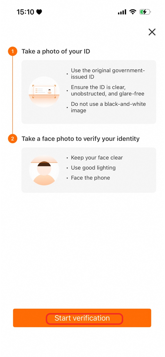
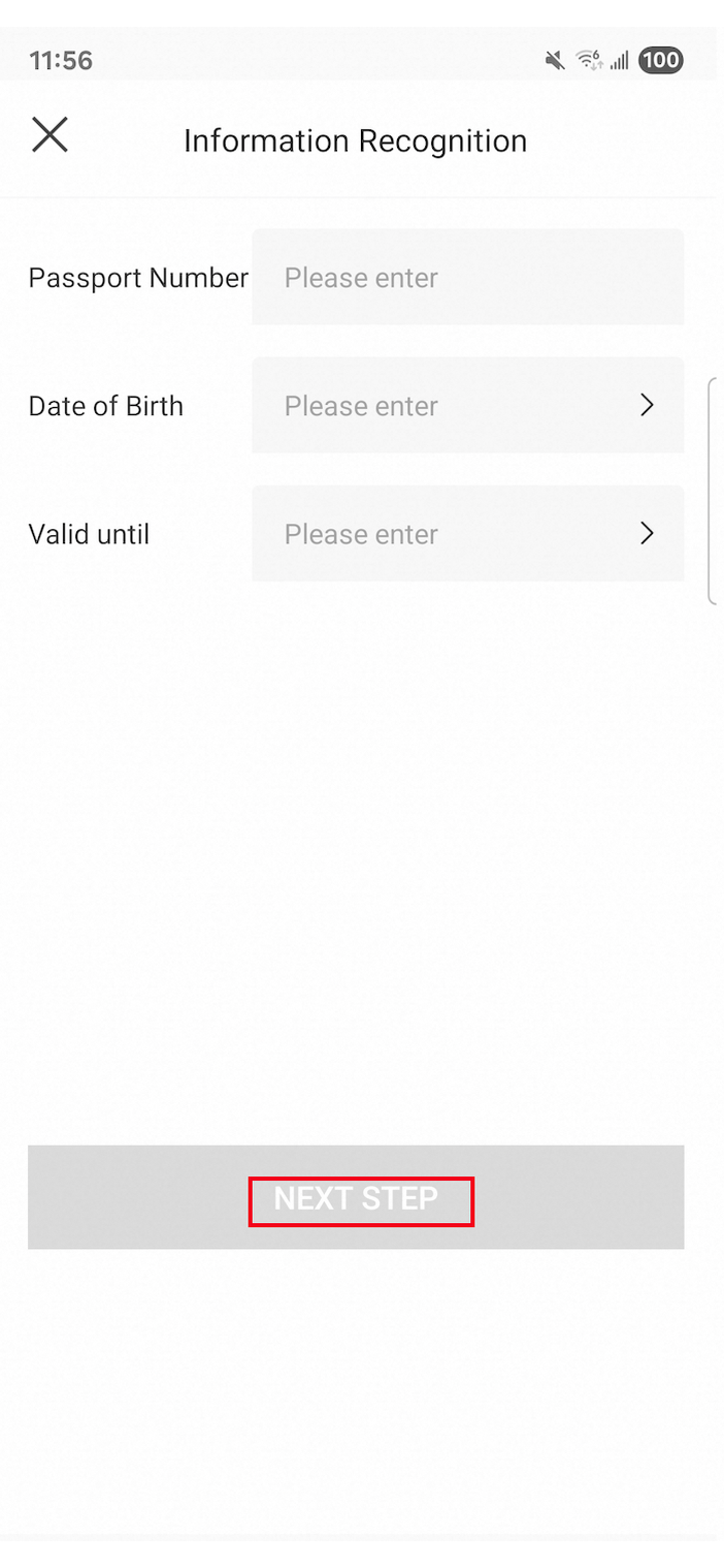
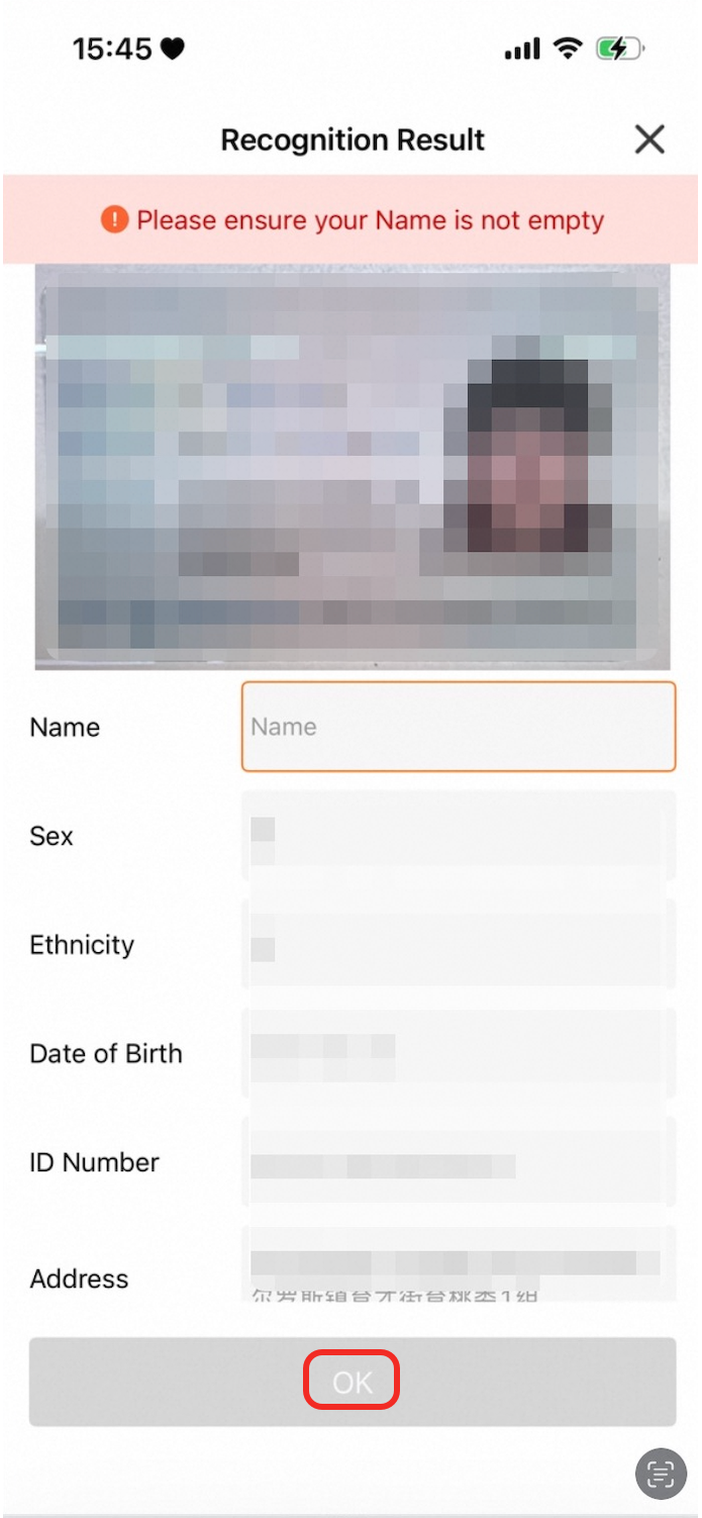
dialogConfig
Parameter | Description | Default color | Android preview | iOS preview |
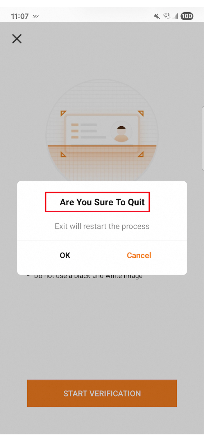
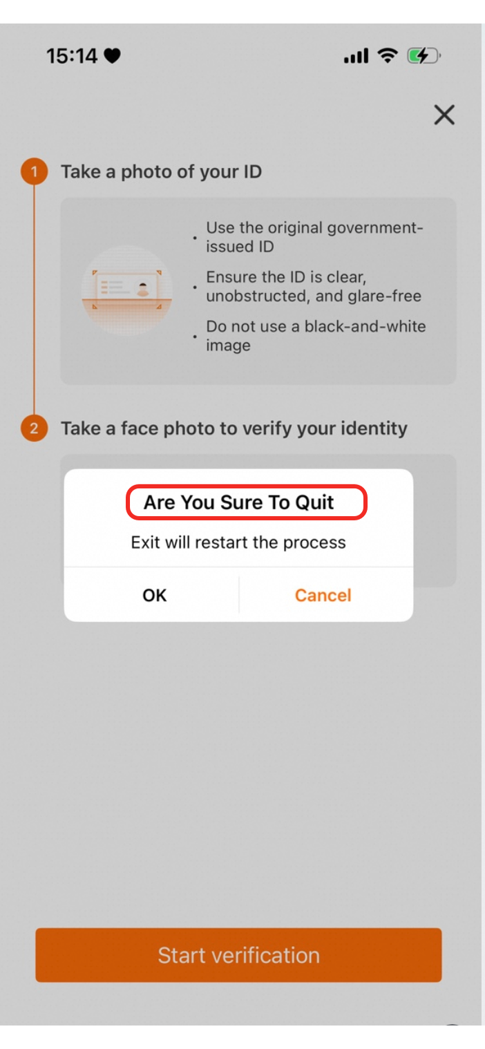
| The text color of the dialog title. |
|
|
|
| The text color of the dialog message. |
|
|
|
| The text color of the primary action button in a two-button dialog (right). |
|
|
|
| The text color of the secondary action button in a two-button dialog (left). |
|
|
|
| The text color of the action button in a single-button dialog. |
|
|
|
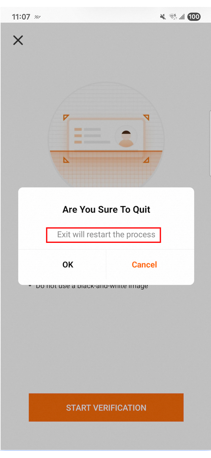
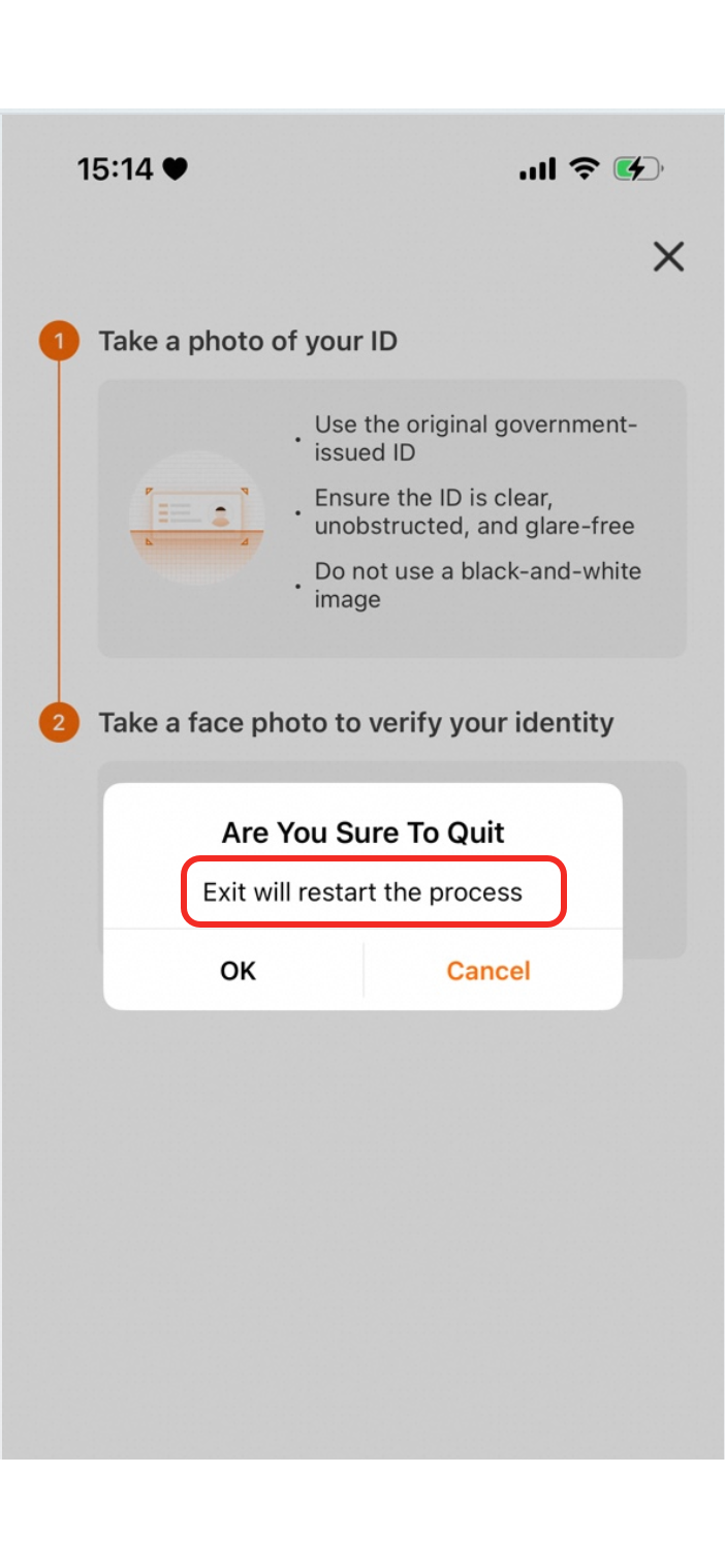
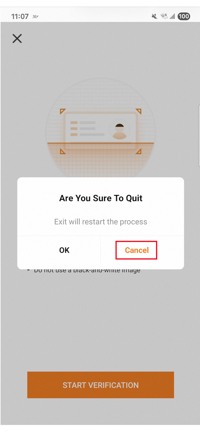
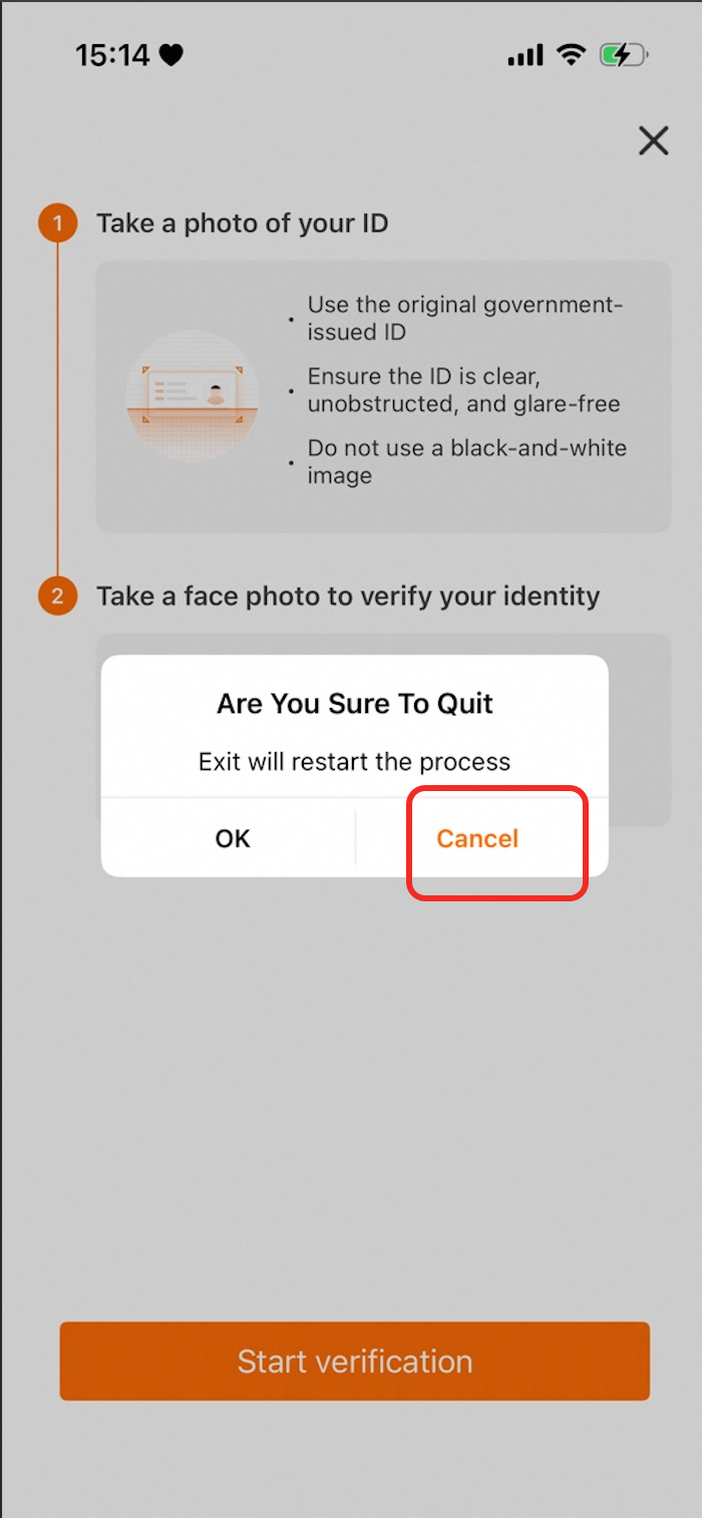
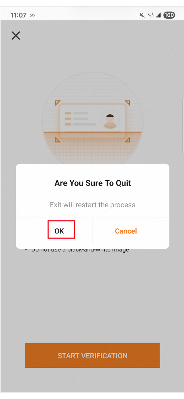
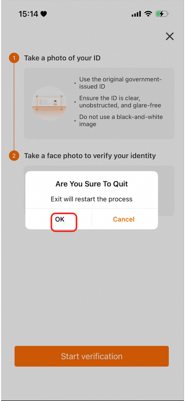
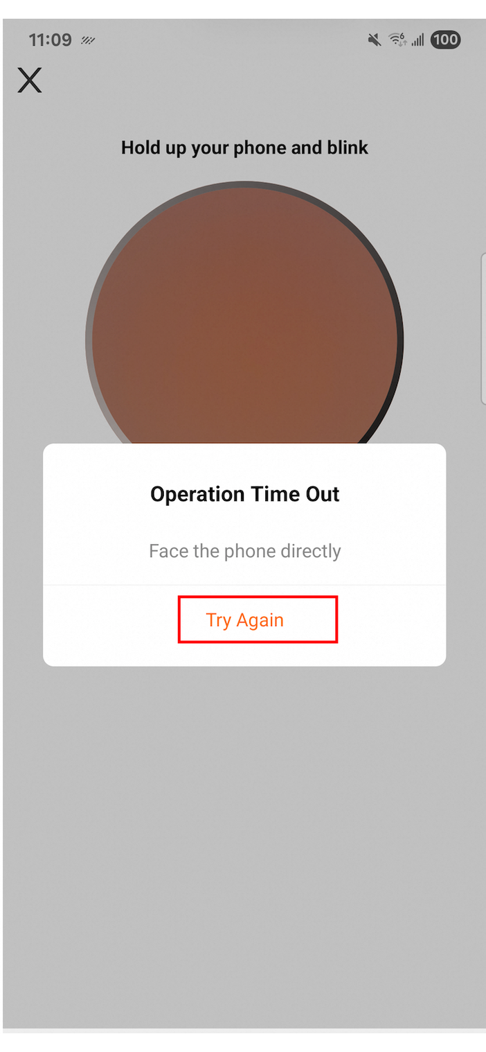
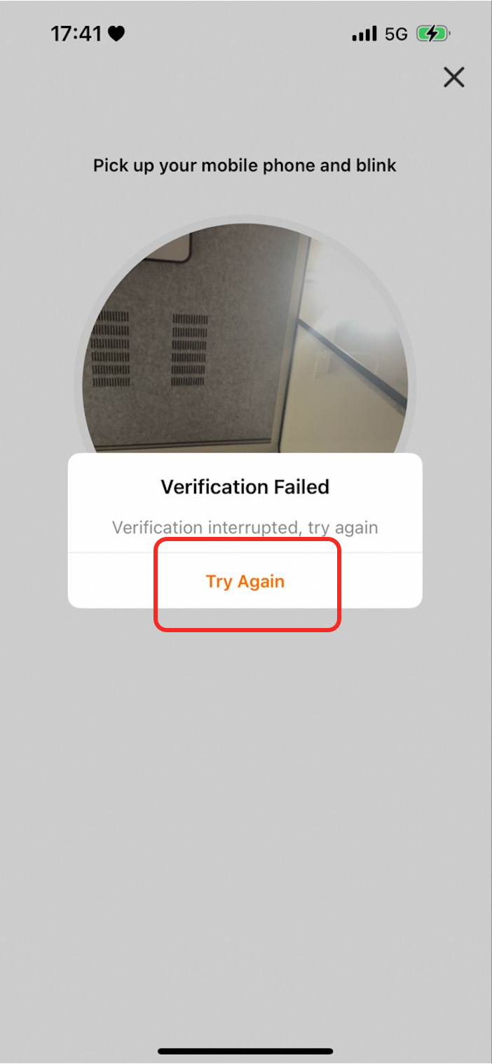
guideConfig
Parameter | Description | Default color | Android preview | iOS preview |
| The text color of the main title. |
|
|
|
| The text color of the content. |
|
|
|
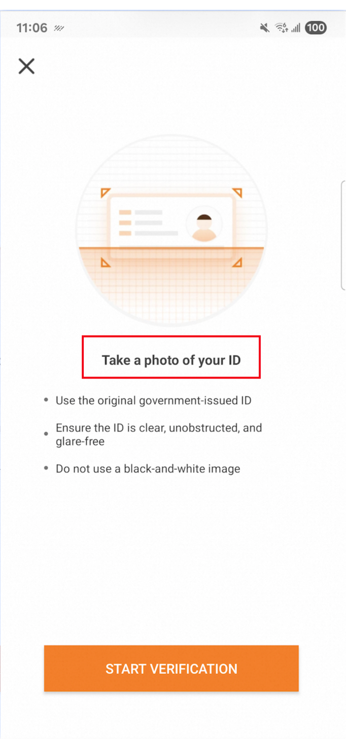
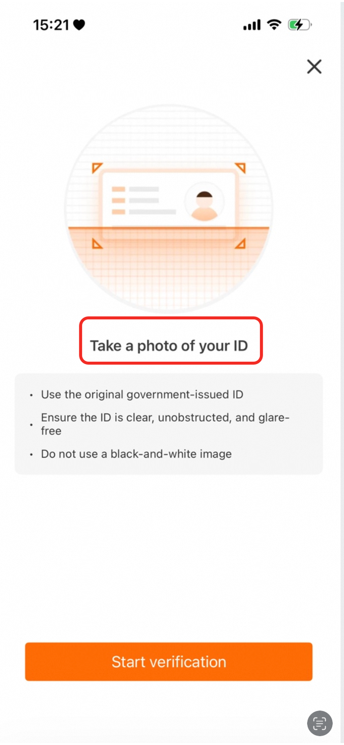
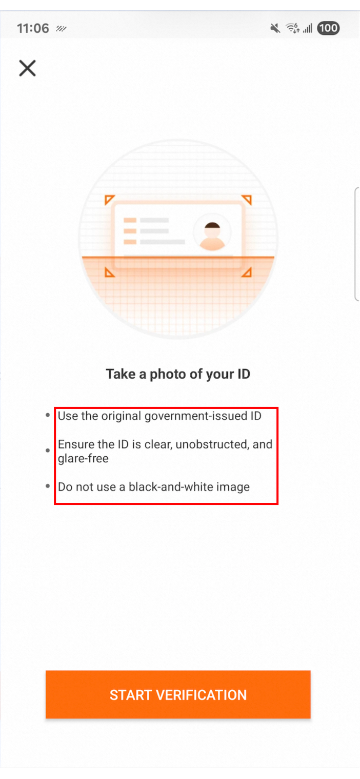
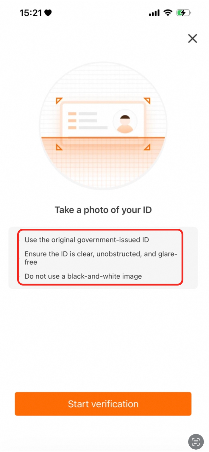
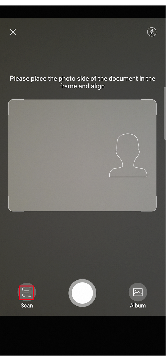
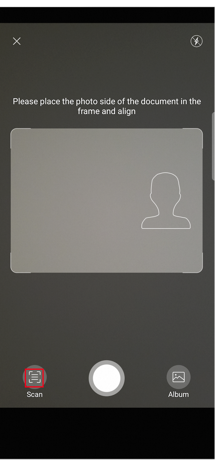
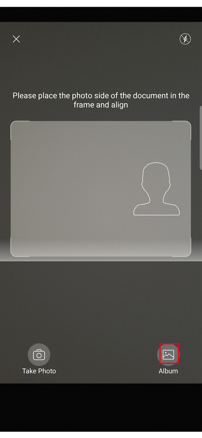
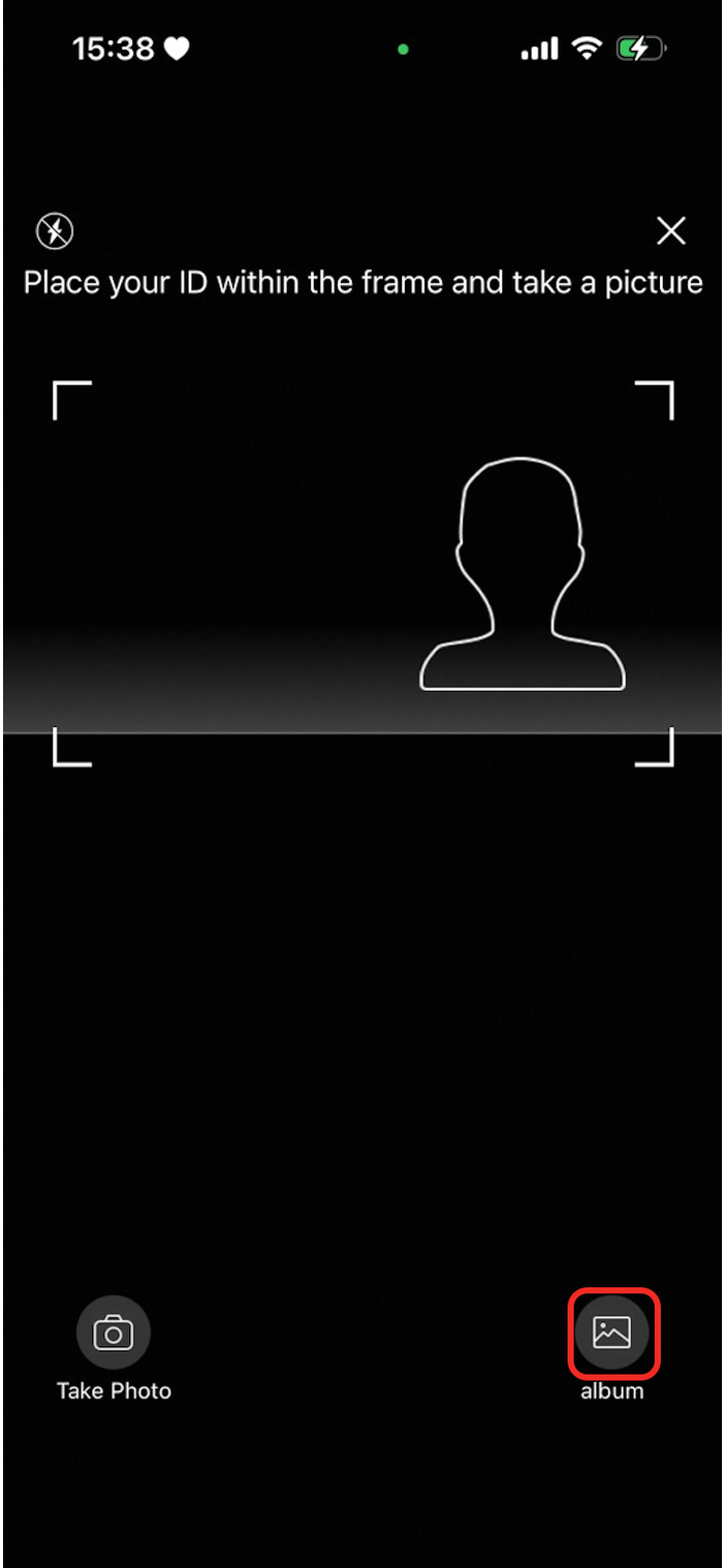
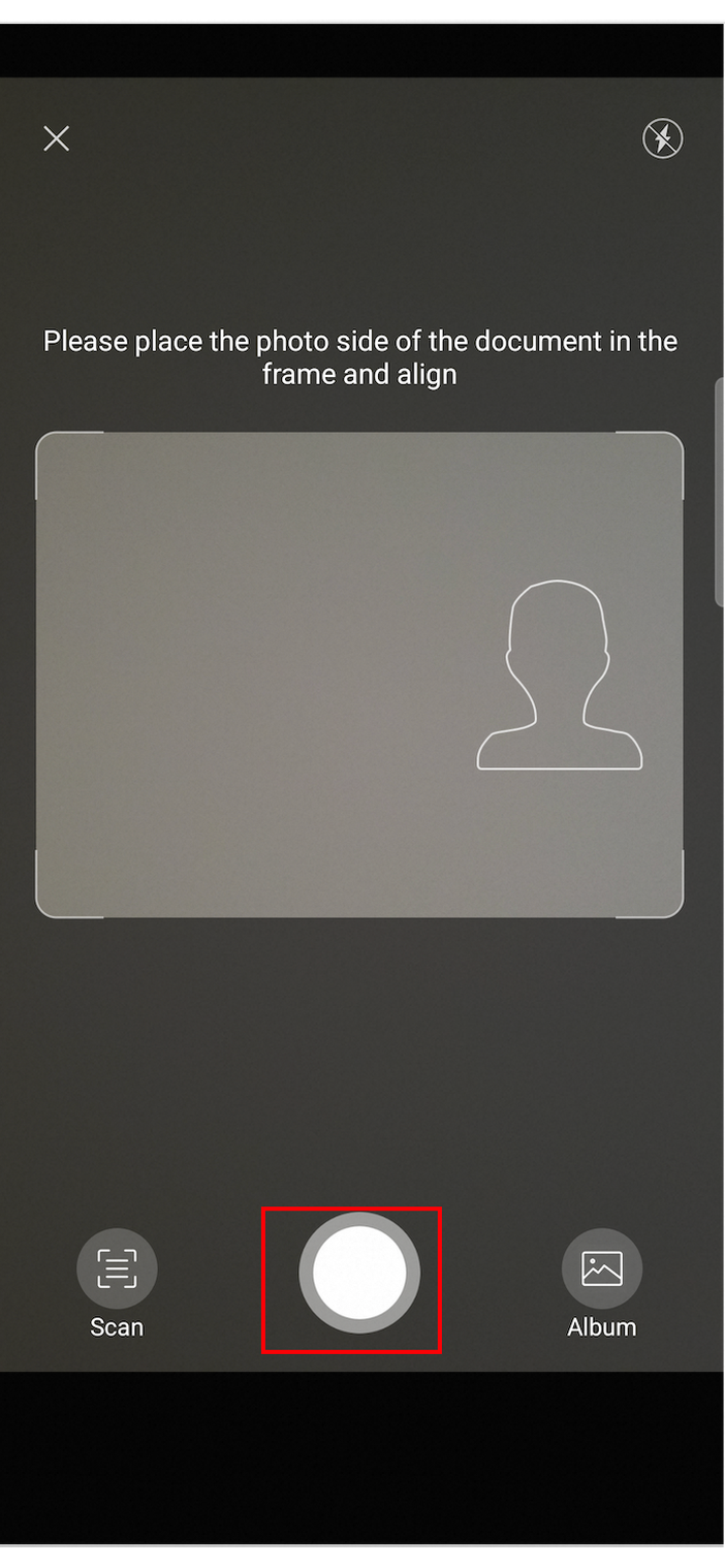
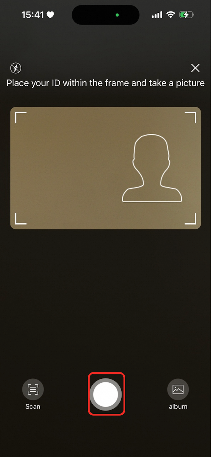
ocrConfig
Parameter | Description | Default color | Android preview | iOS preview |
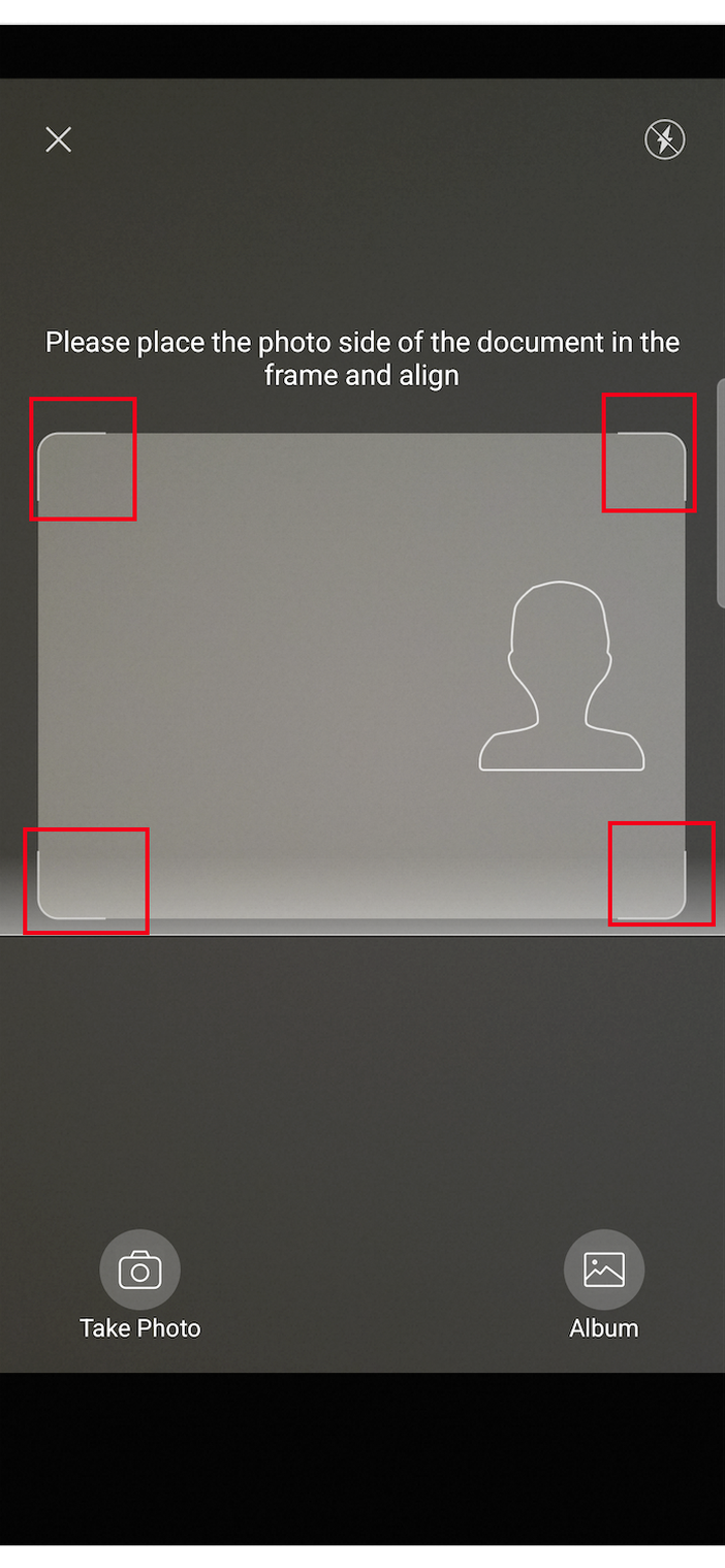
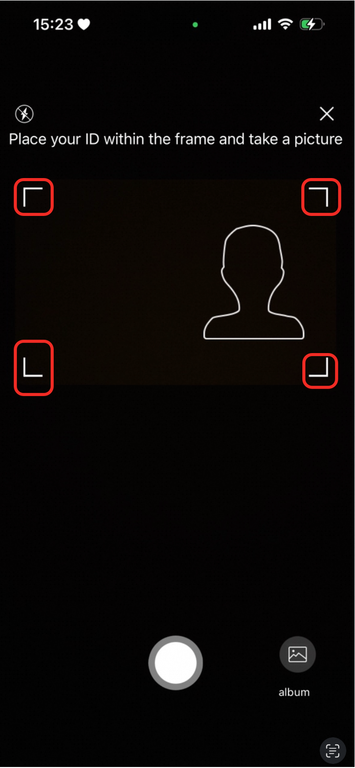
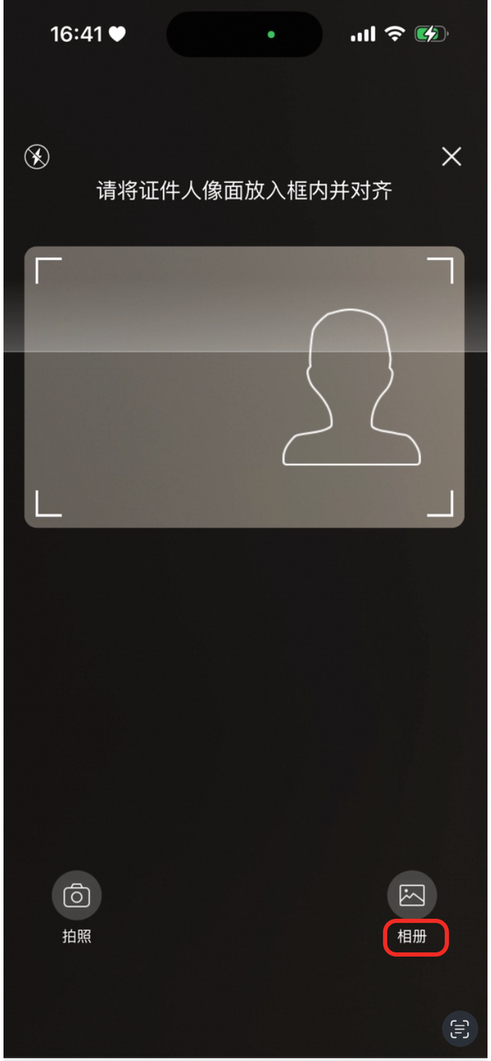
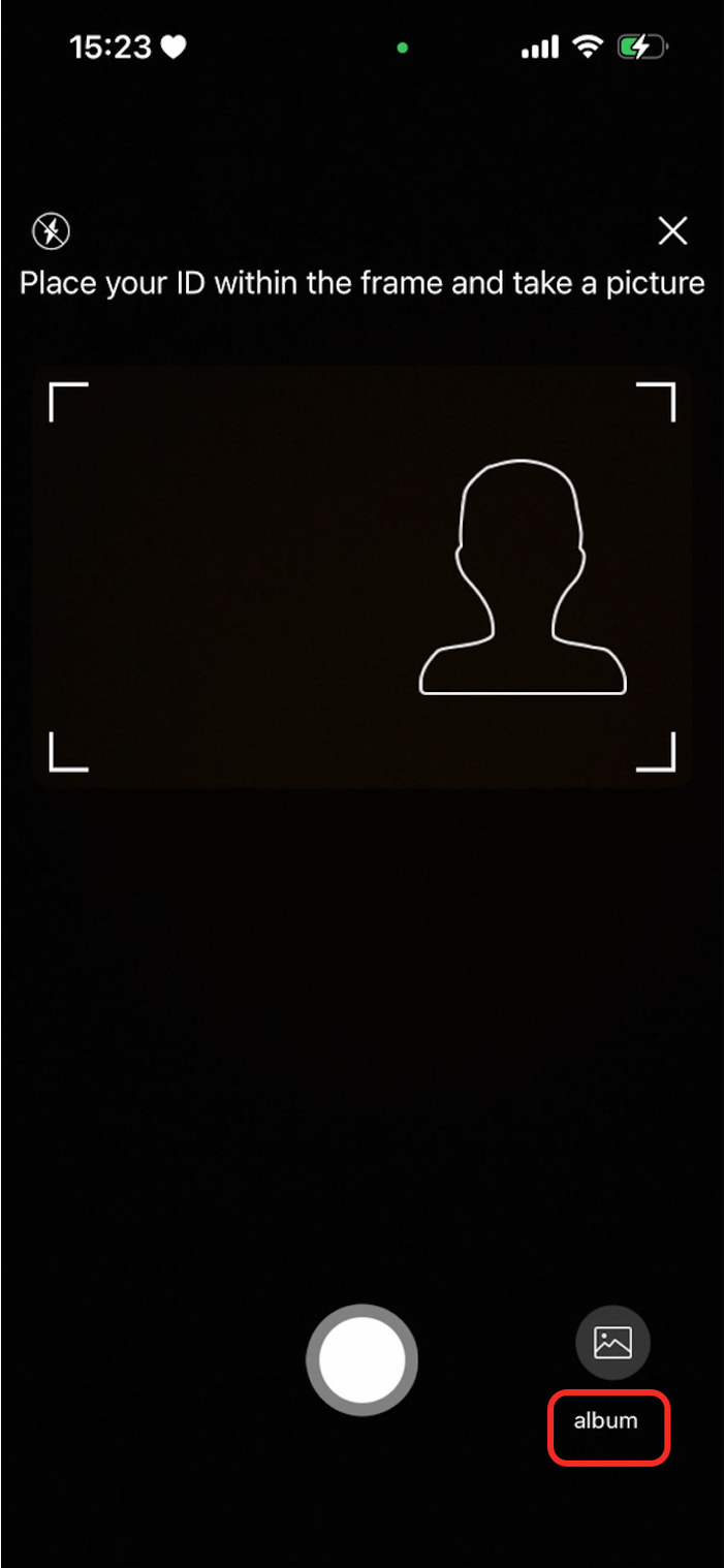
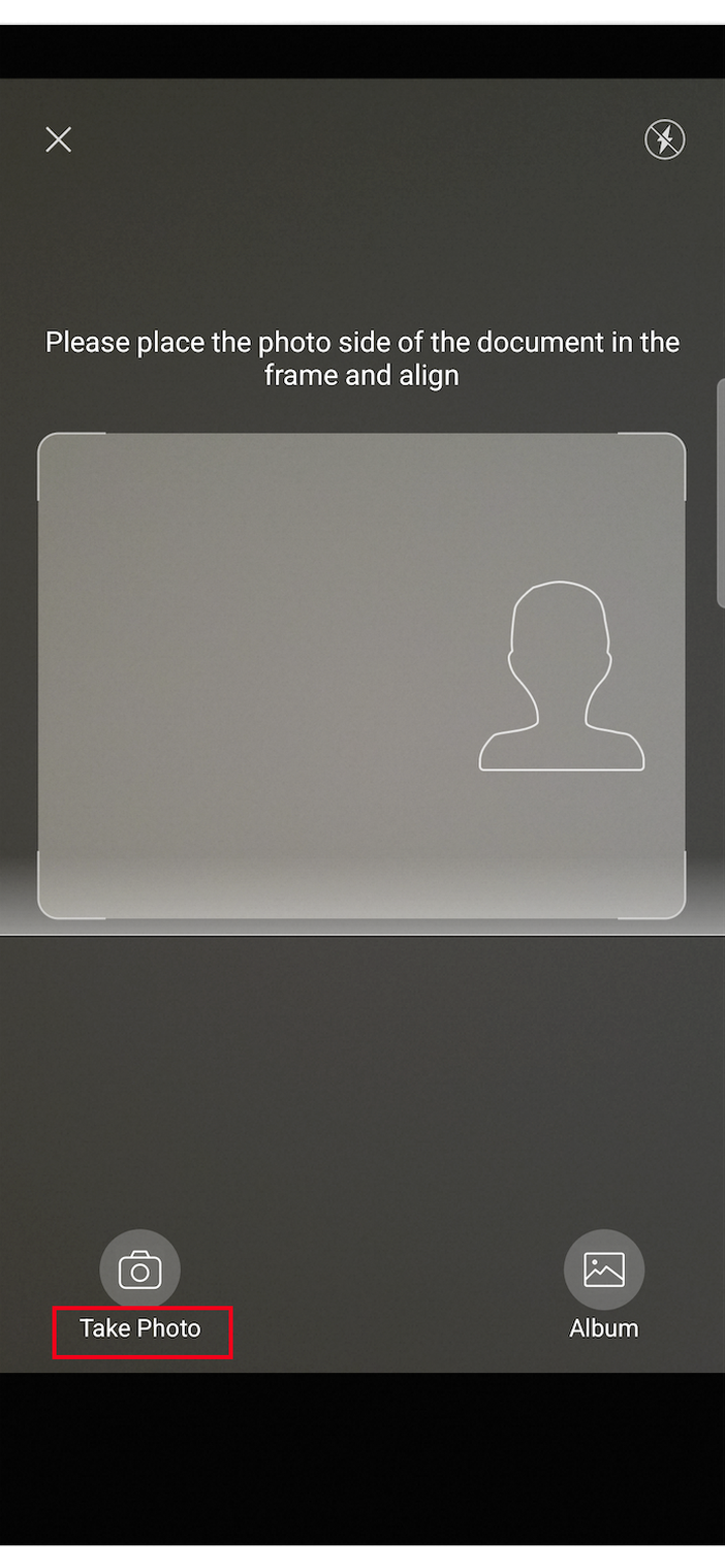
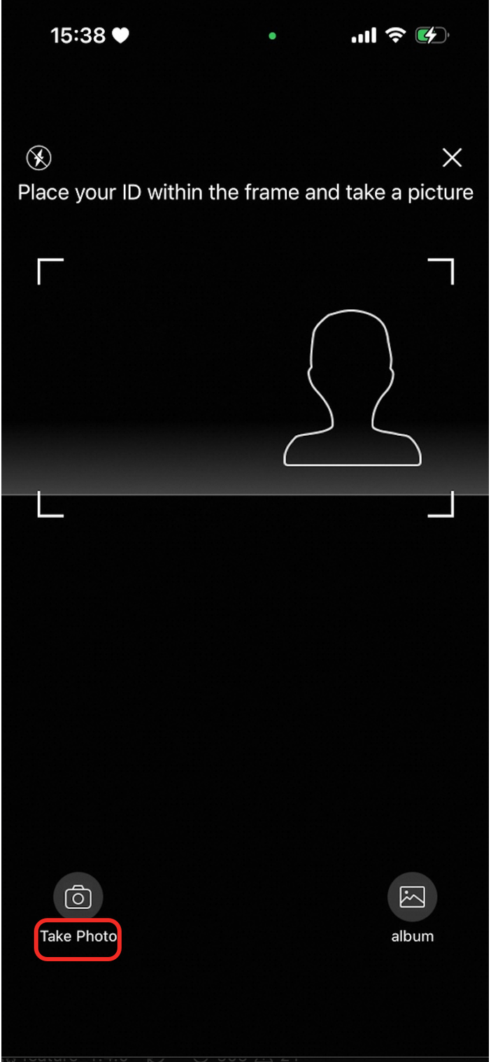
| The border color of the scanning box or hollow area. |
|
|
|
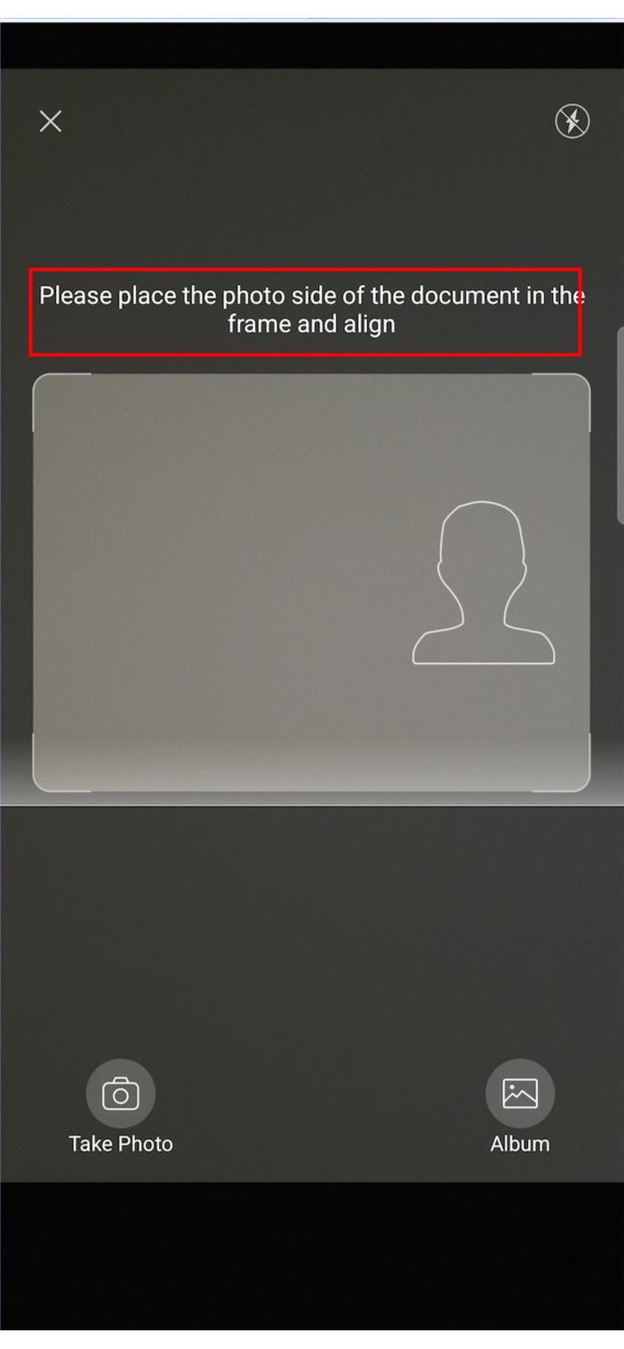
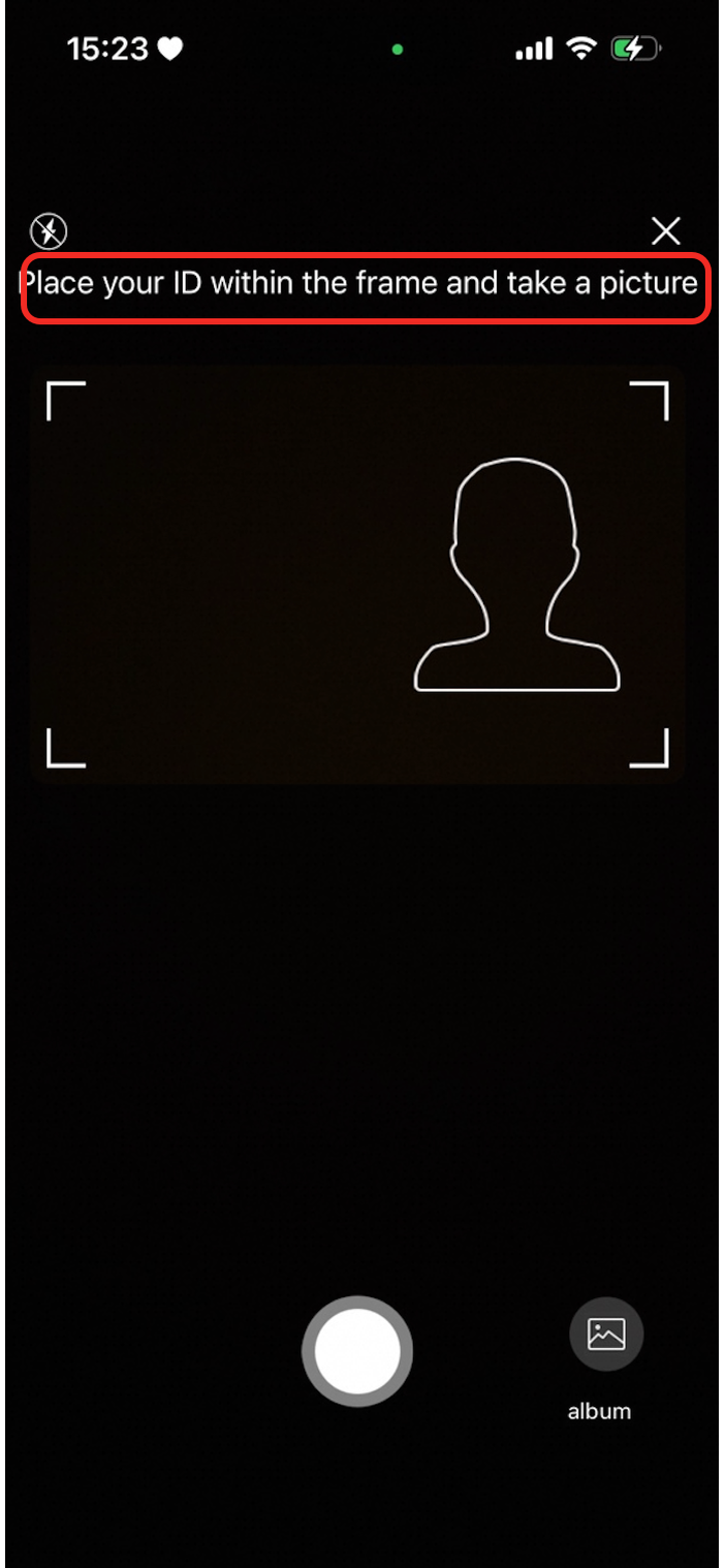
| The color of the prompt text at the top of the recognition page. |
|
|
|
| The text color of the album button. |
|
|
|
| The text color of the take photo/scan toggle button. |
|
|
|
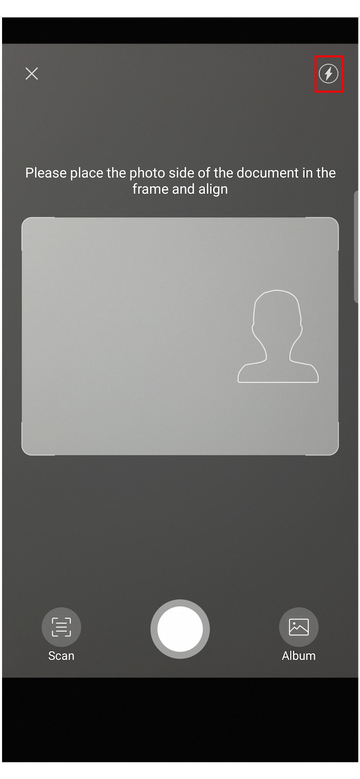
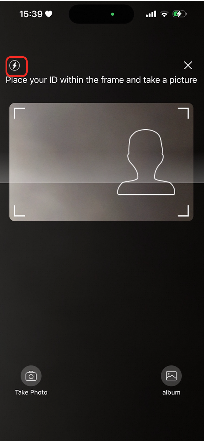
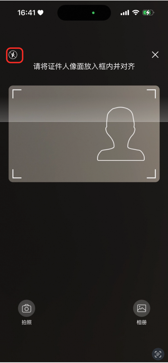
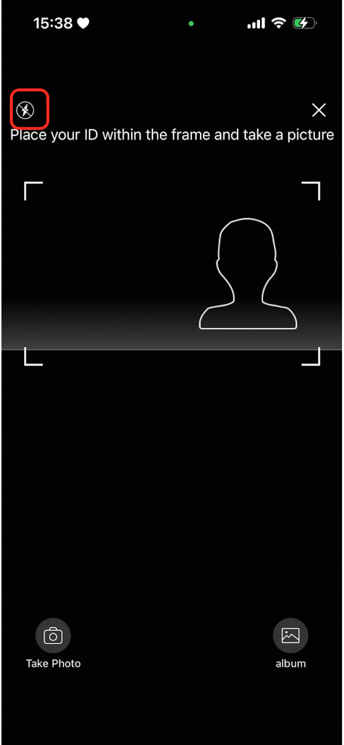
| The 'flash on' icon. |
|
|
|
| The 'flash off' icon. |
|
|
|
| The icon for the auto scan button. |
|
|
|
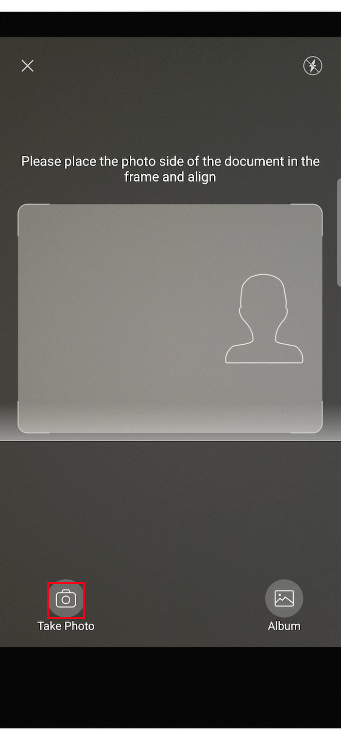
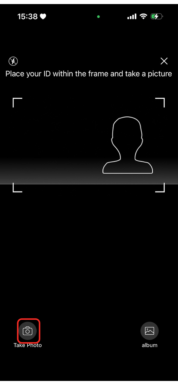
| The icon to switch to 'take photo' mode. |
|
|
|
| The icon for the album button. |
|
|
|
| The icon for the take photo button. |
|
|
|
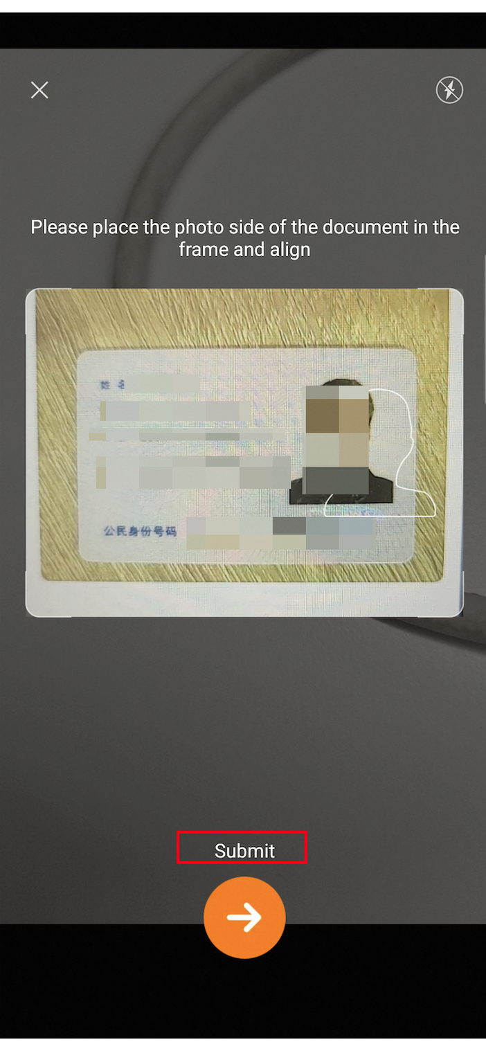
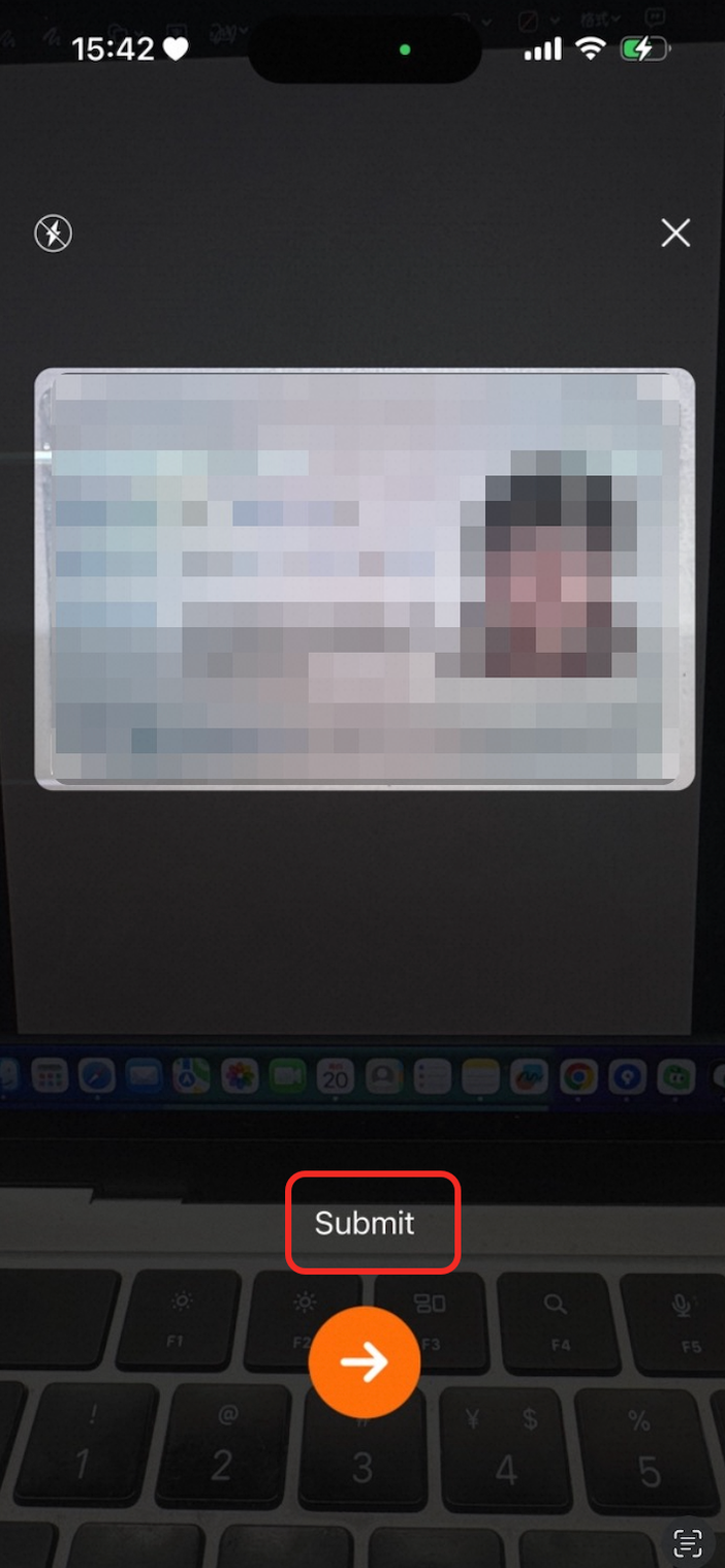
| The color of the submit prompt text. |
|
|
|
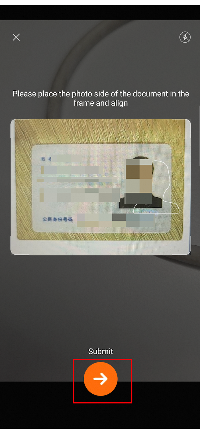
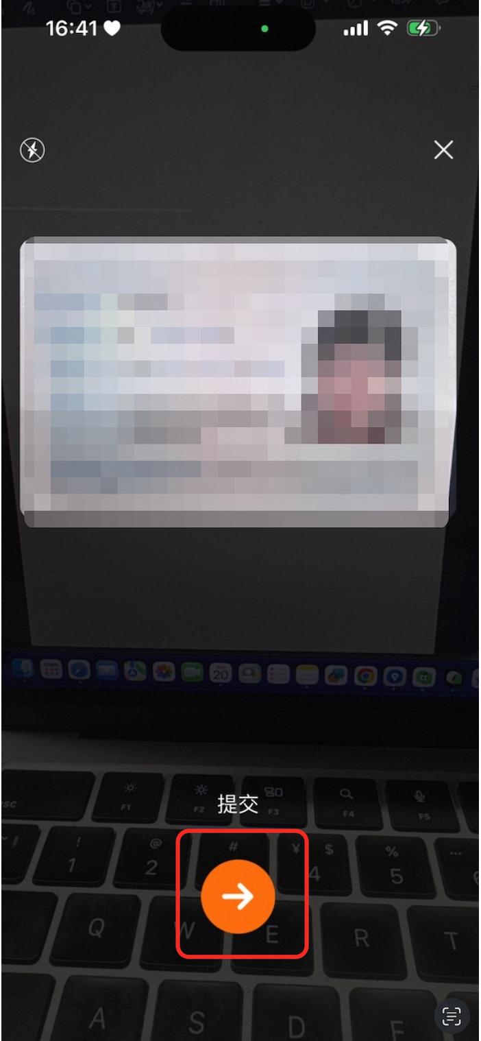
| The icon for the submit button. |
|
|
|
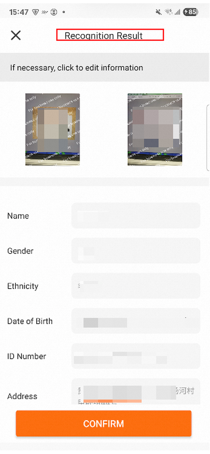
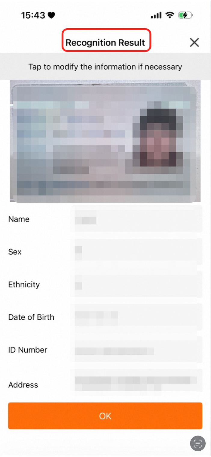
| The color of the title on the result page. |
|
|
|
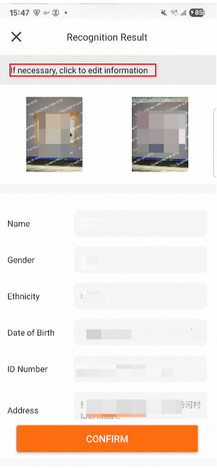
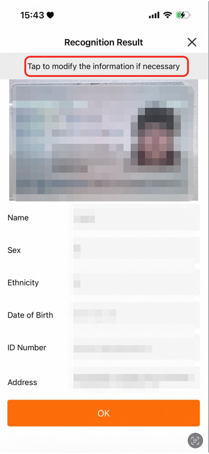
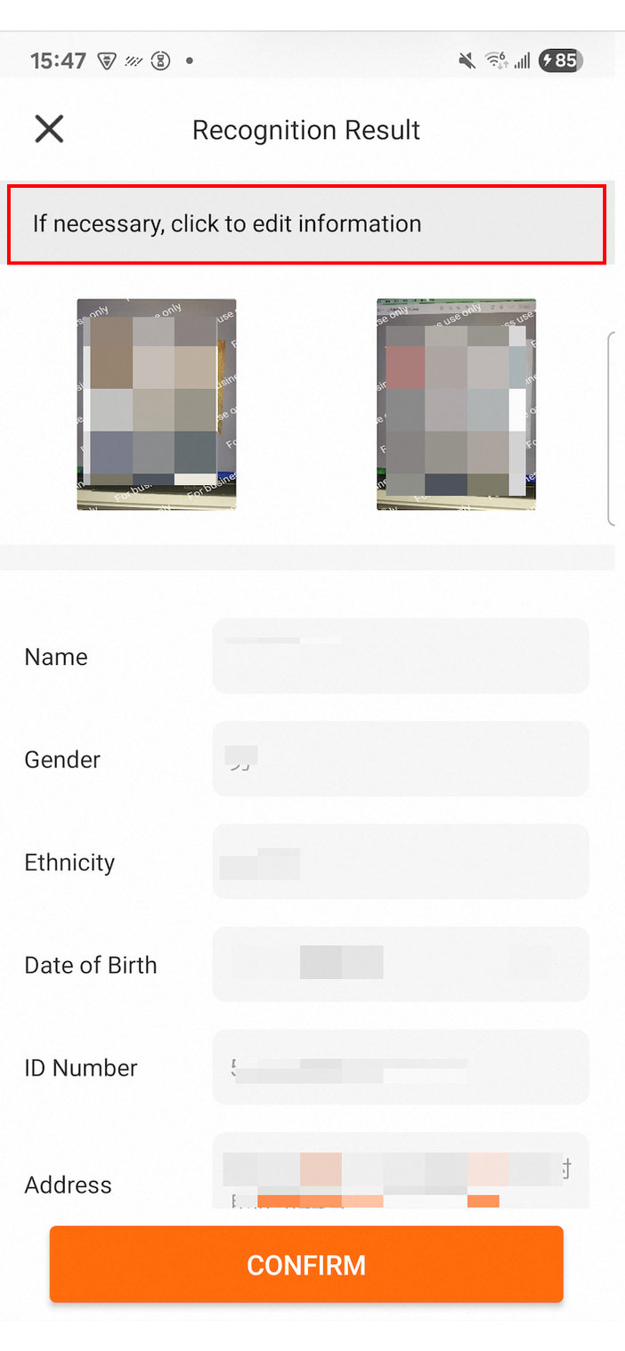
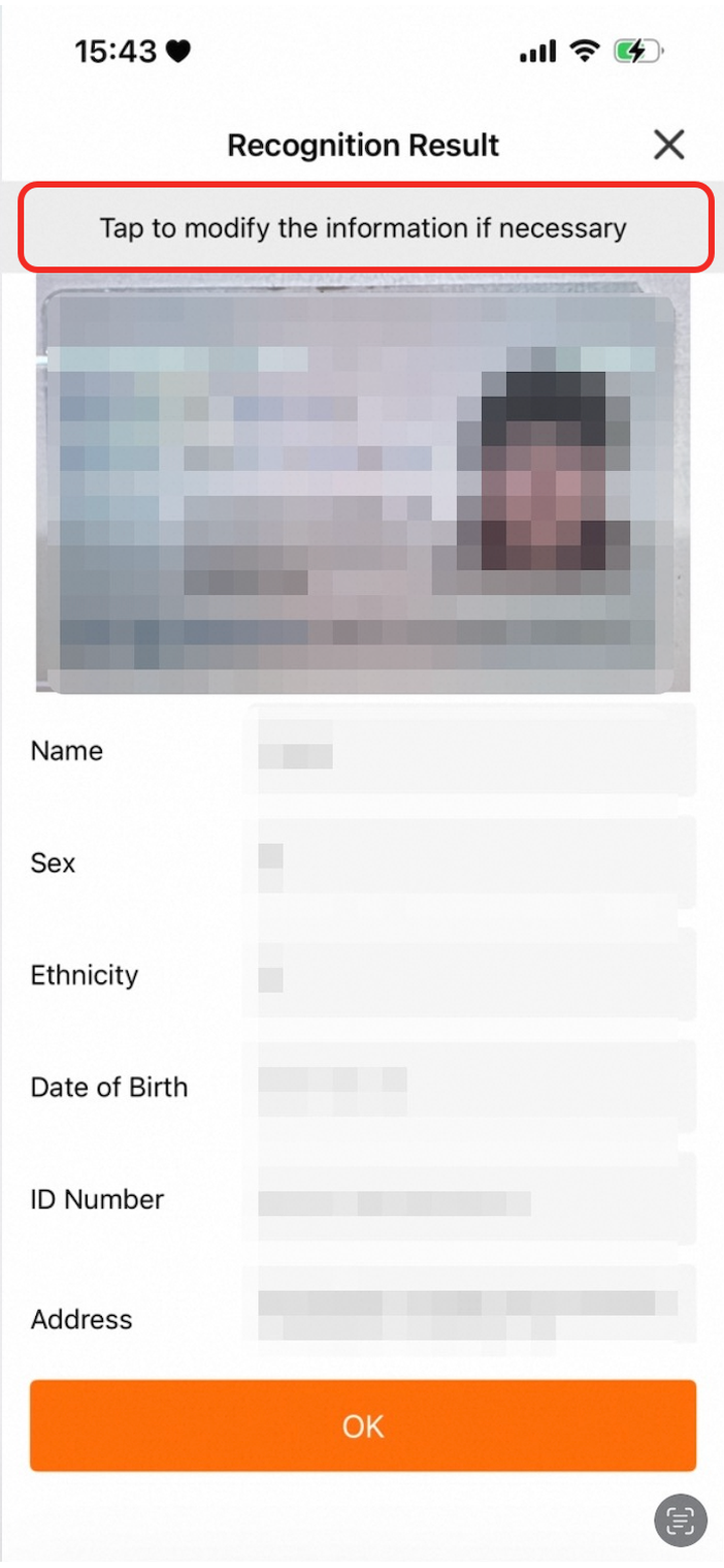
| The text color of the top tip bar in the normal state. |
|
|
|
| The background color of the top tip bar in the normal state. |
|
|
|
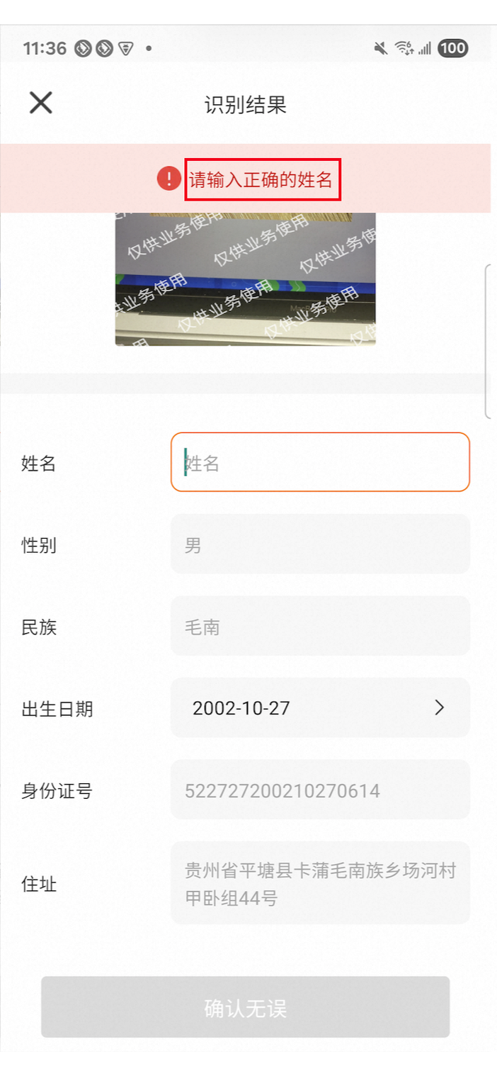
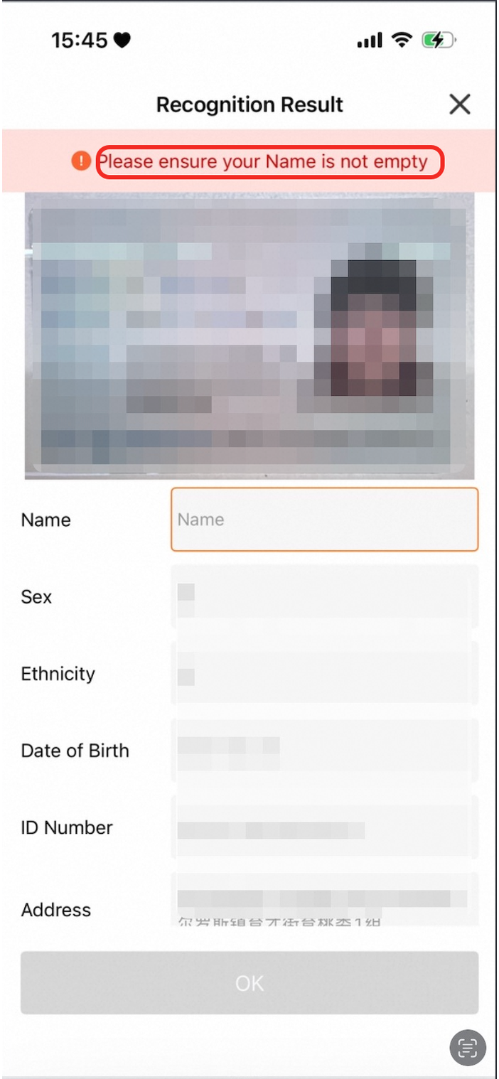
| The text color of the top tip bar when validation fails. |
|
|
|
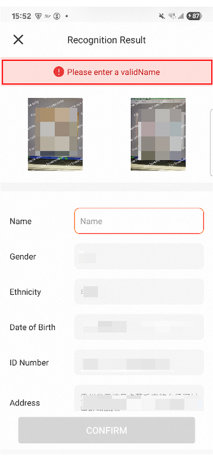
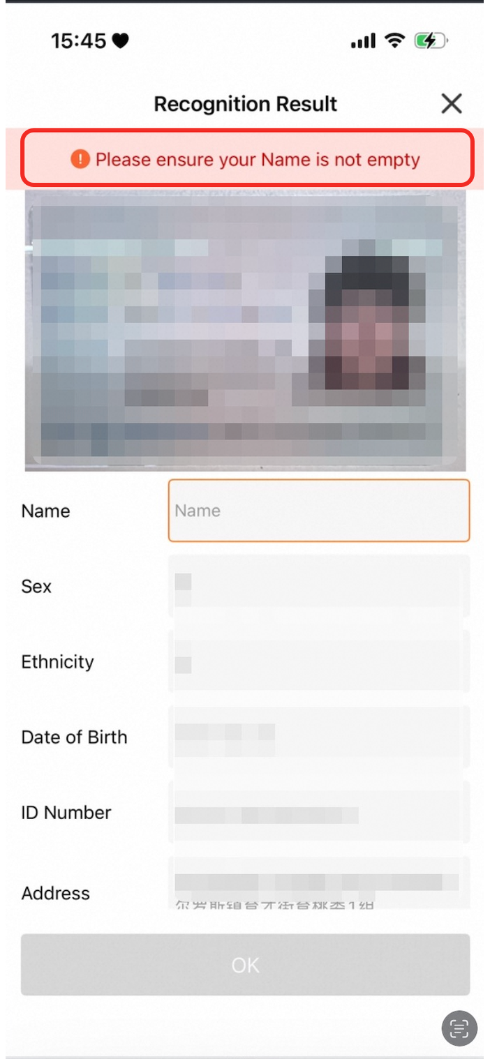
| The background color of the top tip bar when validation fails. |
|
|
|
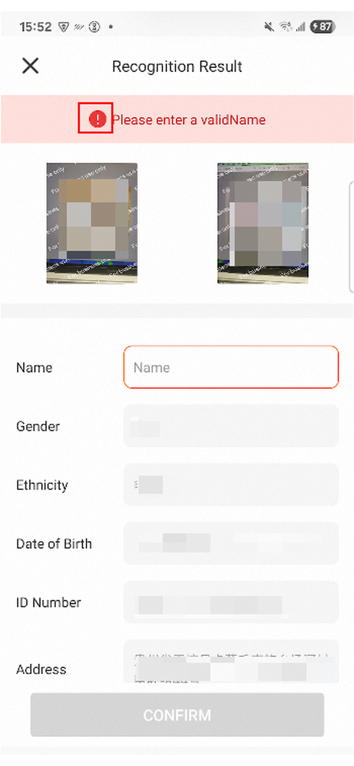
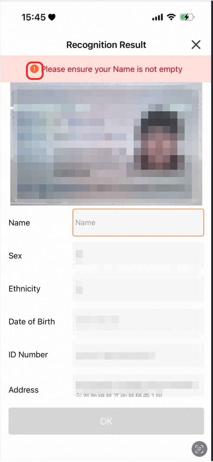
| The icon that indicates a validation failure. |
|
|
|
| The color of entry titles in the information area. |
|
|
|
| The text color of the input box in the information area. |
|
|
|
| The background color of the input box in the information area. |
|
|
|
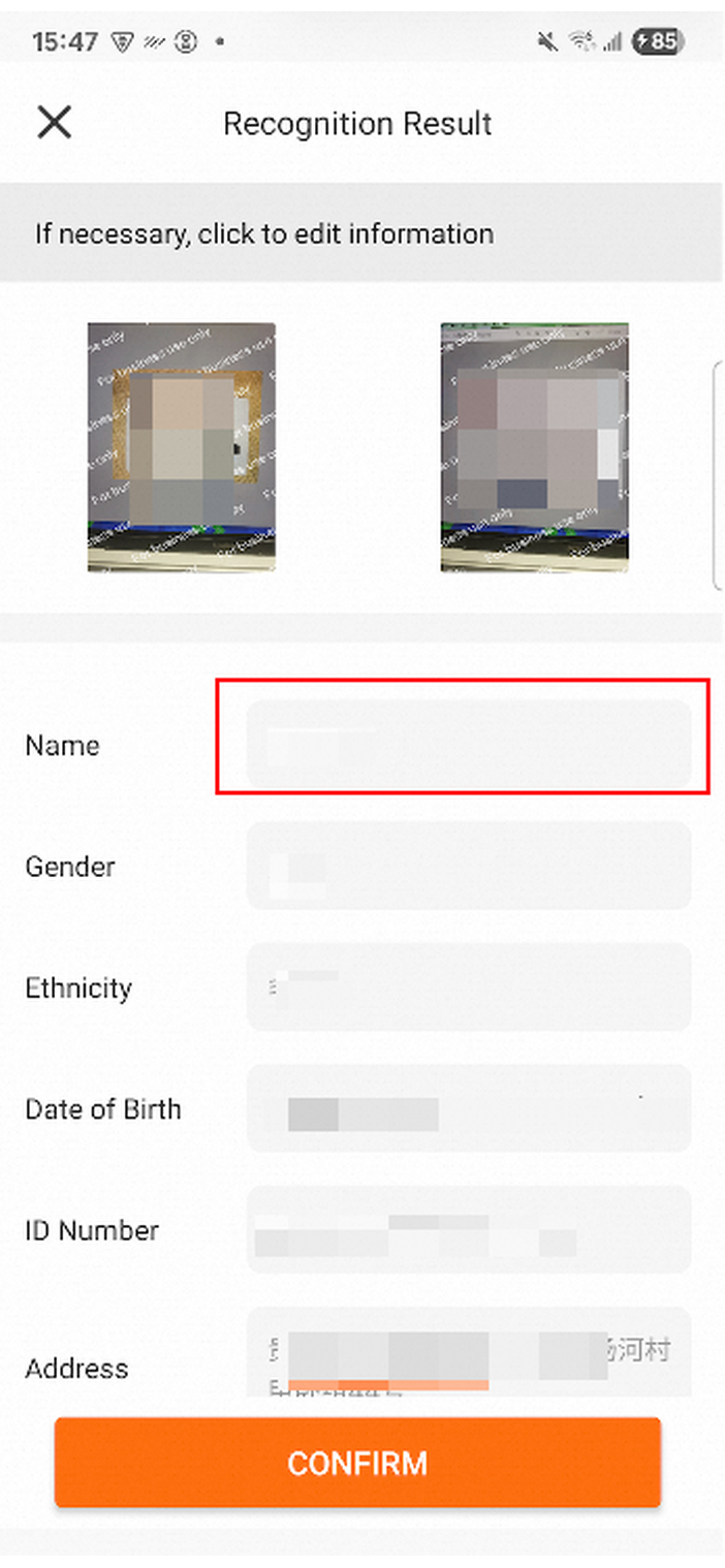
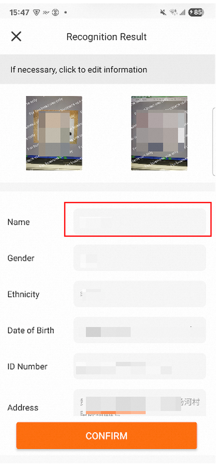
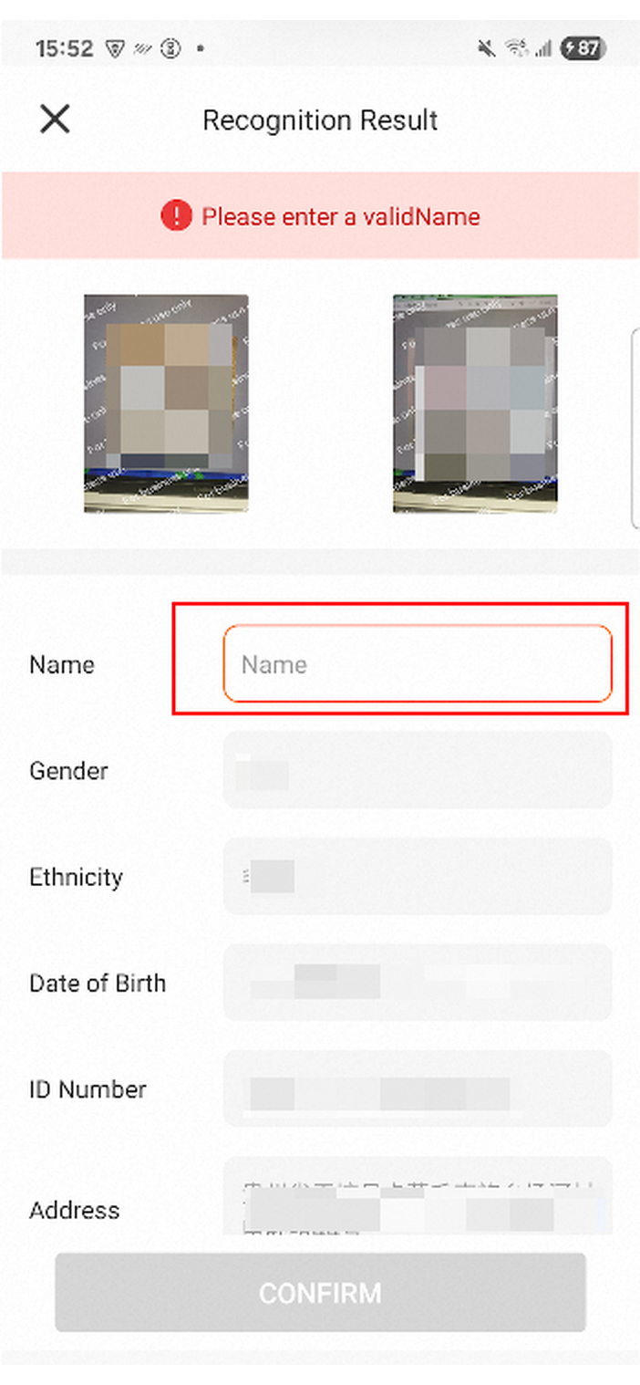
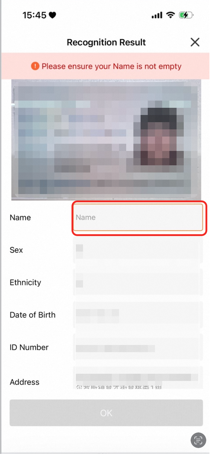
| The border color of an input box in the information area when validation fails. |
|
|
|
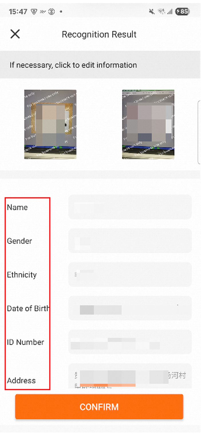
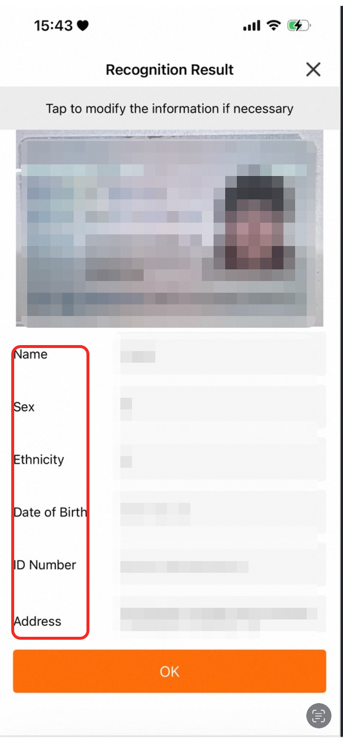
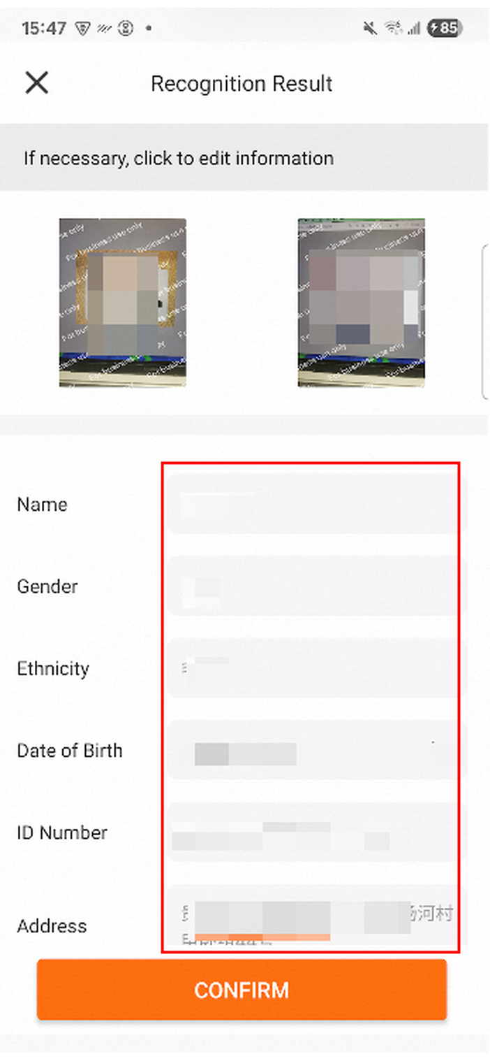
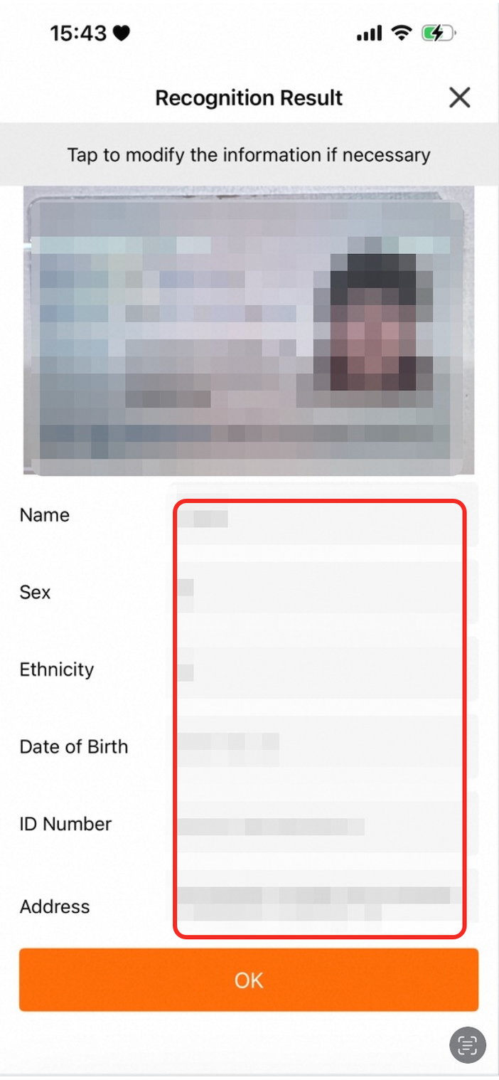
faceConfig
Parameter | Description | Default | Android screenshot | iOS screenshot |
| The color of the prompt text at the top of the face recognition page. |
|
|
|
| The color of the prompt text inside the face recognition frame. |
|
|
|
| The background color of the face recognition page. |
|
|
|
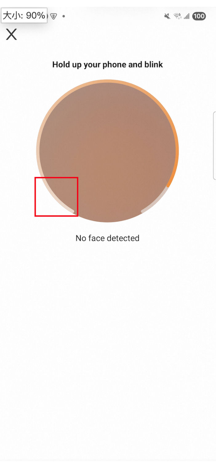
| The start color of the circular progress bar. |
|
| Not supported on iOS. |
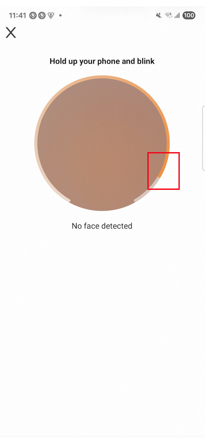
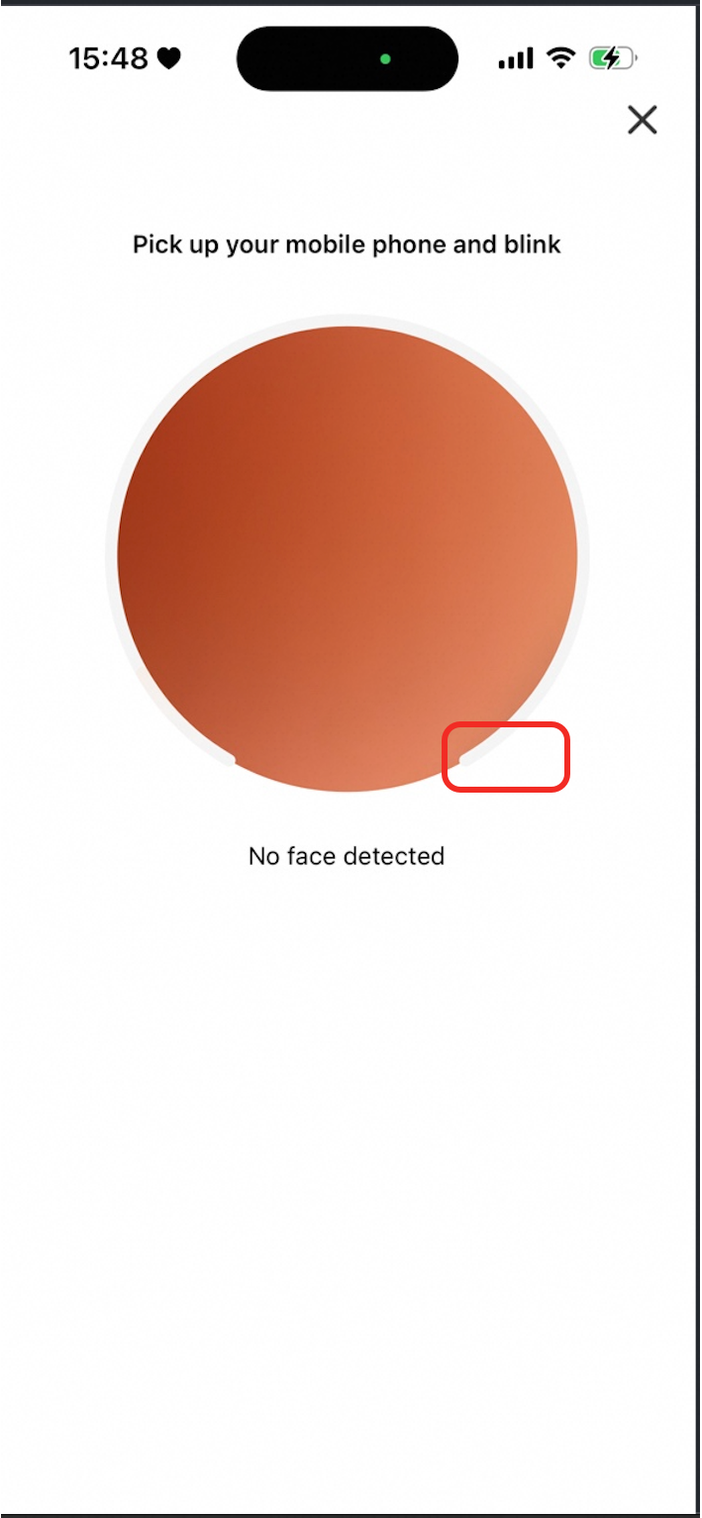
| The end color of the circular progress bar. |
|
|
|

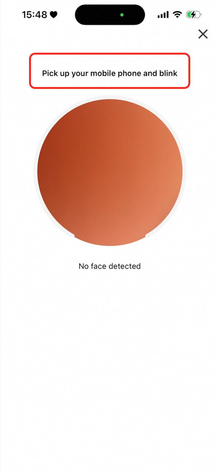

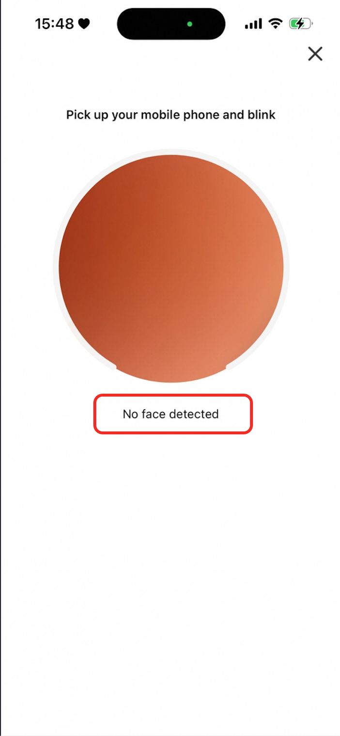
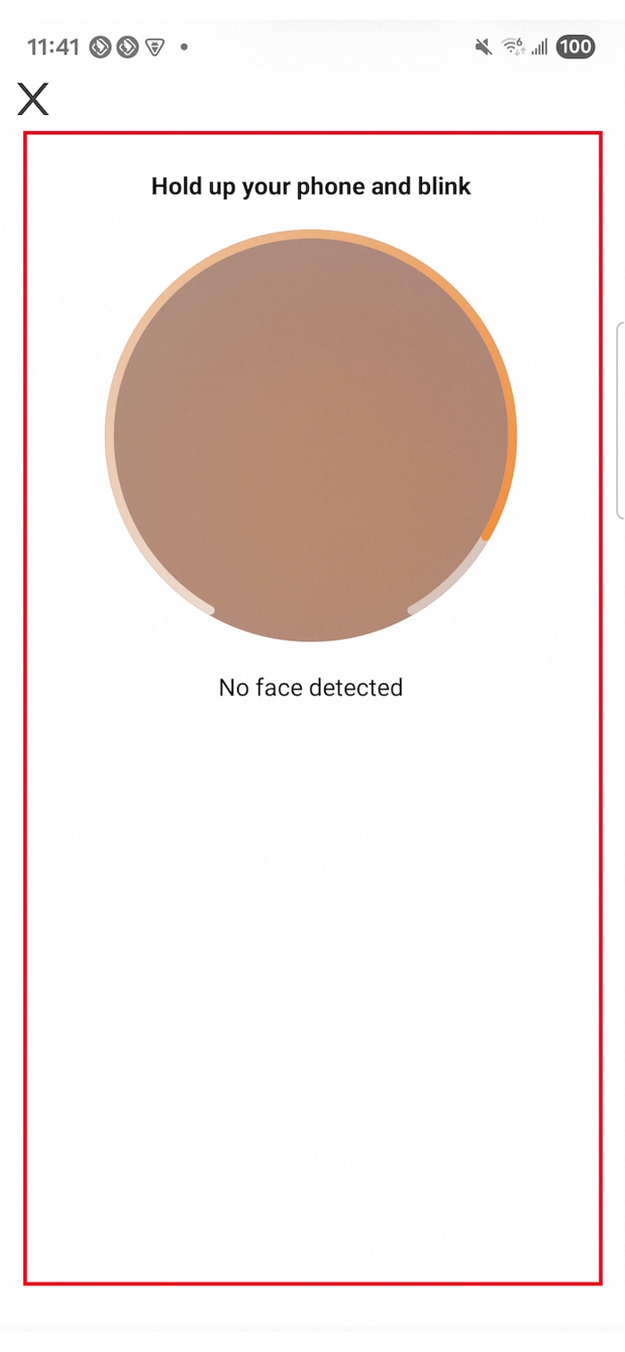
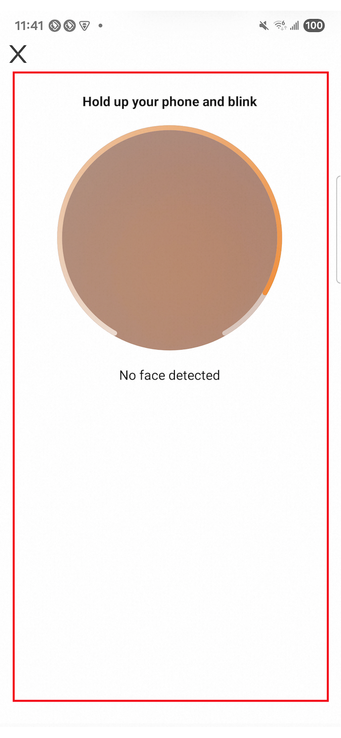
nfcConfig
Parameter | Description | Default color | Android screenshot | iOS screenshot |
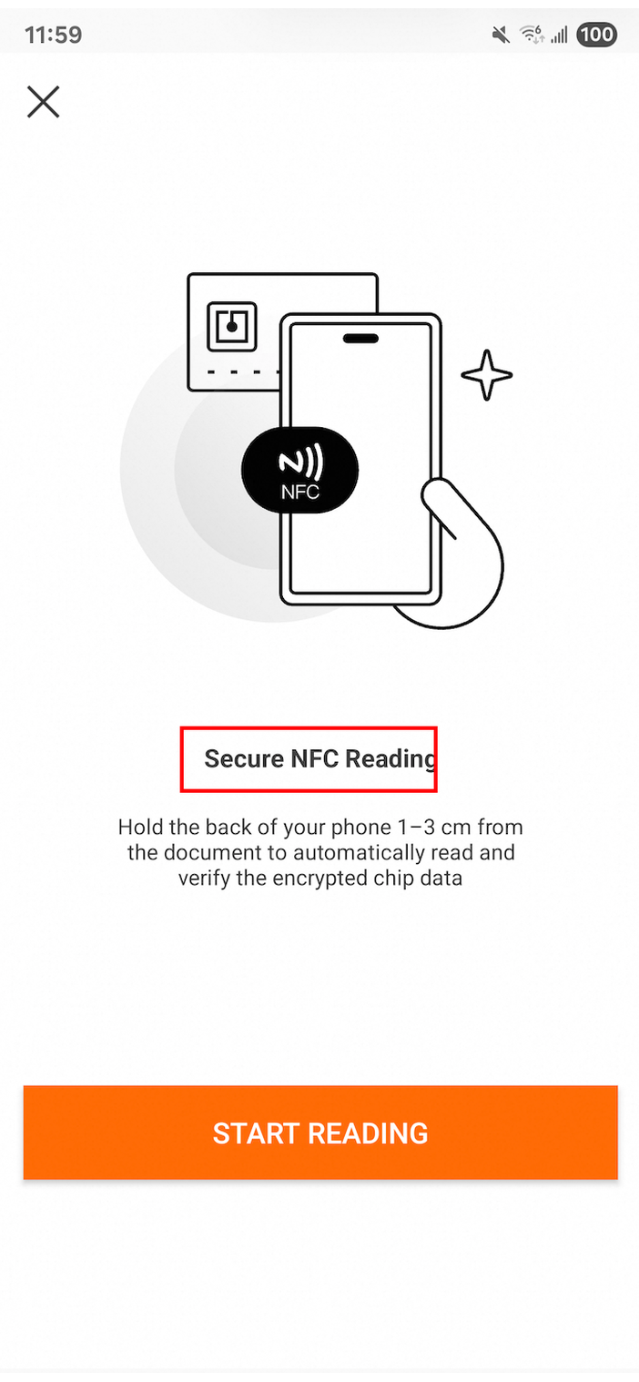
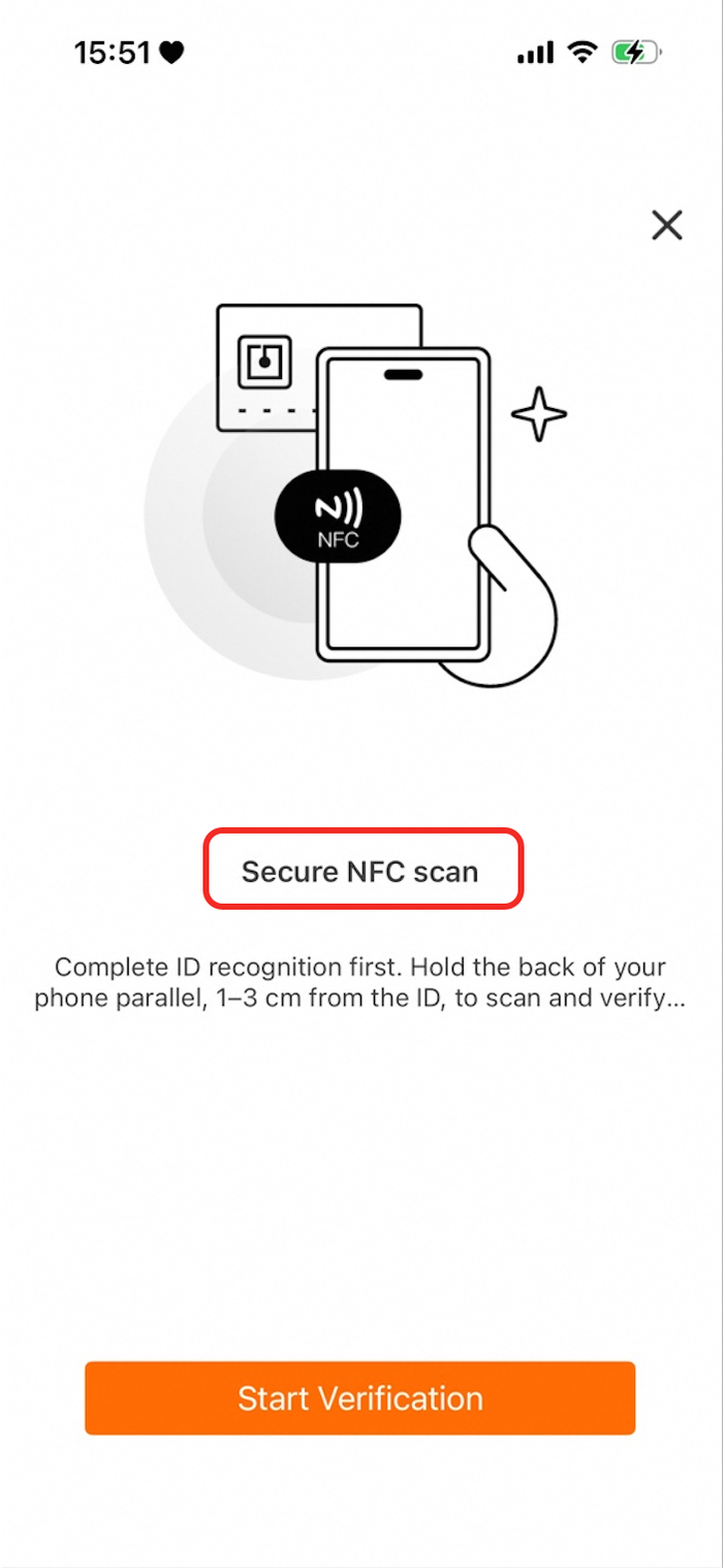
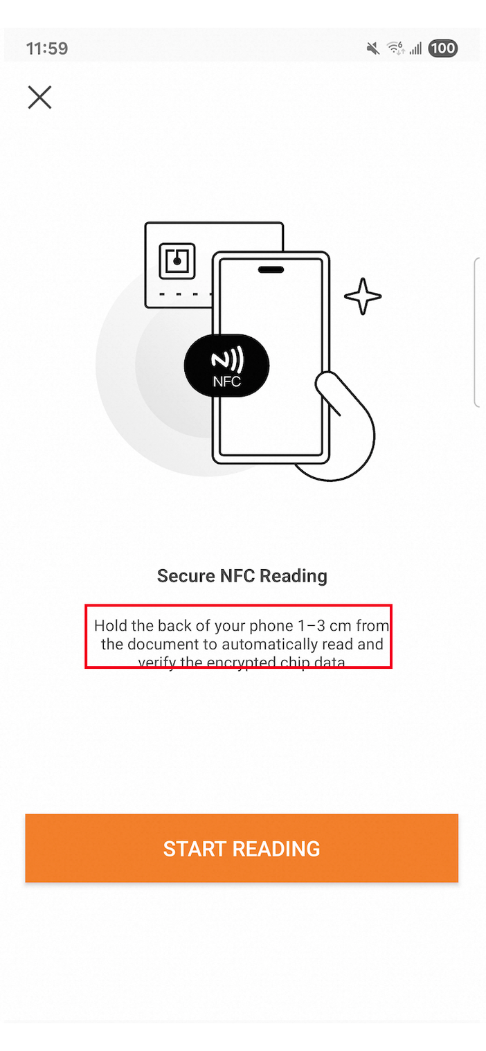
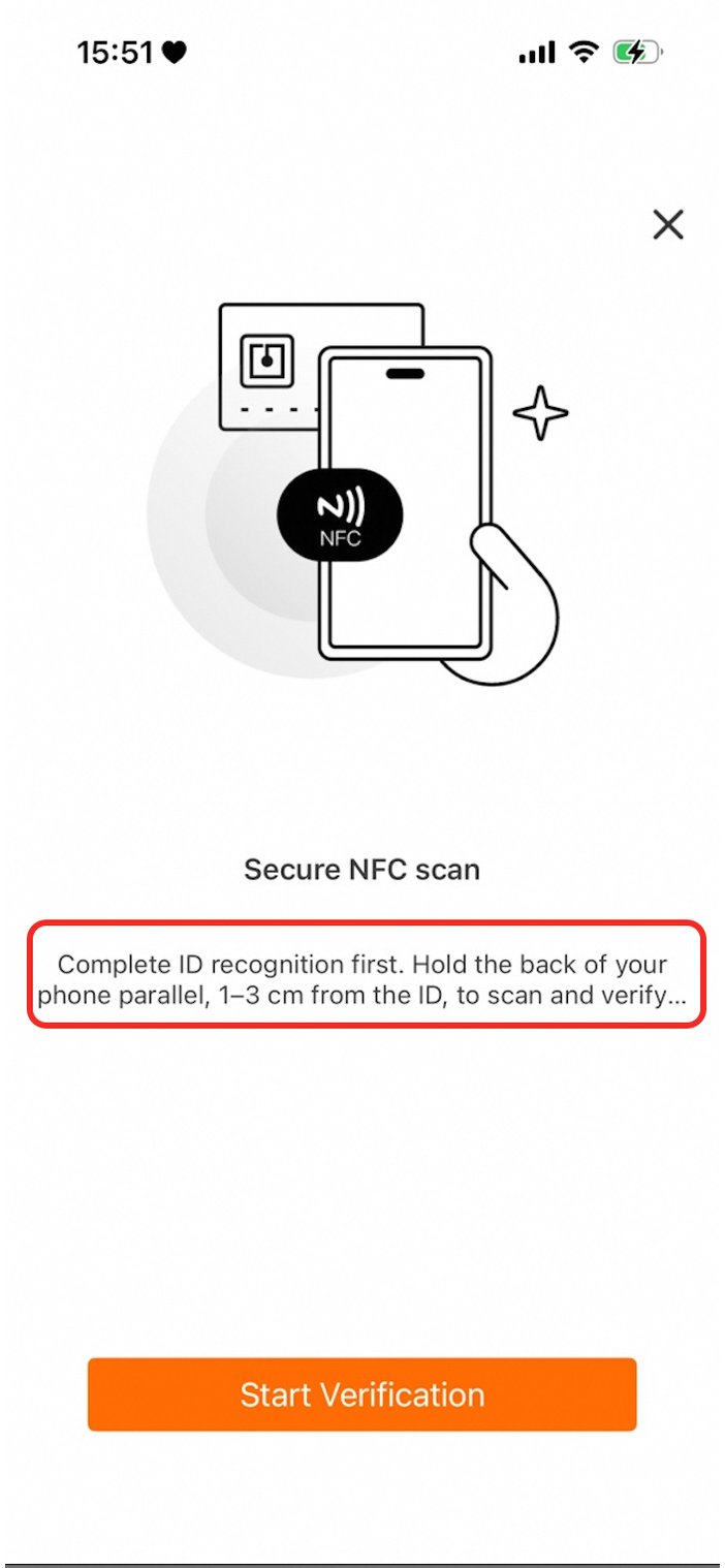
| Specifies the title text color for the NFC reading page. |
|
|
|
| Specifies the body text color for the NFC reading page. |
|
|
|
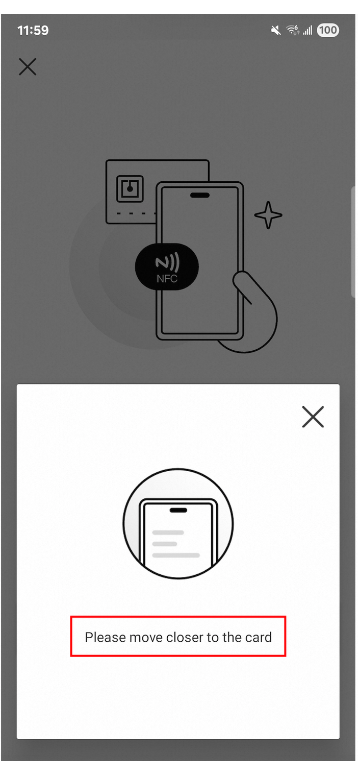
| Specifies the status text color for the reading status pop-up. |
|
| Not applicable. System dialogs cannot be modified. |
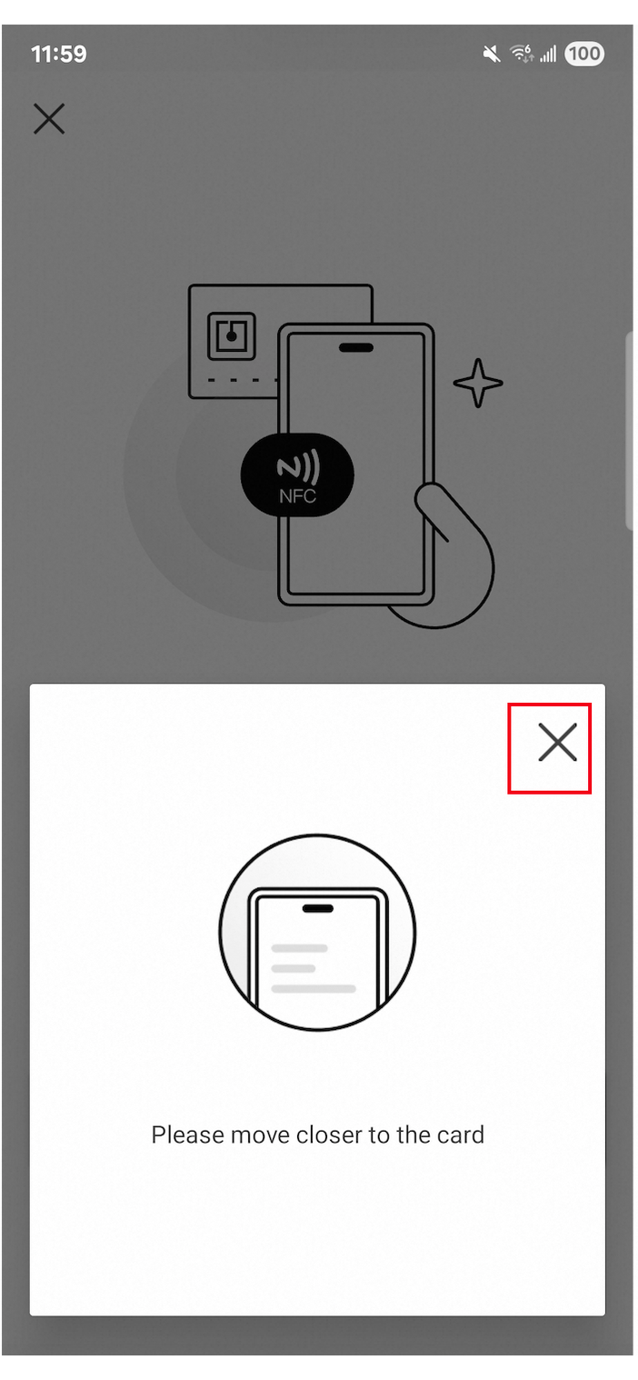
| The Base64-encoded image for the close icon on the reading status pop-up. |
|
| Not applicable. System dialogs cannot be modified. |
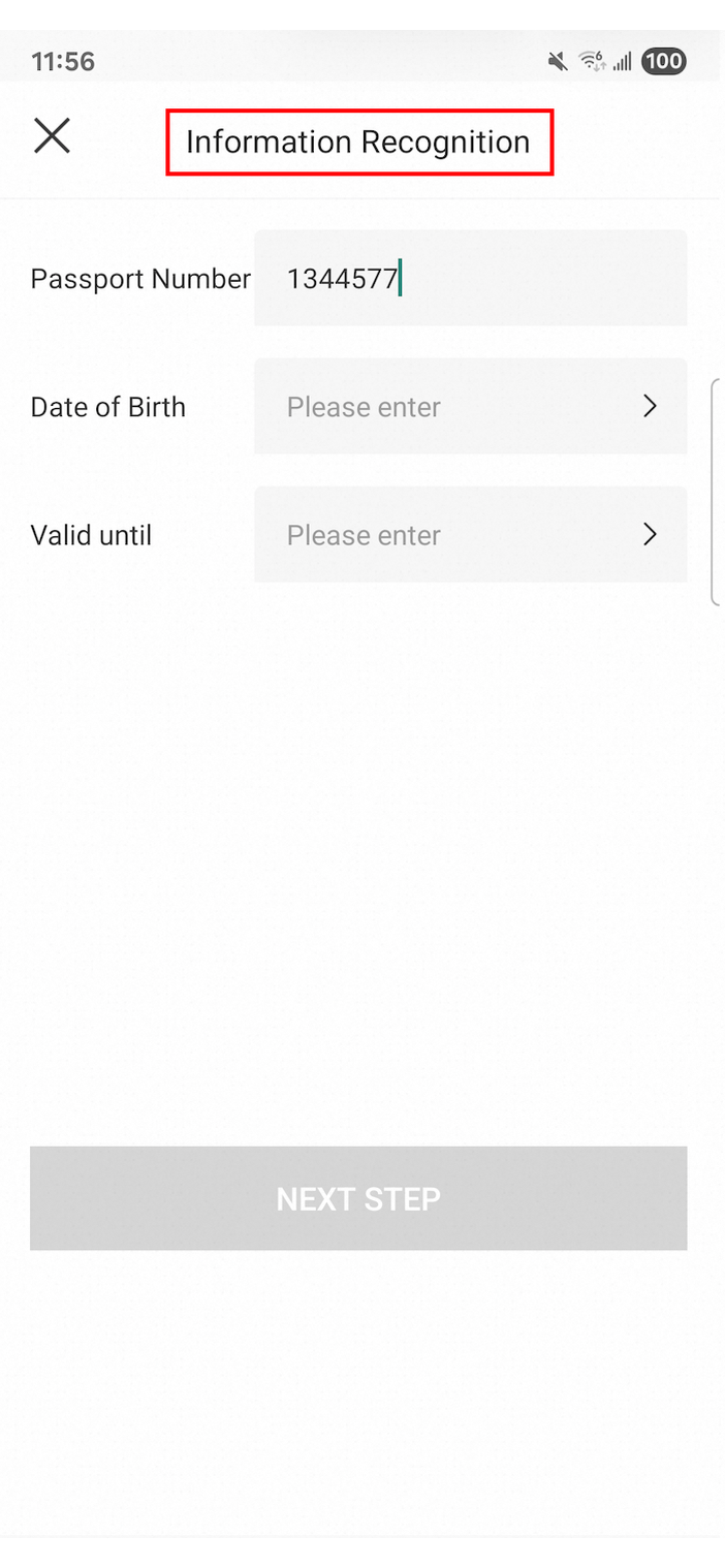
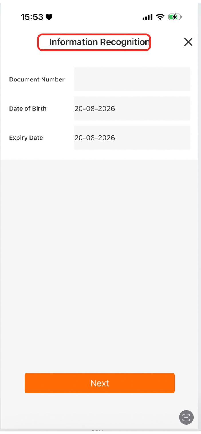
| Specifies the title text color for the information entry page. |
|
|
|
| Specifies the text color for labels on the information entry page. |
|
|
|
| Specifies the text color for input fields on the information entry page. |
|
|
|
| Specifies the placeholder text color for input fields on the information entry page. |
|
|
|