This topic describes how to configure the style of the Title and Card section on the Style tab of the dashboard edit page and displays the effects. The following parameters are configured for a line chart.
Configure Parameters in the Title Subsection
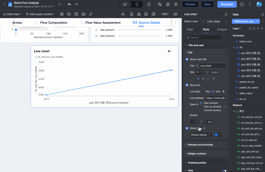
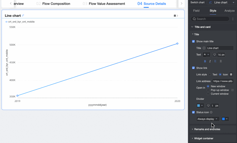
In the Title And Card section, you can customize the Main Title Content, Display Link, and Status Icon.

Configuration item | Configuration content | Description |
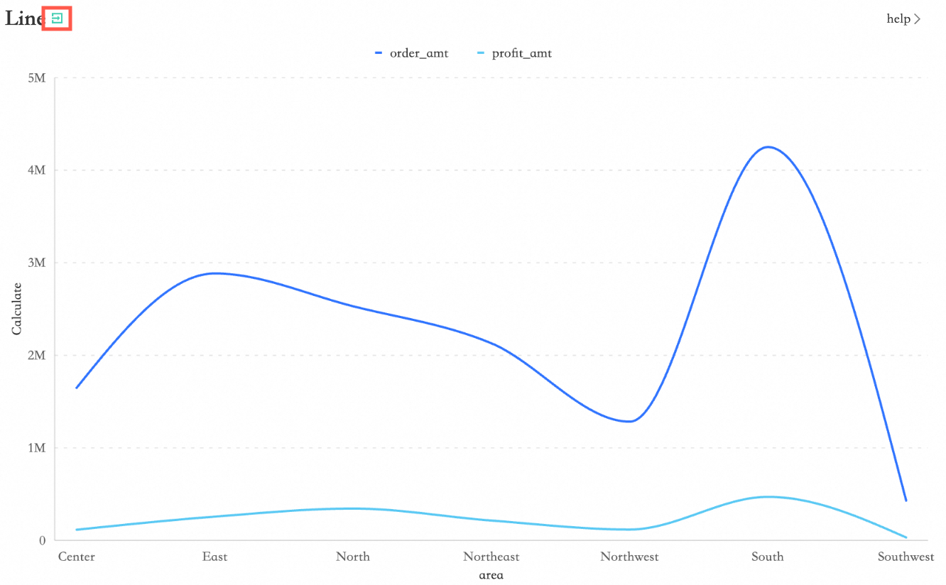
① Title | Title content | Enter a custom title for the chart, such as: Sales Data Analysis. |
Text format | Set the text style for the chart title. | |
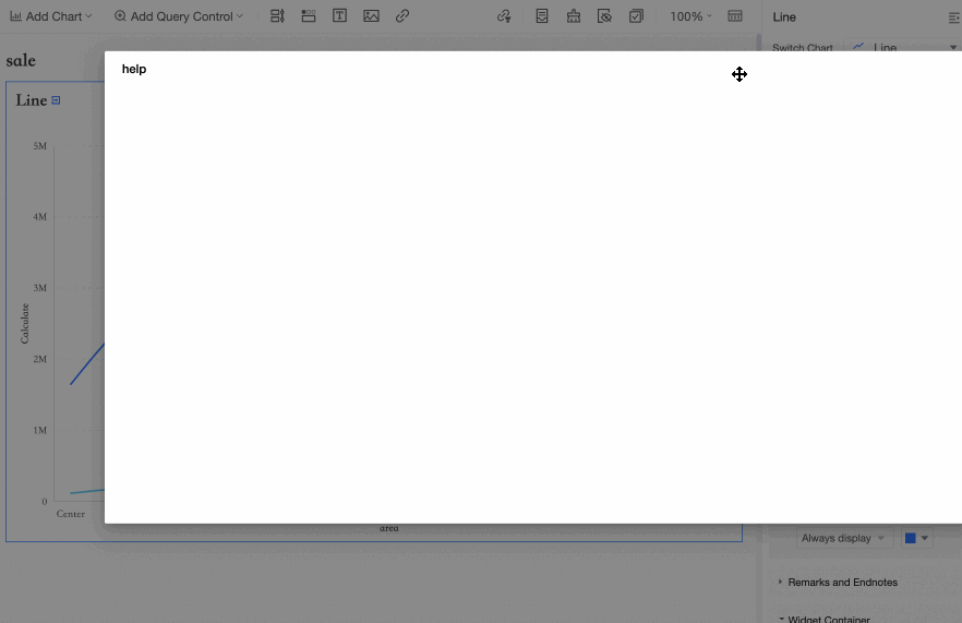
② Display link | Link style | Set the style of the display link. You can select Text or Icon.
|
Link address | Enter the link address to jump to. | |
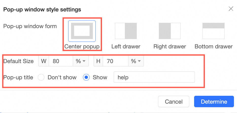
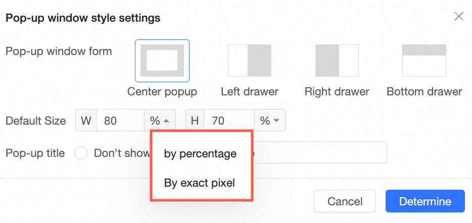
Opening method | Set the opening method for the link. You can select New Window, Pop-up Window, or Current Window.
| |
Separator | Set the style of the separator. | |
③ Status icon | In Status icon, you can set the display mode and color of the icon. After selecting this option, you can choose between Always Display and Display on Hover. The default setting is Display on Hover, which means the icon appears only when you interact with the chart. Note Status icons include five types of icons: filter interaction, jump, drill down, being filtered, and fluctuation analysis.
| |


 Pop-up windowDefault sizePop-up titlePage mask icon to the right of in to set the , , , and .
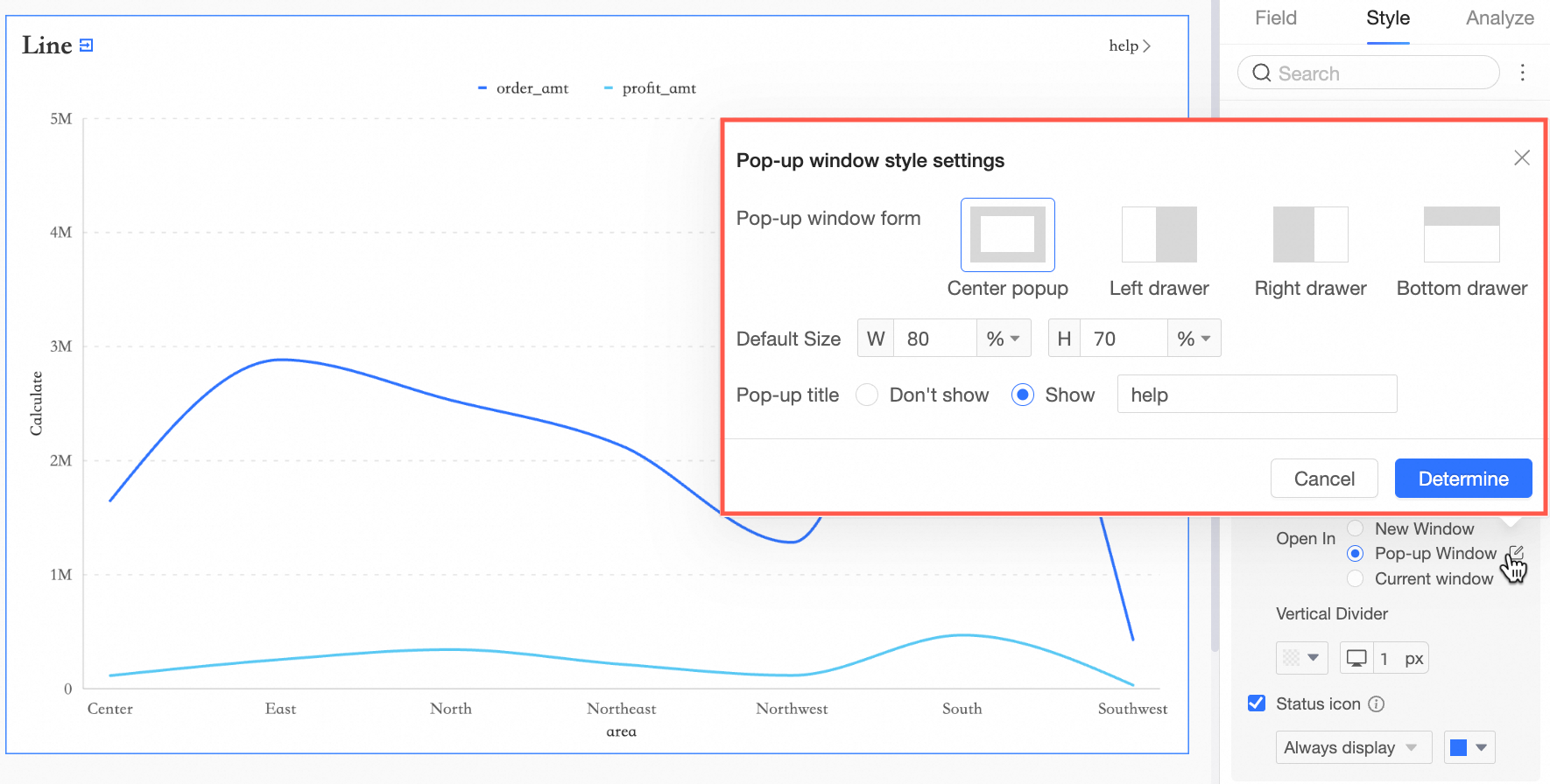


Configure Parameters in the Remarks and Endnotes Subsection
In the Remarks And Endnotes section, configure the Remarks and Endnotes content.
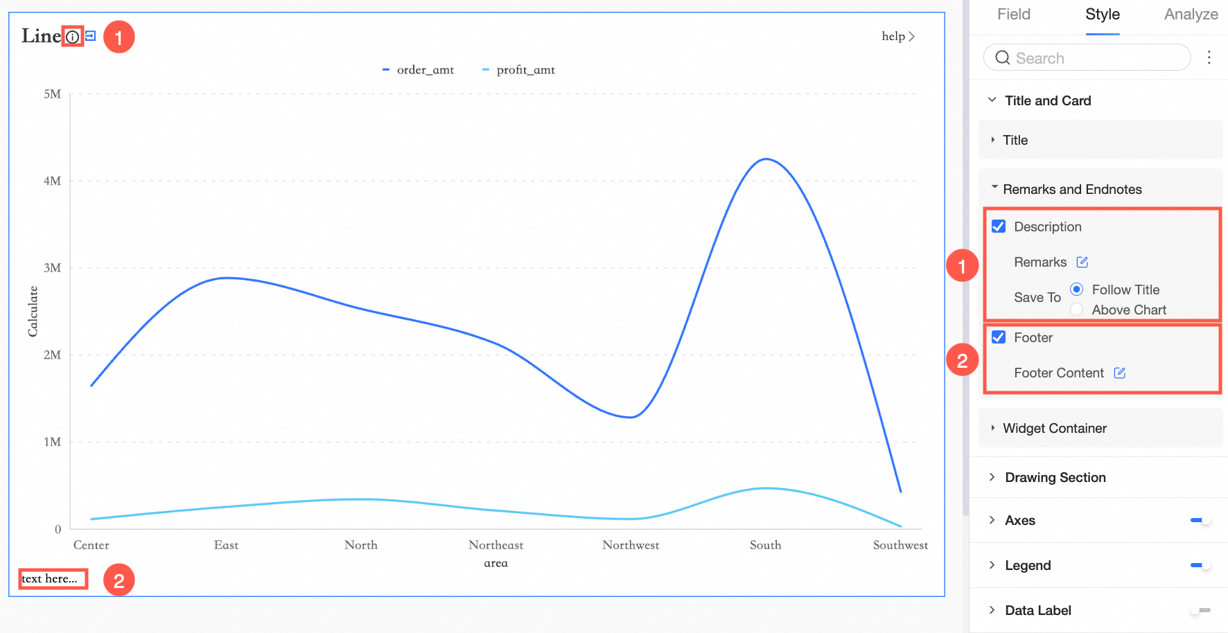
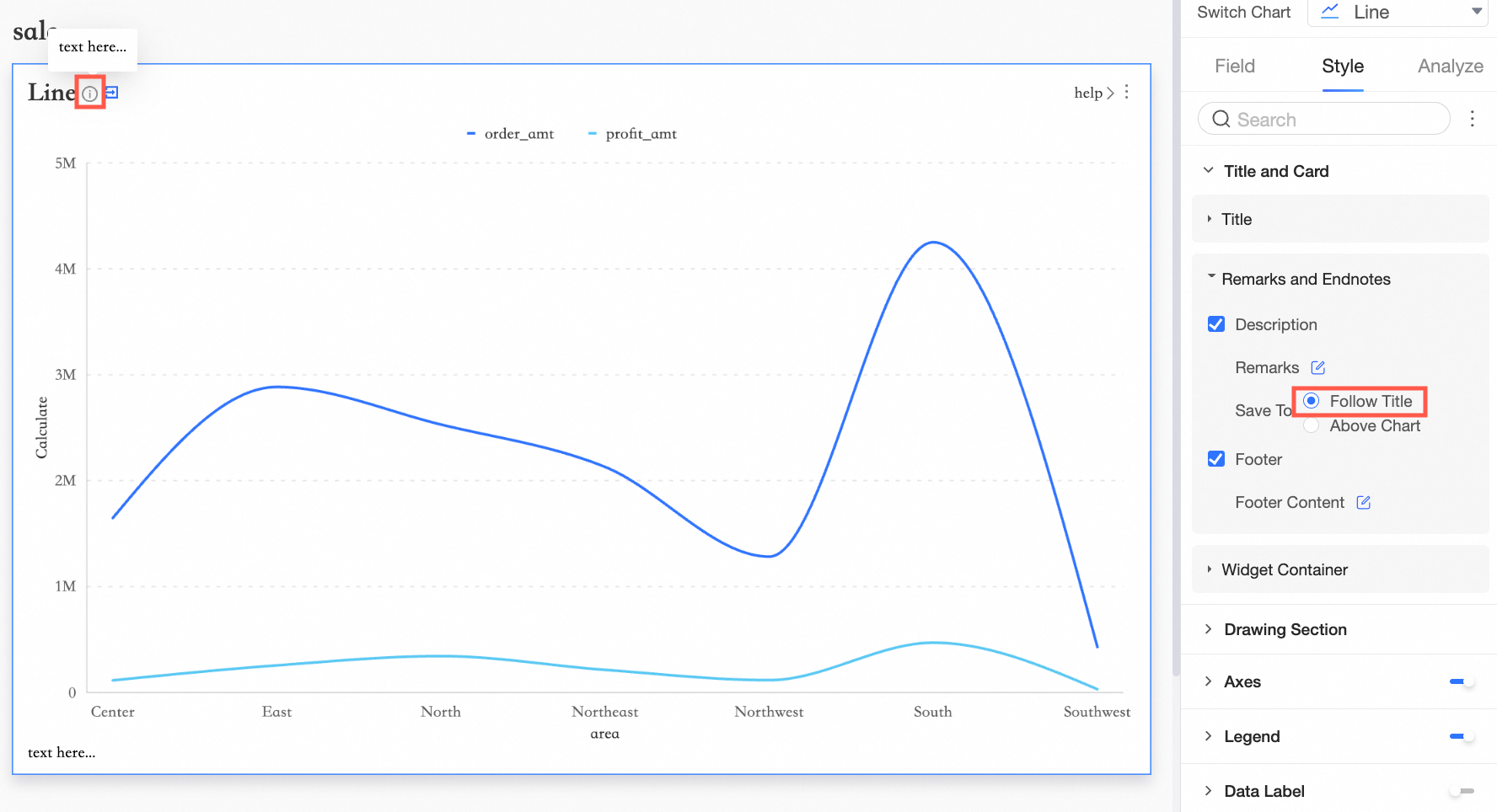
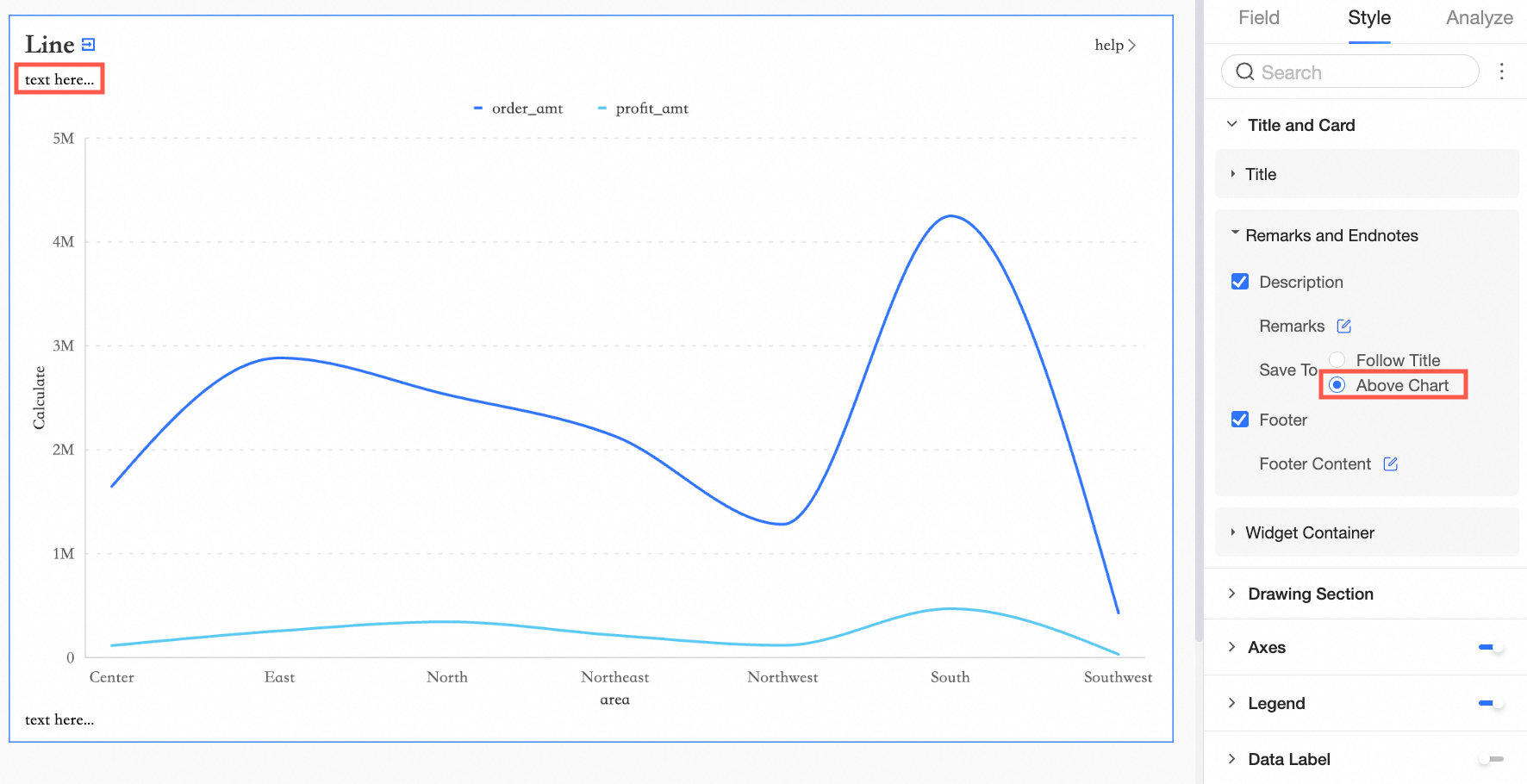
For Remarks Position, you can select Follow Title or Above Chart.
Follow Title
Above Chart
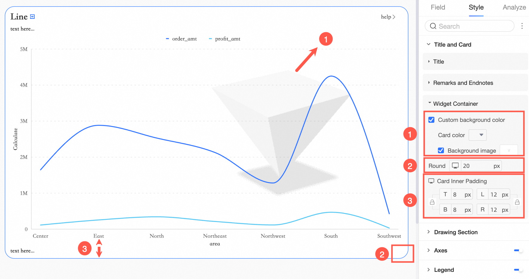
Configure Parameters in the Widget Container Subsection
In the Widget Container section, configure the Widget Container Background Fill, Border Radius, and .
In the Title and Card configuration section,  indicates support, and
  indicates no support.
Widget | Custom Main Title | Remarks | Endnotes | Display Link | Card Padding | Custom Background Fill | |
Control | Tab |
|
|
|
|
|
|
Rich Text |
|
|
|
|
|
| |
Query Control |
|
|
|
|
|
| |
Compound Query Control |
|
|
|
|
|
| |
Image |
|
|
|
|
|
| |
Embedded Page |
|
|
|
|
|
| |
Metrics | Scorecard |
|
|
|
|
|
|
Trend Indicator |
|
|
|
|
|
| |
Gauge |
|
|
|
|
|
| |
Progress Bar |
|
|
|
|
|
| |
Wave Bar |
|
|
|
|
|
| |
Ticker Board |
|
|
|
|
|
| |
Metric Breakdown Tree |
|
|
|
|
|
| |
Metric Relationship Chart |
|
|
|
|
|
| |
Table | Trend Analysis Table |
|
|
|
|
|
|
Cross Table |
|
|
|
|
|
| |
Detail Table |
|
|
|
|
|
| |
Heatmap |
|
|
|
|
|
| |
Line/Area Chart | Line Chart |
|
|
|
|
|
|
Area Chart |
|
|
|
|
|
| |
Stacked Area Chart |
|
|
|
|
|
| |
100% Stacked Area Chart |
|
|
|
|
|
| |
Combination Chart |
|
|
|
|
|
| |
Column/Bar Chart | Vertical Bar Chart |
|
|
|
|
|
|
Stacked Vertical Bar |
|
|
|
|
|
| |
100% Stacked Vertical Bar Chart |
|
|
|
|
|
| |
Horizontal Bar |
|
|
|
|
|
| |
Stacked Horizontal Bar |
|
|
|
|
|
| |
100% Stacked Horizontal |
|
|
|
|
|
| |
Circular Bar |
|
|
|
|
|
| |
Ranking |
|
|
|
|
|
| |
Waterfall Chart |
|
|
|
|
|
| |
Dynamic Bar Chart |
|
|
|
|
|
| |
Pie/Ring | Pie Chart |
|
|
|
|
|
|
Rose Chart |
|
|
|
|
|
| |
Radar Chart |
|
|
|
|
|
| |
Treemap Chart |
|
|
|
|
|
| |
Bubble/Scatter | Bubble Chart |
|
|
|
|
|
|
Scatter Chart |
|
|
|
|
|
| |
Faceted Scatter Chart |
|
|
|
|
|
| |
Funnel/Conversion | Funnel Chart |
|
|
|
|
|
|
Comparison Funnel Chart |
|
|
|
|
|
| |
Flow Analysis Chart |
|
|
|
|
|
| |
Sankey Diagram |
|
|
|
|
|
| |
Geography | Bubble Map |
|
|
|
|
|
|
Colored Map |
|
|
|
|
|
| |
Heat Map |
|
|
|
|
|
| |
Flying Line Map |
|
|
|
|
|
| |
Symbol Map |
|
|
|
|
|
| |
Others | Word Cloud |
|
|
|
|
|
|
Timeline |
|
|
|
|
|
| |
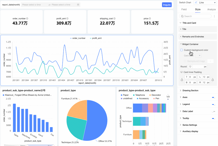
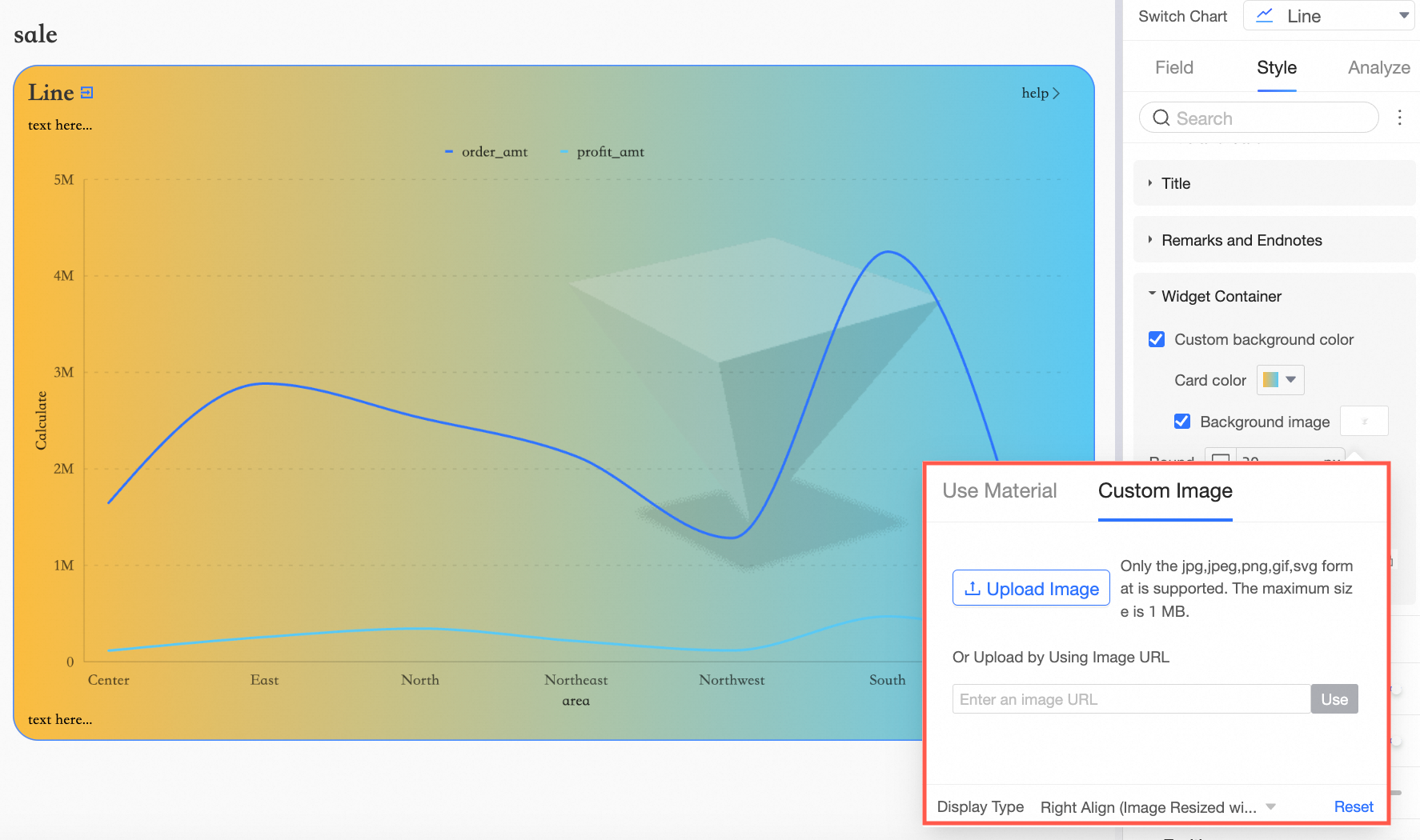
Custom Background Color
In the Widget Container section, configure the custom background fill. 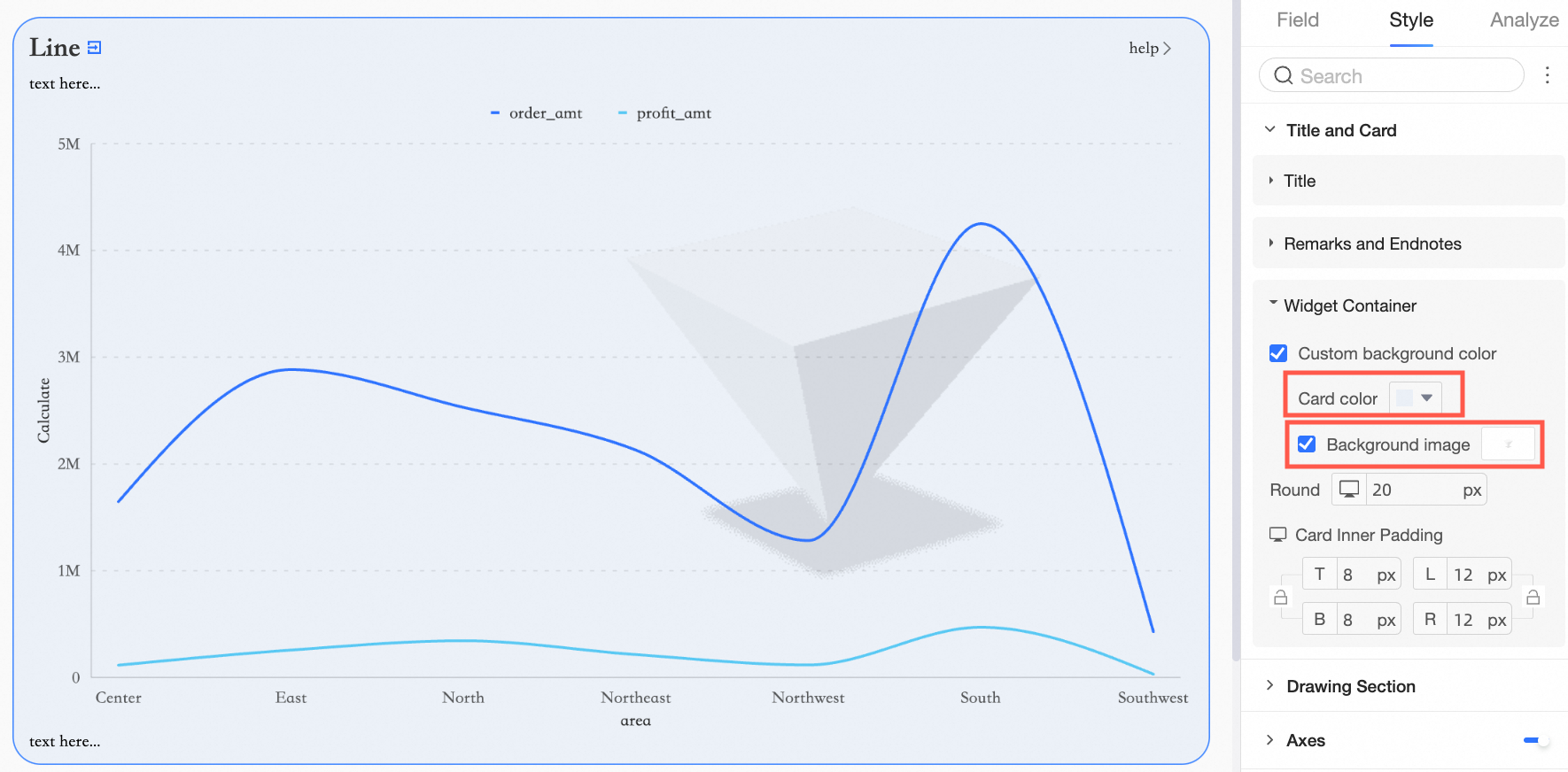
Card color supports solid colors and gradients.
Background images support using system preset images or custom images.
 Note
NoteThe following widgets support custom background fill.
Controls
Tab and Image
Metrics
Scorecard, Trend Indicator, Progress Bar, Wave Bar, and Ticker Board
Trends
Line, Area, Stacked Area, 100% Stacked Area, and Combination Chart
Comparison
Vertical Bar Chart, Stacked Vertical Bar, 100% Stacked Vertical Bar Chart, Horizontal Bar, Stacked Horizontal Bar, 100% Stacked Horizontal, and Circular Bar