This topic describes the chart style and configuration panel of the column chart of the carousel list in Double 11.
Chart Style
The Double 11 carousel list histogram is a type of histogram. Compared with the basic histogram, the Double 11 carousel list histogram can display multiple pieces of content information in the form of page turning animation. It is suitable for the carousel display of product information during Double 11. 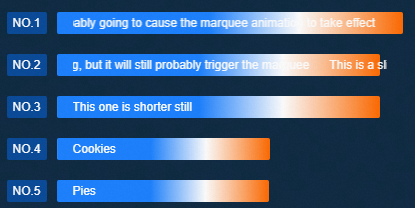
Settings Panel 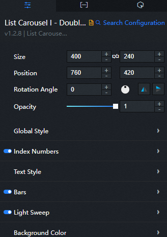
- Search for Configurations: In the right-side panel of Canvas Editor, click the Settings tab, and click Search for Configurations in the upper-right corner. Enter the required configuration item in the search box, and click the search icon to quickly locate the configuration item. Fuzzy match is supported. For more information, see Search for asset configurations.
- Size: indicates the size of a widget, including its pixel width and height. You can click the
 icon to proportionally adjust the width and height of a widget. After you click this icon again, you can adjust the width and height as needed.
 - Position: the position of a widget, which is indicated by pixel X and Y coordinates. X-coordinate indicates the pixel distance between the upper-left corner of the widget and the left border of the canvas. Y-coordinate indicates the pixel distance between the upper-left corner of the widget and the upper border of the canvas.
- Rotation Angle: the angle of a rotation that uses the center point of a widget as the rotation point. The unit is degrees (°). You can use one of the following methods to control the rotation angle of a widget:
- Directly enter the degrees in the Rotation Angle spin box or click the plus sign (+) or minus sign (-) to increase or decrease the value in the Rotation Angle spin box.
- Drag the black dot in the
 icon.
icon. - Click the
 icon to horizontally flip a widget.
 - Click the
 icon to vertically flip a widget.
- Opacity: the opacity of a widget. Valid values: 0 and 1. If this parameter is set to 0, the widget is hidden. If this parameter is set to 1, the widget is completely displayed. Default value: 1.
Global Style
Parameter
Description
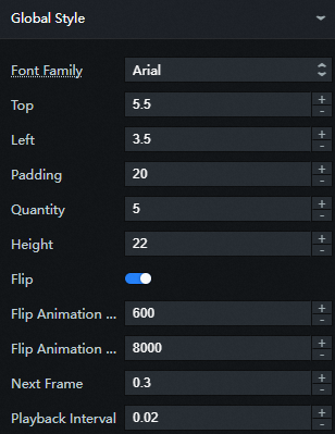
Font Family
The font of text in the timeline widget. Default value: Microsoft YaHei.
Top
The distance from the top of the column in the histogram. Unit: px.
Left
The distance from the column to the left in the column chart. Unit: px.
Padding
The spacing between the columns in the histogram. Unit: px.
Quantity
The number of columns displayed per page is determined by the configuration items and data items. For example, the number is set to 5. When the data items in the data panel are ≤ 5, the number of columns displayed on each page=the number of data items; when the data items in the data panel are ≥ 5, the number of columns displayed on each page=the number of configuration items.
Height
The height of each column in the histogram. Unit: pixels.
Flip
After you enable this feature, the column chart displays the page-turning effect during carousel. This feature takes effect only after automatic carousel is enabled.
Flip Animation Duration (ms)
The duration of each playback of the page turning animation. Unit: ms. This parameter is valid only when both automatic carousel and page turning are enabled.
Flip Animation Stop Time (ms)
The amount of time to wait after each page turning animation is played. Unit: ms. This parameter is valid only when both automatic carousel and page turning are enabled.
Next Frame
The gap between each frame in a page-turning animation. Generally, this parameter is set to a decimal, indicating the percentage of the page-turning animation time.
Playback Interval
The amount of time that each frame overlaps with the previous frame in a page-turning animation. This value is generally set to a decimal to indicate the percentage of the page-turning animation time.
Index Numbers: the serial number of each column in the column chart. You can click the
 icon to control whether the serial number is visible or hidden.
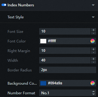
Text Style: the text style of the serial number.
Parameter
Description
Font size
The font size of the serial number text.
Font Color
The color of the serial number text. For more information, see color picker instructions.
Right Margin
The distance between the sequence number background block and the carousel content. Unit: px.
Width
The width of the sequence number background block. Unit: px.
Border Radius
The rounded corner size of the sequence number background block. Unit: px. When the value is 0, there is no rounded corner. The background block of the serial number is square. The larger the setting value, the larger the radian value of the rounded corner.
Background Color: the background color of the sequence number.
Number Format: the style of the serial number text. Valid values: 1, No.1, and (1).
Text Style: the text style of each column in the column chart.
Parameter
Description
Text Style
The font size and color of the content text.
Marquee
Text that exceeds the width of the column can use the marquee style effect to display all the text content. Sets the animation time, in ms, required for text marquee that exceed the width of a column to run through. Click on
 the icon to control the display of the marquee.
 Bars: the style of the columns in the column chart. You can click the
icon to control the display of the column chart style. 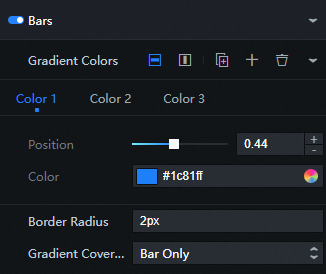
Parameter
Description
Gradient Colors
Click the
 or
or  icon on the right to add or remove a data series color. The column is filled with multiple colors from left to right. Click the
  or
or  icon to configure the arrangement style of multiple data series. Click the
  icon to copy the selected data series configurations and add a data series with the same configurations.
 Position: the proportion of the color position in the gradient band. Valid values: 0 to 1.
Color: the color of the position in the gradient.
Border Radius
The fillet size of the column. Unit: pixels. When the value is 0, there is no rounded corner, and the column is square. The larger the setting value, the larger the radian value of the rounded corner.
Gradient Coverage
The gradient range of the column. Valid values: Bar Only and Full Width.
Light Sweep: the style of the streamer animation. You can click the
icon to display or hide the streamer style. Parameter
Description
Animation Duration (ms)
The total playback duration of the streamer animation during the carousel. Unit: ms.
Light Sweep Pause Time (ms)
The interval at which streamer effects are performed. Unit: ms.
Background Color: the background style of the column chart.
Parameter
Description
Color
The background color of the content bar chart.
NoteWhen the value value in the data is smaller than the largest value, the column chart ratio of the difference between the two is filled with this color.
Border Radius
The fillet size of the background of the histogram. Unit: pixels. If the value is 0, there is no rounded corner. The background of the histogram is square. The greater the value, the greater the radian value of the rounded corner.
Data Panel
Configuration field description
Parameter | Description |
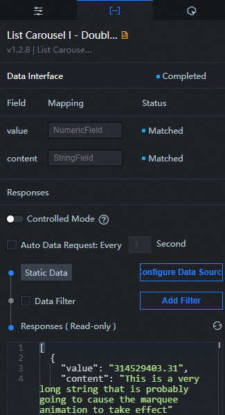
| The weight of the corresponding column chart. The higher the weight, the greater the proportion of the column length. |
| Corresponds to the description of the text content actually displayed in each bar chart. |
| Parameter | Description |
| Controlled Mode | If you turn on the switch, data is not requested when a widget is initialized. Data requests are triggered only based on callback IDs or the method configured in Blueprint Editor. If you turn off the switch, data requests are automatically triggered. By default, the switch is turned off. |
| Auto Data Request | After you select the Auto Data Request check box, you can enable dynamic polling, and manually specify the polling interval. If you do not select this check box, data is not automatically requested. You must manually refresh the page to request data or use Blueprint Editor or callback ID events to trigger data requests. |
| Data Source | In the right-side panel of Canvas Editor, click the Data tab. Click Set next to Static Data. In the Configure Datasource panel, select a data source from the Data Source Type drop-down list. Enter code for data query in the code editor, click Preview Data Response to preview the response of the data source, and then view the response. For more information, see Configure asset data. |
| Data Filter | If you select the Data Filter check box, you can convert the data structure, filter data, and perform simple calculations. If you click the plus sign (+) next to Add Filter, you can configure the script for the data filter in the editor that appears. For more information, see Use the data filter. |
| Data Response Result | The response to a data request. If the data source changes, you can click the  icon next to Data Response Result to view the data response in real time. icon next to Data Response Result to view the data response in real time. |
Interaction Panel
This widget does not support interaction events.
Configure interactions in Blueprint Editor
- In Canvas Editor, right-click a widget in the Layer panel and select Add to Blueprint Editor.
- Click the
 icon in the upper-left corner of the page.
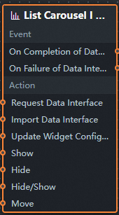
 In Blueprint Editor, click the List Carousel I - Double 11 widget in the Import Nodes pane. On the canvas, you can view the parameters in Blueprint Editor, as shown in the following figure.
Event
Event
Description
On Completion of Data Interface Request
The event is triggered with the processed JSON data after a data interface request is responded and processed by a filter. For more information about specific data examples, see the Data Response Result section of the Data tab in the right-side configuration panel of the canvas editor.
On Failure of Data Interface Request
The event that is returned when a data interface request fails (the request may be due to network problems or interface errors) and is processed by the filter. The event also throws the processed JSON data. For more information about specific data examples, see the Data Response Result section of the Data tab in the right-side configuration panel of the canvas editor.
Action
Action
Description
Request Data Interface
This action is performed to request the server data again. The data sent by an upstream data processing node or layer node is used as a parameter. For example, if the column chart of the carousel list is configured with the API data source as
https://api.testand the data passed to the Request Data Interface as{ id: '1'}, the final request interface ishttps://api.test?id=1.Import Data Interface
After data of a widget is processed in accordance with its drawing format, the widget is imported for redrawing. You do not need to request server data again. For more information about specific data examples, see the Data Response Result section of the Data tab in the right-side configuration panel of the canvas editor.
Update Widget Configurations
Style configurations of widgets are dynamically updated. Before this action is executed, you must click the widget in Canvas Editor, click the Settings tab in the right-side panel, and click Copy Configurations to... to obtain widget configurations. After that, change the style field for the data processing node in Blueprint Editor.
Show
Displays the widget. The following example shows the reference data.
return{
  "animationType": "",
  "animationDuration": 1000,
  "animationEasing": "linear"
}
Hide
The following example shows how to hide a widget.
return{
  "animationType": "",
  "animationDuration": 1000,
  "animationEasing": "linear"
}
Hide/Show
Displays the widget. The following example shows the reference data.
return {
  "animationIn": {
    "animationType": "",
    "animationDuration": 1000,
    "animationEasing": "linear"
  },
  "animationOut": {
    "animationType": "",
    "animationDuration": 1000,
    "animationEasing": "linear"
  }
}
Move
Move a widget to a specified location. The following example shows the reference data.
    return{
      // The positioning type. to indicates absolute positioning, whereas by indicates relative positioning. The default value is to.
        "positionType": "to",
      // The location, which is indicated by the x and y coordinates.
      "attr": {
        "x": 0,
        "y": 0
      },
      // The animation type.
      "animation": {
        "enable": false,
        // The duration in which animation is displayed.
        "animationDuration": 1000,
        // The animation curve, which can be set to linear|easeInOutQuad|easeInOutExpo.
        "animationEasing": "linear"
      }
    }