This topic describes the chart style of the Turntable Draw widget and the meaning of each configuration items.
Chart style
The turntable draw is a component used to simulate the random drawing of prizes on the turntable. 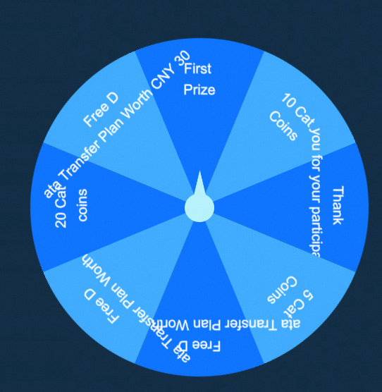
Settings
Search Configuration: Click Search Configuration in the upper-right corner of the Configuration panel. In the Search Configuration panel, enter the name of the configuration items that you want to search for to quickly locate the configuration items. Fuzzy match is supported. For more information, see Search for asset configurations.
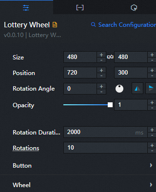
Size: indicates the size of a widget, including its pixel width and height. You can click the
 icon to lock the aspect ratio of the widget and modify the width and height of the widget in equal proportion. After you click this icon again, you can adjust the width and height as needed.
 Position: the position of a widget, which is indicated by pixel X and Y coordinates. X-coordinate indicates the pixel distance between the upper-left corner of the widget and the left border of the canvas. Y-coordinate indicates the pixel distance between the upper-left corner of the widget and the upper border of the canvas.
Rotation Angle: the angle of a rotation that uses the center point of a widget as the rotation point. The unit is degrees (°). You can use one of the following methods to control the rotation angle of a widget:
Directly enter the degrees in the Rotation Angle spin box or click the plus sign (+) or minus sign (-) to increase or decrease the value in the Rotation Angle spin box.
Drag the
 black dot in the icon to control the rotation angle of the widget.
 Click the
 icon to flip the widget style.
 Click the
 icon to flip the widget style.
Opacity: Valid values: 0 to 1. If this parameter is set to 0, the widget is hidden. If this parameter is set to 1, the widget is completely displayed. Default value: 1.
Rotation Time: the rotation time of the Turntable Draw widget. Unit: milliseconds.
Rings: Set the number of turns that the Turntable Draw component needs to rotate within the specified rotation time, in cycles.
Buttons: the style of the dial draw widget button.
Parameter
description
Button Size
The size of the button, including the width and height of the button. Unit: px.
Vertical Spacing
Set the vertical distance between the button and the center point in the component dial. Unit: px.
Button Image
Customize the content of the button image. To use an image on a remote server, enter the URL of the image in the upper-right corner. Click Preview in the image box to preview the image format. Click Change in the dashed box below the image box. For more information about how to change the image design asset, see Use the interface.
Turntable: the style of the content of the turntable lottery turntable.
Parameter
description
Text Style
The style of the text in the dial, including the choice of the font style of the text, the thickness of the text, the size of the font size and the color of the text.
Text Spacing
The distance between text and text in the dial. Unit: pixels.
Row Height
Set the line height value when the text is broken. Unit: px.
Line break
Specifies the number of characters in the line of text. If the number of characters in a line is greater than the specified value, the line is broken.
Fan Color
Set the fan color style of each series in the carousel. Click the
 or
or  icon on the right to add or delete a color series. Click the
  or
or  icon to configure the arrangement style of multiple color series. Click the
  icon to copy the current color series configuration and add a new color series with the same configuration.
 Color: Set the fill color of the sector in the corresponding module in the carousel of the current series.
Is the prize image displayed
When the switch is turned on, the prize picture of the corresponding module in the turntable is displayed on the turntable; when the switch is turned off, the prize picture is not displayed.
Image Size: the size of the prize image, including the width and height of the image. Unit: pixels.
Image Spacing: the spacing between images. Valid values: Horizontal Spacing and Vertical Spacing. Unit: pixels.
The color of the font outline.
The color of the stroke line inside the turntable.
Background image
Customize the content of the carousel background image. To use an image on a remote server, enter the URL of the image in the upper-right corner. Click Preview in the image box to preview the large image style of the carousel background image. Click Change in the dashed box below the image box. For more information about how to change image design assets, see Use the interface.
Data tab
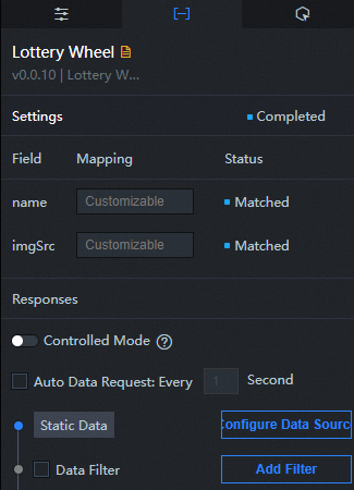
Configuration field description
Column | Description |
| The name of the prize. |
| Pictures of prizes. |
Interaction tab
When you click Draw: Select Enable to enable the widget interaction feature. When you click the draw button of the carousel draw, a data request is triggered, the callback value is thrown, and the data in the carousel is dynamically loaded. By default, the name and imgSrc values in the data are returned. For more information, see Configure the callback ID of a ticker board component.
Configure interactions in Blueprint Editor
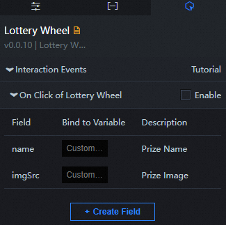
In Canvas Editor, right-click a widget in the Layer panel and select Add to Blueprint Editor.
Click the
 icon in the upper-left corner.
 In Blueprint Editor, click the Turntable Draw component in the Added Nodes pane. You can view the parameters of the Turntable Draw on the canvas, as shown in the following figure.
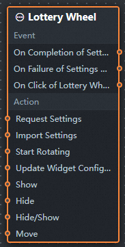
Events
Events
Description
When the interface description request is completed
The event is triggered with the processed JSON data after a data interface request is responded and processed by a filter. For more information about specific data examples, see the Data Response Result section of the Data tab in the right-side configuration panel of the canvas editor.
When the interface description request fails
The event that is returned when a data interface request fails (such as network problems or interface errors) and is processed by the filter. The event also throws the processed JSON data. For more information about specific data examples, see the Data Response Result section of the Data tab in the right-side configuration panel of the canvas editor.
When you click Draw
The event that is thrown when the lottery button is clicked. The data item of the object type corresponding to the button is also thrown. The following example shows the reference data.
return{
  "name": "", // The name of the prize.
  "imgSrc": "" // The prize image.
}
Action
Action
Description
Request API Description
This action is performed to request the server data again. The data sent by an upstream data processing node or layer node is used as a parameter. For example, if the API data source is
https://api.testand the data transferred to the request interface to describe the action is{ id: '1'}, the final request interface ishttps://api.test?id=1.Import Interface Description
After data of a widget is processed in accordance with its drawing format, the widget is imported for redrawing. You do not need to request server data again. For more information about specific data examples, see the Data Response Result section of the Data tab in the right-side configuration panel of the canvas editor.
Start turning
Start turning the turntable, no parameters are required.
Update component configurations
Style configurations of widgets are dynamically updated. Before this action is executed, you must click the widget in Canvas Editor, click the Settings tab in the right-side panel, and click Copy Configurations to... to obtain widget configurations. After that, change the style field for the data processing node in Blueprint Editor.
Display
Displays the widget. The following example shows the reference data.
return {
  "animationType": "",
  "animationDuration": 1000,
  "animationEasing": "linear"
};
Hide
The following example shows how to hide a widget.
return {
  "animationType": "",
  "animationDuration": 1000,
  "animationEasing": "linear"
};
Switch to the implicit state
Specifies whether to show or hide a widget. The following example shows the reference data.
return {
  "animationIn": {
    "animationType": "",
    "animationDuration": 1000,
    "animationEasing": "linear"
  },
  "animationOut": {
    "animationType": "",
    "animationDuration": 1000,
    "animationEasing": "linear"
  }
};
China Mobile
Move a widget to a specified location. The following example shows the reference data.
return {
  // The positioning type. to indicates absolute positioning, whereas by indicates relative positioning. The default value is to.
  "positionType": "to",
  // The location, which is indicated by the x and y coordinates.
  "attr": {
    "x": 0,
    "y": 0
  },
  // The animation type.
  "animation": {
    "enable": false,
    // The duration in which animation is displayed.
    "animationDuration": 1000,
    // The animation curve, which can be set to linear|easeInOutQuad|easeInOutExpo.
    "animationEasing": "linear"
  }
};