This topic describes the chart style and configuration panel of a line bar chart.
Chart Style
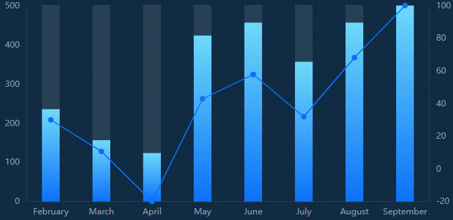
A line bar chart is a type of bar chart. You can use a column chart chart or a line chart to represent the values of two dimensions in the same category. It can clearly and intelligently display the data differences between categories and within categories in a limited space.
Settings Panel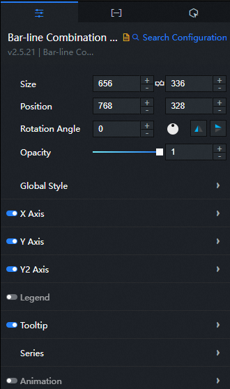
- Search for Configurations: In the right-side panel of Canvas Editor, click the Settings tab, and click Search for Configurations in the upper-right corner. Enter the required configuration item in the search box, and click the search icon to quickly locate the configuration item. Fuzzy match is supported. For more information, see Search for asset configurations.
- Size: indicates the size of a widget, including its pixel width and height. You can click the
 icon to proportionally adjust the width and height of a widget. After you click this icon again, you can adjust the width and height as needed.
 - Position: the position of a widget, which is indicated by pixel X and Y coordinates. X-coordinate indicates the pixel distance between the upper-left corner of the widget and the left border of the canvas. Y-coordinate indicates the pixel distance between the upper-left corner of the widget and the upper border of the canvas.
- Rotation Angle: the angle of a rotation that uses the center point of a widget as the rotation point. The unit is degrees (°). You can use one of the following methods to control the rotation angle of a widget:
- Directly enter the degrees in the Rotation Angle spin box or click the plus sign (+) or minus sign (-) to increase or decrease the value in the Rotation Angle spin box.
- Drag the black dot in the
 icon.
icon. - Click the
 icon to horizontally flip a widget.
 - Click the
 icon to vertically flip a widget.
- Opacity: the opacity of a widget. Valid values: 0 and 1. If this parameter is set to 0, the widget is hidden. If this parameter is set to 1, the widget is completely displayed. Default value: 1.
Global Style
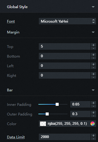
Font: the font family of all text in the widget. Default value: Microsoft Yahei.
Margin
Top: the distance between the chart and the upper boundary of the widget.
Bottom: the distance between the chart and the bottom boundary of the widget.
Left: the distance between the chart and the widget left boundary.
Right: the distance between the chart and the right border of the widget.
Bar
Inner Padding: the distance between columns. Valid values: 0 to 1.
Outer Padding: the distance between the upper and lower columns and the axis. Valid values: 0 to 1.
Color: the background color of the column.
Data Limit: The system loads up to the maximum number of data records that you enter for layout, drawing, and computing. This ensures that the icons control the display and hiding of the y-axis.
X Axis: the column chart x-axis style. You can click the eye icon to display or hide the x-axis.
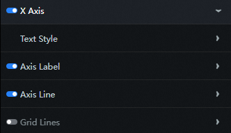
Text Style
Font Size: the size of the text on the x-axis.
Font Color: the color of the text on the x-axis.
Font Weight: the font weight of the text on the x-axis.
Axis Label: the label style of the axis. You can click the eye icon to display or hide the label.
Angle: the angle of the axis label. Valid values: Horizontal, Oblique, and Vertical.
Quantity: the number of axis labels.
Axis Line: the axis style of the x-axis. You can click the eye icon to display the axis.
Color: the color of the axis.
Grid Lines: the network line style of the x-axis. You can click the eye icon to display or hide the grid line.
Color: the color of the network cable.
Y Axis: column chart the style of the y-axis on the left. You can click the eye icon to display or hide the y-axis.
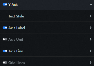
Text Style
Font Size: the size of the text on the left y-axis.
Color: the color of the text on the left y-axis.
Font weight: the weight of the text on the left y-axis.
Axis Label: the axis label style of the left-side y-axis. You can click the
 icon to display or hide the axis label.
 Min: the display mode of the minimum value on the left y-axis. You can enter a value or select a value.
0: By default, the minimum value of the y-axis range is 0.
The minimum value of the data: the minimum value in the data.
Automatic Rounding: The system automatically calculates the value based on the maximum value, minimum value, and number of axis labels.
Max: the maximum value of the left-side y-axis. You can enter a value or select a value.
The maximum value of the data: the maximum value in the data.
Automatic Rounding: The system automatically calculates the value based on the maximum value, minimum value, and number of axis labels.
Quantity: the number of axis labels.
Display Format: the display format of the value in the left-side y-axis label. Validated values include Default, 11 (Integer), 11.1 (Float), 11.11 (Float), 11%, 11.1%, and 11.11%.
Axis Unit: the unit of the y-axis on the left. You can click the
icon to display or hide the axis unit. Axis Line: the axis style of the left-side y-axis. You can click the
icon to display the axis. Color: the color of the axis.
Grid Lines: the style of the grid line in the y-axis on the left. You can click the
icon to control the appearance or concealment of the grid line. Color: the color of the grid lines.
Y2 Axis: column chart the style of the right axis. You can click
the icon to control the visualization of the axis. 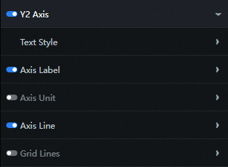
Text Style
Font Size: the size of the text on the right axis.
Font Color: the color of the right axis line text.
Font Weight: the font weight of the text on the right axis.
Axis Label: the label style of the axis line on the right. You can click the
icon to display or hide the label. Min: the display mode of the minimum value of the right axis. You can enter a value or select a value.
The minimum value of the data: the minimum value in the data.
Automatic Rounding: The system automatically calculates the value based on the maximum value, minimum value, and number of axis labels.
Max: the maximum value of the right axis. You can enter a value or select a value.
The maximum value of the data: the maximum value in the data.
Automatic Rounding: The system automatically calculates the value based on the maximum value, minimum value, and number of axis labels.
Quantity: the number of axis labels.
Display Format: the display format of the values on the right side of the axis label. You can select Default, 11 (Integer), 11.1 (Float), 11.11 (Float), 11%, 11.1%, or 11.11%.
Axis Unit: the unit of the axis on the right. You can click the
icon to display or hide the axis unit. Axis Line: the axis style of the right axis. You can click the
icon to display the axis. Color: the color of the axis.
Grid Lines: the network line style of the axis line on the right. You can click the
icon to display or hide the grid lines. Color: the color of the network cable.
Legend: the legend style of the column chart. You can click
the icon to display or hide the legend. 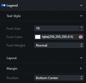
Text Style
Font Size: the size of the legend text.
Font Color: the color of the legend text.
Font Weight: the font weight of the legend text.
Layout
Margin
Horizontal Interval: The distance between the left and right sides of adjacent legends. This configuration items is only valid when there are multiple series.
Vertical Interval: the distance between the legend and the upper and lower boundaries of the widget and column chart.
Position: the position of the legend relative to the start coordinates of the widget. You can select Top Left, Top Center, Top Right, Bottom Left, Bottom Center, or Bottom Right.
Tooltip: The style of the dialog box that appears when you move over or click a column chart on a preview or publish page. You can click
 the icon to control the display of the dialog box.
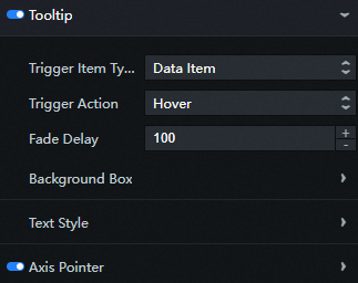
Trigger Item Type: dialog box the type of the target to be triggered. This field is optional, including Data Item and Axis.
Trigger Action: dialog box the action to be triggered. This field is optional, including Hover and Click.
Fade Delay: If the trigger condition is not met, the dialog box disappears. This configuration items sets the delay time before the dialog box disappears. Unit: ms.
Background Box: The background box style of the dialog box.
Background Color: the background color of the dialog box.
Custom Box Size: The width and height of the dialog box, in px. You can click
the icon to control the display of the custom background frame size. Padding: the inner margin of the dialog box. Unit: pixels.
Horizontal Offset: the horizontal offset of the dialog box relative to the mouse arrow. Unit: px.
Vertical Offset: the vertical offset of the dialog box relative to the mouse arrow. Unit: px.
Border Color: The border color of the dialog box.
Border Width: the border thickness of the dialog box. Unit: pixels.
Text Style: The style of the text in the dialog box.
Color: dialog box the color of the text.
Font: dialog box the font family of the text.
Font Size: dialog box the size of the text.
Font Weight: dialog box the font weight of the text.
Axis Pointer: the style of the axis indicator displayed when the trigger type of the dialog box is Axis and the trigger action is executed.
Type: the type of the axis indicator. Only Line Indicator is supported.
Line Style: indicates the line color, width, and line type. The line type is optional. Valid values: Solid Line, Dashed Line, and Dotted Line.
Series: Click the
 or
or  icon on the right to add or delete a data series. Click the
  or
or  icon to configure the arrangement style of multiple data series. Click the
  icon to copy the selected data series configurations and add a data series with the same configurations.
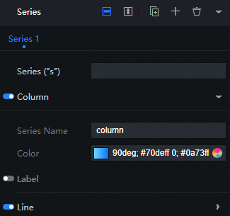
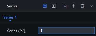
Series("s"): data series value, which corresponds to s field value in the Data panel.
Column: the style of the column in this series. You can click the
icon to control the visibility of the column. Series Name: the name of the data series, which can be customized. If the data s field can be displayed directly, define it as empty.
Color: the color of the column. Color fill and gradient fill are supported.
Label: the style of the column label. You can click the
icon to display or hide the column label. Font Size: the size of the column tag text.
Color: the color of the column tag text.
Font Weight: the font weight of the column tag text.
Position: the position of the tag. Valid values: Top, Middle, and Bottom.
Line: the style of the polyline in this series. You can click the
icon to control the visibility of the polyline. ImportantThe polyline appears only if the
zfield of the series has data.Series Name: the name of the data series, which can be customized. If the data s field can be displayed directly, define it as empty.
Color: the color of the polyline. Colors are supported.
Style: the line type of the polyline. You can select Solid or Dashed.
Width: the line thickness of the polyline.
Curve: If you turn on this switch, the polyline is displayed as a curve.
Point: the style of the dot on the polyline. You can click the
icon to control the display of the dot. Radius: the radius of the dot on the polyline. Unit: pixels.
Label: the label style of the polyline.
Font Size: the size of the line label text.
Color: the color of the line label text.
Font Weight: the font weight of the line label.
Animation: the column chart animation effect style. You can click the
icon to turn the animation effect on or off. 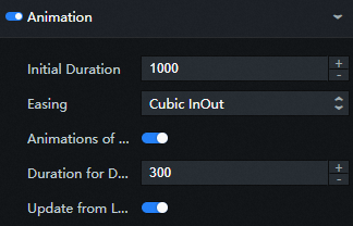
Initial Duration: the duration of the first animation rendered by the component. Unit: ms.
Easing: the easing effect of the animation. The system provides a variety of common easing effects for you to choose from.
Animations of All Series In Sequence: Turn on the switch, each series of column chart play animation in sequence; Turn off the switch, all column chart play animation together.
Duration for Data Update: the animation duration when the widget data is updated. Unit: ms.
Update from Latest Status: If you turn on the switch, the animation starts from the previous position when the widget data is updated. If you turn off the switch, the animation starts from the initial position when the widget data is updated.
Data Panel 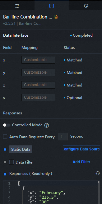
Configuration field description
Parameter | Description |
| The category of the component, that is, the value of the x-axis. |
| The value of each bar, that is, the value of the y-axis. |
| The value of each point on the polyline, that is, the value of the z-axis. |
| Optional. The value of the corresponding series. |
| Parameter | Description |
| Controlled Mode | If you turn on the switch, data is not requested when a widget is initialized. Data requests are triggered only based on callback IDs or the method configured in Blueprint Editor. If you turn off the switch, data requests are automatically triggered. By default, the switch is turned off. |
| Auto Data Request | After you select the Auto Data Request check box, you can enable dynamic polling, and manually specify the polling interval. If you do not select this check box, data is not automatically requested. You must manually refresh the page to request data or use Blueprint Editor or callback ID events to trigger data requests. |
| Data Source | In the right-side panel of Canvas Editor, click the Data tab. Click Set next to Static Data. In the Configure Datasource panel, select a data source from the Data Source Type drop-down list. Enter code for data query in the code editor, click Preview Data Response to preview the response of the data source, and then view the response. For more information, see Configure asset data. |
| Data Filter | If you select the Data Filter check box, you can convert the data structure, filter data, and perform simple calculations. If you click the plus sign (+) next to Add Filter, you can configure the script for the data filter in the editor that appears. For more information, see Use the data filter. |
| Data Response Result | The response to a data request. If the data source changes, you can click the  icon next to Data Response Result to view the data response in real time. icon next to Data Response Result to view the data response in real time. |
Interaction Panel 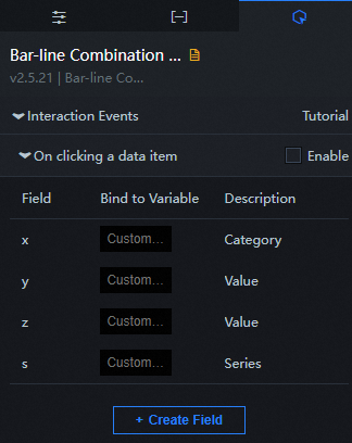
Select the Enable check box to enable interactions between widgets. When you click a column or dot in a polyline histogram, a data request is triggered and a callback value is thrown to dynamically load the data of different columns or dots. By default, the x, y, z, and s values in the data are returned. For more information, see Configure the callback ID of a ticker board.
Configure interactions in Blueprint Editor
- In Canvas Editor, right-click a widget in the Layer panel and select Add to Blueprint Editor.
- Click the
 icon in the upper-left corner of the page.
 In Blueprint Editor, click the Bar Chart widget in the Added Nodes pane. On the canvas, you can configure the parameters for the bar chart, as shown in the following figure.
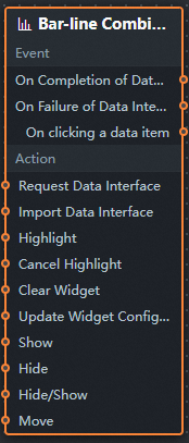
Event
Event
Description
On Completion of Data Interface Request
The event is triggered with the processed JSON data after a data interface request is responded and processed by a filter. For more information about specific data examples, see the Data Response Result section of the Data tab in the right-side configuration panel of the canvas editor.
On Failure of Data Interface Request
The event that is returned when a data interface request fails (the request may be due to network problems or interface errors) and is processed by the filter. The event also throws the processed JSON data. For more information about specific data examples, see the Data Response Result section of the Data tab in the right-side configuration panel of the canvas editor.
On clicking a data item
The event that is raised when you click a column in a line bar chart or a dot on a line. The event also throws the data item corresponding to the column or dot.
Action
Action
Description
Request Data Interface
This action is performed to request the server data again. The data sent by an upstream data processing node or layer node is used as a parameter. For example, if the API data source is set to
https://api.test, and the data that is transferred to the Request Data Interface is set to{ id: '1'}, the final request interface ishttps://api.test?id=1.Import Data Interface
After data of a widget is processed in accordance with its drawing format, the widget is imported for redrawing. You do not need to request server data again. For more information about specific data examples, see the Data Response Result section of the Data tab in the right-side configuration panel of the canvas editor.
Highlight
Highlight the element corresponding to the data item. Examples of reference data are as follows.
return {
  "data": {},
  "options": {
    "style": {
      "stroke": "#f00",
      "fill": ""
    },
    "selectMode": "single",
    "cancelHighlightFirst": false
  }
}
Cancel Highlight
Cancels the highlighting of the element corresponding to the data item. Examples of reference data are as follows.
return {
  "data": {},
  "options": {
    "mode": "single"
  }
}
Clear Widget
Clear component data. No parameters are required.
Update Widget Configurations
Style configurations of widgets are dynamically updated. Before this action is executed, you must click the widget in Canvas Editor, click the Settings tab in the right-side panel, and click Copy Configurations to... to obtain widget configurations. After that, change the style field for the data processing node in Blueprint Editor.
Show
Displays the widget. The following example shows the reference data.
return{
  "animationType": "",
  "animationDuration": 1000,
  "animationEasing": "linear"
}
Hide
The following example shows how to hide a widget.
return{
  "animationType": "",
  "animationDuration": 1000,
  "animationEasing": "linear"
}
Hide/Show
Specifies whether to show or hide a widget. The following example shows the reference data.
return {
  "animationIn": {
    "animationType": "",
    "animationDuration": 1000,
    "animationEasing": "linear"
  },
  "animationOut": {
    "animationType": "",
    "animationDuration": 1000,
    "animationEasing": "linear"
  }
}
Move
A widget is moved to a specified location. Examples of reference data are as follows.
    return{
      // The positioning type. to indicates absolute positioning, whereas by indicates relative positioning. The default value is to.
        "positionType": "to",
      // The location, which is indicated by the x and y coordinates.
      "attr": {
        "x": 0,
        "y": 0
      },
      // The animation type.
      "animation": {
        "enable": false,
        // The duration in which animation is displayed.
        "animationDuration": 1000,
        // The animation curve, which can be set to linear|easeInOutQuad|easeInOutExpo.
        "animationEasing": "linear"
      }
    }
FAQ
How do I add a line or column to a line column chart?
Add multiple series in the Series configuration items of the component.
Modify the data configuration and add
sfields.ImportantThe
sfield value must be consistent with the Series("s").