This topic describes the table progress bar widget and the meaning of each configuration items.
Chart Style
A progress bar table is a widget that consists of progress bar and tables. You can configure the styles of tables, table columns, and page-turning devices. 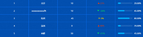
Settings Panel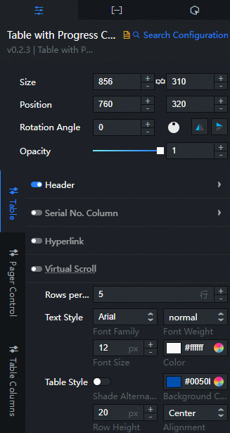
- Search for Configurations: In the right-side panel of Canvas Editor, click the Settings tab, and click Search for Configurations in the upper-right corner. Enter the required configuration item in the search box, and click the search icon to quickly locate the configuration item. Fuzzy match is supported. For more information, see Search for asset configurations.
- Size: indicates the size of a widget, including its pixel width and height. You can click the
 icon to proportionally adjust the width and height of a widget. After you click this icon again, you can adjust the width and height as needed.
 - Position: the position of a widget, which is indicated by pixel X and Y coordinates. X-coordinate indicates the pixel distance between the upper-left corner of the widget and the left border of the canvas. Y-coordinate indicates the pixel distance between the upper-left corner of the widget and the upper border of the canvas.
- Rotation Angle: the angle of a rotation that uses the center point of a widget as the rotation point. The unit is degrees (°). You can use one of the following methods to control the rotation angle of a widget:
- Directly enter the degrees in the Rotation Angle spin box or click the plus sign (+) or minus sign (-) to increase or decrease the value in the Rotation Angle spin box.
- Drag the black dot in the
 icon.
icon. - Click the
 icon to horizontally flip a widget.
 - Click the
 icon to vertically flip a widget.
- Opacity: the opacity of a widget. Valid values: 0 and 1. If this parameter is set to 0, the widget is hidden. If this parameter is set to 1, the widget is completely displayed. Default value: 1.
Table
Header: Set the header style. You can click
 to control the display of the header.
 Parameter
Description
Text Alignment
The alignment mode of the header. You can select Left, Center, or Right.
Text Style
The style of the header text, including the text font style, text weight, font size, and color.
Sort Selected Style
The color that appears when the sort button of a column in the header is clicked and selected during preview and publishing.
NoteYou can configure the Sorting Style parameter only after you turn on Sortable for a column in the Column Settings section.
Border Style
The border style of the header section, including the border width and border color.
Background color
The background color of the header section.
Row Height
The row height value of the table header.
Serial Number Column: Set the serial number column style of the table. You can click
to control the display or hide of the serial number column. Parameter
Description
Column field name
The name of the field in the sequence number column. The field must match the field in the data panel. By default, the
imgSrcfield is matched.Header Content
The content displayed in the header of the serial number column.
Column width percentage
The percentage of the column width in the serial number column. A larger value indicates a larger width.
Image Size
The image size style of the ordinal column, including the image width and image height.
Text Style
The text style of the sequence number column, including the text font style, text weight, font size, and color.
Text Background
The text background style of the ordinal column, including the background width, background height, rounded corners, and background color.
Hyperlink Configuration: Set the hyperlink configuration style of the table. You can click
 to display or hide the hyperlink configuration.
 Parameter
Description
Hyperlink Field Name
The name of the hyperlink field. You must set the hyperlink link field in the Data panel. After setting a hyperlink in a row of the table, click anywhere in the row to jump to the hyperlink.
Open in new window
Turn on the switch, jump hyperlink will open a new web page window; Turn off the switch, hyperlink in the original page jump.
Virtual Scroll: specifies the virtual scroll of the table. You can click
 to display or hide the virtual scroll.
 Content Area Height: the height of the content area. If the height of the content area is greater than the height of the content area, a scroll bar appears in the content area.
NoteMake sure that the ID value of the data is unique.
Rows Per Page: the number of rows that can be displayed on each page of the table.
Text Style: the style of the table text, including the font style, weight, font size, and color.
Basic Style: the basic style of the table.
Parameter
Description
Open zebra crossing
Turn on the switch to enable the zebra crossing style; Turn off the switch to disable the zebra crossing style.
Table Background Color
The background color of the table.
Row Height
The height of each row in the table.
Text Alignment
The table alignment mode. You can select Left, Center, or Right.
Table Border: the style of the table border, including the border width and color.
Margin: the distance between the inner boundary of the table and the top, bottom, left, and right sides of the table.
Page Turbors
Parameter
Description
Page Turner Hide
If you turn on the switch to hide the page changer style, all the parameters of the page changer cannot be configured. If you turn off the switch to hide the page changer style, the page changer style is displayed. You can configure the following parameters.
Hide a single page
If you turn on the switch, the page changer style is hidden when the table has only one page of content. If you turn off the switch, the page changer style is always displayed.
General Settings
General settings for page-pader styles, including size selection, alignment, and forward and backward style selection for page-padders.
Page Number
The number of pager pages. When the number of pages is too large, the number of pages on the page is displayed. More ellipsis (...) is used instead.
Ellipsis Color
The ellipsis color used when there are too many page numbers.
Input box
Turn on the switch to open the page-turning input box. When the number of pages is too large, the page number written in the Jump to input box is displayed and click OK to jump. The page number takes effect when the total number of pages is greater than Page Number. Turn off the switch to disable the page number jump effect in the input box.
Current Page Style
The current page style of the page-turning device, including the text color and background color of the current page.
Normal Page Style
The normal page style of the page-turning device, including the normal text color and background color of other pages.
Unavailable Style
Styles that are not available for page-turning, including the text color and background color of the unavailable styles.
Margin
The distance of the pager boundary from the top, bottom, left, and right sides of the table.
Table Column
Click the
 or
or  icon on the right to add or delete a column configuration. Click the
  or
or  icon to configure the arrangement style for multiple columns. Click the
  icon to copy the selected column configurations and add a column with the same configurations.
 Column Field Name: the name of the column field, which must match the field in the data.
Column Name: the name of the column in the table header. The name must match the field in the data.
Column Width: the width of the column. If the value is 0, the width of the column is adaptive. If the width of the content exceeds the width of the column, the width of the content is used to ensure that the content is accurately displayed.
Sortable: If you turn on the switch, the Sort button is displayed in the header of the current column. You can click the Sort button to select a sorting style for the data in the table. If you turn off the switch, the Sort button is not displayed in the header of the current column, and you cannot click the current column to sort table data.
NoteWhen the value in the table is progress bar, the table data cannot be sorted regardless of whether the Sortable switch is turned on.
Indicator Trend: Click
to enable the indicator trend style. Parameter
Description
Icon
The style of the indicator trend icon. You can select five icon styles and set the icon size. Click
to turn on the icon style. Trend Color
The color of the three trends of rising, flat and falling.
Synchronize Text Color
If you turn on the switch, the icon color is synchronized with the numeric text color; if you turn off the switch, the colors are not synchronized.
Metric Settings
Set the indicator base value and number suffix style.
thousands separator
thousands separator the separator symbol. Click
to open the thousands separator style. NoteWhen multiple thousands separator symbols are entered, only the first digit symbol is used as the thousands separator delimiter of the data by default, and numbers cannot be used as the thousands separator delimiter.
Display
If you turn on the switch, invalid data in the indicator trend style can be displayed. If you turn off the switch, invalid data in the indicator trend style cannot be displayed.
NoteIf all data is valid, ignore this configuration.
Progress Chart: Click
to enable the progress chart style. The value of the progress chart should be set to the numberdata type.Parameter
Description
Progress Chart Form
The shape of the progress chart. You can select Ring or Bar.
Section
The progress color, background color, and progress bar dimensions of the progress chart.
Value information
The precision digits, suffix style, font, text weight, font size, and color of the value. Click
to open the numeric information style.
Data Panel
Configuration field description
Parameter | Description |
| The value description of the table. You can customize multiple field values. The field names must match the column names in the Column Configuration section in the configuration panel. |
| Parameter | Description |
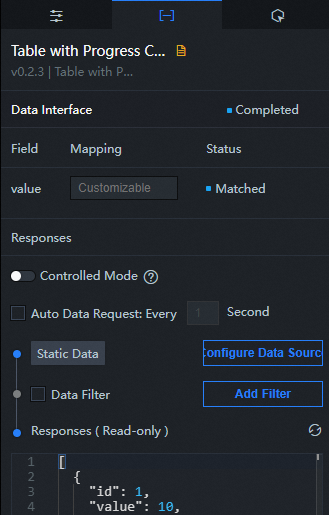
| Controlled Mode | If you turn on the switch, data is not requested when a widget is initialized. Data requests are triggered only based on callback IDs or the method configured in Blueprint Editor. If you turn off the switch, data requests are automatically triggered. By default, the switch is turned off. |
| Auto Data Request | After you select the Auto Data Request check box, you can enable dynamic polling, and manually specify the polling interval. If you do not select this check box, data is not automatically requested. You must manually refresh the page to request data or use Blueprint Editor or callback ID events to trigger data requests. |
| Data Source | In the right-side panel of Canvas Editor, click the Data tab. Click Set next to Static Data. In the Configure Datasource panel, select a data source from the Data Source Type drop-down list. Enter code for data query in the code editor, click Preview Data Response to preview the response of the data source, and then view the response. For more information, see Configure asset data. |
| Data Filter | If you select the Data Filter check box, you can convert the data structure, filter data, and perform simple calculations. If you click the plus sign (+) next to Add Filter, you can configure the script for the data filter in the editor that appears. For more information, see Use the data filter. |
| Data Response Result | The response to a data request. If the data source changes, you can click the  icon next to Data Response Result to view the data response in real time. icon next to Data Response Result to view the data response in real time. |
Interaction Panel
Interaction Event | Description |
When a single row is clicked | Select the Enable check box to enable interactions between widgets. You can click a row in the progress bar table to throw a callback value. By default, the |
When you click Pagination | Select the Enable check box to enable interactions between widgets. You can click to progress bar the callback value that is returned when the table is paginated. By default, the custom |
When you click Sort | Select the Enable check box to enable interactions between widgets. You can click the progress bar table sort button to throw a callback value. By default, the custom |
Configure interactions in Blueprint Editor
- In Canvas Editor, right-click a widget in the Layer panel and select Add to Blueprint Editor.
- Click the
 icon in the upper-left corner of the page.
 In Blueprint Editor, click the Table with Progress Charts component in the Added Nodes pane.
Event
Event
Description
When the data interface request is completed
The event is triggered with the processed JSON data after a data interface request is responded and processed by a filter. For more information about specific data examples, see the Data Response Result section of the Data tab in the right-side configuration panel of the canvas editor.
When a data interface request fails
The event that is returned when a data interface request fails (the request may be due to network problems or interface errors) and is processed by the filter. The event also throws the processed JSON data. For more information about specific data examples, see the Data Response Result section of the Data tab in the right-side configuration panel of the canvas editor.
When a single row is clicked
Throws data for the current row when a row in the progress bar table is clicked.
When you click Pagination
The data of the current page is thrown when a page of the progress bar table is clicked.
When you click Sort
When one of the sort keys of the progress bar table is clicked, the currently sorted data is thrown.
When you click Multiple Select
Throws the data for the current multi-option when you click Multi-option in the Select column of the progress bar table.
When an action item is clicked
When you click an operation item button in the progress bar table, the data of the current operation item is displayed.
Policy Action
Policy Action
Description
Request Data Interface
This action is performed to request the server data again. The data sent by an upstream data processing node or layer node is used as a parameter. For example, if the progress bar table is configured with the API data source as
https://api.testand the data passed to the request data interface as{ id: '1'}, the final request interface ishttps://api.test?id=1.Import data
After data of a widget is processed in accordance with its drawing format, the widget is imported for redrawing. You do not need to request server data again. For more information about specific data examples, see the Data Response Result section of the Data tab in the right-side configuration panel of the canvas editor.
Jump to
Redirects a widget to a page. By default, the page starts from 0. Examples of reference data are as follows.
return {
  "current":1 // If you are redirected to the fourth page,{current:3}
}
Highlight Table Rows
Specifies the element corresponding to the table row highlight. Examples of reference data are as follows.
return {
  "data": {
    id:3, // The data to be highlighted.
    name: 'Zhang San'
  },
  "style": {
    color:'#ff0', // The style of the highlighted data.
    background:'#f00'
  }
}
Cancel row highlighting
Unhighlights the corresponding element in the table row.
Clear Highlight
Clear all highlight effects of the widget. No parameters are required.
Open Select Column
Open the data content corresponding to the selected column in the progress bar table.
Disable Select Column
Disables Hide the data content corresponding to the selected columns in the progress bar table.
Open Operation Column
Open the data in the Actions column of the progress bar table.
Disable Operation Column
Disables Hide progress bar in the Actions column of the table.
Set Selected Value
Set the parameter content of the selected value. The following example shows the reference data.
return {
  "value": 1
}
Update component configurations
Style configurations of widgets are dynamically updated. Before this action is executed, you must click the widget in Canvas Editor, click the Settings tab in the right-side panel, and click Copy Configurations to... to obtain widget configurations. After that, change the style field for the data processing node in Blueprint Editor.
Display
Displays the widget. The following example shows the reference data.
return {
  "animationType": "",
  "animationDuration": 1000,
  "animationEasing": "linear"
};
Hide
The following example shows how to hide a widget.
return {
  "animationType": "",
  "animationDuration": 1000,
  "animationEasing": "linear"
};
Switch to the hidden state
Specifies whether to show or hide a widget. The following example shows the reference data.
return {
  "animationIn": {
    "animationType": "",
    "animationDuration": 1000,
    "animationEasing": "linear"
  },
  "animationOut": {
    "animationType": "",
    "animationDuration": 1000,
    "animationEasing": "linear"
  }
};
Move
Move a widget to a specified location. The following example shows the reference data.
return {
  // The positioning type. to indicates absolute positioning, whereas by indicates relative positioning. The default value is to.
  "positionType": "to",
  // The location, which is indicated by the x and y coordinates.
  "attr": {
    "x": 0,
    "y": 0
  },
  // The animation type.
  "animation": {
    "enable": false,
    // The duration in which animation is displayed.
    "animationDuration": 1000,
    // The animation curve, which can be set to linear|easeInOutQuad|easeInOutExpo.
    "animationEasing": "linear"
  }
};