You can configure a selector and enable option filtering and custom input. If you need to configure font options in the selector, you can enable the font rendering function to preview the fonts.
Configuration description
| Field |
Description |
Data type |
Required? |
Remarks |
name |
The name of the control. |
string |
Yes |
None. |
type |
The type of the control. |
string |
Yes |
None. |
default |
The default value. |
string |
No |
If this field is not specified, the default value is the first item in the options field. |
options |
The list of options. |
array |
No |
Each option contains the label and value fields. The label field specifies the text to be displayed, and the value field specifies the value of the text. |
filterable |
Specifies whether to support filtering. |
boolean |
No |
Default value: true. |
allowCustom |
Specifies whether to support custom input. |
boolean |
No |
This field takes effect only when filterable is set to true. Default value: true. |
useFont |
Specifies whether to support font rendering. |
boolean |
No |
None. |
Value description
| Condition |
Data type |
Example |
Default value |
| None |
string |
"left" |
"" |
Configuration examples
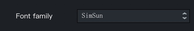
"font": {
    "name": "Font",
    "type": "select",
    "useFont": true,
    "default": "SimSun",
    "options": [
      {
        "value": "Microsoft Yahei",
        "label": "Microsoft YaHei"
      },
      {
        "value": "SimSun",
        "label": "SimSun"
      },
      {
        "value": "SimHei",
        "label": "SimHei"
      }
    ]
}