You can configure a margin control suite that consists of four steppers to specify the top, bottom, left, and right margins.
Fields
| Field | Description | Type | Required | Remarks |
|---|---|---|---|---|
name | The name of the control. | string | Yes | None |
type | The type of the control. | string | Yes | None |
default | The default value. | string | No | If this field is not specified, it is left empty. |
components | The controls in the suite. | array | No | The default value is ["top","bottom","left","right"]. You can configure "top", "bottom", "left", and "right". |
enableHide | Specifies whether to hide controls on the canvas. | boolean | No | The default value is false. If this field is set to true, a show or hide icon appears, and the show field is added. |
Values
| Condition | Data type | Example | Default value |
|---|---|---|---|
The enableHide field is not configured or is set to false. | object | | |
The enableHide field is set to true. | object | | |
Sample configurations
- The
enableHidefield is not configured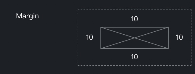
{ "margin": { "name": "Margin", "type": "margin", "default": { "top": 10, "left": 10, "right": 10, "bottom": 10 } } } - The
enableHidefield is set totrue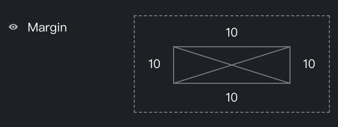
{ "margin": { "name": "Margin", "type": "margin", "enableHide": true, "default": { "top": 10, "left": 10, "right": 10, "bottom": 10 } } } - The
componentsfield is configured
{
  "marginComponents": {
    "name": "Margin",
    "type": "margin",
    "enableHide": true,
    "components": ["top", "bottom"]
  }
}