You can configure an image selector.
Description
| Parameter | Description | Type | Required | Description |
name | The name of the control. | string | Yes | If this parameter is not specified, the key name is used as the display name, for example, margin. |
type | The property type. Valid values: | string | Yes | No default value |
default | Default value | string | No | The dimension. |
options | Options | array | No | An array of objects containing label, value, and src fields. The label is the display text, the value is the text value, and the src is the image address or icon name. |
Values
| Condition | Data type | Examples | Default value |
| N/A | string | "left" | "" |
Configuration example
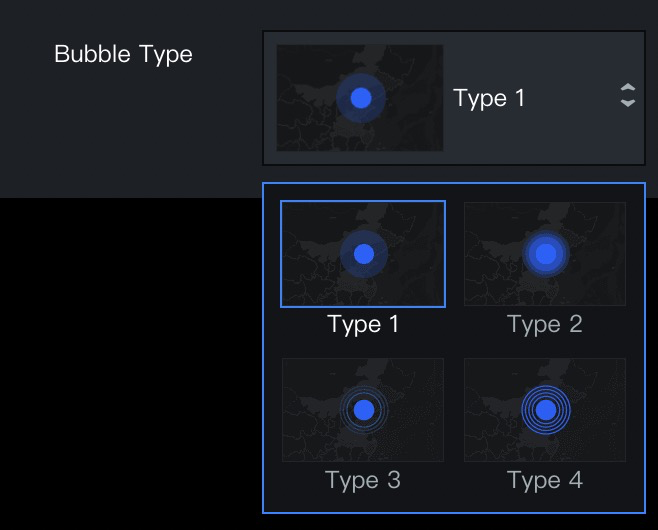
"bubbleKey": {
    "name": "Bubble Type",
    "type": "imageSelect",
    "default": "type1",
    "options": [
      {
        "label": "Type 1",
        "value": "type1",
        "src": "https://img.alicdn.com/tfs/TB1BCgwoAT2gK0jSZFkXXcIQFXa-162-104.png"
      },
      {
        "label": "Type 2",
        "value": "type2",
        "src": "https://img.alicdn.com/tfs/TB1EmgwoAT2gK0jSZFkXXcIQFXa-162-104.png"
      },
      {
        "label": "Type 3",
        "value": "type3",
        "src": "https://img.alicdn.com/tfs/TB13x3soAP2gK0jSZPxXXacQpXa-162-104.png"
      },
      {
        "label": "Type 4",
        "value": "type4",
        "src": "https://img.alicdn.com/tfs/TB1pKUuoAL0gK0jSZFxXXXWHVXa-162-104.png"
      }
    ]
  }