SQL query visualization charts let you visualize and analyze query results using line charts, column charts, bar charts, and pie charts. Each chart type suits different analytical scenarios, helping you choose the best format for your data.
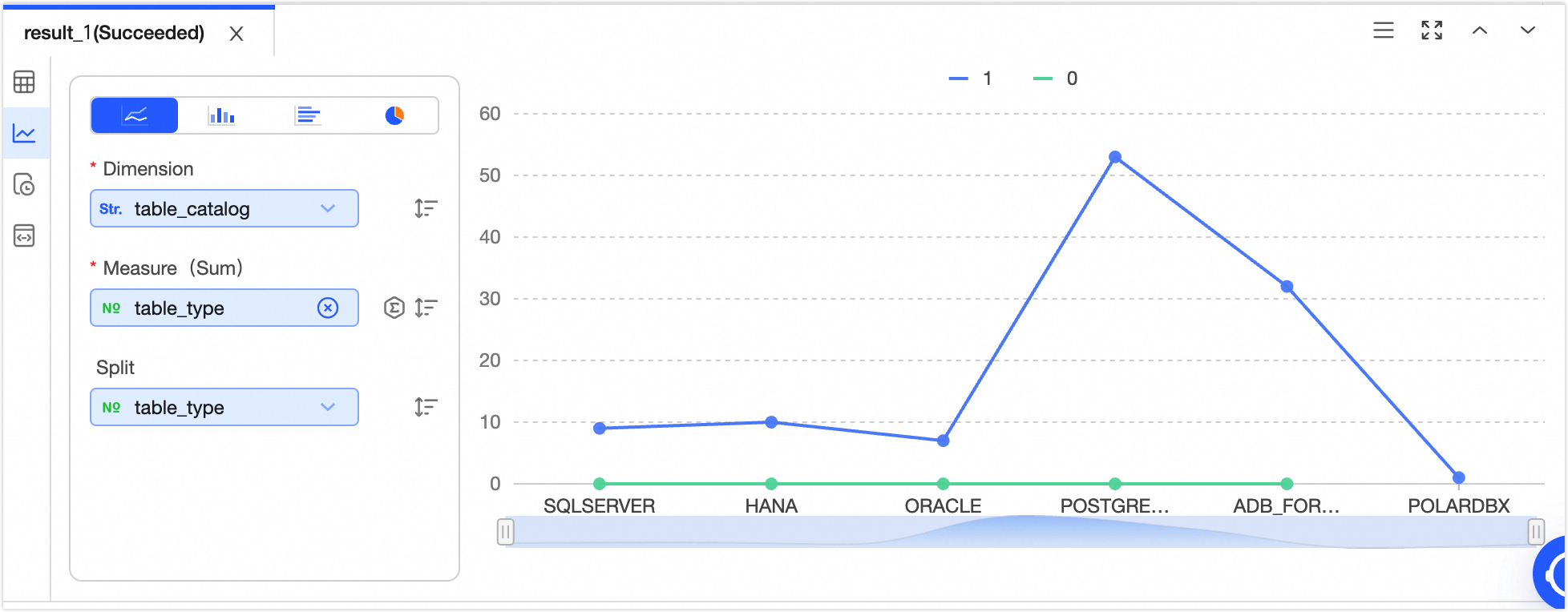
Line chart
Line charts display data trends over equal time intervals, such as tracking sales changes over time or forecasting future trends.
|
Legend
|
Data elements
|
|
|
-
X-axis
-
Y-axis
-
Split
Note
-
Single click  icon to sort data elements in ascending, descending, or no particular order. When sorting is applied to both the x-axis and y-axis, the x-axis sorting has priority. icon to sort data elements in ascending, descending, or no particular order. When sorting is applied to both the x-axis and y-axis, the x-axis sorting has priority.
-
Single click  icon to choose the aggregation method for data. The default method for numeric fields is sum, with options for sum, average, or count; for non-numeric fields, the default is count, which is the only available option. icon to choose the aggregation method for data. The default method for numeric fields is sum, with options for sum, average, or count; for non-numeric fields, the default is count, which is the only available option.
|
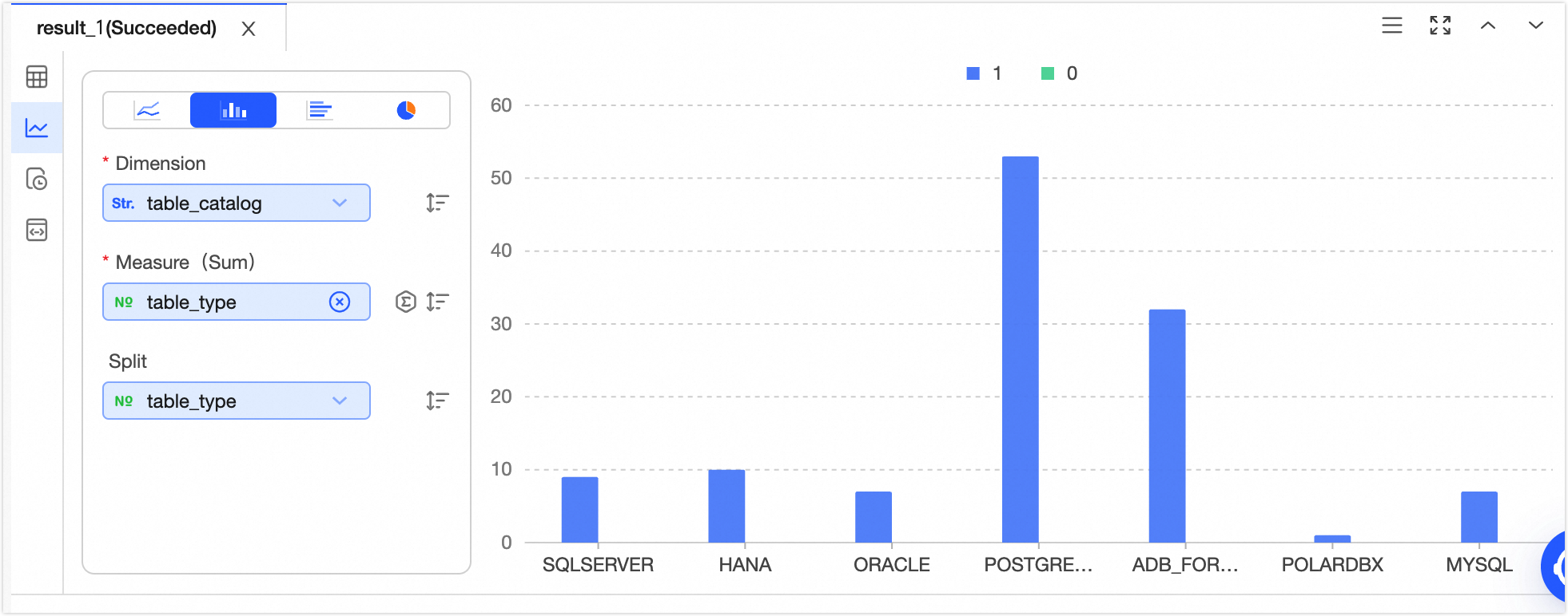
Column chart
Column charts compare differences across data groups and show variations over time.
|
Legend
|
Data elements
|
|
|
-
X-axis
-
Y-axis
-
Split
Note
-
Single click icon to sort data elements in ascending, descending, or no particular order. When sorting is applied to both the x-axis and y-axis, the x-axis sorting has priority.
-
Single click icon to choose the aggregation method for data. The default method for numeric fields is sum, with options for sum, average, or count; for non-numeric fields, the default is count, which is the only available option.
|
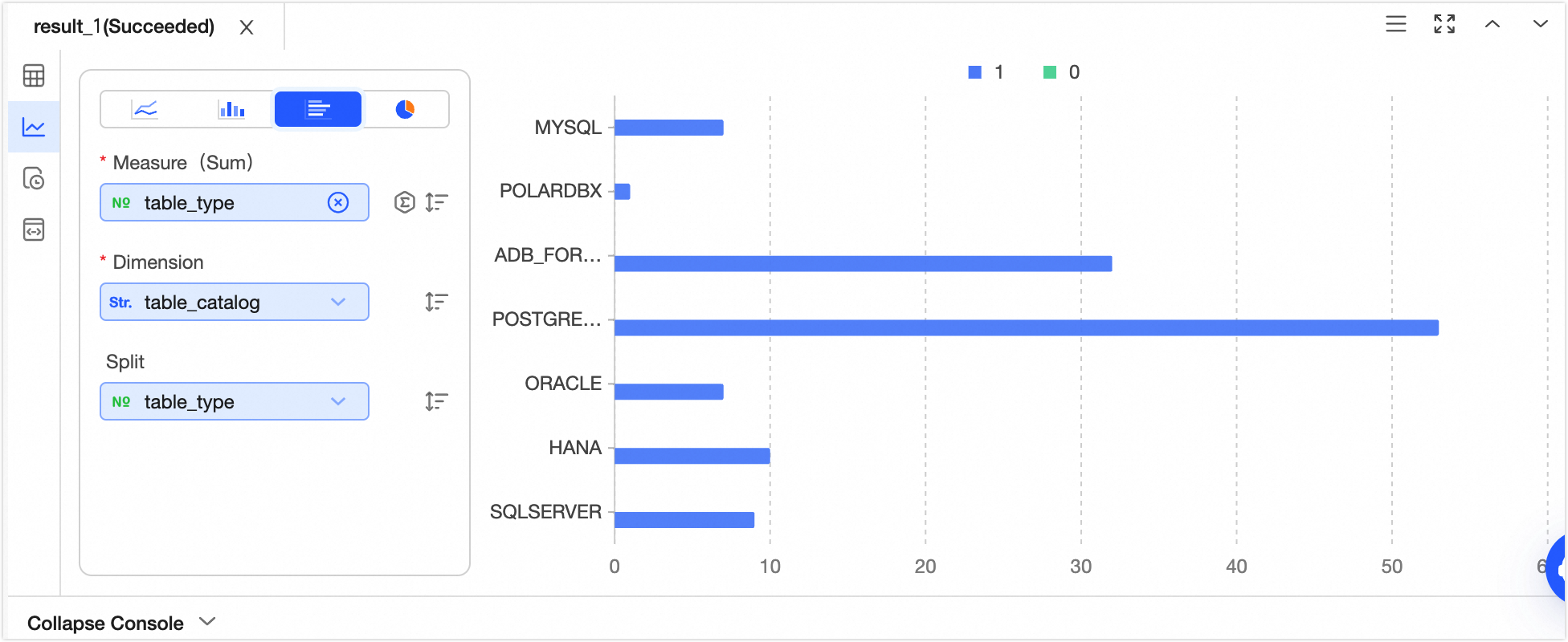
Bar chart
Bar charts compare the magnitude and differences between data points in a horizontal layout.
|
Legend
|
Data elements
|
|
|
-
X-axis
-
Y-axis (sum)
-
Split
Note
-
Single click icon to sort data elements in ascending, descending, or no particular order. When sorting is applied to both the x-axis and y-axis, the y-axis sorting has priority.
-
Single click icon to choose the aggregation method for data. The default method for numeric fields is sum, with options for sum, average, or count; for non-numeric fields, the default is count, which is the only available option.
|
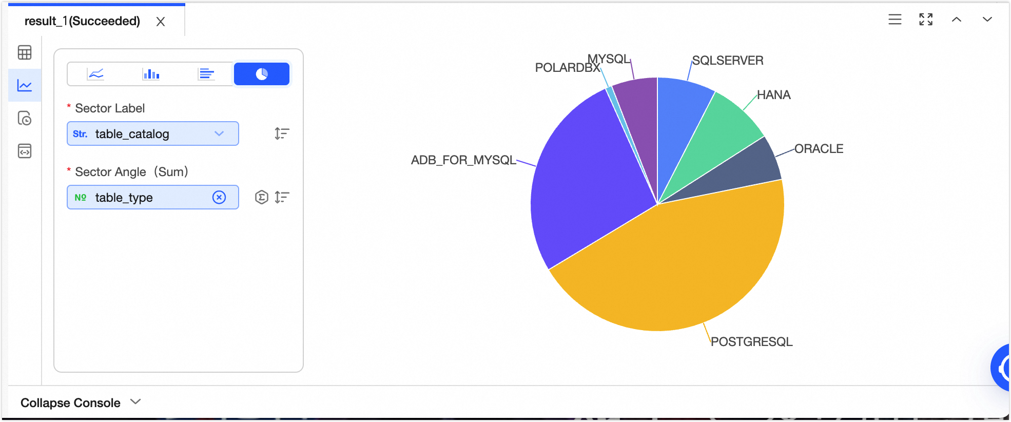
Pie chart
Pie charts show the proportion of each segment relative to the total in a dataset.
|
Legend
|
Data elements
|
|
|
-
Sector tag
-
Central angle
Note
-
Single click icon to sort data elements in ascending, descending, or no particular order. When sorting is applied to both the sector tag and central angle, the sector tag sorting has priority.
-
Single click icon to choose the aggregation method for data. The default method for numeric fields is sum, with options for sum, average, or count; for non-numeric fields, the default is count, which is the only available option.
|