After you go to the canvas editing page on a PC, you can use the canvas configuration and component configuration tools provided by the system to manage the canvas and components. This topic describes the structure and features of Canvas Editor on a PC to help you use Canvas Editor on a PC to develop visual applications.
Canvas Editor page and widget configuration page
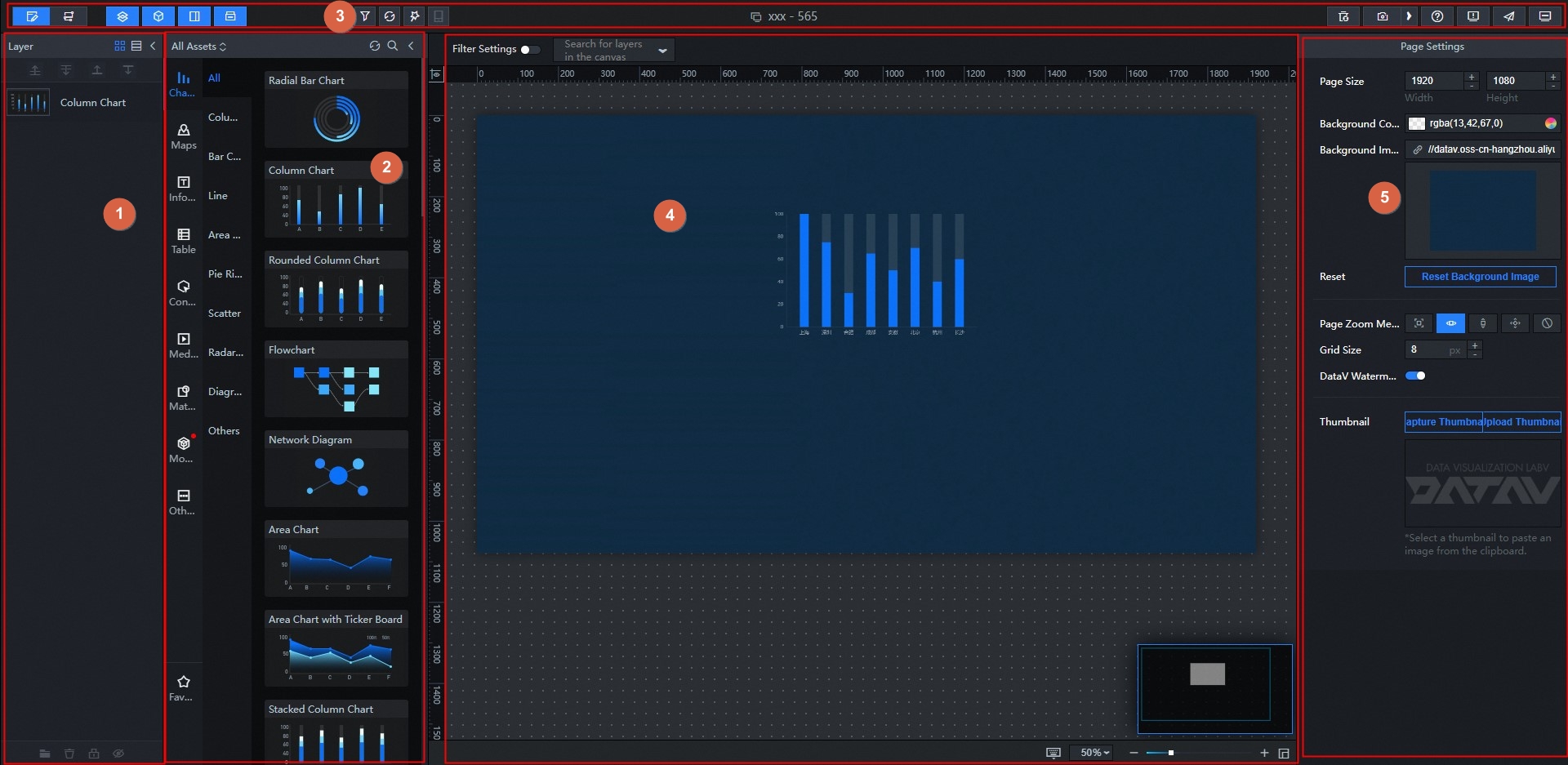
No. | Term | Description |
1 | Layers | In the layer list, you can view the layer positions of each widget in the canvas. You can manually adjust the upper and lower positions of each widget layer based on your application requirements. |
2 | Asset list | In the asset list, you can view various types of widgets. You can drag widgets to the canvas for configuration to complete the development of a visual application project. |
3 | Toolbar | The toolbar is located at the top of the editor page. You can use the toolbar to switch between the canvas view and the blueprint view, switch between the right-side panel, add project filters, update widgets, view help documents, and preview or publish a visual application. |
4 | Canvas | The canvas is located in the middle of the editor page. You can use the features provided by the canvas to properly lay out the style of each asset content in the canvas, configure the filter in the canvas, search for the layer content in the canvas, set the zoom ratio of the canvas, control the display of thumbnails, and view shortcut functions. |
5 | Configure parameters in the Page Settings panel | Click a blank area outside the canvas. The Page Settings panel appears on the right side of the page. In the page settings, you can adjust the screen resolution size, set the background color and image, select the screen fit scaling mode to adjust the grid spacing. Note The DataV watermark can be removed from DataV in the Enterprise Edition. For more information, see |
6 | Configure charts | Click a widget on the canvas. The Configuration, Data, and Interaction tabs appear on the right side of the page. For more information, see configuration items description. |
Configure parameters in the Page Settings panel
Click a blank area outside the canvas. The Page Settings panel appears on the right side of the page.
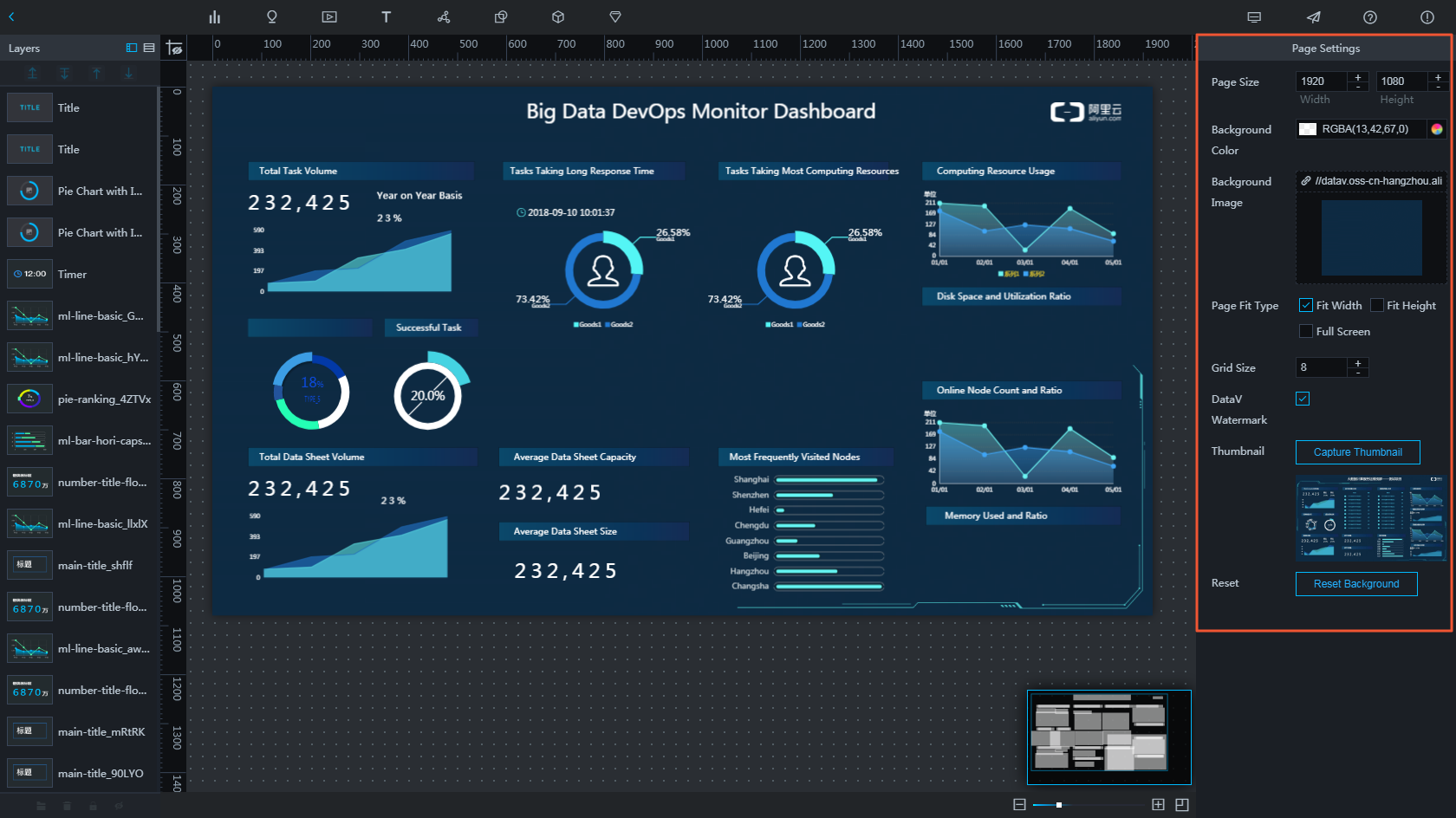
Field | Descriptions |
Screen Size | The screen resolution. Default value: 1920 × 1080. Unit: pixels. |
Background Color | Adjusts the background color of the visualization application. |
Background image | Upload a background image that does not exceed 1 MB in size as the background image of the entire web page. |
Reset | Click Restore Default Background to restore the page settings to the original state. |
Page Zoom Mode | Select an appropriate page scaling method based on the screen size of the visualization application. If the display screen of your application is a non-standard screen size, we recommend that you use the Full Screen mode. |
Grid Spacing | The grid spacing is the minimum movement unit of a widget on the page. The boundaries of the widget are automatically attached to the edges of the grid based on the grid spacing. The minimum value is 1px. In this case, the widget moves smoothly. |
DataV watermark | Turn off the switch to cancel the DataV watermark. Important The DataV watermark feature is supported only for the Enterprise Edition and later. |
Minimap | Click Capture to capture the thumbnail of the project on the My Visualizations page. You can also click Upload thumbnail to select an image as the thumbnail of the project. |