スコアカードは、データまたは販売実績を視覚的に表現し、現在のステータスをすばやく把握し、迅速な対応を促進します。問題の特定と解決に効果的なツールとして、このトピックでは、スコアカードにデータを追加し、そのスタイルをカスタマイズするプロセスについて説明します。
前提条件
ダッシュボードが作成されていること。詳細については、「ダッシュボードを作成する」をご参照ください。
制限
スコアカードは、[スコアカード タグ/ディメンション] と [スコアカード メトリック/メジャー] で構成されます。
スコアカード タグは、データ ディメンションによって定義されます。リージョンなど、単一のディメンションを選択できます。
スコアカード メトリックは、データ メジャーに基づいています。 1 つ以上のメジャーを選択する必要があり、注文数量や注文金額など、最大 20 のメジャーを含めることができます。
概要
シナリオ
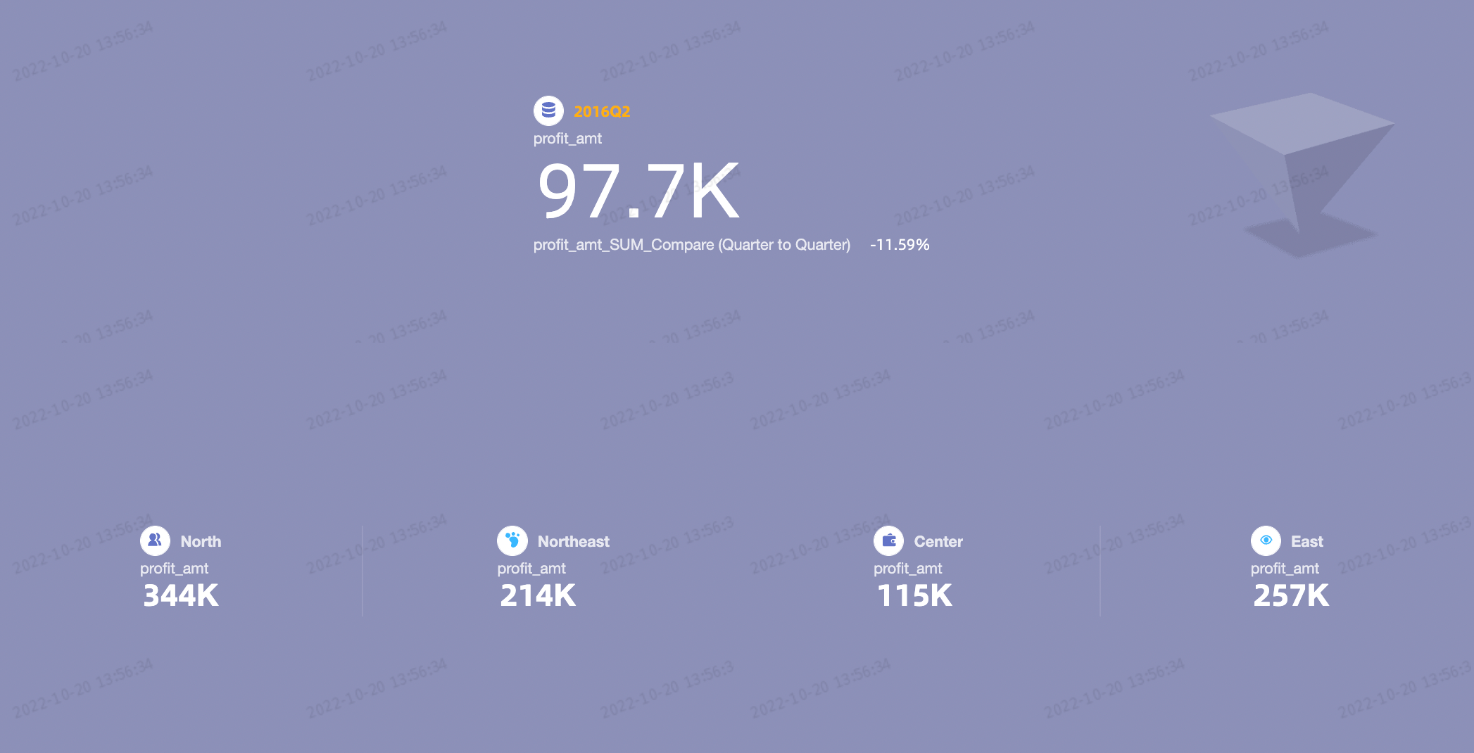
スコアカードは、単一のディメンション内で 1 つ以上のメジャーを表示するために一般的に使用されます。特に、正確なメトリックの読み取りが必要なシナリオで役立ちます。
利点
コンピューティング能力:前年比や前月比の比較のための高度な計算を簡単に設定できます。
視覚化:ロゴでスコアカードを強化し、背景、フォント サイズ、色を好みに合わせて調整できます。
注釈:カスタム テキストまたはメトリックをメモとして組み込み、外部ハイパーリンクを設定して、他のシステムとのデータのやり取りを容易にすることができます。
例
スコアカード データを設定する
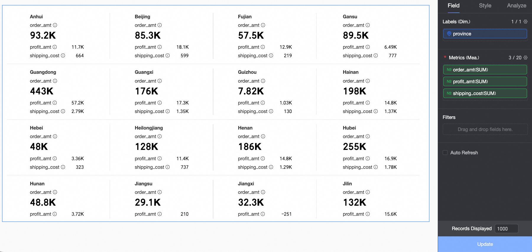
[フィールド] タブで、必要なディメンションフィールドとメジャーフィールドを選択します。
[ディメンション] リストで Province を見つけ、ダブルクリックするか、[scorecard タグ/ディメンション] エリアにドラッグします。
[メジャー] リストで、「Order Amount」、「Shipping Cost」、および「Profit Amount」を見つけて、それぞれダブルクリックするか、[スコアカード メトリック/メジャー] エリアにドラッグします。
説明[スコアカード メトリック/メジャー] エリアでは、最初のメジャーがプライマリ メトリックです。別のメジャーをプライマリ メトリックとして指定するには、[スコアカード メトリック/メジャー] エリア内でメジャーを並べ替えます。
[更新] をクリックします。チャートが自動的に更新されます。
スコアカードのスタイルを設定する
このセクションでは、スコアカードのスタイルを設定する方法について説明します。一般的なチャート スタイル設定については、「チャート タイトルを設定する」をご参照ください。
設定領域の上部にある 検索ボックス構成項目 すべてのカテゴリを展開/折りたたむ ボックスを使用して、設定項目をすばやく見つけます。または、チャートの右側にある アイコンをクリックして、すべてのカテゴリを展開/折りたたみます。
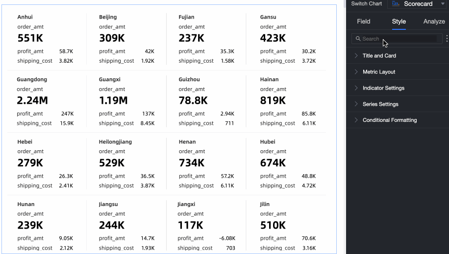
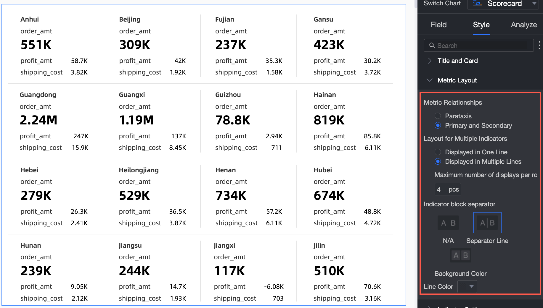
メトリック レイアウト で、メトリック ブロックのレイアウト スタイルをカスタマイズします。
チャート設定項目
説明
[メトリック間の関係]
並列モードとプライマリ-セカンダリモードをサポートしています。
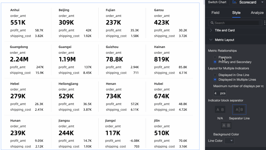
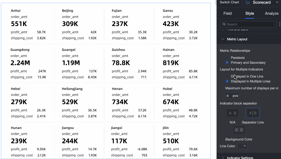
[メトリック ブロック グループの表示形式]
左右のスライドと改行タイル方式をサポートしています。また、スコアカードでインジケーターブロックの1 行あたりの数を設定することもできます。
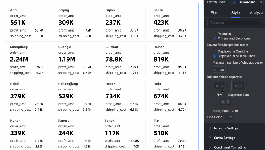
メトリック ブロックの区切り
なし、行区切り、背景塗りつぶしをサポートしています。 行区切りの場合は、区切りの色を設定できます。 背景塗りつぶしの場合は、メトリック ブロックの背景色と間隔を設定できます。
メトリックコンテンツでは、メトリックブロック内のコンテンツの位置と表示スタイル、フォントサイズ、およびメトリック装飾グラフィックのスタイルを調整します。
チャート設定項目
説明
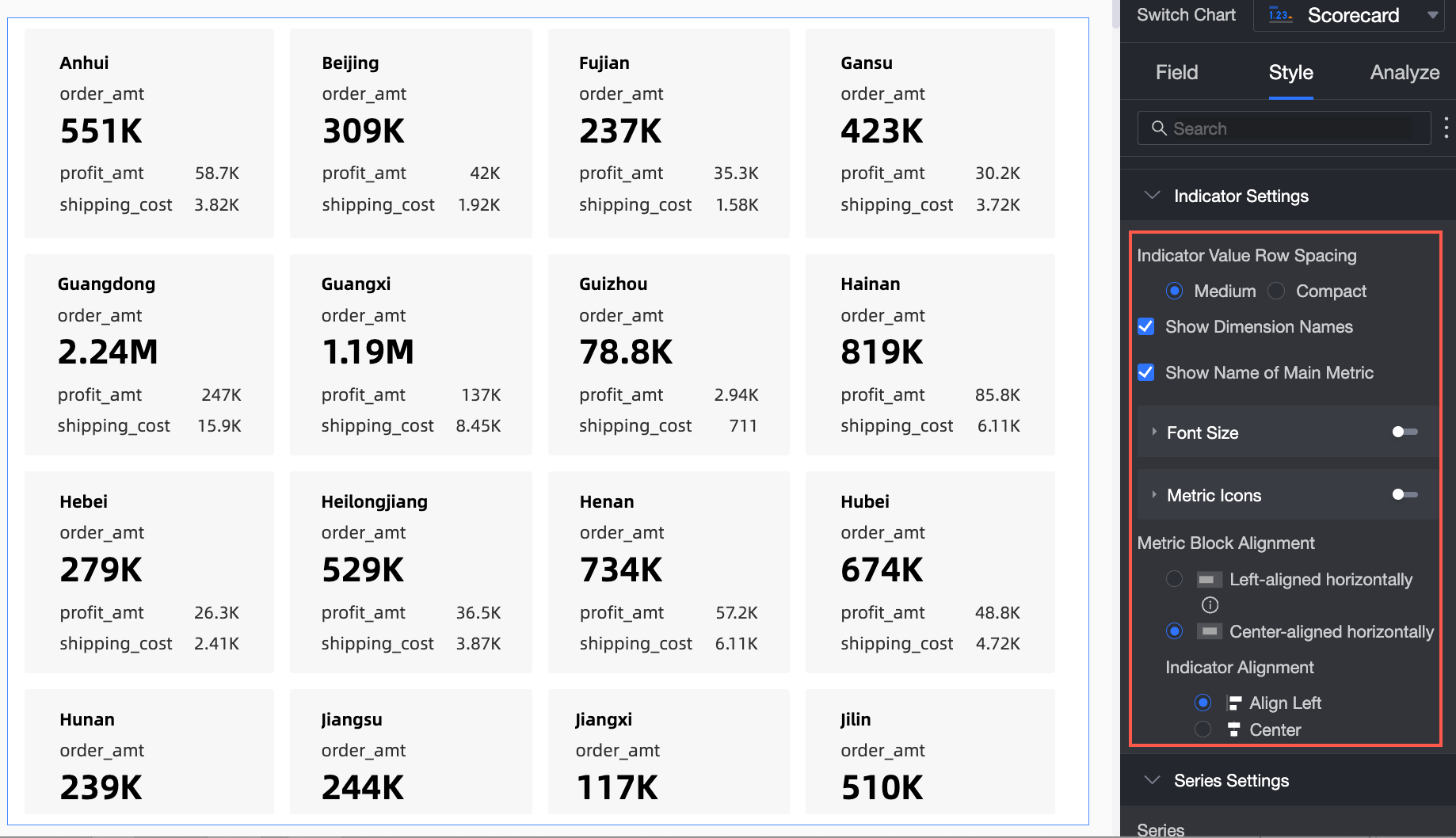
メトリック値の行間
標準モードとコンパクトモードをサポートしています。
ディメンション名を表示
スコアカードにディメンションの名前を表示するかどうかを設定します。
プライマリ メトリック名を表示
スコアカードにプライマリ メトリックの名前を表示するかどうかを設定します。
フォント サイズ設定
フォントサイズ設定を有効にするかどうかを構成します。有効にした場合、ディメンション [名前]、[プライマリメトリック名]、[プライマリメトリック値]、および [セカンダリメトリック名と値] のフォントサイズ、色、太字、斜体スタイルを構成できます。
説明[スコアカード メトリック/メジャー] 領域では、最初のメジャーがプライマリ メトリックです。その他のメジャーはセカンダリ メトリックです。
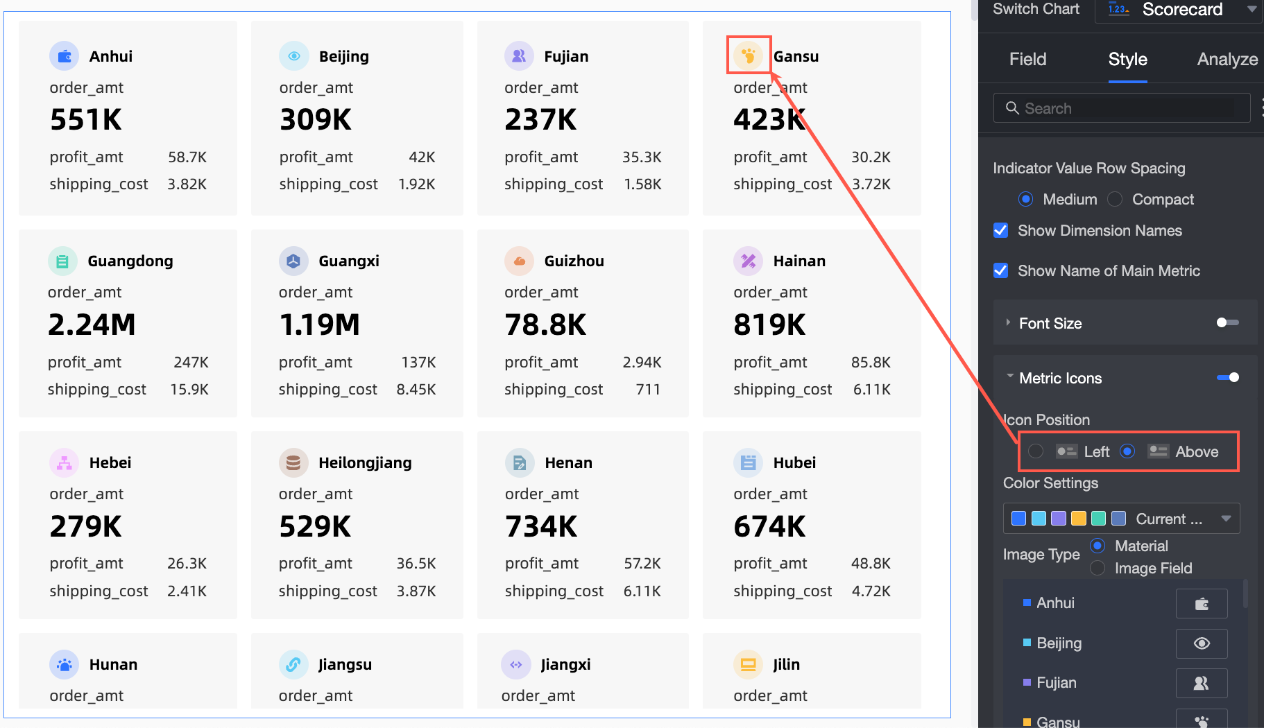
メトリック装飾グラフィック
プライマリ メトリック装飾グラフィックを表示するかどうかを設定します。有効にした場合は、装飾グラフィックの位置、配色、種類、スタイルを設定できます。
位置は、左モードと上モードをサポートしています。
配色では、装飾グラフィックの色を設定できます。
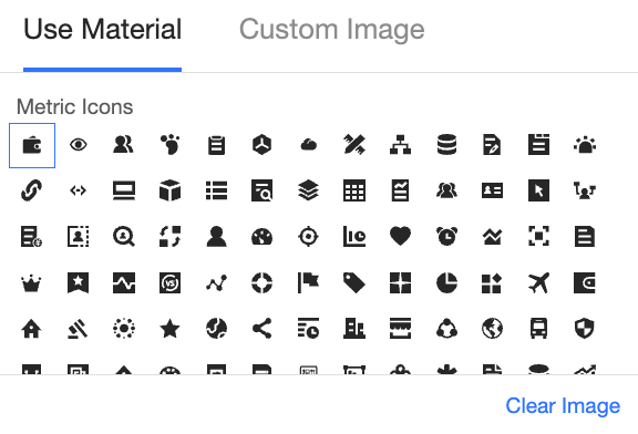
種類は、マテリアルと画像フィールドをサポートしています。
データセットイメージ フィールド
 [データセット画像フィールド] に が含まれていて、フィールド タイプが画像 () の場合にのみ使用できます。
マテリアルを選択すると、マテリアルアイコンを使用したり、カスタム ローカル画像をアップロードしたりできます。
説明PNG、JPG、GIF 形式のみがサポートされており、最大サイズは 1 MB です。
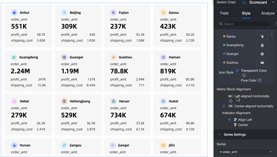
スタイルは、透明モードと単色モードをサポートしています。
メトリック ブロック内のコンテンツの位置
メトリック ブロック内のコンテンツの表示位置を設定します。 水平方向左揃えモードと水平方向中央揃えモードをサポートしています。 水平方向中央揃えの場合は、メトリックとの配置を設定できます。これは、左揃えと中央揃えをサポートしています。
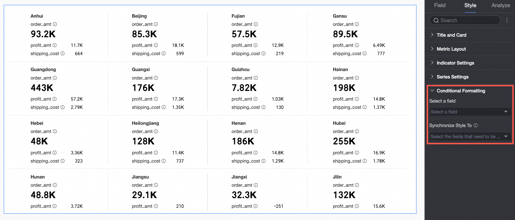
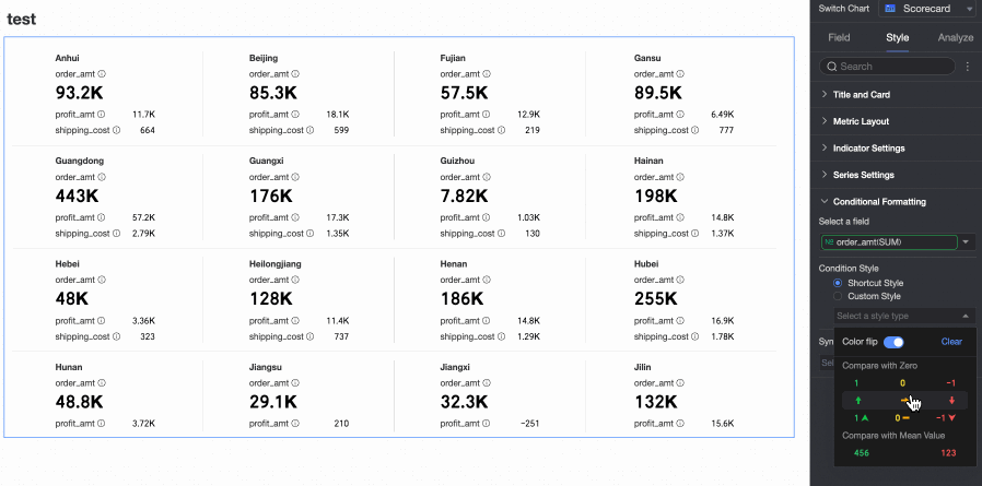
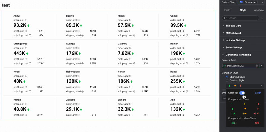
[条件付き書式] で、メジャー データの条件付き書式ルールを設定します。
チャート設定項目
説明
[フィールドを選択]
条件付き書式を設定するフィールドを選択します。 [スコアカード メトリック/メジャー] 領域に追加された任意のメジャーを選択できます。
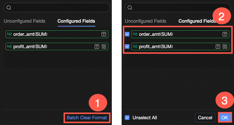
スタイル構成の完了後、構成済みの特定の条件付きフォーマットが不要になった場合は、フィールドパネルの右下隅にある [一括消去フォーマット] をクリックします。リストから消去する条件付きフォーマットを選択し、[OK] をクリックして消去を完了します。
[クイック スタイル]
システム提供のスタイルから、現在のメジャー フィールドのマーカー アイコンまたはフォント表示色を設定します。
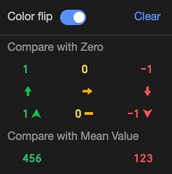
比較:0 との比較と平均との比較をサポートしています。
色の反転
たとえば、0 との比較では、0 未満の値は赤、0 より大きい値は緑です。反転後、0 未満の値は緑、0 より大きい値は赤になります。
削除: 設定済みのクイックスタイルが不要になった場合は、 [削除] をクリックしてスタイルを削除します。

[カスタム スタイル]
システム提供のクイック スタイルに加えて、必要に応じて現在のメジャー フィールドのカスタム スタイルを設定できます。
テキスト
 [テキスト] タブで、現在のメジャー フィールドのテキストをハイライト表示する条件を構成します。他のフィールドの値に基づいて条件を構成できます。
アイコン
 [アイコン] タブで、現在のメジャー フィールドのマーカー ルールを構成します。他のフィールドの値に基づいてマーカー ルールを構成できます。
[スタイルを同期]
現在のメジャーの条件付き書式設定を他のメジャーに複製します。
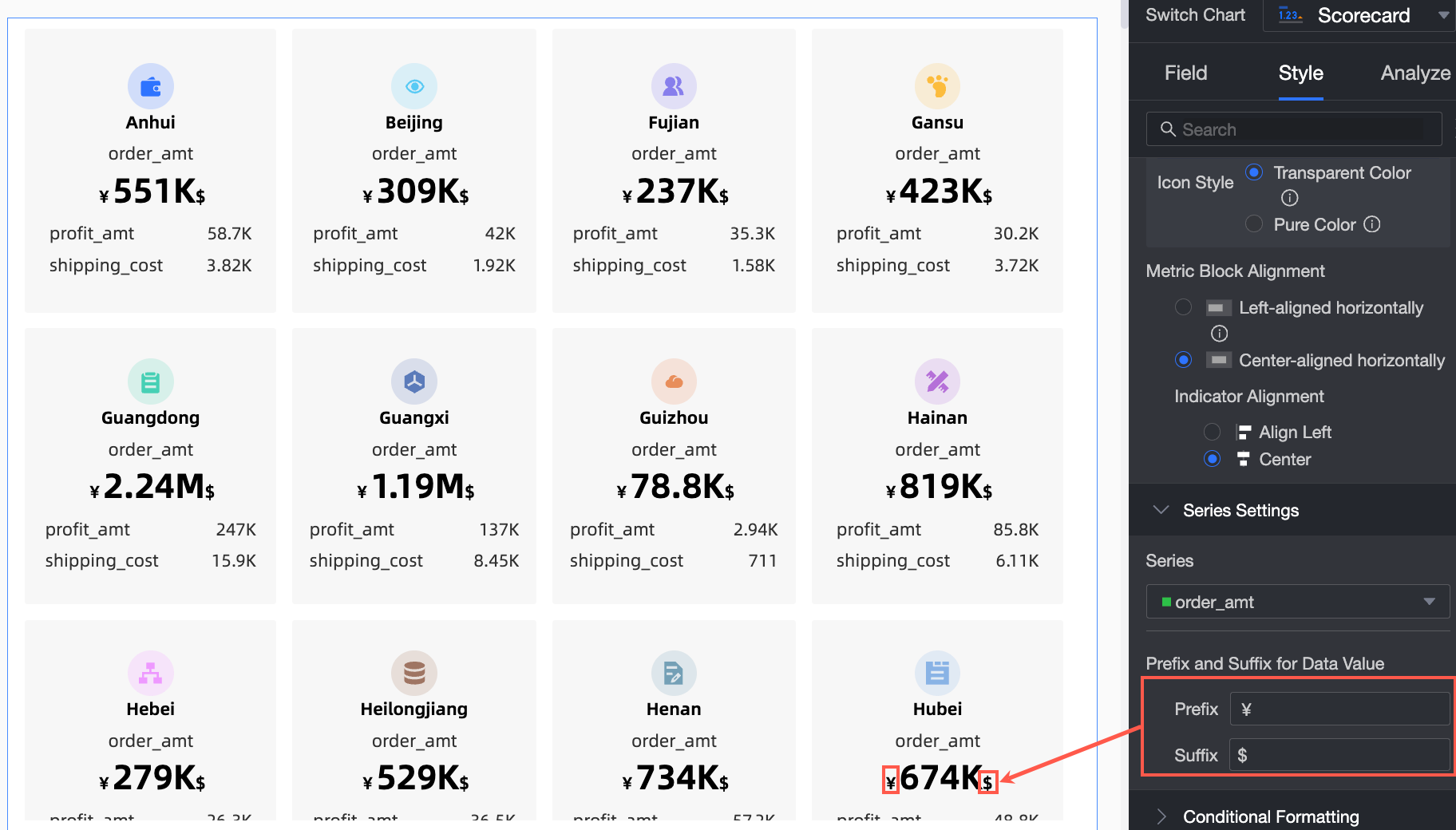
[系列設定] 内で、系列とメトリックデータ値のプレフィックスとサフィックスを構成します。
チャート設定項目
説明
[シリーズを選択]
[スコアカード メトリック/メジャー] 領域に追加されたメジャーを選択します。
[メトリック データ値のプレフィックスとサフィックス]
メトリック データ値のプレフィックスとサフィックスを設定します。
チャート分析を設定する
設定項目 | 名前 | 説明 |
データのインタラクション | [フィルター インタラクション] | 分析するデータが異なるチャートに属している場合は、この機能を設定してチャートを関連付けてからデータを分析できます。詳細については、「フィルター インタラクション」をご参照ください。 |
[ハイパーリンク] | 分析するデータが異なるダッシュボードに属している場合は、ハイパーリンクを設定してダッシュボードを関連付けてからデータを分析できます。ハイパーリンクには、[パラメーター ハイパーリンク] と [外部リンク] が含まれます。詳細については、「ハイパーリンク」をご参照ください。 |
次の手順
他のユーザーがダッシュボードを表示できるようにするには、特定のユーザーとダッシュボードを共有します。詳細については、「ダッシュボードを共有する」をご参照ください。
トピック固有の分析用に調整されたナビゲーション メニューを備えた包括的なダッシュボードを作成するには、ダッシュボードを BI ポータルに統合することを検討してください。詳細については、「BI ポータル」をご参照ください。