This topic describes two methods for configuring chart drilling and filter interaction. It also includes diagrams that illustrate how these features affect the same chart.
Prerequisites
Download the data source file used in this example: Sample sales data.
Create a data source. For more information, see FAQ.
Create a dataset. For more information, see Create a dataset.
In this example, the dataset is named company_sales_record.
Edit the dataset and create a dashboard. For more information, see Drilling.
Method 1: Start with drilling configuration
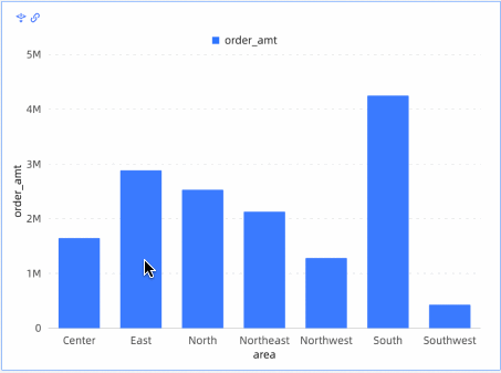
This example uses a column chart in a regional sales report to demonstrate how to configure and display drilling and filter interaction.
On the Sales Amount by Region bar chart's Fields tab, click the
 icon to the right of the target dimension Region.
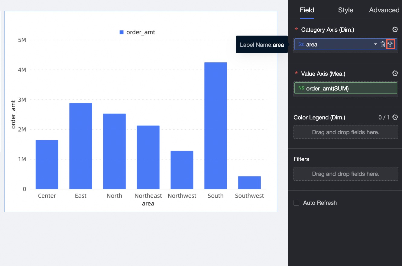
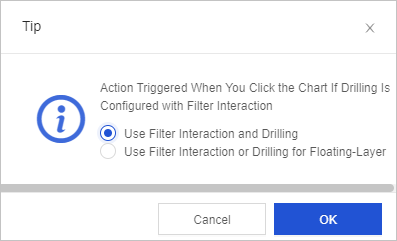
Set how filter interaction and drilling are triggered when you click the chart. You can choose Take effect simultaneously or Select filter interaction or drilling from a floating layer. For this example, choose Select filter interaction or drilling from a floating layer.
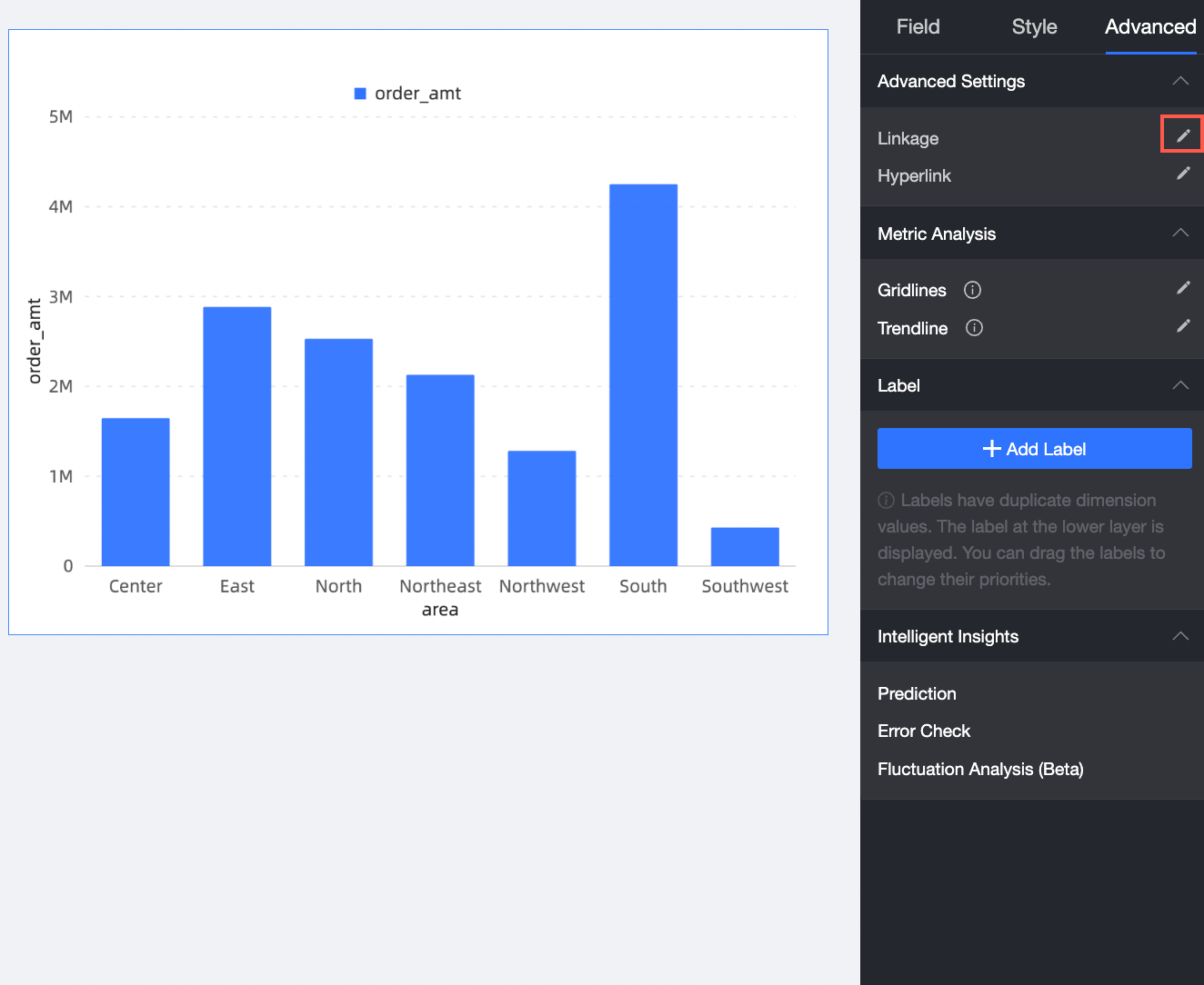
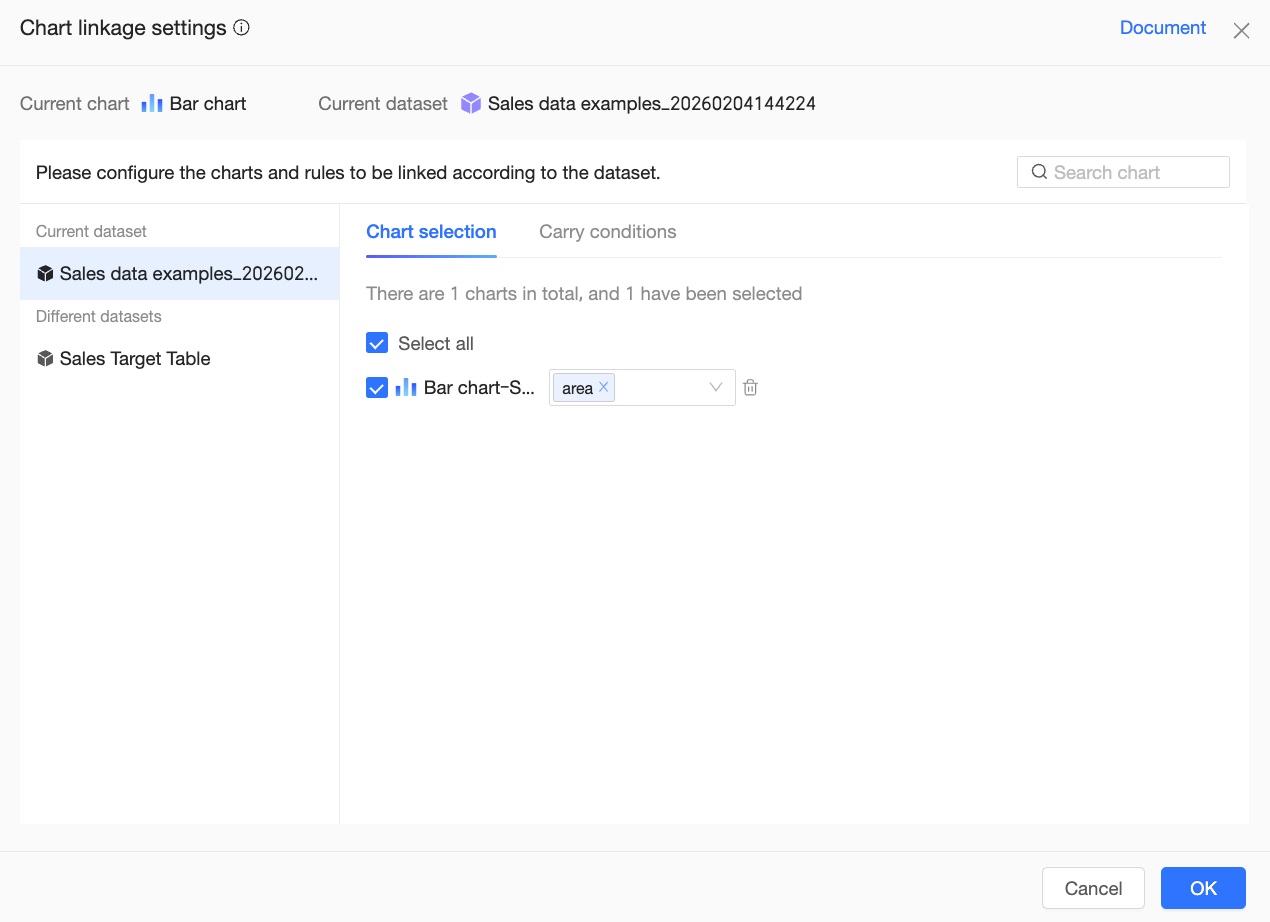
On the Analysis tab for the Sales Amount by Region column chart, click the edit icon next to Filter Interaction.
On the Chart Filter Interaction Settings page, select the region dimension field to associate. Then, associate the charts and click OK.
 Note
NoteThe current chart can be associated with charts from the same dataset or different datasets.
When you configure filter interaction for mobile clients, you can choose whether to trigger the interaction directly when a user taps a data point, if only the interaction dimension is configured.
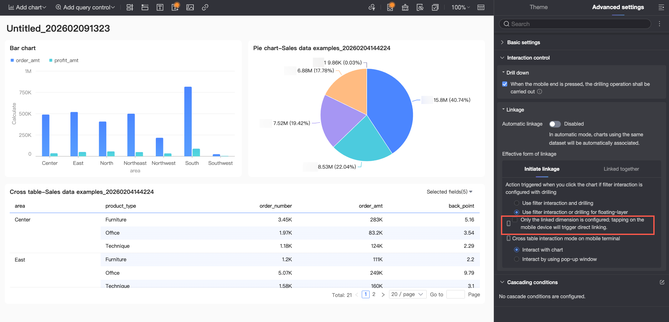
If you select this option, the interaction is triggered directly. When a user taps a data point, the system filters other associated charts on the dashboard based on the value of that data point.
If you do not select this option, the interaction is triggered manually. When a user taps a data point, the system highlights the data point in the chart and displays the filter interaction option in a floating layer or tooltip. The user must then manually confirm the action.
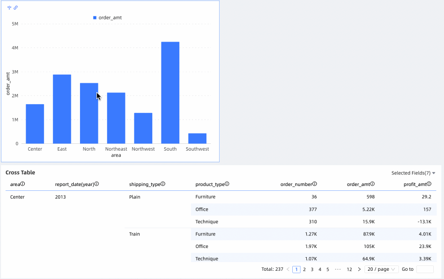
In the Sales Amount by Region column chart, click East China. In the pop-up window, select Filter Interaction.
The Orders by Region cross table now shows the order details for the East China region.
Method 2: Start with advanced configuration
This example uses a column chart in a regional sales report to demonstrate how to configure and display drilling and filter interaction.
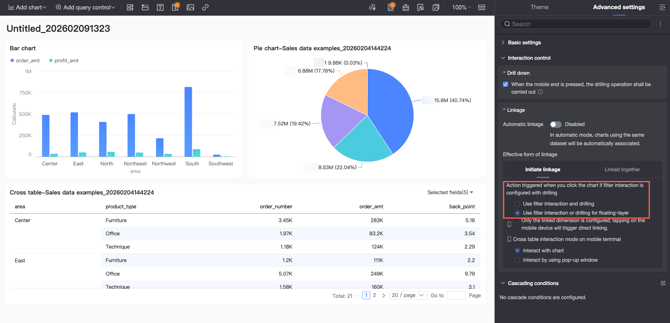
On the dashboard edit page, go to the Advanced Configuration tab. Set how filter interaction and drilling are triggered when you click a chart. You can choose Take effect simultaneously or Select filter interaction or drilling from a floating layer. For this example, choose Select filter interaction or drilling from a floating layer. This is a global setting that applies to all charts on the current dashboard.
On the Analysis tab for the column chart, click the edit icon next to Filter Interaction.
On the Chart Filter Interaction Settings page, select the region dimension field to associate. Then, associate the charts and click OK.
The current chart can be associated with charts from the same dataset or different datasets.
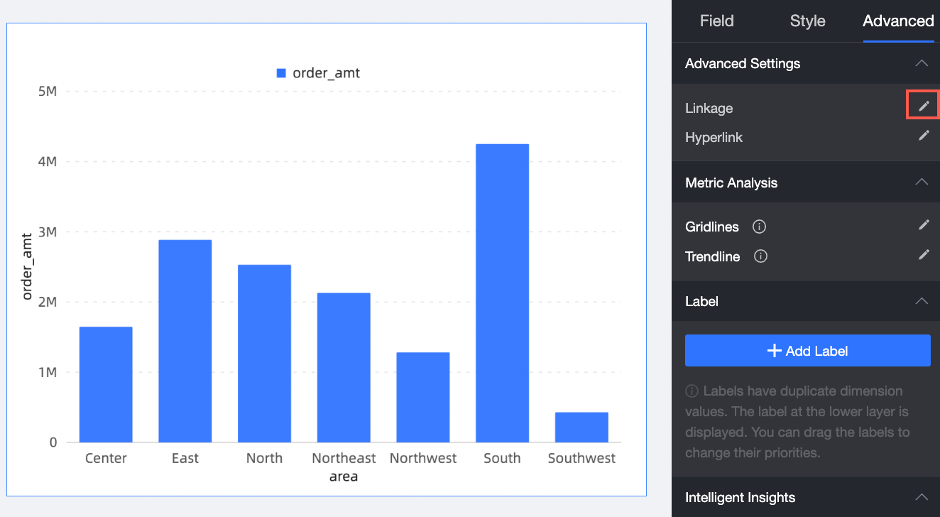
In the Sales Amount By Region column chart, on the corresponding Analysis tab, click the
 icon to the right of the target dimension Region.
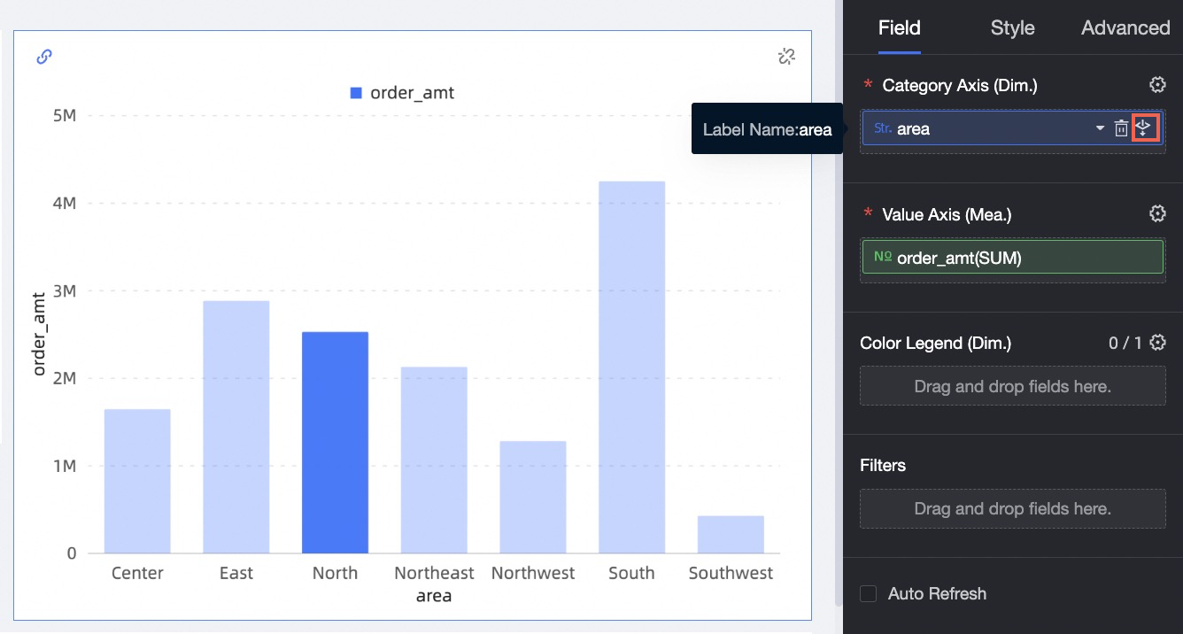
A pop-up window appears for setting the filter interaction trigger method for the current chart. The configuration here overrides the settings on the Advanced Configuration tab of the dashboard. You can set the trigger method for the current chart as needed. In this example, keep the column chart's setting consistent with the global setting. Choose Select filter interaction or drilling from a floating layer.
In the Sales Amount by Region column chart, click East China. In the pop-up window, select Drill Down.
The column chart for the region now shows the sales details for each province within the East China region.