By Damo from F(x) Team
Currently, the Flexbox layout is one of the most popular Web page layout methods. It brings great flexibility and convenience to Web developers designing the UI layout of pages or components. It is the great flexibility that hides some useful but little-known tricks. If you are Flexbox savvy or very familiar with its specifications, you probably have heard of them. However, these little things may confuse you and cause unnecessary trouble.
To optimize the Flexbox layout of imgcook, I read the Flexbox specifications again and realized I had neglected some important information. So, I put up everything I learned in this article, including the Flexbox layout, CSS writing, logical properties, and element justification. Hopefully, it is helpful for those that want to learn more about Flexbox or have problems when using it.
A unified terminology helps us discuss and solve problems better. The following figure indicates the terms generally used when we talk about Flexbox:
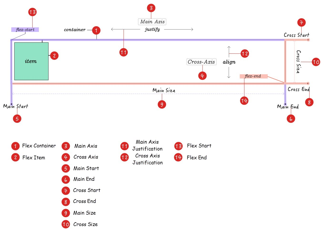
Main Axis and Cross Axis are concepts only applied in the Flexbox layout system. The Main Axis runs horizontally, and the Cross Axis runs vertically. However, it may not be the case in other topics. In addition to the value of flex-direction of Flexbox, the Main Axis and Cross Axis are also affected by the CSS writing mode (writing-mode and direction) and the HTML dir property!
In CSS Box Alignment Module Level 3, two new concepts were introduced, namely the Block Axis and Inline Axis:
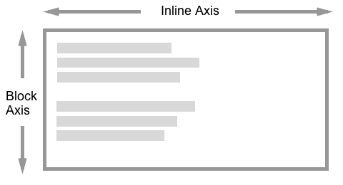
A Block Axis is also called a Column, and an Inline Axis is also called a Row:
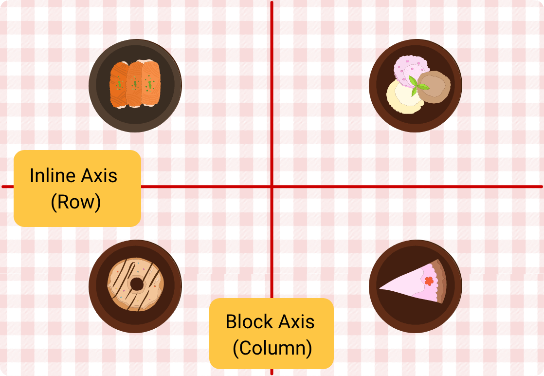
So far, the Flexbox and the Grid specifications have described alignment methods. In CSS, alignment methods are managed in the Box Alignment module. So, the "axis" or "axes" mentioned in the following paragraphs tends to be Block Axis and Inline Axis. In the Flexbox layout:
Likewise, the Block Axis and the Inline Axis are also subject to the CSS writing mode (writing-mode and direction) and the HTML dir property. In the Flexbox layout, they are also influenced by flex-direction.
writing-mode and direction in the CSS Writing Modes Level 3 specification and dir in the HTML can change the direction of the Main Axis and Cross Axis.
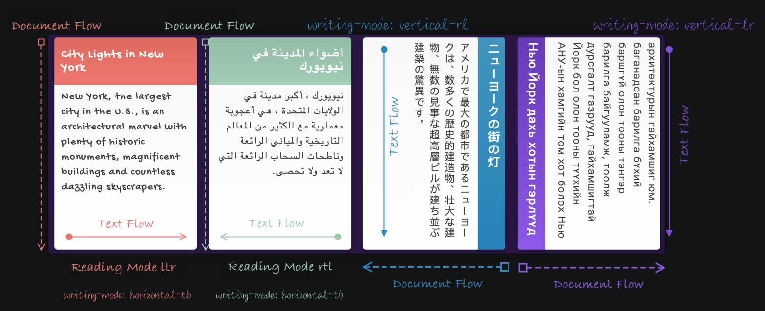
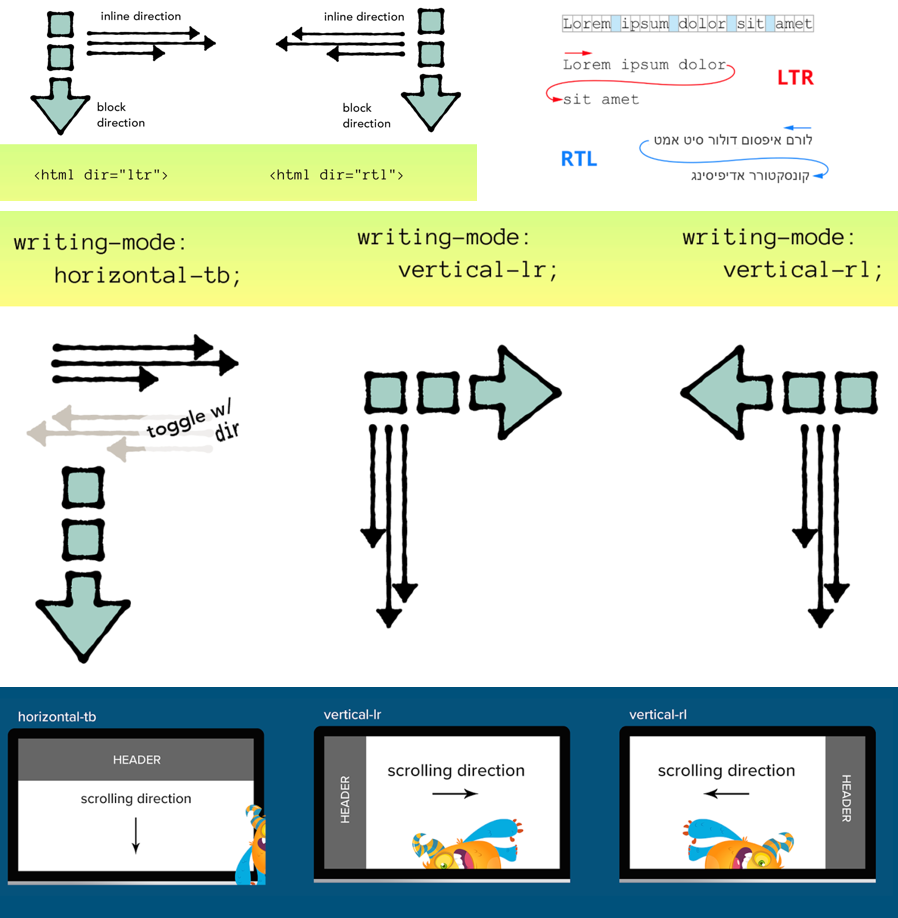
When the Block Axis, Inline Axis, and writing mode are established, Block Start, Block End, Inline Start, and Inline End can be determined:
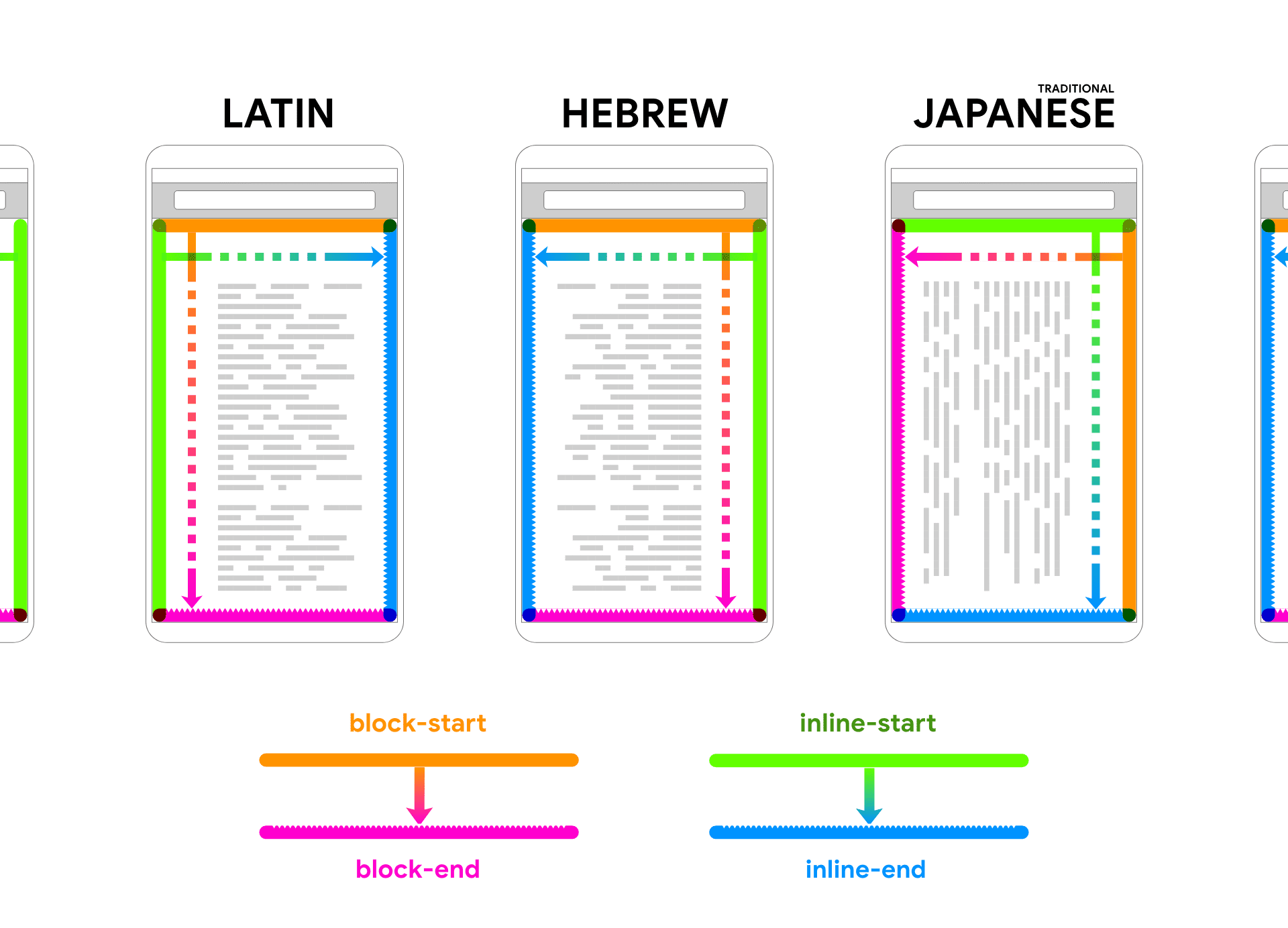
In the Flexbox layout:
The CSS Logical Properties and Values Level 1 specification introduced block-start, block-end, inline-start, and inline-end, but they are not equivalent to flex-start, start, flex-end, and end of Flexbox, Grid, and Box Alignment. They don’t belong to the same world. These properties correspond to physical properties top, right, bottom, and left:
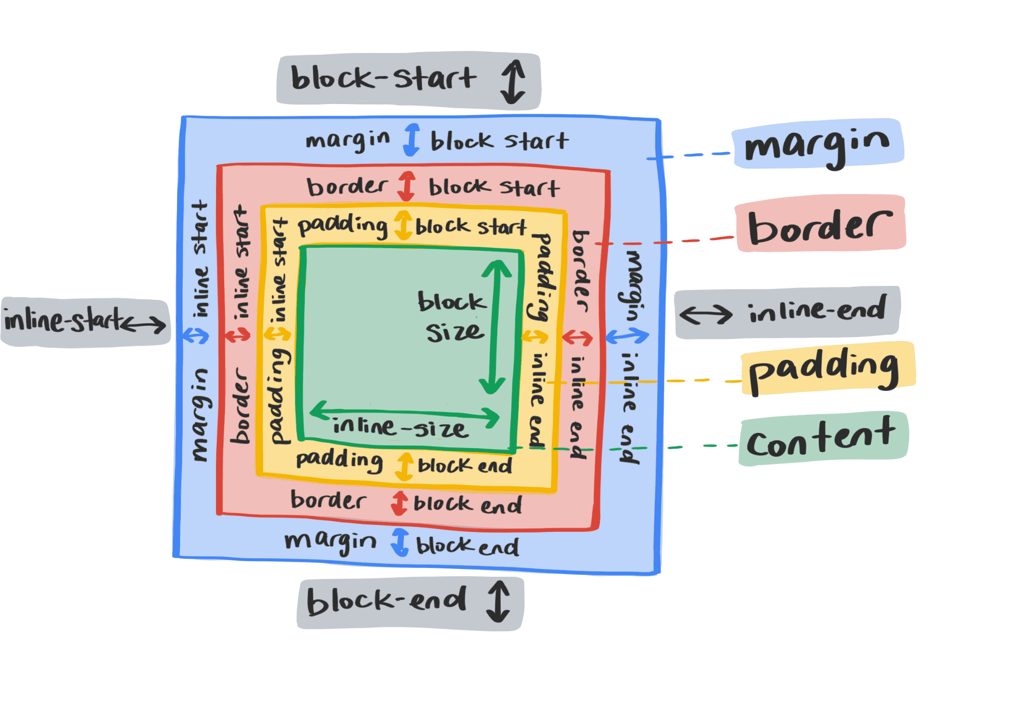
In other words, after CSS logical properties are introduced, the CSS box model will be divided into a physical box model and logic box model:
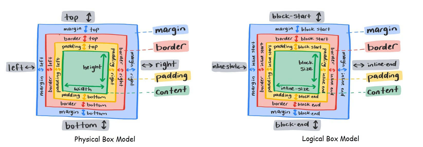
CSS properties are also divided into logical properties and physical properties:
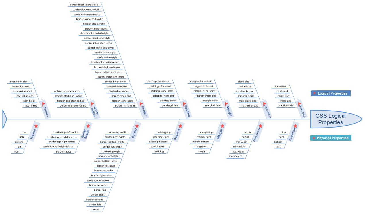
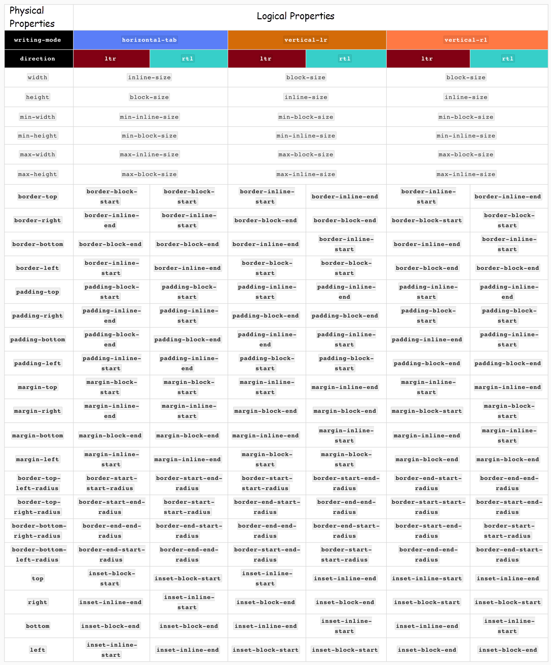
Note: CSS logical properties are also affected by CSS writing mode writing-mode, direction, property, and HTML dir property. Different combinations have different effects:
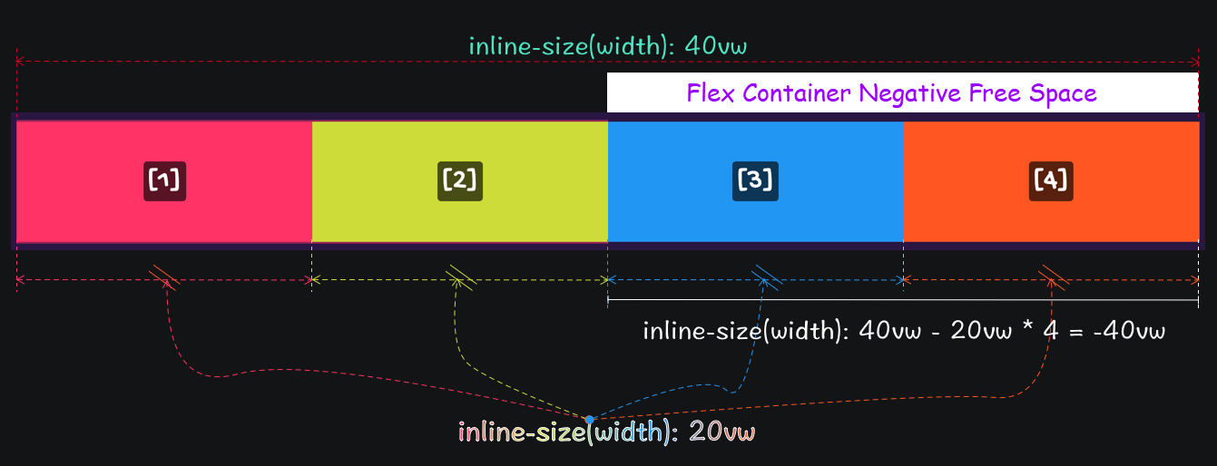
In the Flexbox Layout module, the Flex container may have one or more Flex items. The total size of Flex items may be greater or less than the Flex container:

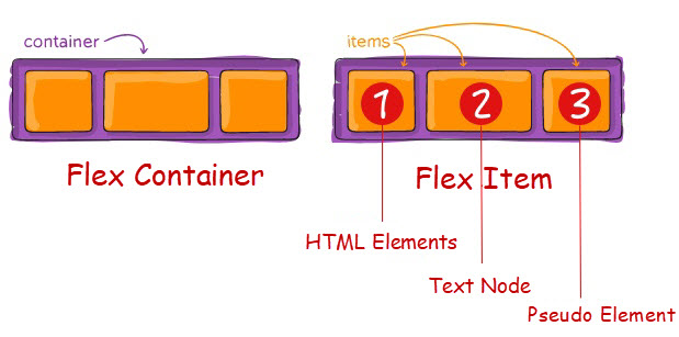
Set the value of display to flex or inline-flex, and then the container becomes a Flex container. The child elements of the container include text nodes and pseudo-elements.
The image below shows specific scenarios that use flex and inline-flex:

If the value of display of the element is specified explicitly to flex or inline-flex, Flex items calculate their size by their content when size-related properties are not specified explicitly.
display: flex, when the Flex container does not specify a width-related property explicitly, its width is equivalent to its parent container (equivalent to width:100%)display: inline-flex, when the Flex container does not specify the width-related property explicitly, its width is equal to the total width of all Flex items.
When the total width of all Flex items in the Flex container is larger than the Flex container:
display: flex, Flex items overflow the Flex container.display: inline-flex, Flex items stretch the Flex container, which may cause the Flex container to overflow its parent element (or ancestor element.)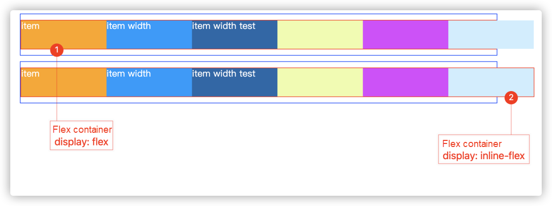
It’s better to use display: inline-flex with min-width and min-height. It’s not recommended to specify width and height explicitly.
When display is set to flex, the Flex container appears to be a block container while it is actually a Flex container. The context format is Flexbox Formatting Content (FFC), so some layout properties for Block formatted Content are no longer applicable. For example:
column -* property does not work on Flex containers.float and clear properties do not work on Flex items, nor does it get Flex items out of document flow.vertical-align property does not work on Flex items.::first-line and ::first-letter does not work on Flex containers, which do not provide first line or initials formatting for their ancestors.Note: If the value of display is inline-flex, and the element has specified the value of float or position to relative, absolute, or fixed explicitly, the calculated value of display is flex. This means the Flex container performance behavior is equivalent to display: flex.
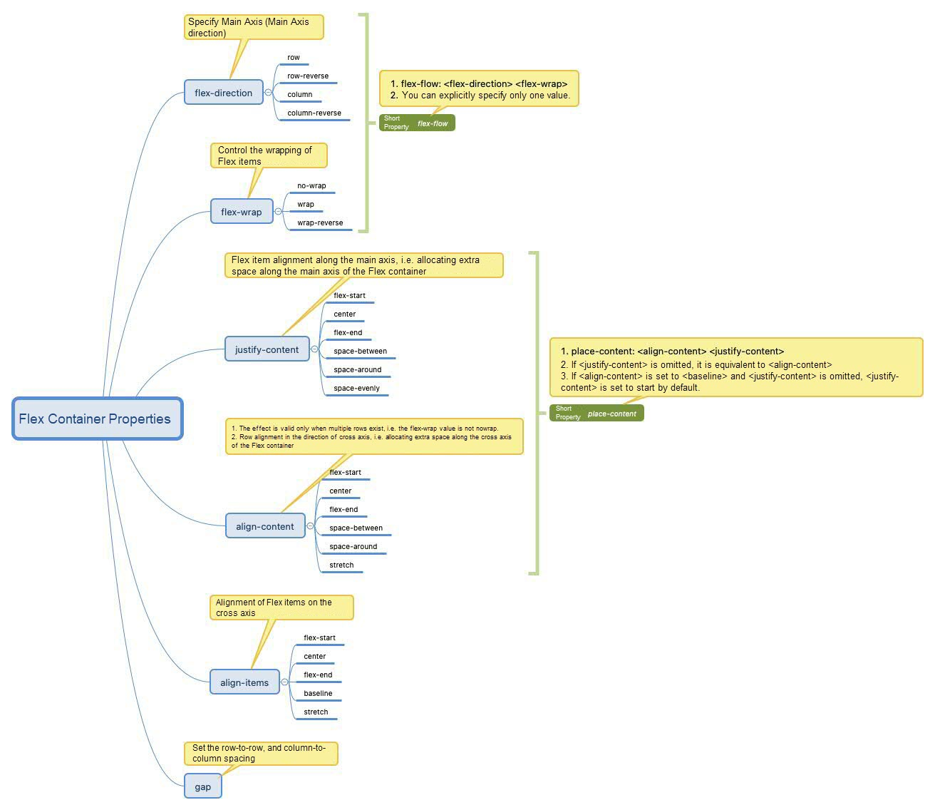
With the flex-direction used explicitly in a Flex container, you can specify the direction of the Main Axis. If the flex-direction property is not specified explicitly, the default value row is used.
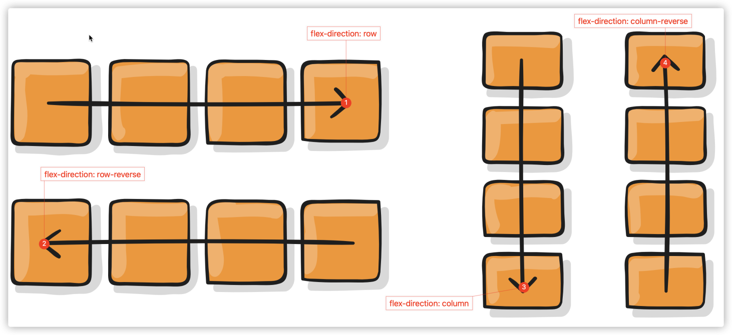
The figure above only shows the reading direction Left-to-Right (LTR). Unless otherwise stated, the following documents will not list different figures based on the mode of reading (CSS writing-mode, direction, and HTML dir property.)
The flex-direction is specified explicitly on the Flex container unless you need to modify the direction of the Main Axis explicitly. For example, the layout method is shown in the following figure:
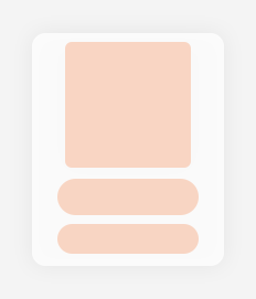
flex-direction: column
row-reverse acts just on the opposite way of default value row and fits the following layout:
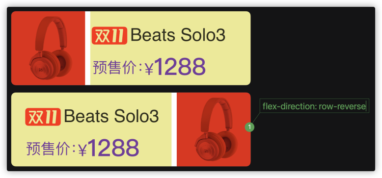
In a Flexbox layout, when specifying the direction of the Flex container Main Axis, flex-direction also affects the order of Flex items. It is very suitable for reverse typesetting without changing the DOM structure. In addition, the explicit use of the order property in Flex items can also perform the sorting of Flex items as needed without affecting the DOM structure.
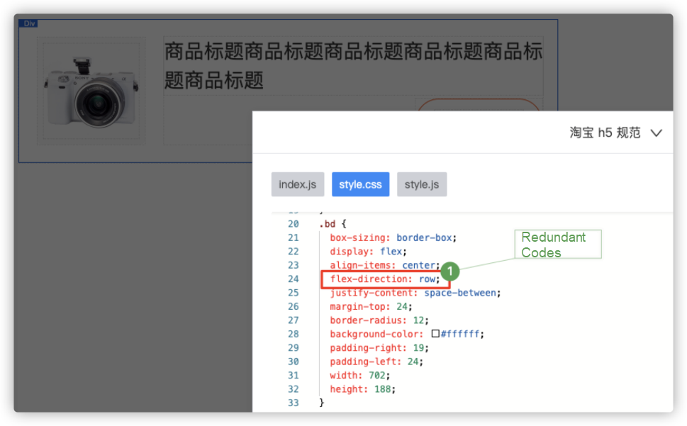
When using Flexbox layout in imgcook, the value of flex-direction, including the default value row is specified explicitly on the Flex container. In the layout algorithm optimization, you can take actions to specify the value of flex-direction explicitly only when the value is not row:
You can use flex-wrap to wrap Flex items in a Flex container:
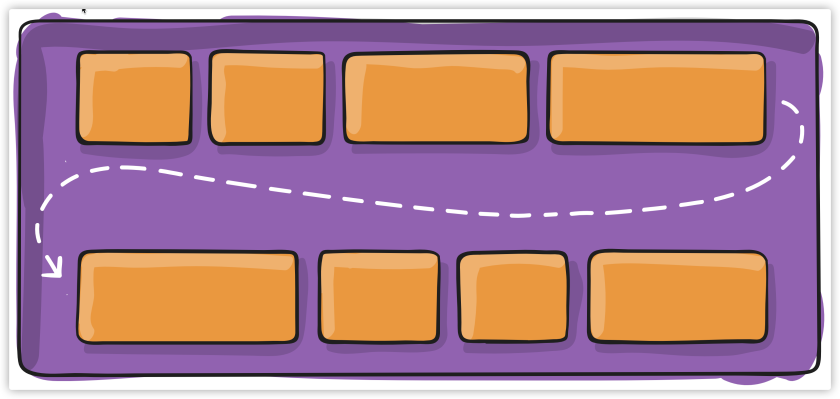
The flex-wrap property only takes effect when the total width of all Flex items is longer than the Flex container main axis.
Flex items are wrapped up when the value of flex-wrap is set to Wrap and wrap-reverse other than nowrap. The effect of wrap-reverse is opposite to that of wrap.
| Combination Effect | Performance Effect |
| Effect 1 | 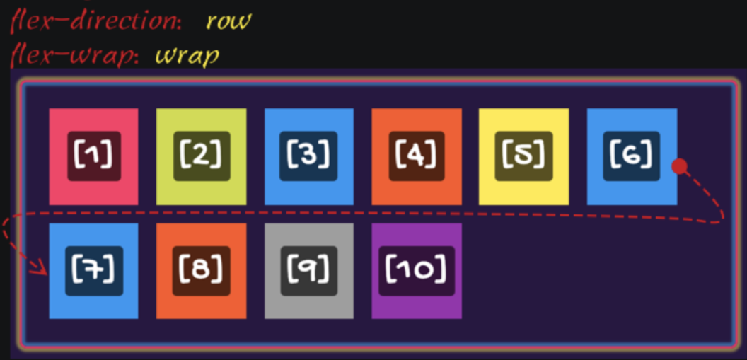 |
| Effect 2 | 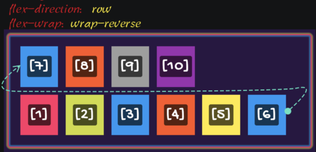 |
| Effect 3 | 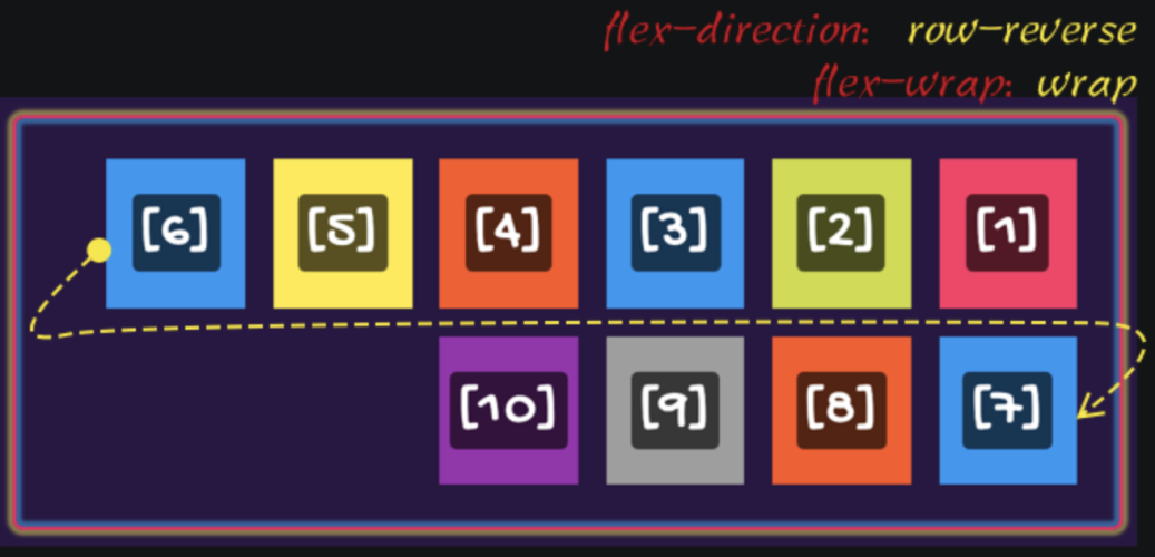 |
| Effect 4 | 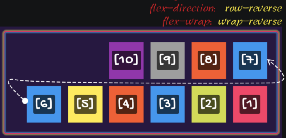 |
| Effect 5 | 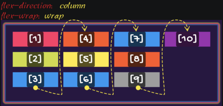 |
| Effect 6 | 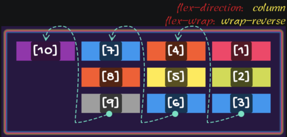 |
| Effect 7 | 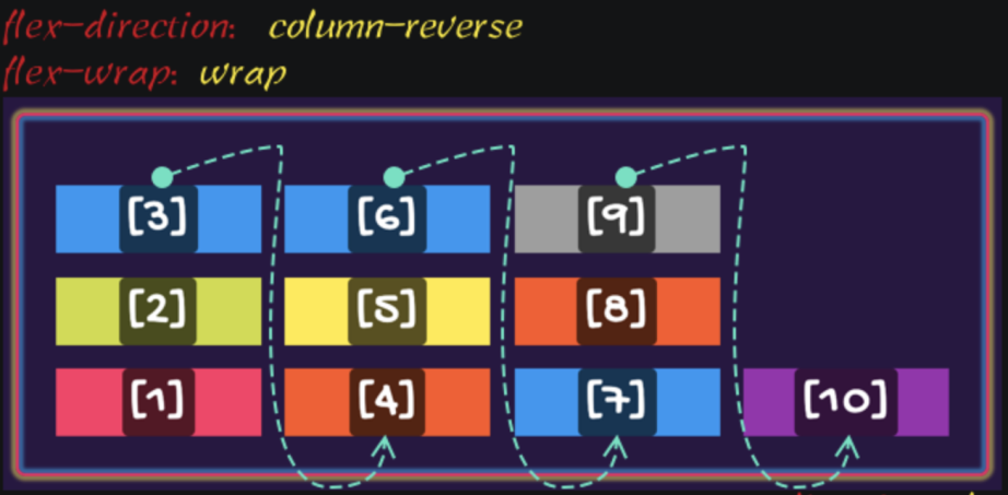 |
| Effect 8 | 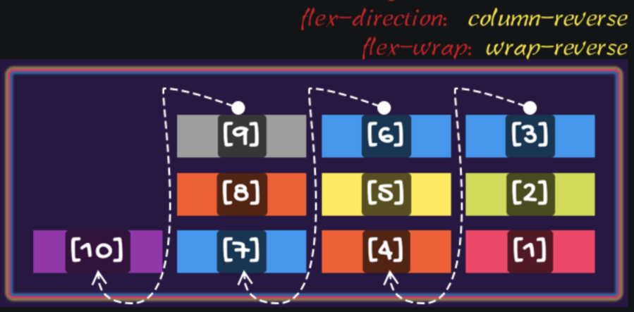 |
flex-direction and flex-wrap can be abbreviated as flex-flow. When using flex-flow, you can specify one or both of the two values explicitly:
flex-flow is specified explicitly with only one value, which matches <flex-direction>. The value of flex-wrap will be initial.flex-flow is specified explicitly with only one value, which matches <flex-wrap>, the value of flex-direction will be initial.flex-flow is specified explicitly with two values, the order of flex-direction and flow-wrap does not matter, which means flex-flow: column wrap and flex-flow: wrap column are equivalent.You can use justify-content in a Flex container to control the alignment of Flex items Main Axis direction and allocate the positive free space in the Flex container in the Main Axis direction. When you use justify-content for the second purpose, the positive free space of the Flex container is allocated according to different alignment methods to both sides of the Flex item, which is controlling the spacing between Flex items.
justify-content is used in the following two specifications:
In a Flexbox Layout module, justify-content has six values:
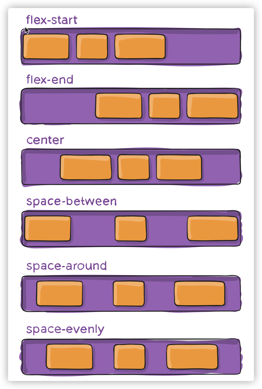
Notice the differences between space-between, space-around, and space-evenly:

space-between makes the starting edge of the first Flex item superimpose on the main start of the Flex container and the ending edge of the last Flex item on the main end of the Flex container, leaving equal spacing between other adjacent Flex items. It has the same effect as flex-start when there is only one Flex item in the Flex container.space-around makes the spacing between the starting edge of the first Flex item and the Flex container main start equal to that between the ending edge of the last Flex item and the Flex container main end and equal to half the spacing between other adjacent Flex items. It has the same effect as center when there is only one Flex item in the Flex container.space-evenly makes the spacing between the starting edge of the first Flex item and the Flex container main start equal to that between the ending edge of the last Flex item and the Flex container main end and equal to the spacing between other adjacent Flex items. It has the same effect as center when there is only one Flex item in the Flex container.If the Flex container has negative free space, the value of justify-content has the following effects:
flex-start: Flex items overflow from the main end of the Flex container.flex-end: Flex items overflow from the main start of the Flex container.center: Flex items overflow from both ends of the Flex containerspace-between has the same effect as flex-start.space-around has the same effect as center.space-evenly has the same effect as center.In the Flexbox layout, you can use these properties to control the free space in the Flex container, such as:
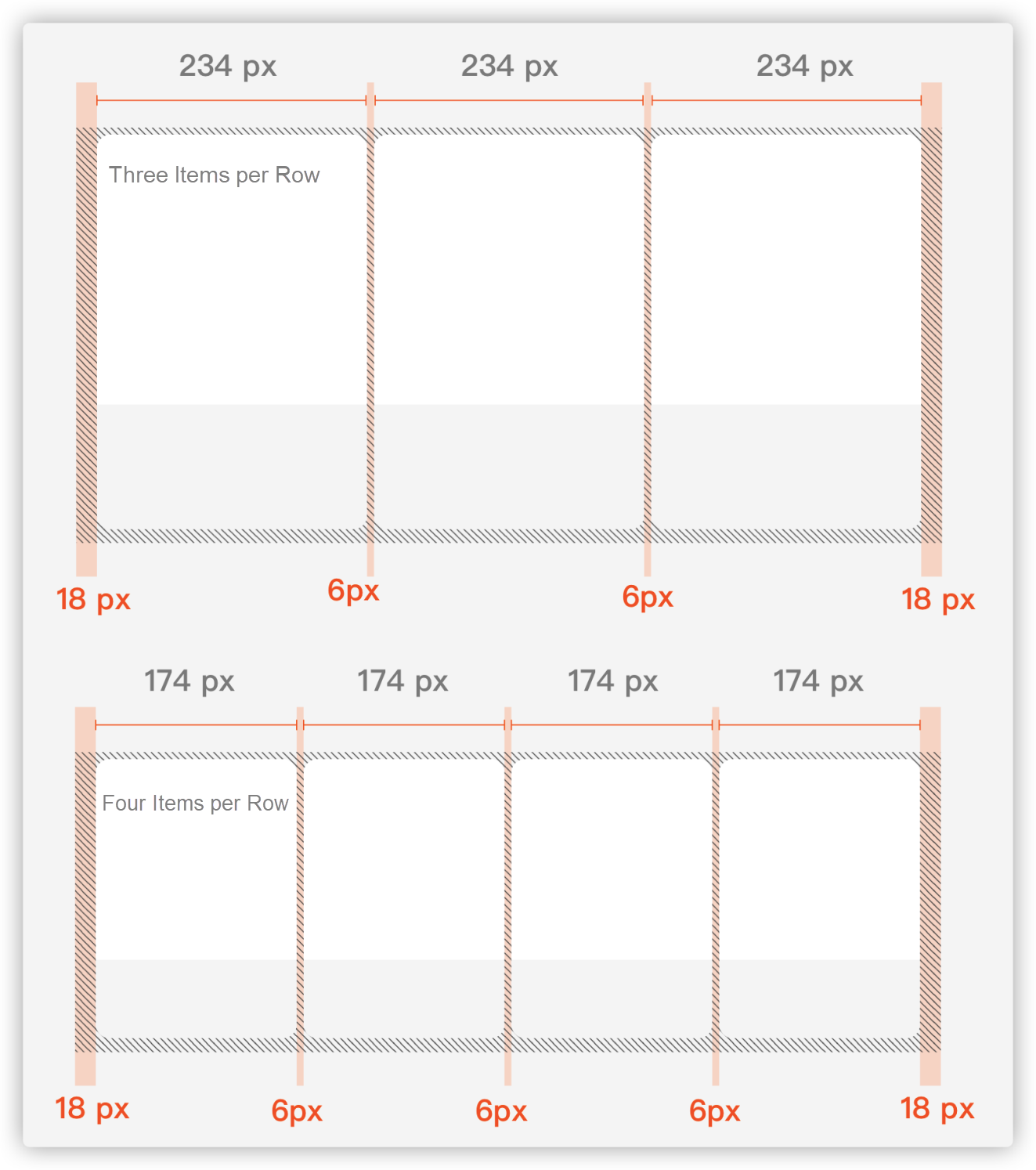
In the Flexbox container, you can use align-items to control the alignment of Flex items on the cross axis.
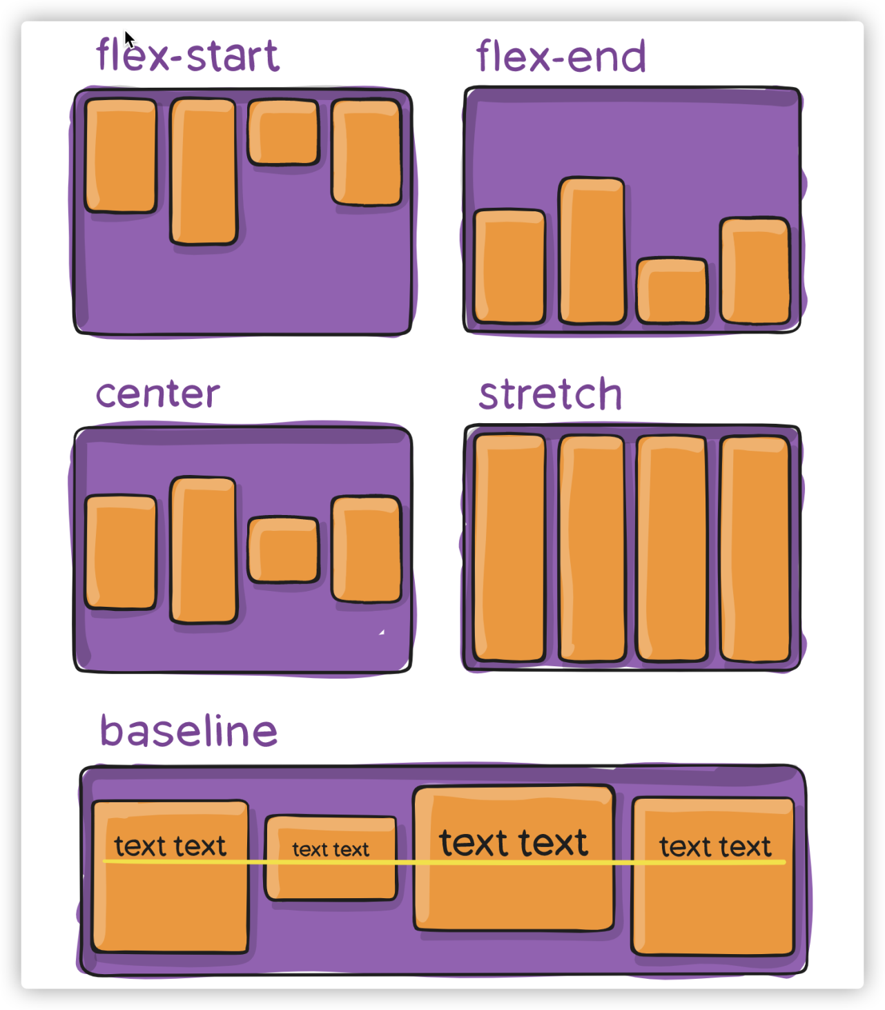
The default value of align-items is stretch. Flex items are stretched to fill the entire Flex container only when the value of height (or width) of Flex items are specified explicitly.
If the Flex container has zero or negative free space:
flex-start: Flex items overflow from the cross end of the Flex container.flex-end: Flex items overflow from the cross start of the Flex container.center: Flex items overflow from both sides of the Flex container.baseline: Flex items overflow from the cross end of the Flex container in a way somewhat similar to flex-start.align-content only applies when the total width of all Flex items is greater than the Flex container Main Axis, and flex-wrap is specified explicitly to a value other than wrap.
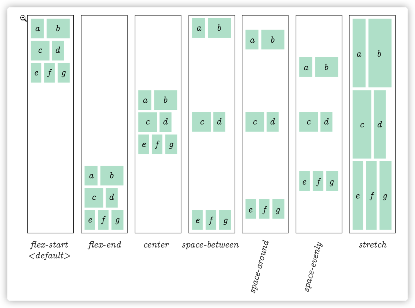
The performance of align-content is somewhat similar to justify-content when it controls the alignment of Flex items along the Main Axis (allocating the positive free space along the Flex container Main Axis), while align-content can control the alignment of multiple rows along the Cross Axis of the Flex container (allocating the positive free space along the Flex container Cross Axis.) You can take the whole row along the Cross Axis when align-content is applied as a single Flex item when justify-content is applied.
Another difference about align-content is that it has an extra stretch value. When the total width of all rows in a Flex container is greater than the Flex container Cross Axis, Flex container cross axis has zero or negative free space:
flex-start: Rows of the Flex container overflow from the cross endflex-end: Rows of the Flex container overflow from the cross startcenter: Rows of the Flex container overflow from both sides of the cross axisStretch has a similar effect with flex-start.space-around has a similar effect to center.space-between has a similar effect to flex-start.space-evenly has a similar effect to center.Gap controls the spacing between Flex items but ignores the spacing between Flex items and the edge of the Flex container:
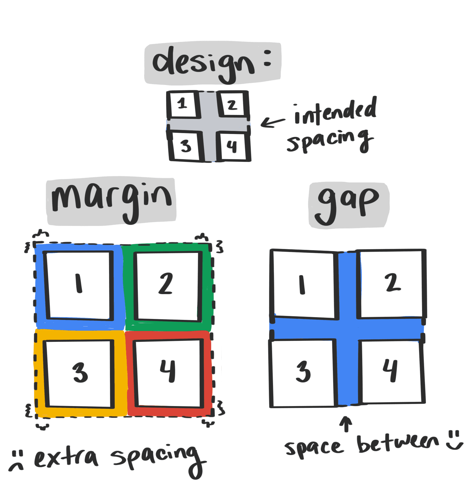
You can use justify-content, align-content, and align-items to allocate space of the Flex container along the Main and Cross Axes, controlling the alignment of all Flex items in the Flex container. If you need to deal with Flex items individually, use align-self:
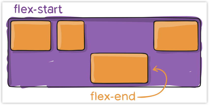
The following figures show the effects of different values of align-self:
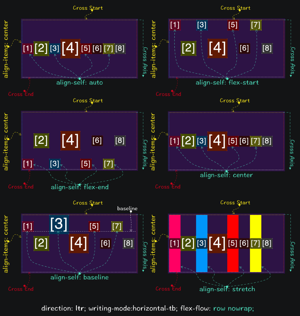
Specifying the value of align-self to auto explicitly does not override align-items of the Flex container. In addition, if you specify the value of margin to auto explicitly, the align-self value of the Flex item will be invalid.

In scenarios similar to the preceding figure, align-self becomes very handy.
You can use flex-direction to order all Flex items in a Flex container in the LTR, RTL, TTB, or BTT direction.
flex-direction: row
flex-direction: row-reverse
flex-direction: column
flex-direction: column-reverse
You can also use order to specify values of Flex items and sort them without changing the DOM structure; the larger the value, the more backward an item is sorted:
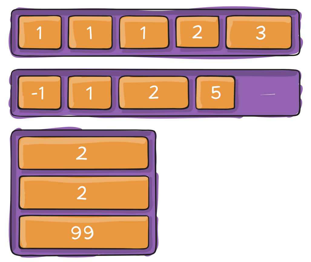
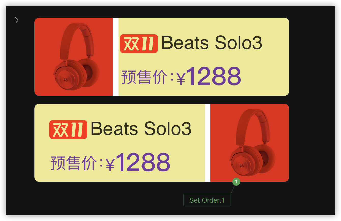
In some cases where you need to swap the position of two items, you can also set order in Flex items in addition to flex-direction:
You can use flex property on Flex items to grow or shrink them according to the free space of the Flex container. It includes three sub-properties: flex-basis, flex-shrink, and flex-grow. These properties have their respective initial values:
flex-grow: 0
flex-shrink: 1
flex-basis: auto
Specifically, flex-grow indicates the expansion ratio, flex-shrink indicates the shrinkage ratio, and flex-basis indicates the scaling basis. The performance details of these three properties are listed below:
flex-grow sets the expansion ratio of a Flex item to gain (expand) some free space of the Flex container (Positive Free Space). This means the Flex item may become larger.flex-shrink sets the shrinkage ratio of a Flex item to reduce some of the Negative Free Space of the Flex container. This means the Flex item may become smaller.flex-basis specifies the initial size of the Flex item in the direction of the Main Axis before it grows or shrinks.You can specify 1 value (single value syntax), 2 values (double-value syntax), or 3 values (triple-value syntax) for flex property.
Single Value Syntax: the value must be one of the following:
<number>), such as flex:1, which is taken as the value of <flex-grow>
width) value, such as flex:30vw , which is taken as the value of <flex-basis>
none, auto, or initial (i.e. the initial value)Double-Value Syntax: The first value must be a dimensionless numeric value, which is taken as the value of <flex-grow>. The second value must be one of the following:
<number>), which is taken as the value of <flex-shrink>
width) value, which is taken as the value of <flex-basis>
Triple-Value Syntax:
<number>), which is taken as the value of <flex-grow>
<number>), which is taken as the value of <flex-shrink>
width), which is taken as the value of <flex-basis>
The value of flex property can be:
auto: Flex items determine their size based on their width and height, but Flex items scale up or down according to the free space of the Flex container. It is equivalent to flex:1 1 auto.initial: Flex items determine their size based on their width and height. They shrink to adapt to the Flex container but do not stretch and absorb the extra free space in the Flex container. It is equivalent to flex:0 1 auto.none: Flex items determine their size based on their width and height. It is completely inelastic, meaning it does not shrink or stretch to fit the Flex container. It is equivalent to flex:0 0 auto.<flex-grow> defines the flex-grow property of Flex items, value: <number>
<flex-shrink> defines the flex-shrink property of Flex items, value: <number>
<flex-basis> defines the flex-basis property of Flex items. If the value is 0, you must add units, so it is not considered scalable.
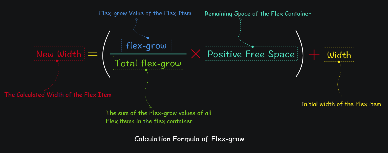
flex-grow Calculation
flex-grow calculation formula:
Example:
If there are four Flex items in the Flex container with specific parameters:
80vw
10vw
10vw x 4 = 40vw
flex-grow are 0, 1, 2, and 3, respectively, and the total value flex-grow of all Flex items is 0 + 1 + 2 + 3 = 6.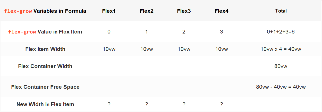
Calculation Process:
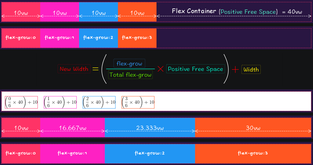
The results are listed below:

The value of flex-grow can also be a decimal. If you change the values of flex-grow in the preceding example into 0, 0.1, 0.2, and 0.3, the total value of flex-grow (the sum of flex-grow of all Flex items) is 0.6, which is less than 1. At this time, Flex items will also divide the free space of the Flex container based on the growth factor of flex-grow. They grow wider, but the free space of the Flex container will not be divided up because the sum of flex-grow of all Flex items is less than 1. In this example, only 60% of the free space of the Flex container is divided.
If the total flex-grow is less than 1, its calculation formula is:
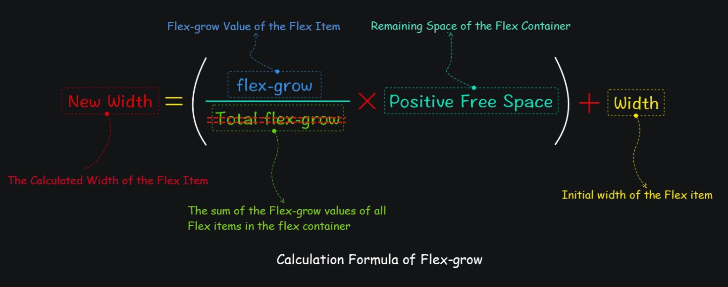

Even when the sum of Flex item flex-grow is greater than 1, it is absolutely not the case that Flex items can divide up the positive free space of the Flex container based on their own flex-grow ration because the size of an element is also impacted by max-width. When the max-width value of a Flex item is specified explicitly, and the calculated width of Flex items based on the flex-grow value is greater than max-width, the max-width value will prevail. In the previous example, if we set the value of max-width of every Flex item to 18vw, the calculation process and result are listed below:
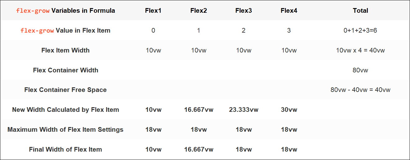
At this time, the free space of the Flex container is not used up, which is 40vw - 0vw - 6.667vw - 8vw - 8vw = 17.333vw. This means the Flex container still has 17.333vw of free space.
If the width-related properties (including flex-basis) of a Flex item are not specified explicitly, the flex-grow value is calculated by the width of Flex item content.
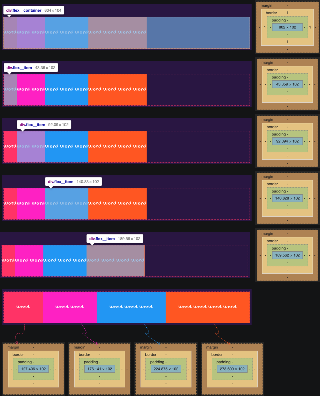
The preceding figure indicates:
804px
43.36px, 92.09px, 140.83px, and 189.56px. The total width is 465.84px.804px - 465.84px = 338.16px.flex-grow of all Flex items is 1. The sum flex-grow of all Flex items is 4.Take the corresponding value to flex-grow in the formula, and the result is:

Note: Different browsers handle decimals differently.
flex-shrink Calculation
flex-shrink calculation formula:
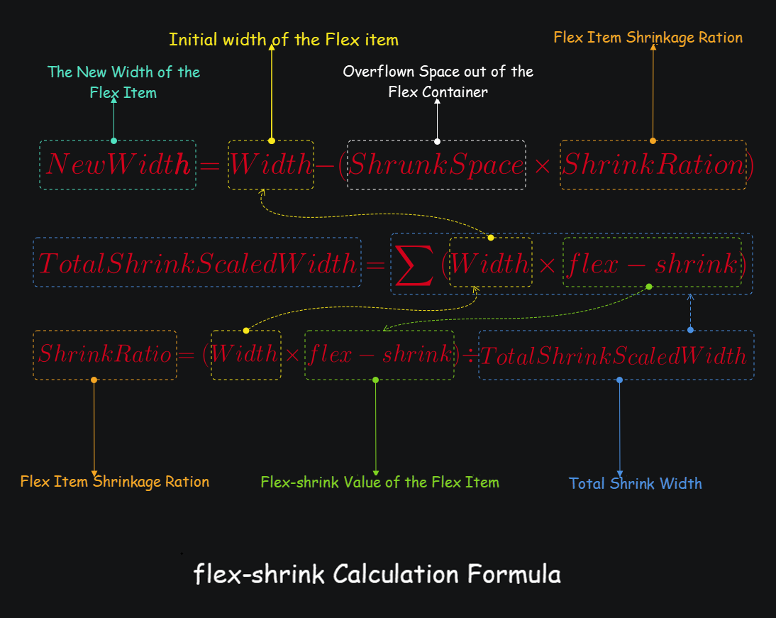
Example:
Let’s assume that the Flex container has four Flex items. The specific parameters are listed below:
40vw.15vw.15vw x 4 = 60vw.40vw - 60vw = -20vw.flex-shrink are 0, 1, 2, and 3, and the total Flex item flex-shrink value is 0+1+2+3=6.
Calculation Process:
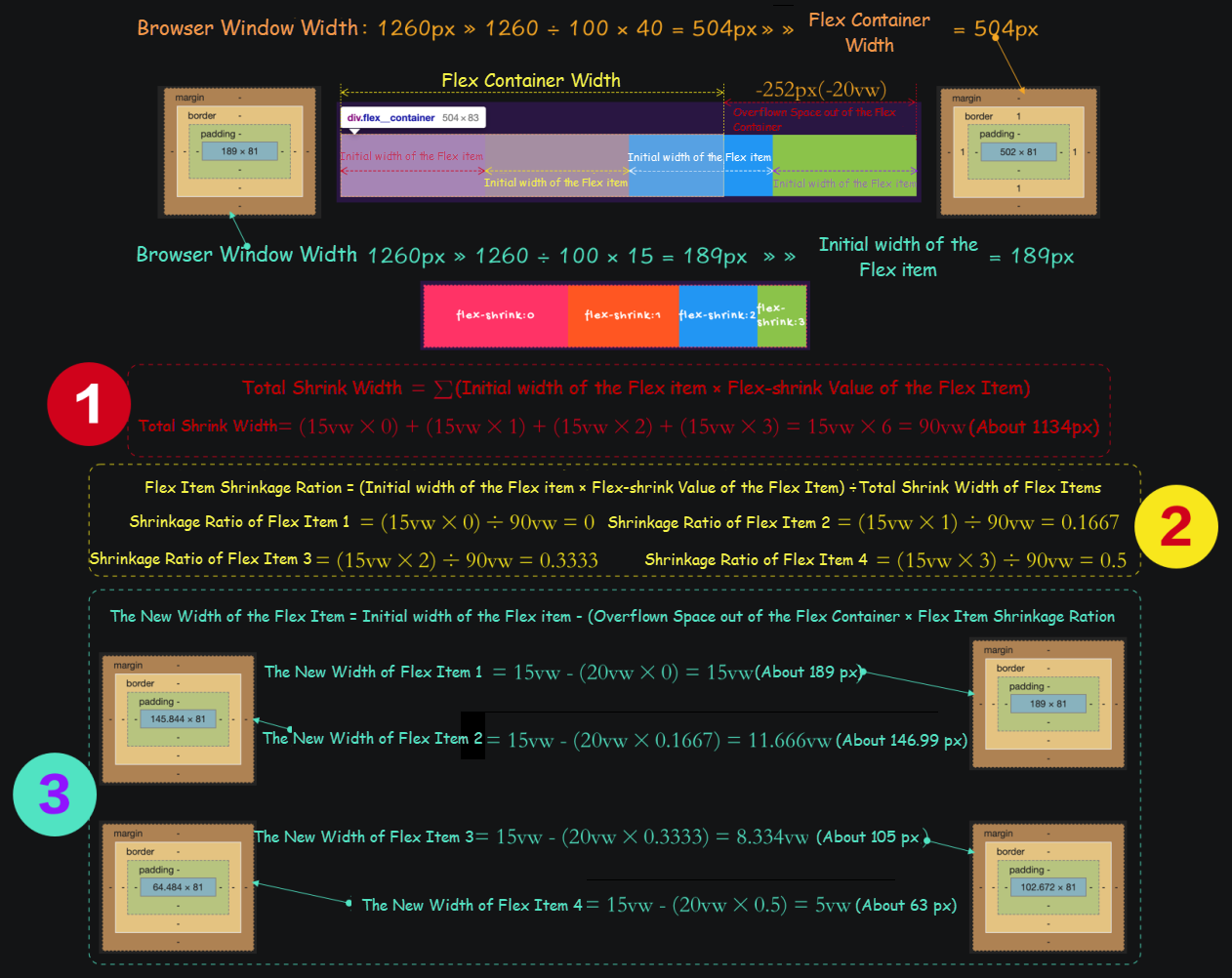
The result is listed below:

The flex-shrink can be calculated by another formula:
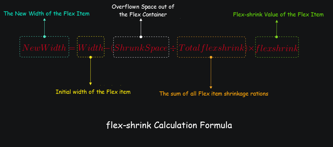
Like flex-grow, the value of flex-shrink can also be a decimal. If the sum of all the Flex item flex-shrink is less than 1, then the negative free space of the Flex container will not be divided by the Flex items according to the shrinkage factor, and the Flex items will still overflow the Flex container.
When the flex-shrink sum is less than 1, the calculation formula is listed below:
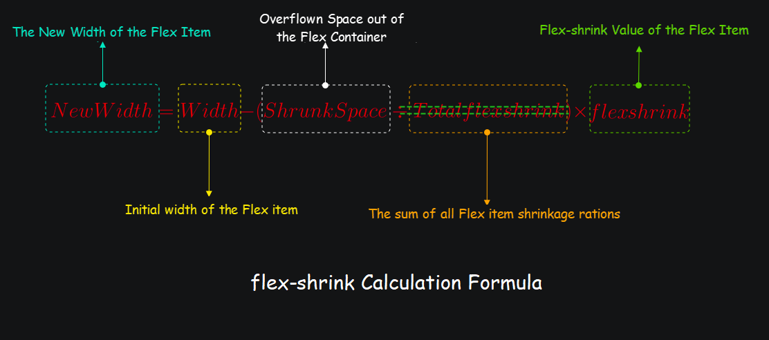
Based on the preceding example, the Flex item flex-shrink is set to 0, 0.1, 0.2, and 0.3. The calculation process is listed below:

Even when the sum of Flex item flex-shrink is greater than 1, it is absolutely not the case that Flex items can divide up the negative free space of the Flex container based on their own flex-shrink ration because the size of an element is also impacted by min-width. When the min-width value of a Flex item is specified explicitly, and the calculated width of Flex items based on the flex-shrink value is greater than the min-width, the min-width value will prevail. In the previous example, if we set the value of min-width of every Flex item to 10vw, the calculation process and result are listed below:
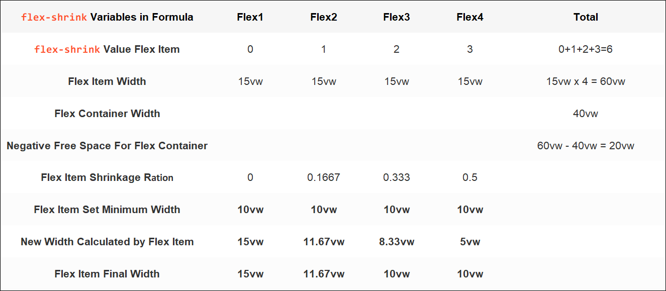
In this case, the total width of Flex items will still be wider than the Flex container, and Flex items will still overflow the Flex container.
There is another similarity between flex-shrink and flex-grow. When the width-related properties of Flex items in the Flex container are not specified explicitly, the initial width of a Flex item is the width of its content.
flex-shrink has something completely different from flex-grow. If the new width of a Flex item calculated from flex-shrink is close to 0, the Flex item will set the width based on the element's min-content, and the width will be passed on to other Flex items and shrink by the shrinkage factor.
For example, we change the flex-shrink of the fourth Flex item from 3 to 9. According to the preceding formula, the new width of Flex Item 4 is 15vw - (20vw ÷ 12) × 9=0.
While the calculated width is 0, the actual width rendered is min-content of the item. In this example, the width of the word "shrink," as shown in the following figure is about 47.95px (or about 3.66vw). This value will be divided into 3 parts (because the flex-shrink values of the other three Flex items in this example are 0, 1, and 2), and the corresponding Flex item continues to divide the width that the Flex Item 4 should shrink:
15vw - 20 ÷ 12 × 0 - 3.66 ÷ 3 × 0 = 15vw (about 196.5px)15vw - 20 ÷ 12 x 1 - 3.66 ÷ 3 x 1 = 12.113vw (about 158.6847px)15vw - 20 ÷ 12 x 2 - 3.66 ÷ 3 × 2 = 9.227vw (about 120.869px)When the browser window width is 1310px, the rendering result is:
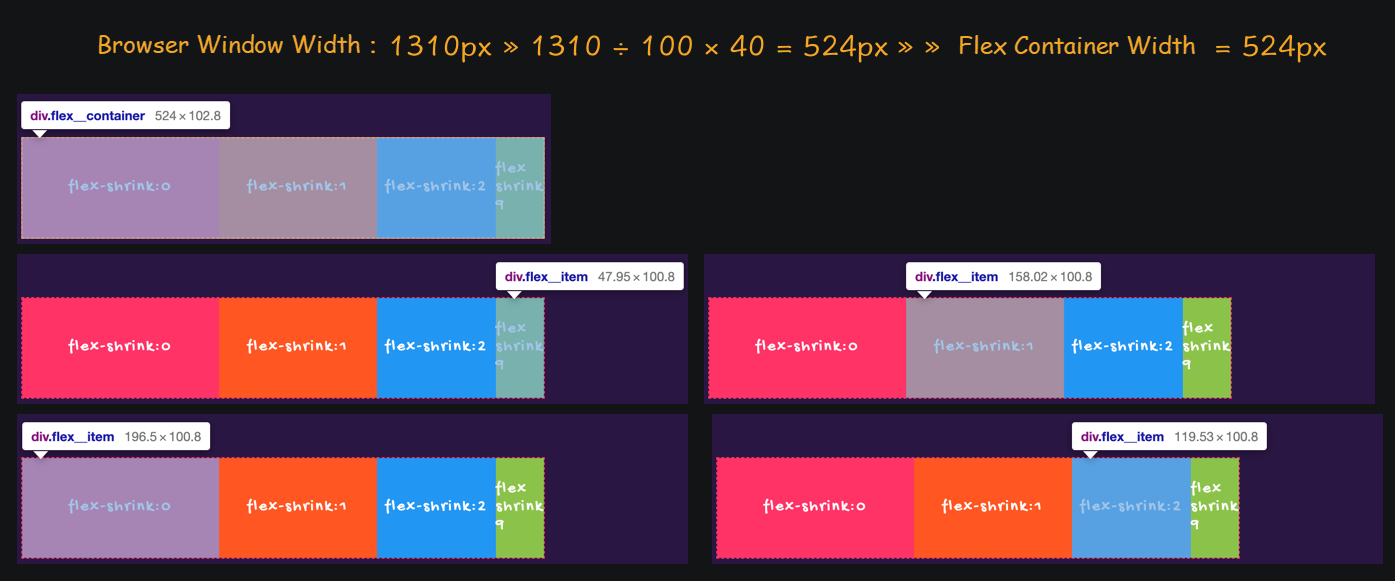
In the Flexbox Layout module, based on the aforementioned alignment properties of the Flex container and the flex-shrink and flex-grow of Flex items, we can well handle the positive and negative free space of the Flex container:
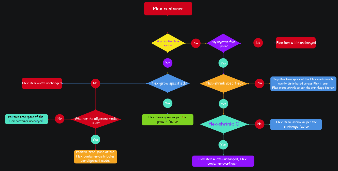
flex-grow is set, the positive free space of the Flex container is allocated for Flex items according to the growth factor. If flex-grow is not set, when the alignment is set in the Flex container, the Flex container positive free space is allocated according to the alignment. Otherwise, the positive free space of the Flex container remains unchanged.flex-shrink value is set to 0, Flex items overflow the Flex container instead of shrinking. If the flex-shrink value is not specified explicitly, the negative free space of the Flex container is equally distributed to Flex items, which will become narrower. The default value for the Flex item flex-shrink is 1. If flex-shrink is specified explicitly to a value other than 0, the negative free space of the Flex container is distributed to Flex items according to different shrinkage factors, and Flex items will become narrower.The following flow chart shows the process:
flex-basis Calculation
The calculation of flex-basis is more complicated than flex-grow and flex-shrink because it is related to the Flex item Content, width, min-width, and max-width. It’s all about the weight of these properties. Simply put, when these properties apply to a Flex item at the same time, the one with the largest weight determines the width of the Flex item.
In the Flexbox layout, you can use flex-basis initialize the Flex item size before the allocation of any Flex container space (positive or negative free space.)
There is an implicit formula for setting the size of Flex items in the Flexbox Layout module:
content ➜ width ➜ flex-basis
Simply put, if the flex-basis value of a Flex item is not specified explicitly, then flex-basis rolls back to the value of width (or inline-size) property. If the value of width (or inline-size) property is not specified explicitly, then flex-basis rolls back to the width value calculated based on Flex item content. However, it should be noted that the size of Flex items is also subject to flex-grow, flex-shrink, and the Flex container size. The Flex item final size will be affected by min-width and max-width (or min-inline-size and max-inline-size) properties.
Let's take a look at an example:
<div class="flex__container">
    <div class="flex__item"></div>
    <div class="flex__item"></div>
    <div class="flex__item"></div>
    <div class="flex__item"></div>
</div>
.flex__container {
width: 600px;
display: flex;
border: 1px dashed #f36;
align-items: stretch;
}Not Specifying Any Size-Related Properties of the Flex Items Explicitly – The size of Flex items is determined by their content.
<div class="flex__container">
    <div class="flex__item">Lorem ipsum dolor sit amet</div>
    <div class="flex__item">Lorem ipsum dolor sit amet consectetur adipisicing elit</div>
    <div class="flex__item">Fugiat dolor nihil saepe. Nobis nihil minus similique hic quas mollitia.</div>
    <div class="flex__item">Lorem ipsum dolor sit amet consectetur adipisicing elit. Molestias consequuntur sequi suscipit iure fuga ea!</div>
</div>
In this example, the flex-basis property is not specified explicitly for the Flex item, so flex-basis takes the default value auto:
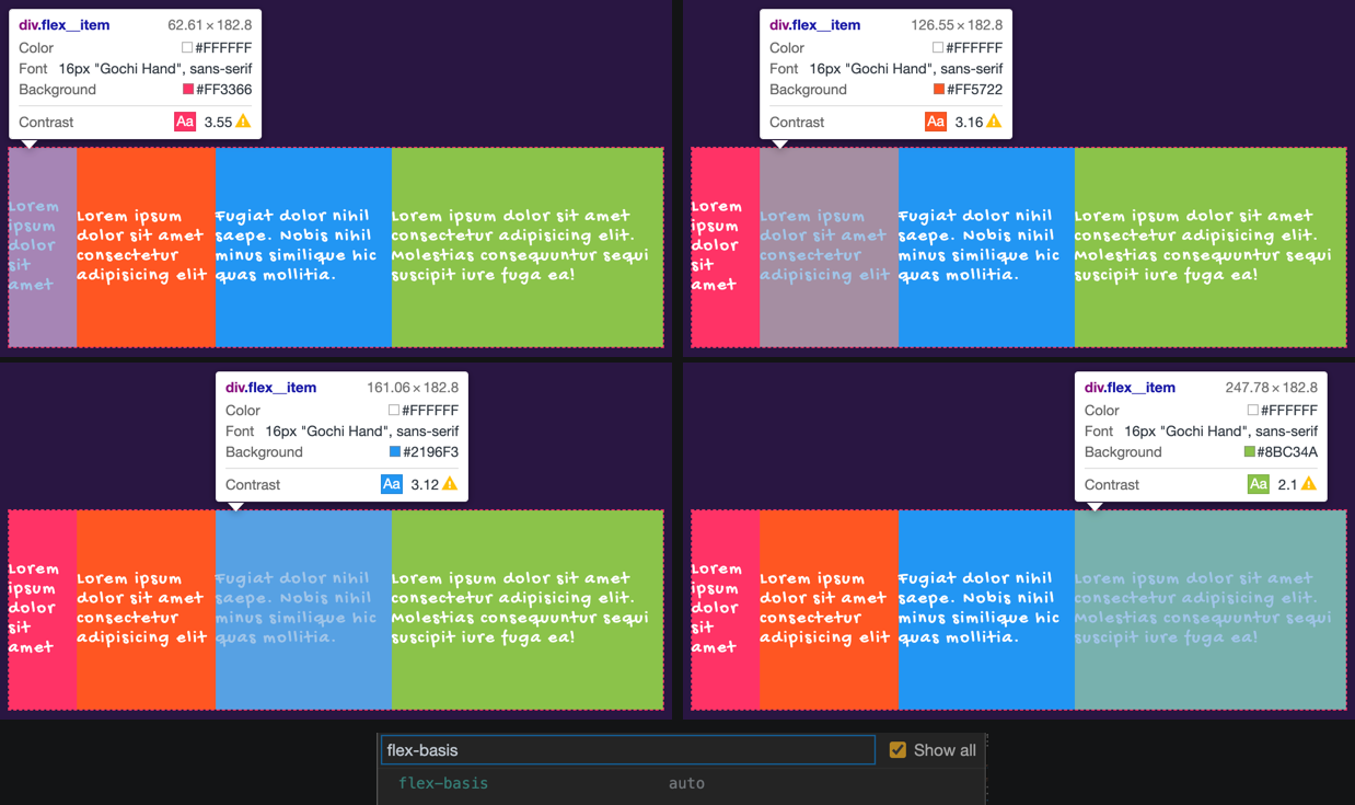
Specify the Flex Item width Value Explicitly:
:root {
  --width: 120px;
}

.flex__item {
  width: var(--width);
}
Now, all Flex items are equal in width:
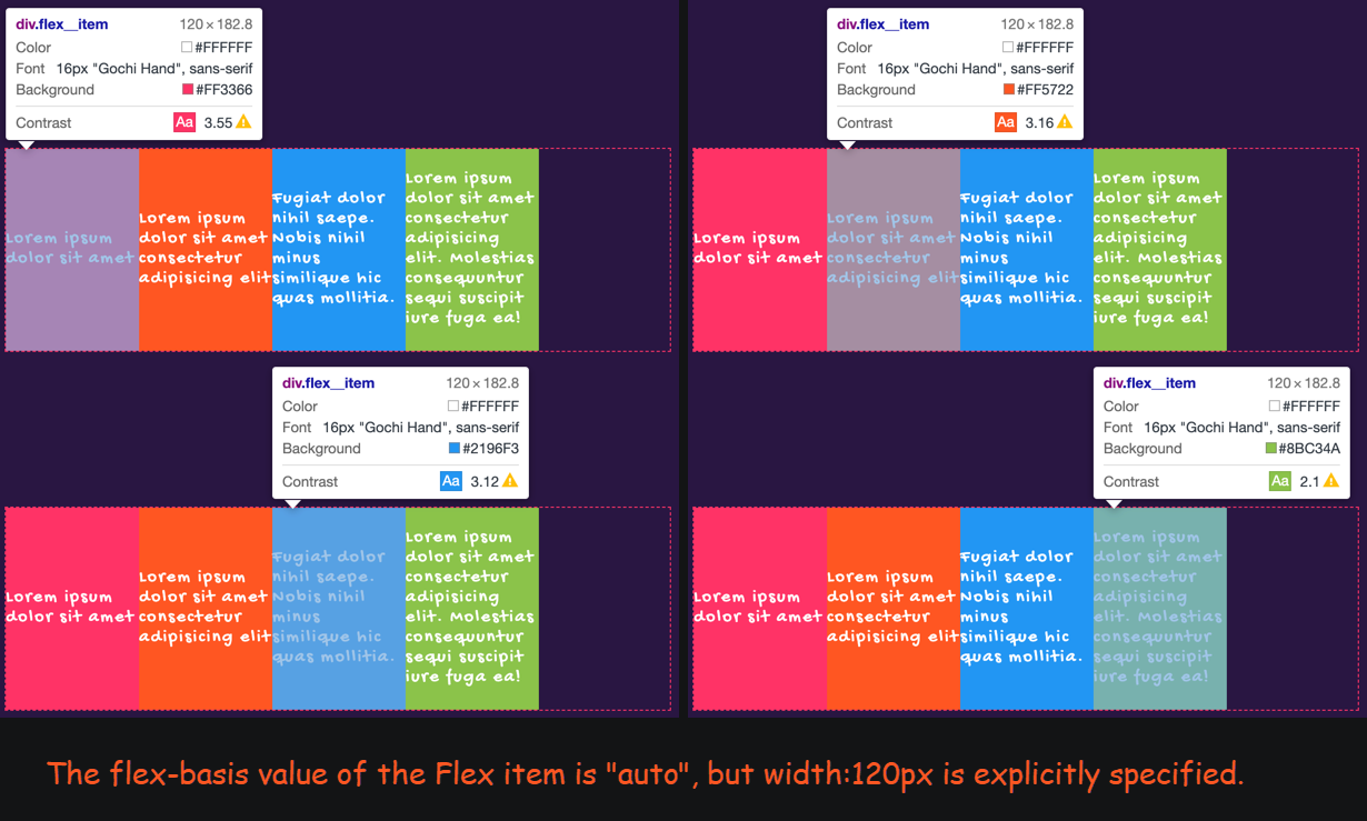
The flex-basis value calculated by the browser is still auto. However, since the value width:120px is specified explicitly, the size of the Flex item is eventually determined by the value of the width property.
Specify the flex-basis Value of the Flex Item Explicitly – The Flex Item has width and flex-basis values.
:root {
    --width: 120px;
    --flexBasis: 150px;
}

.flex__container {
    width: 800px;
}

.flex__item {
    width: var(--width);
    flex-basis: var(--flexBasis);
}
Although width and flex-basis are specified explicitly for the Flex item at the same time, the Flex item is eventually sized by the flex-basis value:
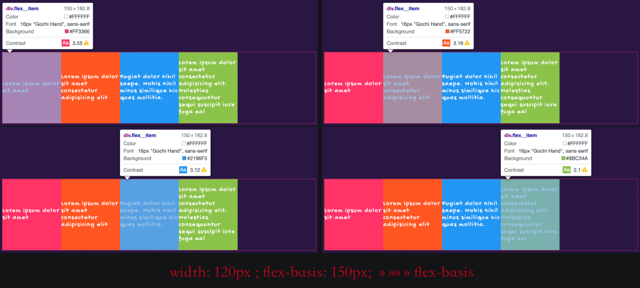
In the Flexbox Layout module, the size of Flex items should be based on the implicit formula (content ➜ width ➜ flex-basis). If you want to specify the size for a Flex item explicitly, the best choice is flex-basis rather than width (or inline-size).
Remember:
flex-basis is limited by min-width and max-width (or min-inline-size and max-inline-size in case of a logical property.)
In CSS, if width, min-width, and max-width properties are applied to an element at the same time, their weight calculations are performed based on the following rules:
width is greater than max-width, the element width equals max-width, i.e. max-width overwrites width (max-width prevails)width is less than min-width, the element width equals min-width, i.e. min-width overwrites width (min-width prevails)min-width is greater than max-width, min-width priority will be higher than max-width (min-width prevails)If width, flex-basis, and min-width are applied to a Flex item at the same time, the specific process is listed below:
content ➜ width ➜ flex-basis, the value of flex-basis will be used for the Flex item (flex-basis prevails).width is less than min-width, the Flex item width equals min-width, i.e. min-width overwrites width (min-width prevails)In this way, if flex-basis is less than min-width, the Flex item width will be min-width, i.e. min-width overwrites flex-basis (min-width prevails).
If width, flex-basis, and max-width are applied to a Flex item at the same time, the following rules are used:
content ➜ width ➜ flex-basis, the value of flex-basis will be used for the Flex item (flex-basis prevails).width is greater than max-width, the Flex item width equals max-width, i.e. max-width overwrites width (max-width prevails)In this way, if flex-basis is greater than max-width, the Flex item width will be max-width, i.e. max-width overwrites flex-basis (max-width prevails).
If width, flex-basis, min-width, and max-width are applied to a Flex item at the same time, an extra rule is introduced:
min-width is greater than max-width, min-width will have higher priority than max-width (min-width prevails).When the new rule is applied to the Flex items:
flex-basis is greater than max-width, the width of the Flex item is equal to max-width, i.e. max-width overwrites flex-basis (max-width prevails).flex-basis is less than min-width, the width of the Flex item is equal to min-width, i.e. min-width overwrites flex-basis (min-width prevails).Since min-width is taken when min-width is greater than max-width, we can compare the weights of flex-basis and min-width. Here, min-width is taken for flex-basis. On the contrary, if min-width is less than max-width, max-width is still taken, and max-width is taken if flex-basis is greater than max-width.
If you have figured out how it works, you can use simpler rules to determine the size of Flex items:
First, decide which property is used for a Flex item based on the rule content ➜ width ➜ flex-basis. If flex-basis is specified explicitly for the Flex item, content and width are ignored. Also, min-width sets the lower limit value of the Flex item, and max-width sets the upper limit value.
The following flowchart describes the process:
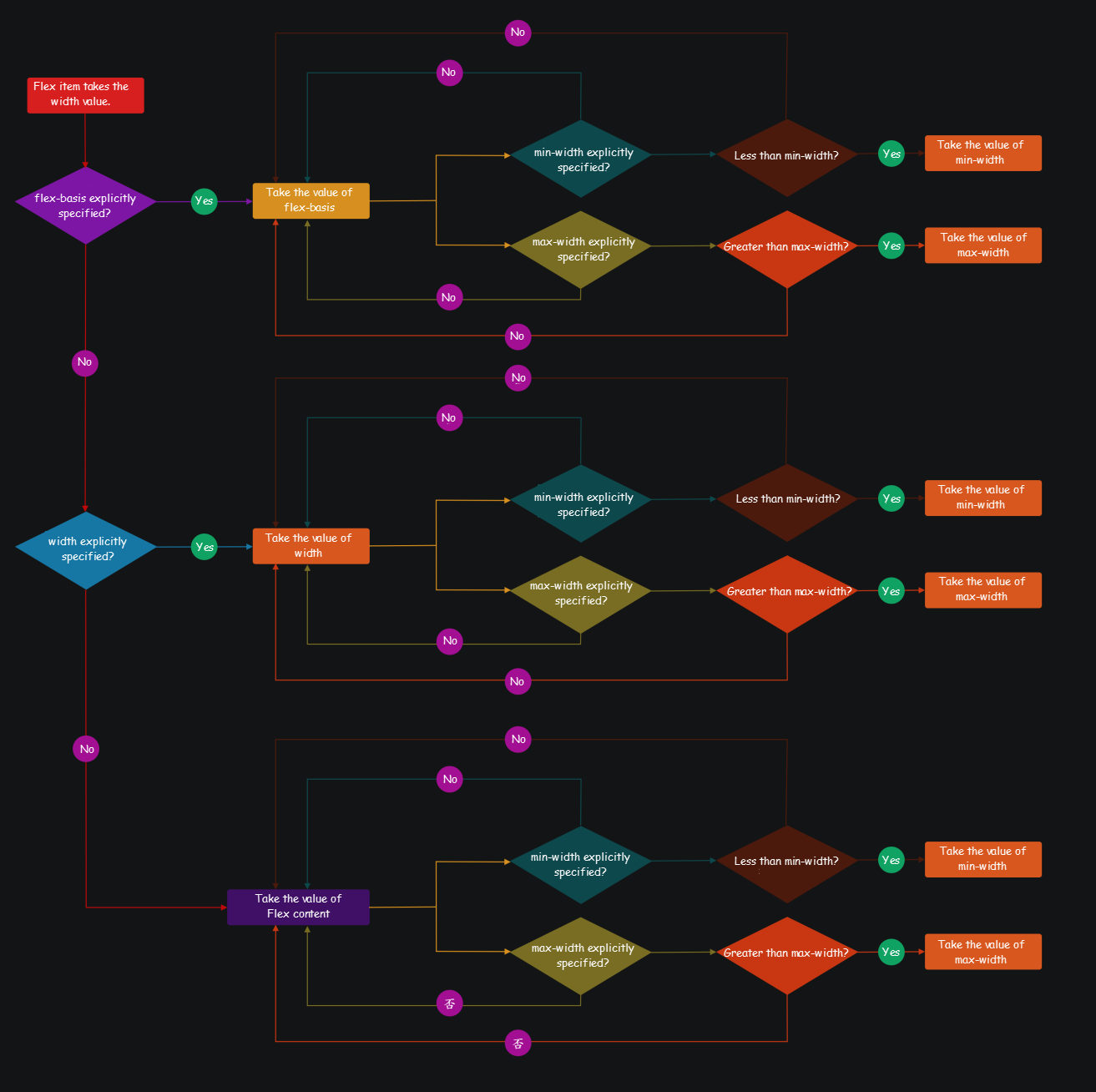
Note: flex-shrink and flex-grow of the Flex item also affect its size!
margin of Flex ItemsYou can specify the value of margin explicitly as auto to control the position of a Flex item in a Flex container:
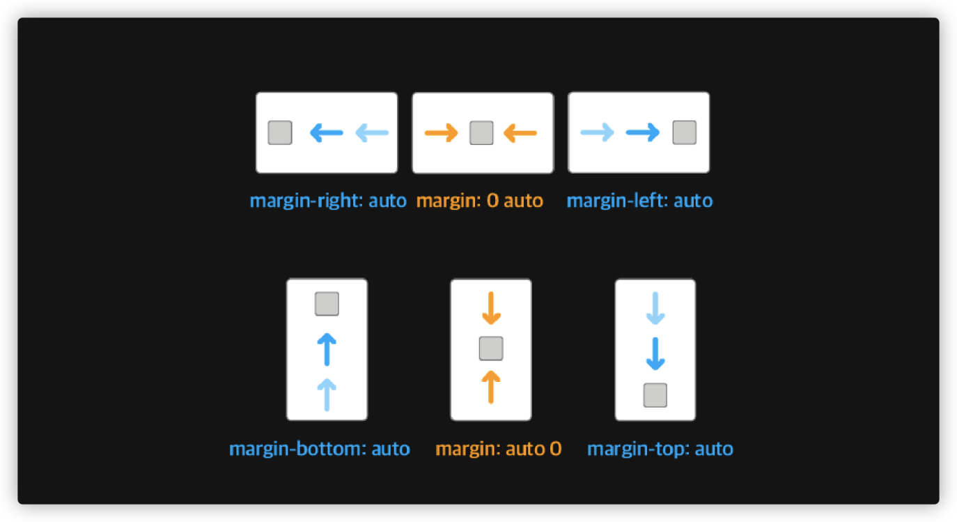
For example, you can use margin-left: auto to realize the effect shown in the following figure:

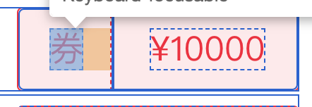
In this case, it is better not to specify any properties explicitly related to padding and margin for internal elements. Manual implementation may look like this:
<div class="flex__container">
<span class="coupon">Coupon</span>
<span class="divider"></span>
<span class="price">¥1000</span>
</div>.flex__container {
display: inline-flex;
min-width: 200px;
height: 60px;
border: 1px solid rgba(255, 0, 54, 1);
background-color: rgba(255, 0, 54, 0.1);
border-radius: 4px;
color: #ff0036;
font-size: 24px;
font-weight: 400;
}
.flex__container > span {
display: inline-flex;
justify-content: center;
align-items: center;
}
.divider {
border-right: 1px dashed currentColor;
}
.coupon {
min-width: 50px;
}
.price {
flex: 1;
min-width: 0;
padding: 0 10px;
}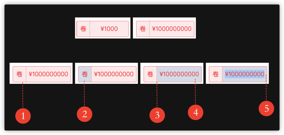
inline-flex for the Flex container and specify a min-width, which is equivalent to the value in the sketch design by default, and a height
width for this element.1px, you can use border or specify a fixed width.flex:1, so it can take up the positive free space of the Flex container.padding-left and padding-right.This article involves most of the content in the Flexbox specification and some critical points. In addition to the content mentioned in the article, there are other details about using Flexbox to design the UI layout, such as element positioning in the Flex container, hierarchical computing, overflow encountered in the Flex containers and items, and rolling calculations. These features are not included in the article because they are rare and scenario-specific with very complicated border processing.

66 posts | 5 followers
FollowAlibaba F(x) Team - December 6, 2021
淘系技术 - December 9, 2020
Alibaba Clouder - April 16, 2018
Alibaba Clouder - December 25, 2017
Alibaba Clouder - December 26, 2017
Alibaba Clouder - December 8, 2017

66 posts | 5 followers
Follow Web Hosting Solution
Explore Web Hosting solutions that can power your personal website or empower your online business.
Learn More YiDA Low-code Development Platform
A low-code development platform to make work easier
Learn More mPaaS
mPaaS
Help enterprises build high-quality, stable mobile apps
Learn More Web Hosting
Explore how our Web Hosting solutions help small and medium sized companies power their websites and online businesses.
Learn MoreMore Posts by Alibaba F(x) Team
Dikky Ryan Pratama May 4, 2023 at 5:19 pm
Your post is very inspiring and inspires me to think more creatively., very informative and gives interesting new views on the topic., very clear and easy to understand, makes complex topics easier to understand, very impressed with your writing style which is smart and fun to work with be read. , is highly relevant to the present and provides a different and valuable perspective.