從螢幕滑出或彈出一塊自訂內容區,用於展示彈窗、資訊提示、選擇輸入、切換等內容,支援多個彈出層疊加展示。maskClosable 為 false 時,不觸發 onClose 函數。
屬性
屬性 | 類型 | 必填 | 預設值 | 說明 |
|---|---|---|---|---|
visible | boolean | 否 | false | 是否顯示 |
maskClosable | boolean | 否 | false | 點擊蒙層是否可以關閉 |
showCloseIcon | boolean | 否 | false | 是否展示關閉表徵圖 |
disableScroll | boolean | 否 | true | 彈窗展示時,是否禁止頁面滾動 |
animation | boolean | 否 | true | 是否開啟過渡動畫 |
duration | number | 否 | 300 | 過渡動畫時間長度,單位毫秒 |
position | 'center' | 'top' | 'bottom' | 'left' | 'right' | 否 | 'center' | 彈窗布局 |
zIndex | number | 否 | 998 | 彈窗層級 |
className | string | 否 | - | 類名 |
事件
事件名 | 說明 | 類型 |
|---|---|---|
onClose | 彈窗關閉時,觸發回調 |
|
樣式類
類名 | 說明 |
|---|---|
amd-popup | 整體樣式 |
amd-popup-mask | 遮罩層樣式 |
amd-popup-disable-scroll | 禁用滾動樣式 |
amd-popup-animation | 開啟過渡動畫樣式 |
amd-popup-content | 內容樣式 |
amd-popup-top | 內容樣式 |
amd-popup-bottom | 內容樣式 |
amd-popup-left | 內容樣式 |
amd-popup-right | 內容樣式 |
amd-popup-center | 內容樣式 |
amd-popup-close-container | 關閉表徵圖地區樣式 |
amd-popup-close-container | 關閉表徵圖樣式 |
程式碼範例
基本使用
index.axml 的程式碼範例如下:
<view>
<popup visible="{{basicShow}}" maskClosable="{{maskClosable}}" position="{{position}}" animation="{{animation}}" onClose="handlePopupClose"
showCloseIcon="{{showCloseIcon}}">
</popup>
<popup visible="{{showCenterDisableScoll}}" maskClosable="{{maskClosable}}" position="center" animation="{{animation}}"
onClose="handlePopupClose" showCloseIcon="{{showCloseIcon}}">
<scroll-view scroll-y="{{true}}" class="box center" disable-lower-scroll="out-of-bounds" disable-upper-scroll="out-of-bounds">
<view class="centerContent"> 試一下滾動</view>
</scroll-view>
</popup>
<popup visible="{{showCenterScoll}}" maskClosable="{{maskClosable}}" position="center" animation="{{animation}}" onClose="handlePopupClose"
showCloseIcon="{{showCloseIcon}}" disableScroll="{{false}}">
<scroll-view scroll-y="{{true}}" class="box center">
<view class="centerContent"> 試一下滾動</view>
</scroll-view>
</popup>
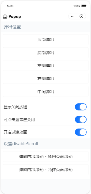
<demo-block title="彈出位置">
<view class="btn-list">
<button data-position="top" onTap="handleShowBasic">頂部彈出</button>
<button data-position="bottom" onTap="handleShowBasic">底部彈出</button>
<button data-position="left" onTap="handleShowBasic">左側彈出</button>
<button data-position="right" onTap="handleShowBasic">右側彈出</button>
<button data-position="center" onTap="handleShowBasic">中間彈出</button>
</view>
</demo-block>
<list>
<list-item>
顯示關閉按鈕
<switch slot="extra" checked="{{showCloseIcon}}" controlled onChange="handleChangeShowCloseIcon" />
</list-item>
<list-item>
可點擊遮罩層關閉
<switch slot="extra" checked="{{maskClosable}}" controlled onChange="handleChangeMaskClosable" />
</list-item>
<list-item>
開啟過渡動畫
<switch slot="extra" checked="{{animation}}" controlled onChange="handleChangeAnimation" />
</list-item>
</list>
<demo-block title="設定disableScroll">
<view class="btn-list">
<button onTap="handleShowDisableScroll">彈窗內部滾動 - 禁用頁面滾動</button>
<button onTap="handleShowScroll">彈窗內部滾動 - 允許頁面滾動</button>
</view>
</demo-block>
</view>index.js 的程式碼範例如下:
Page({
  data: {
    position: '',
    basicShow: false,
    maskClosable: true,
    showCloseIcon: true,
    animation: true,
    showCenterScoll: false,
    showCenterDisableScoll: false,
  },
  handlePopupClose() {
    this.setData({
      basicShow: false,
      showCenterScoll: false,
      showCenterDisableScoll: false,
    });
  },
  handleShowBasic(e) {
    const { position } = e.target.dataset;
    this.setData({
      position,
      basicShow: true,
    });
  },
  handleShowDisableScroll() {
    this.setData({
      showCenterDisableScoll: true,
    });
  },
  handleShowScroll() {
    this.setData({
      showCenterScoll: true,
    });
  },
  handleChangeMaskClosable(checked) {
    const { showCloseIcon } = this.data;
    if (!showCloseIcon && !checked) {
      return my.alert({
        content: '同時隱藏關閉按鈕和蒙層關閉事件將無法關閉彈出層',
      });
    }
    this.setData({ maskClosable: checked });
  },
  handleChangeShowCloseIcon(checked) {
    const { maskClosable } = this.data;
    if (!maskClosable && !checked) {
      return my.alert({
        content: '同時隱藏關閉按鈕和蒙層關閉事件將無法關閉彈出層',
      });
    }
    this.setData({ showCloseIcon: checked });
  },
  handleChangeAnimation(checked) {
    this.setData({ animation: checked });
  },
});
index.acss 的程式碼範例如下:
.box {
  display: flex;
  justify-content: center;
  align-items: center;
}

.box.center {
  display: block;
  height: 200px;
}

.centerContent {
  width: 60%;
  height: 500px;
  margin: 24rpx auto;
  padding: 24rpx;
  background-color: #ccc;
  box-sizing: border-box;
}
index.json 的程式碼範例如下:
{
  "defaultTitle": "Popup",
  "usingComponents": {
    "popup": "antd-mini/es/Popup/index",
    "demo-block": "../../components/DemoBlock/index",
    "button": "antd-mini/es/Button/index",
    "list": "antd-mini/es/List/index",
    "list-item": "antd-mini/es/List/ListItem/index",
    "switch": "antd-mini/es/Switch/index"
  }
}