A Sankey diagram uses the width of flows to visualize traffic, weight, or other measures between different nodes. This topic describes the basic configurations and provides an example of a Sankey diagram.
Introduction
A Sankey diagram is a type of flow chart that shows the flow from one set of values to another. It is suitable for scenarios such as visualizing network traffic. A Sankey diagram typically contains three sets of values: source, target, and value. The source and target values define the link between nodes, and the value specifies the weight of the edge between the source and target nodes.
It consists of the following basic components:
Nodes
Edges
For example, the following data can be represented by a Sankey diagram.
source | target | value |
node1 | node2 | 14 |
node1 | node3 | 12 |
node3 | node4 | 5 |
… | .. | … |
The following Sankey diagram visualizes the relationships in the preceding data.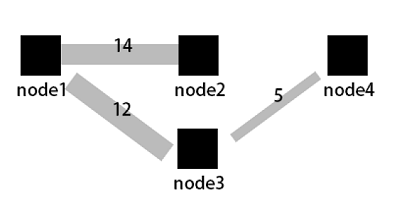
Configuration example
Log on to the Simple Log Service console. In the Projects section, click the project you want.
In the left-side navigation pane, choose . In the Dashboard list, click the dashboard you want. In the upper-right corner of the dashboard page, click Edit. In edit mode, choose .
In the panel on the right, configure Chart Types, Query And Analysis Configurations, and Chart Configurations. In the panel on the left, configure the time range, Logstore, and query statement. Then, click Apply in the upper part of the page to view the chart.
The query statement to summarize network request data is as follows:
* | select COALESCE(client_ip, slbid, host) as source, COALESCE(host, slbid, client_ip) as dest, sum(request_length) as inflow group by grouping sets( (client_ip, slbid), (slbid, host))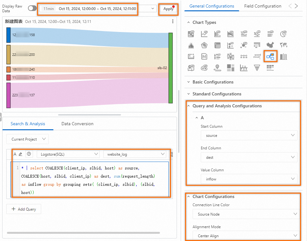
You can also configure multiple query statements to visualize the flow between multiple nodes. The following figure shows the flow between the
slbid,client_ip, andhostnodes.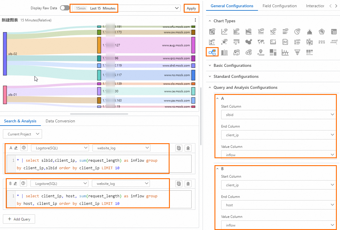
Query A: Calculates the total request traffic from different clients that passes through different Server Load Balancer instances.
* | select slbid,client_ip,sum(request_length) as inflow group by client_ip,slbid order by client_ip limit 10Query B: Calculates the traffic distribution between clients and hosts.
* | select client_ip,host,sum(request_length) as inflow group by host,client_ip order by client_ip limit 10Simple Log Service and Classic Load Balancer (CLB) provide a Layer 7 access log feature to record the details of all requests that are sent to a CLB instance. The details include the request time, client IP address, latency, URI of the request, and server response. You can use Layer 7 access logs to create a Sankey diagram. For more information, see Enable the access log feature.
General configuration
Configure global settings for the Sankey diagram.
Basic Configurations
Parameter
Description
Title
The title of the chart.
Display Title
If you turn on Display Title, the title of the chart is displayed.
Display Border
If you turn on Display Border, the borders of the chart are displayed.
Display Background
If you turn on Display Background, the background color of the chart is displayed.
Display Time
If you turn on Display Time, the query time range of the chart is displayed.
Fixed Time
If you turn on Fixed Time, the query time range of the chart is independent of the global time range of the dashboard.
Standard Configurations
Parameter
Description
Format
The display format of numeric values.
Unit
The unit of numeric values.
Number of Digits after Decimal Point
The decimal places of numeric values.
Display Name
The name of the display field.
If you specify a value for Display Name, the value is used as the names for all display fields in the chart. If you want to change the name of a display field, you must configure parameters on the Field Configuration tab.
Color Scheme
The color scheme of the chart.
Built-in: uses the built-in color scheme.
Solid: uses the color that you select.
Threshold: uses different colors for different values based on the specified thresholds for the values.
Query and Analysis Configurations
Parameter
Description
Source Column
The source node.
End Column
The target node.
Value Column
The traffic value between the source node and the target node.
Chart Configurations
Parameter
Description
Connection Line Color
Set the color of the links.
Alignment Mode
Set the alignment of the chart.
Thresholds
Parameter
Description
Threshold
Set thresholds for the data.
If you set Color Scheme to Threshold and configure thresholds here, the chart background is displayed in the corresponding threshold colors.
Parameters in the Variable Replacement section
Parameter
Description
Variable Replacement
The settings for variable replacement. You can click AddVariable Replacement to add a filter of the Variable Replacement type to the table. After you configure the settings for variable replacement on the General Configurations tab, Simple Log Service adds a filter in the upper-left corner of the table. You can select a value from the filter drop-down list. Then, Simple Log Service automatically replaces the variable in the query statement of the table with the variable value indicated by the value that you select, and performs a query and analysis operation. For more information, see Example 2: Configure variable replacement.
Documentation
Parameter
Description
Add Documentation Link
Add a custom documentation link or description. After the configuration, the information is displayed in the upper-right corner of the Sankey diagram.
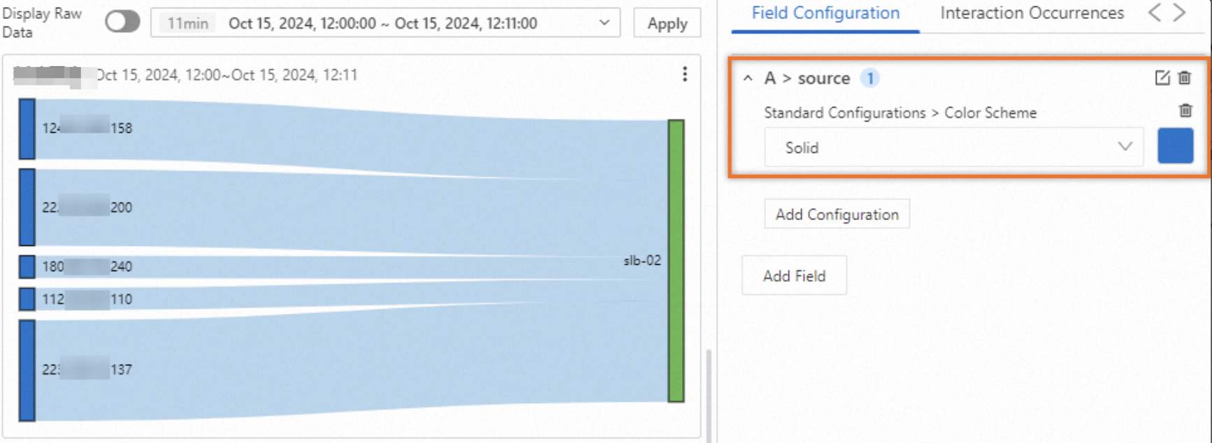
Field configuration
You can use field configuration to customize the visualization settings for the results of a specific query or for a specific column in the results. For more information about the configuration items, see General configuration.
For example, A > source indicates that you are configuring the source field in the results of Query A. In the following figure, Color Scheme is set to Monochrome.
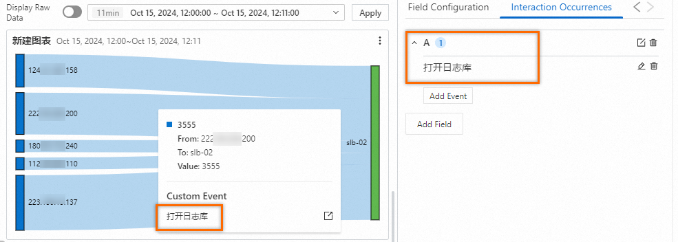
Interaction events
You can use interaction events to configure interactions for the results of a specific query or for a specific column in the results to perform in-depth data analysis. Interaction events include Open Logstore, Open Saved Search, Open Dashboard, Open Trace Analysis, Open Trace Details, and Custom HTTP Link. For more information, see Add interaction events to a dashboard for drill-down analysis.
For example, A indicates that you are configuring an interaction event for the results of Query A. If you set the event to Open Logstore, you can click any point on the chart related to Query A and then click Open Logstore to navigate to the specified Logstore.