my.datePicker
This interface is only supported in mPaaS 10.1.32 and later versions.
Use this API to open the date selection list.
Parameters
Parameter | Type | Required | Description |
format | String | No | Format of the returned date. 1. yyyy-MM-dd (default) 2. HH:mm 3. yyyy-MM-dd HH:mm 4. yyyy-MM (Base library with version lower than 1.1.1 is not supported. Use 5. yyyy (Base library with version lower than 1.1.1 is not supported. Use |
currentDate | String | No | The date and time initially selected. By default, the current time date and time are used. |
startDate | String | No | Minimum date and time. |
endDate | String | No | Maximum date and time. |
success | Function | No | The callback function for a successful API call. |
fail | Function | No | The callback function for a failed API call. |
complete | Function | No | The callback function used when the API call is completed. This function is always executed no matter the call succeeds or fails. |
Return value on success
Name | Type | Description |
date | String | Selected date. |
Error code
Error | Description | Solution |
11 | The user cancelled the operation. | This is normal user interaction, and you don’t have to take any action. |
Sample code
// API-DEMO page/API/date-picker/date-picker.json
{
    "defaultTitle": "Date Picker"
}
<!-- API-DEMO page/API/date-picker/date-picker.axml -->
<view class="page">
<view class="page-description">API for selecting date</view>
<view class="page-section">
<view class="page-section-title">my.datePicker</view>
<view class="page-section-demo">
<button class="page-body-button" type="primary" onTap="datePicker">Select date-1</button>
<button class="page-body-button" type="primary" onTap="datePickerHMS">Select date-2</button>
<button class="page-body-button" type="primary" onTap="datePickerYMDHMS">Select date-3</button>
</view>
</view>
</view>// API-DEMO page/API/date-picker/date-picker.js
Page({
datePicker() {
my.datePicker({
currentDate: '2016-10-10',
startDate: '2016-10-9',
endDate: '2017-10-9',
success: (res) => {
my.alert({
title: 'datePicker response: ' + JSON.stringify(res)
});
},
});
},
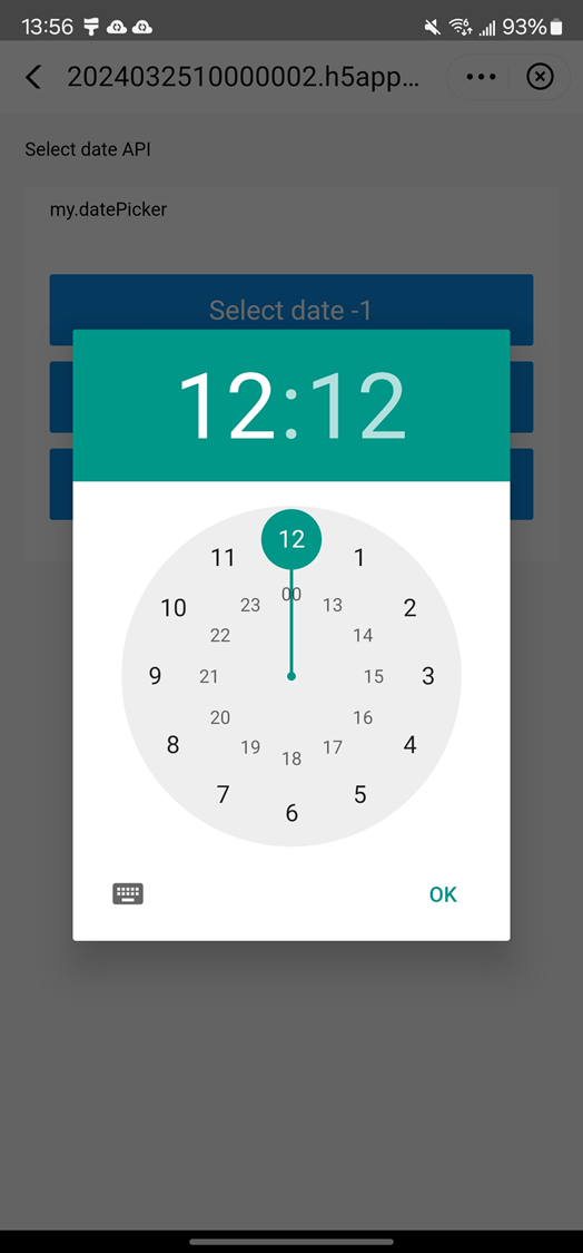
datePickerHMS() {
my.datePicker({
format: 'HH:mm',
currentDate: '12:12',
startDate: '11:11',
endDate: '13:13',
success: (res) => {
my.alert({
title: 'datePicker response: ' + JSON.stringify(res)
});
},
});
},
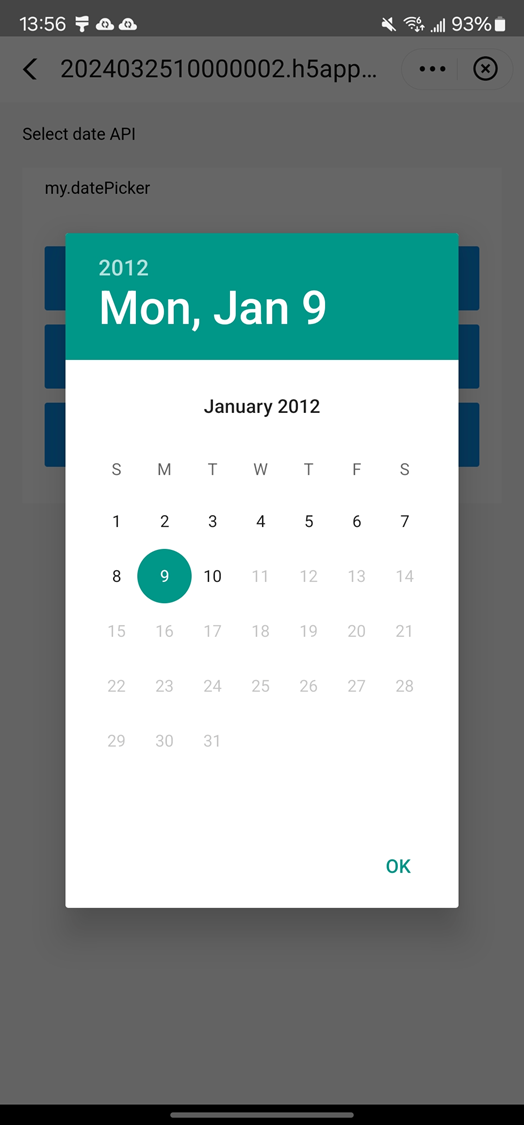
datePickerYMDHMS() {
my.datePicker({
format: 'yyyy-MM-dd HH:mm',
currentDate: '2012-01-09 11:11',
startDate: '2012-01-01 11:11',
endDate: '2012-01-10 11:11',
success: (res) => {
my.alert({
title: 'datePicker response: ' + JSON.stringify(res)
});
},
});
},
});/* API-DEMO page/API/date-picker/date-picker.acss */
button + button {
margin-top: 20rpx;
}For iOS users who use the baseline version V10.1.68.35 and later, the latest style of time picker can be set by creating the AUImplDatePicker class and overriding the userNewYearDateAndTime method to return the YES method.
@implementation AUImplDatePicker (NewDatePicker)
// External override can use the new UI of year, month, day, hour and minute.
- (BOOL)userNewYearDateAndTime
{
    return YES;
}

@end
The latest style of time picker is as follows: