Extension options are configuration items that developers define for an extension. Users can configure these options to customize the behavior of an extension in different workspaces. For example, a developer can create an option that lets users control the maximum length of SQL statements, which allows for different length limits in different workspaces.
Background information
Developers define extension options during registration. Users can then set these options for the extension within a specific workspace.
For more information about how to register an extension, see Develop and deploy an extension: Self-built service.
Before enabling an extension in a workspace, users can configure its options as shown in the following figure.

Developers can call the GetOptionValueForProject API to retrieve the option configurations set by a user, such as a workspace administrator, in a specific workspace.
Usage notes
The extension developer provides the option configurations and related text. The platform is not responsible for any security threats posed by the content.
Supported components
Option configuration supports seven types of components: text, single-line input box, multi-line input box, single-select drop-down list, multi-select drop-down list, checkbox group, and radio button group. The following figure shows these components.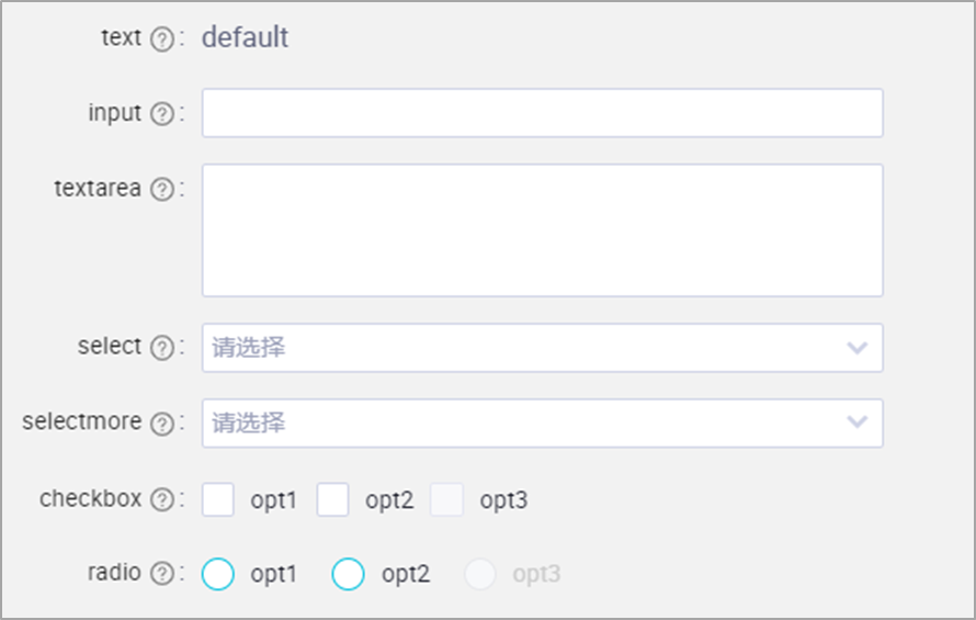
Option configuration
When registering an extension, the developer must define the options as a JSON string in the Option Configuration field.
{
    "type": "object",
    "properties": {

        "Component name (must be unique)": {
        "type": "string",
            "title": "See the table below",
            "x-decorator": "See the Parameter parsing table",
            "x-component": "See the Parameter parsing table",
            "x-decorator-props": {
                "tooltip": "Description"
            },
            "x-component-props": {
                "dataSource": "See the Parameter parsing table",
                "mode": "multiple"
            }
        }

    }
}
Refer to the following resources for configuration:
For more information about component parameters, see Parameter parsing.
For configuration examples, see Configuration example: Setting the CU resource threshold for SQL tasks and Configuration example: Using the seven component types.
For more information about registering and managing extensions, see Develop and deploy an extension: Self-built service.
Parameter parsing
Field | Component type | Value |
title | Text | Text |
Single-line input box | Single-line input box | |
Multi-line input box | Multi-line input box | |
Single-select drop-down list | Single-select drop-down list | |
Multi-select drop-down list | Multi-select drop-down list | |
Checkbox group | Checkbox group | |
Radio button group | Single choice | |
x-decorator | Text | FormItem |
Single-line input box | FormItem | |
Multi-line input box | FormItem | |
Single-select drop-down list | FormItem | |
Multi-select drop-down list | FormItem | |
Checkbox group | FormItem | |
Radio button group | FormItem | |
x-component | Text | PreviewText.Input |
Single-line input box | Input | |
Multi-line input box | Input.TextArea | |
Single-select drop-down list | Select | |
Multi-select drop-down list | Select | |
Multiple selection | Checkbox.Group | |
Single selection | Radio.Group | |
dataSource | Text | Optional |
Single-line input box | Optional | |
Multi-line input box | Optional | |
Single-select drop-down list | Optional. Configure as needed. Each object in the array is a unique option. The value and label cannot be duplicates. label specifies the text to display on the UI. value specifies the identifier for the text, which you can define. The following is a code sample: | |
Multi-select drop-down list | Optional. Configure as needed. Each object in the array is a unique option. The value and label cannot be duplicates. label specifies the text to display on the UI. value specifies the identifier for the text, which you can define. The following is a code sample: | |
Checkbox group | Optional. Configure as needed. Each object in the array is a unique option. The value and label cannot be duplicates. label specifies the text to display on the UI. value specifies the identifier for the text, which you can define. The following is a code sample: | |
Single choice | Optional. Configure as needed. Each object in the array is a unique option. The value and label cannot be duplicates. label specifies the text to display on the UI. value specifies the identifier for the text, which you can define. The following is a code sample: |
Configuration example: Set the CU resource threshold for SQL tasks
The following figure shows an example of how to configure the CU consumption threshold for an SQL task, along with the result.

The following code shows the JSON configuration for the option.
{
    "type": "object",
    "properties": {
        "cuNumber": {
            "type": "string",
            "title": "CU Threshold",
            "x-decorator": "FormItem",
            "x-component": "Input",
            "x-decorator-props": {
                "tooltip": "Enter the CU consumption threshold for the SQL task."
            }
        }
    }
}
Configuration example: Use the seven component types
The following figure shows an example of the configuration process and the result of using the seven component types.

The following code shows the JSON configuration for the option.
To use all seven components at once, you can copy the following JSON and modify the data as needed.
{
    "type":"object",
    "properties":{

        "text":{
            "type":"string",
            "title":"Text",
            "x-decorator":"FormItem",
            "x-component":"PreviewText.Input",
            "x-decorator-props":{
                "tooltip":"Description file"
            },
            "default":"This is text information"
        },
        "input":{
            "type":"string",
            "title":"Single-line input box",
            "x-decorator":"FormItem",
            "x-component":"Input",
            "x-decorator-props":{
                "tooltip":"Description file"
            },
            "x-component-props":{

            },
            "default":"This is the default value"
        },


        "textarea":{
            "type":"string",
            "title":"Multi-line input box",
            "x-decorator":"FormItem",
            "x-component":"Input.TextArea",
            "x-decorator-props":{
                "tooltip":"Description file"
            },
            "x-component-props":{

            },
            "default":"This is the default value"
        },

        "select":{
            "type":"string",
            "title":"Single-select drop-down list",
            "x-decorator":"FormItem",
            "x-component":"Select",
            "x-decorator-props":{
                "tooltip":"Description file"
            },
            "x-component-props":{
                "dataSource":[
                    {
                        "value":"10001",
                        "label":"opt1"
                    },
                    {
                        "value":10002,
                        "label":"opt2"
                    },
                    {
                        "value":10003,
                        "label":"opt3",
                        "disabled":true
                    }
                ]
            },
            "default":"10001"
        },

        "selectmore":{
            "type":"string",
            "title":"Multi-select drop-down list",
            "x-decorator":"FormItem",
            "x-component":"Select",
            "x-decorator-props":{
                "tooltip":"Description file"
            },
            "x-component-props":{
                "dataSource":[
                    {
                        "value":"10001",
                        "label":"opt1"
                    },
                    {
                        "value":10002,
                        "label":"opt2"
                    },
                    {
                        "value":10003,
                        "label":"opt3",
                        "disabled":true
                    }
                ],
                "mode":"multiple"
            },
            "default":["10001","10002"]
        },

        "checkbox":{
            "type":"array",
            "title":"Checkbox group",
            "x-decorator":"FormItem",
            "x-component":"Checkbox.Group",
            "x-decorator-props":{
                "tooltip":"Description file"
            },
            "x-component-props":{
                "dataSource":[
                    {
                        "value":"10001",
                        "label":"opt1"
                    },
                    {
                        "value":10002,
                        "label":"opt2"
                    },
                    {
                        "value":10003,
                        "label":"opt3",
                        "disabled":true
                    }
                ],
                "mode":"multiple"
            },
            "default":["10001","10002"]
        },

        "radio":{
            "type":"number",
            "title":"Radio button group",
            "x-decorator":"FormItem",
            "x-component":"Radio.Group",
            "x-decorator-props":{
                "tooltip":"Description file"
            },
            "x-component-props":{
                "dataSource":[
                    {
                        "value":"10001",
                        "label":"opt1"
                    },
                    {
                        "value":10002,
                        "label":"opt2"
                    },
                    {
                        "value":10003,
                        "label":"opt3",
                        "disabled":true
                    }
                ],
                "mode":"multiple"
            },
            "default":"10001"
        }

    }
}
For more information, see Best practices: (Advanced feature) Prohibit the use of the MAX_PT function.