You can configure a line control suite that consists of a line weight stepper, curve option button, style selector, and solid color padding box.
Fields
| Field | Description | Type | Required | Remarks |
|---|---|---|---|---|
name | The name of the control. | string | Yes | None |
type | The type of the control. | string | Yes | None |
default | The default value. | string | No | If this field is not specified, it is left empty. |
components | The controls in the suite. | array | Yes | The default value is ["width","curve","style","color"]. You can configure "width", "curve", "style", and "color". |
enableHide | Specifies whether to hide controls on the canvas. | boolean | No | The default value is false. If this field is set to true, a show or hide icon appears, and the show field is added. |
Values
| Condition | Data type | Example | Default value |
|---|---|---|---|
The enableHide field is not configured or is set to false. | object | | |
The enableHide field is set to true. | object | | |
Sample configurations
- The
enableHidefield is not configured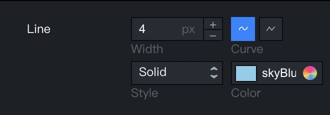
"line": { "name": "Line Suite", "type": "line" } - The
enableHidefield is set totrue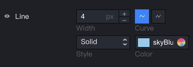
"line": { "name": "Line Suite", "type": "line", "enableHide": true } - The
componentsfield is configured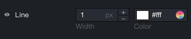
"line": {
    "name": "Line Suite",
    "type": "line",
    "enableHide": true,
    "components": [
      "style",
      "color"
    ]
}