You can configure a font control suite that consists of a font selector, font weight selector, font size stepper, and solid color padding box.
Configuration description
| Field | Description | Data type | Required? | Remarks |
|---|---|---|---|---|
name | The name of the control. | string | Yes | None. |
type | The type of the control. | string | Yes | None. |
default | The default value. | array | No | If this field is not specified, the default value is empty. |
components | The controls in the suite. | array | No | Default value: ["fontFamily","fontWeight","fontSize","color"]. You can configure "fontFamily", "fontWeight", "fontSize", and "color". |
enableHide | Specifies whether controls in the suite can be hidden. | boolean | No | Default value: false. If this field is set to true, a show or hide icon appears, and the show field is added. |
Value description
| Condition | Data type | Example | Default value |
|---|---|---|---|
The enableHide field is not configured or is set to false. | object | | |
The enableHide field is set to true. | object | | |
Configuration examples
- The
enableHidefield not configured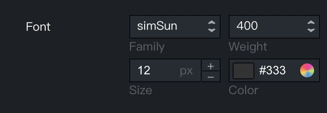
{ "font": { "name": "Font", "type": "font", "default": { "fontFamily": "simSun", "fontWeight": 400, "color": "#333", "fontSize": 12 } } } - The
enableHidefield set totrue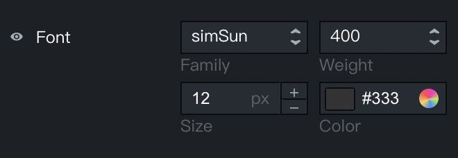
{ "font": { "name": "Font", "type": "font", "enableHide": true, "default": { "fontFamily": "simSun", "fontWeight": 400, "color": "#333", "fontSize": 12 } } } - Customized settings of the
componentsfield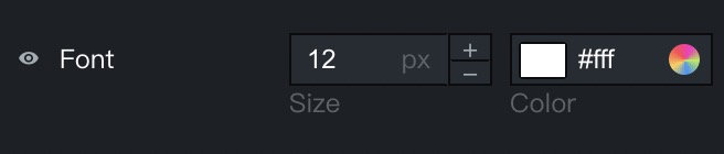
{
  "fontComponents": {
    "name": "Font",
    "type": "font",
    "enableHide": true,
    "components": ["fontSize", "color"]
  }
}