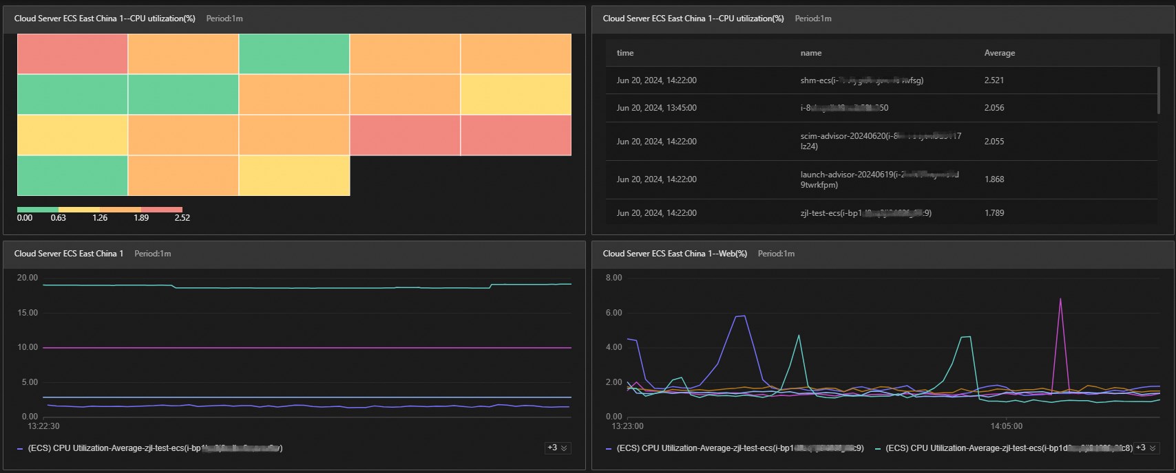
Cloud Monitor dashboards give you a unified view of your services — from high-level health overviews to per-instance metric details. Use dashboards to spot trends, compare instances, and troubleshoot issues without switching between multiple pages.
View monitoring data across multiple instances
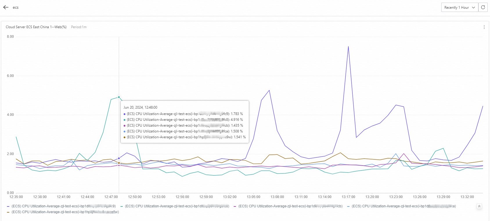
When your application runs on multiple Elastic Compute Service (ECS) instances, add their monitoring data to a single chart for side-by-side comparison. For example, plot CPU utilization across all your ECS instances in one chart to quickly identify which instances are under pressure.
View multiple metrics for a single instance
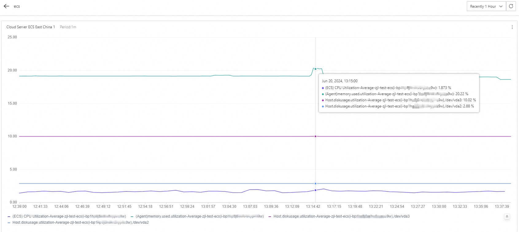
Track several metrics — such as CPU utilization, memory usage, and disk usage — for one ECS instance in a single chart. Viewing all key metrics together makes it easier to correlate issues and identify root causes.
Rank instances by resource consumption
Sort instances by a metric — such as CPU utilization in descending order — to see which instances consume the most resources. With 20 ECS instances, for example, ranking by CPU utilization lets you quickly identify over-provisioned or under-utilized instances and reallocate resources to reduce costs.
Visualize metric distribution across instances using a heatmap
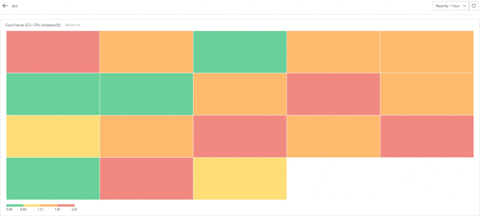
A heatmap shows the CPU utilization distribution across all your ECS instances at a glance, with color intensity indicating utilization levels. Click any color block to drill down and view the change trend for that specific instance over a selected time range.
Display a dashboard in full screen
Dashboards support full-screen mode and refresh monitoring data automatically. Add multiple metrics to a dashboard and switch to full screen for a distraction-free display — useful for Network Operations Center (NOC) screens or team presentations.