This topic describes the chart styles of the Color Block widget and the meaning of each configuration items.
Chart style
A color block is a type of media component that supports background color modification and filtering effects. 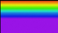
Configuration Panel 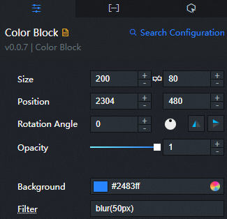
Search Configuration: Click Search Configuration in the upper-right corner of the Configuration panel. In the Search Configuration panel, enter the name of the configuration items that you want to search for to quickly locate the configuration items. Fuzzy match is supported. For more information, see Search for asset configurations.
Size: indicates the size of a widget, including its pixel width and height. You can click the
 icon to lock the aspect ratio of the widget and modify the width and height of the widget in equal proportion. After you click this icon again, you can adjust the width and height as needed.
 Position: the position of a widget, which is indicated by pixel X and Y coordinates. X-coordinate indicates the pixel distance between the upper-left corner of the widget and the left border of the canvas. Y-coordinate indicates the pixel distance between the upper-left corner of the widget and the upper border of the canvas.
Rotation Angle: the angle of a rotation that uses the center point of a widget as the rotation point. The unit is degrees (°). You can use one of the following methods to control the rotation angle of a widget:
Directly enter the degrees in the Rotation Angle spin box or click the plus sign (+) or minus sign (-) to increase or decrease the value in the Rotation Angle spin box.
Drag the
 black dot in the icon to control the rotation angle of the widget.
 Click the
 icon to flip the widget style.
 Click the
 icon to flip the widget style.
Opacity: Valid values: 0 to 1. If this parameter is set to 0, the widget is hidden. If this parameter is set to 1, the widget is completely displayed. Default value: 1.
Color Background: the background color of the color block.
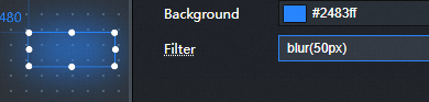
filter Effect: Color block filter effect, used to set the visual effect of color block, such as blur and saturation effect. You can customize the effect codes supported by the input filter.
Figure 1. Unconfigured filter
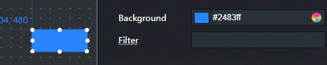
Figure 2. Configuration filter post
 Note
NoteThe filter configuration example is the configuration style of the fuzzy function. For more information, see Cascading Style Sheets (CSS)-filter.
Data tab
This component does not support data configuration.
Interaction tab
This widget does not support interaction events.
Configure interactions in Blueprint Editor
In Canvas Editor, right-click a widget in the Layer panel and select Add to Blueprint Editor.
Click the
 icon in the upper-left corner.
 In Blueprint Editor, click the Color Blocks component in the Added Nodes pane. You can view the parameters in the canvas, as shown in the following figure.
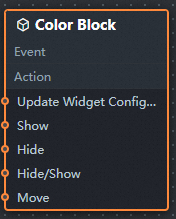
Event: The earth layer does not support events.
Action
Action
Description
Update component configurations
Style configurations of widgets are dynamically updated. Before this action is executed, you must click the widget in Canvas Editor, click the Settings tab in the right-side panel, and click Copy Configurations to... to obtain widget configurations. After that, change the style field for the data processing node in Blueprint Editor.
Display
Displays the widget. The following example shows the reference data.
return {
  "animationType": "",
  "animationDuration": 1000,
  "animationEasing": "linear"
};
Hide
The following example shows how to hide a widget.
return {
  "animationType": "",
  "animationDuration": 1000,
  "animationEasing": "linear"
};
Switch to the implicit state
Specifies whether to show or hide a widget. The following example shows the reference data.
return {
  "animationIn": {
    "animationType": "",
    "animationDuration": 1000,
    "animationEasing": "linear"
  },
  "animationOut": {
    "animationType": "",
    "animationDuration": 1000,
    "animationEasing": "linear"
  }
};
China Mobile
Move a widget to a specified location. The following example shows the reference data.
return {
  // The positioning type. to indicates absolute positioning, whereas by indicates relative positioning. The default value is to.
  "positionType": "to",
  // The location, which is indicated by the x and y coordinates.
  "attr": {
    "x": 0,
    "y": 0
  },
  // The animation type.
  "animation": {
    "enable": false,
    // The duration in which animation is displayed.
    "animationDuration": 1000,
    // The animation curve, which can be set to linear|easeInOutQuad|easeInOutExpo.
    "animationEasing": "linear"
  }
};