By Ranjith Udayakumar, Alibaba Cloud Tech Share Author. Tech Share is Alibaba Cloud's incentive program to encourage the sharing of technical knowledge and best practices within the cloud community.
In the preceding article of this series, we have learned the features of Alibaba Cloud Quick BI in the process of understanding how to visualize the data to state fascinating data stories according to your business scenario in Quick BI. In this article, we are going to analyze and visualize the use cases to consolidate and reaffirm our understanding of deciphering data to uncover hidden insights.
As discussed earlier, we are going to visualize the use cases to decipher the data to uncover the hidden insights, besides in the previous article we learnt some of the features of the Quick BI and how to leverage Quick BI to derive business insights out of the given data.
Here we will use the data from ATM Dataset and ATM Master Dataset. We already ingested the datasets in the QuickBI and created the dataset "ATM Analytics" to analyze and visualize the use case to make better informed decisions.
Create a Dashboard:
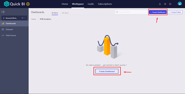
Navigate to Dashboard Management Page and Click Create a new Dashboard
We can see that the dashboard is created and opened in new page, on the very right side of the following figure, the ATM Analytics Dataset is Selected, and the fields have already been divided into Dimensions and Measures as in like dataset management page.
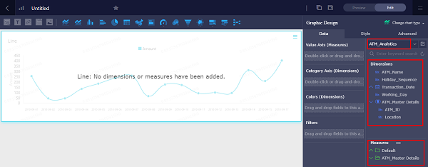
We can see that the default chart is line chart, we can simply delete it and start off with cards to quickly enable consumers to understand the overall picture of their business. In our case it is about the ATMs, so we are going to start off with No. of ATMs, No. of Transactions, Volume of Transactions.
Drag and Drop the Card Chart to the Canvas
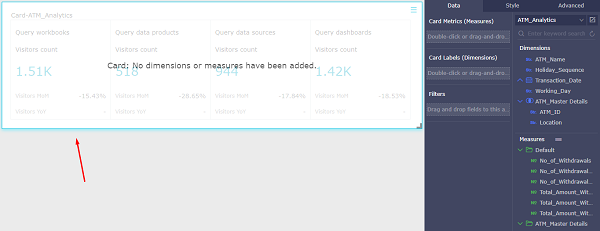
We can see that there is no measure that can tell about the No. of ATMs, so we need to create a calculated column using the ATM_ID Dimension to find the No. of ATMs.
To create a calculate column, Click the Edit Icon on the right side of the Dataset Name.
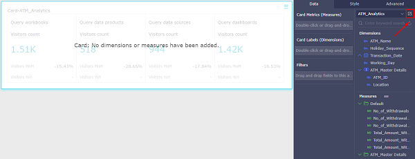
We can see that Data Management page for ATM Analytics Dataset is opened in new page, Click the "+" Icon on the Measure Pane Title on the left side of the Dataset Management Page to create a calculated measure column. Calculated Column Dialog Box will appear, enter the name for the and expression for the calculated measure column to find the "No. of ATMs" and Click Ok.
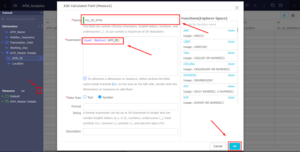
We can see that Calculated Measure Column is created, we must save the dataset and then we need to click the refresh button to view the data.
Note: Initially when data management page is opened, it will not show the data. So, we need to manually refresh the dataset to preview the data. After creating the calculated measure column, we need to save the dataset before clicking the refresh button to preview the data, if we click refresh data without saving the dataset it may throw an error.
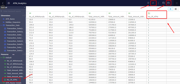
We need to Switch back to the dashboard page, click refresh to see the "No. of ATMs" Measure Column in the Measure section of the Dataset.
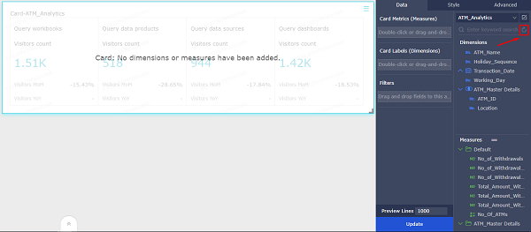
Now, use your mouse to drag the "No. of ATMs" field from the Measure to the "Card Metrics (Measure)", click update at the bottom and we can then see that the chart has been successfully drawn.
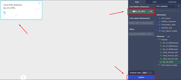
Note: Click "Style" tab to format the card, Rename the title of the card, Change Background from light to dark and Hide the primary measure name.
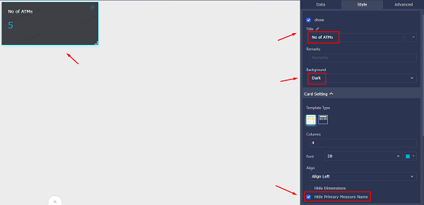
Similarly, do the same for "No. of Transactions" and "Transactions Volume".

Click Bar Chart, Bar Chart has been added to the Canvas, use your mouse to drag the "No. of Transactions" field from the Measure to the "Value Axis", and then drag the "ATM Name" field to the "Category Axis", click update at the bottom and we can then see that the chart has been successfully drawn.
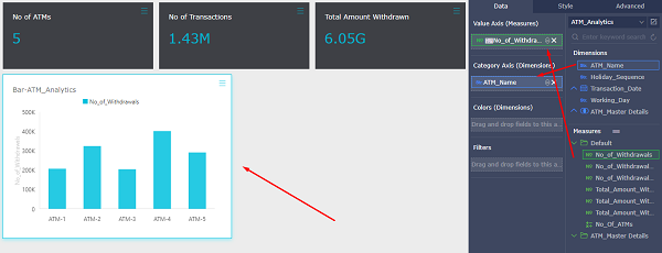
Note: Click "Style" tab to format the bar chart, Rename the title of the bar chart, Rename the Series value, and Add axis names for both x and y axis.
Similarly, Click Stripe Chart, Stripe Chart has been added to the Canvas, use your mouse to drag the "Transactions Amount Withdrawn" field from the Measure to the "Value Axis", and then drag the "ATM Name" field to the "Category Axis", click update at the bottom and we can then see that the chart has been successfully drawn.
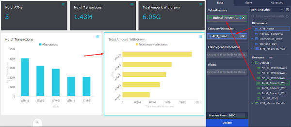
Note: Click "Style" tab to format the Stripe chart, Rename the title of the stripe chart, Rename the Series value, Change the Color of the Series Value, and Add axis names for both x and y axis.
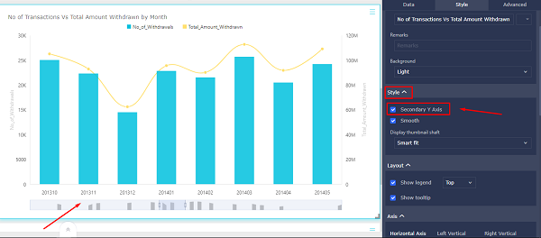
Click Line Chart, Line Chart has been added to the Canvas, use your mouse to drag the "No. of Transactions" and "Total Value Withdrawn" fields from the Measure to the "Value Axis", and then drag the "Month" field to the "Category Axis", click update at the bottom and we can then see that the chart has been successfully drawn.
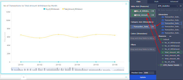
There are two measures which are completely different in value scale, so we need to add another Y- axis in the chart.
Click "Style" tab, under the style section we can see that there is a checkbox to enable and disable the Secondary Y- axis. Enable the Secondary Y Axis. Then we can see that there are two Y-axes in the chart, which correspond to two indicators of Value Axis (Measures) respectively.
We can see that location is in String format, we need to convert it into Location Type. To convert the dimension datatype from string to location, Click the Edit Icon on the right side of the Dataset Name.
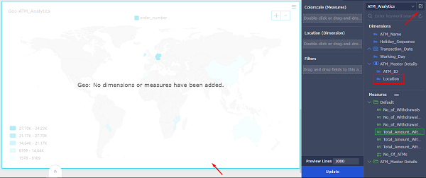
We can see that Data Management page for ATM Analytics Dataset is opened in new page, Right Click the "Location" Field, Click Change Dimension, then City. We can see that "Location" field is converted to Location Type, we must save the dataset and then we need to Switch back to the dashboard page, click refresh to see the "Location" Dimension (Location Type) Column in the Dimension section of the Dataset.
Click Geo Chart, Geo Chart has been added to the Canvas, use your mouse to drag the "No. of Transactions" and "Total Value Withdrawn" fields from the Measure to the "Color scale (Measure)", and then drag the "Month" field to the "Location", click update at the bottom and we can then see that the chart has been successfully drawn.
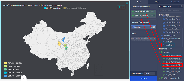
Note: Click "Style" tab to format the Geo chart, Rename the title of the Geo chart.
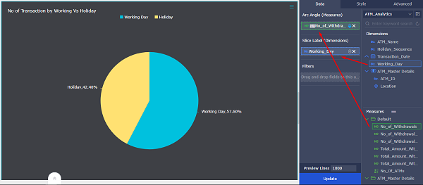
Click Pie Chart, Pie Chart has been added to the Canvas, use your mouse to drag the "No. of Transactions" field from the Measure to the "Arc Angle (Measures)", and then drag the "Working Day" field to the "Slice Label (Dimensions)", click update at the bottom and we can then see that the chart has been successfully drawn.
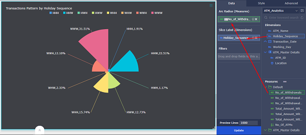
Click Polar Chart, Polar Chart has been added to the Canvas, use your mouse to drag the "No. of Transactions" field from the Measure to the "Arc Radius (Measures)", and then drag the "Holiday Sequence" field to the "Slice Label (Dimensions)", click update at the bottom and we can then see that the chart has been successfully drawn.
Click Bar Chart, Bar Chart has been added to the Canvas, use your mouse to drag the "No. of Transactions by our customer" , "No. of Transactions by Other Customer", and "Total Amount Withdrawn" fields from the Measure to the "Value Axis (Measures)", and then drag the "ATM Name" field to the " Category Axis (Dimensions)", click update at the bottom and we can then see that the chart has been successfully drawn.
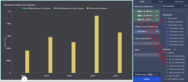
There are three measures which are completely different in value scale, so we need to add another Y- axis in the chart.
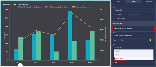
Click "Style" tab, under the style section we can see that there is a checkbox to enable and disable the Secondary Y- axis. Enable the Secondary Y Axis, then move on to the "Series Settings" Section, Select the Series value i.e. Total Amount Withdrawn, Click Axis, then change it to "Slave Axis".
Now, we can see that there are two Y-axes in the chart, which correspond to two indicators of Value Axis (Measures) respectively.
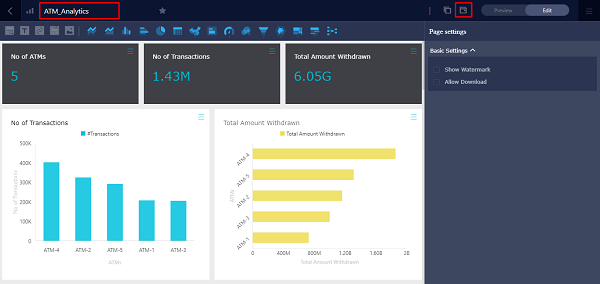
Rename the dashboard in the upper-left corner as ATM Analytics, and then click Save in the upper-right corner.
Navigate to the workspace, we can see the ATM Analytics Dashboard, click "Make Public" button to publish the report publicly.
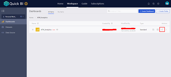
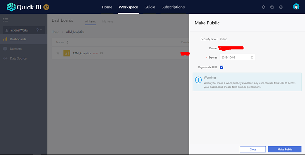
We can set the expiration time and then we can click publish which will generate public URL through which we all can access the dashboard.
We analyzed and visualized the ATM use case, we will see what all insights are we got from analyzing the ATM Dataset.
Data is the new fuel in this new era, and I hope that this multi-part article series has helped you in the process of deciphering data to uncover hidden insights, and effectively make use of the features offered by Alibaba Cloud QuickBI to achieve the same.
Strikingly Achieves Automation Innovation Synergy for Scale with HashiCorp and Alibaba Cloud

2,593 posts | 794 followers
FollowAlibaba Clouder - March 1, 2019
Alibaba Clouder - August 13, 2018
Alibaba Clouder - October 15, 2018
Alibaba Clouder - July 15, 2020
Alibaba Clouder - October 9, 2018
Alibaba Clouder - August 10, 2020

2,593 posts | 794 followers
Follow Quick BI
A new generation of business Intelligence services on the cloud
Learn More MaxCompute
Conduct large-scale data warehousing with MaxCompute
Learn More Data Lake Analytics
A premium, serverless, and interactive analytics service
Learn MoreMore Posts by Alibaba Clouder