By Ranjith Udayakumar, Alibaba Cloud Tech Share Author. Tech Share is Alibaba Cloud's incentive program to encourage the sharing of technical knowledge and best practices within the cloud community.
In the previous "Deciphering Data to Uncover Hidden Insights" series, we covered three topics of data analytics, including:
For me, "the best vision is insight." As per the saying, I like to walk you through in the process of deciphering data to uncover hidden and valuable insights for your business. In this article, I want to share how to visualize the data to tell compelling data stories according to your business scenario in Alibaba Cloud's Quick BI data visualization tool.
For this article, we are going to be looking at:
We will be covering the entire process of deciphering data. The overall process involves:
"A picture is worth a thousand words "- When you're attempting to comprehend the information from the data and to discover relationships between your data, which might include thousands or millions of variables in front.
Visualization becomes inevitable in the world of Big Data; Data visualization tools and technologies are essential to analyze massive amounts of information and it allows us to make data-driven decisions.
Data visualization refers to the pictorial representation of data. Information could be visualized in many ways including infographics, charts, graphs, and maps, each of which can offer a specific insight. Visual elements pave the way to see and understand patterns, outliers, and trends.
At its core, data visualization has three purposes:
"Data Visualization plays an inevitable role in the modern business world." Data visualization ought to be insightful, efficient, appealing, and in several cases interactive too.
Insightful
The basic purpose of the visualization or the canvas is to inform a meaningful information to the consumer. Envision the basic forms of visualizations like Tile or Bar or Pie, everybody is acquainted with these visuals and can quickly infer the intended point they represent. Since we're currently aggregating information and displaying it pictorial format it should convey the message that the aggregated information is telling us which becomes harder with a large amount of data.
For example, you data may be presented in the following manner:
We can infer the insight clearly with the visuals rather than surfing through the data. Above are the common ways to quickly identify the insights hidden in the Data.
Efficient
The biggest benefit of using Data visualization is the efficiency gained through proper execution which will empower the consumer to make the data-driven decision easier and better. A well-designed visual will save the precious time of the consumer as it can communicate the intended message concisely and without ambiguity. For example, you may use a bar chart to visualize "Revenue contribution of Products by Year".
We can efficiently save our time with the visuals rather than analyzing the data to find the revenue contribution of products which is time-consuming.
Appealing
Much like a nature scenery draws the viewer in and making them spellbound, properly designed and well-executed data visualizations will draw you in and lead you to the intended conclusion in a visually pleasing way. For example, you may use a scatter chart to represent "Expense Versus Revenue by Products".
We can have appealing visuals that give a better understanding and attractiveness rather than the data in the format of a table.
Interactive
Some dashboard visualizations are built in a way to allow us to interact with the data in Realtime. Dashboards, visualizations contain variables and filters that can be adjusted based upon which we could infer result (what could be expected if certain criteria are met). For example, you can represent "Sales by Year" with a line chart.
We can have filters, data action link, etc., which allow us to do exploratory analysis and to interact effectively with visuals.
As we discussed earlier, we are going to visualize the use cases to decipher the data to uncover the hidden insights, besides we are going to understand the features of the QuickBI and how to avoid the common mistakes that we often do while doing the visualizations.
We will see the options and features available in Quick BI to quickly enable you to fully make use of the features of QuickBI which in turn will help you while building the reports. After that, we will analyze and visualize the ATM Dataset Use Case.
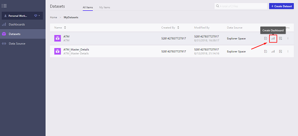
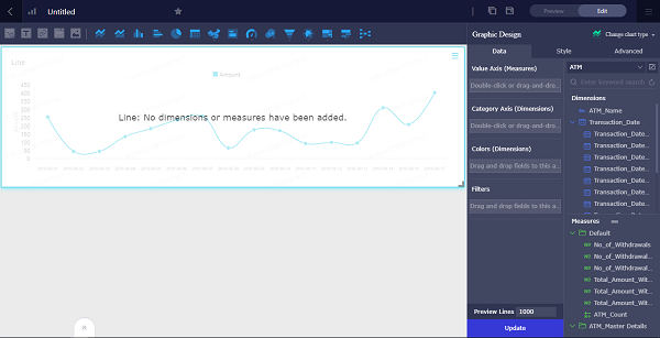
Creation of dashboard from dataset page:
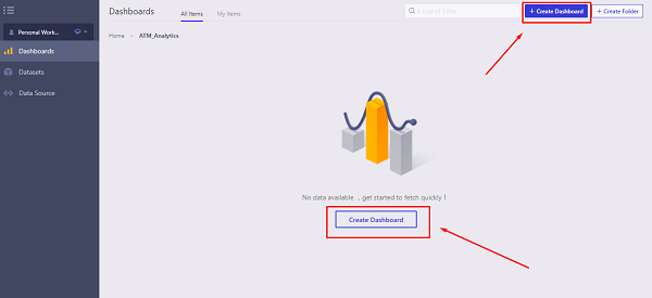
Creation of dashboard from the dashboard page

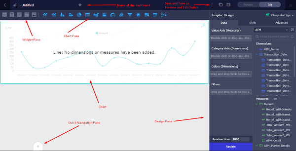
Dashboard Overview
After entering the dashboard, we can see the following items:
Dashboard Settings


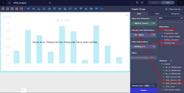
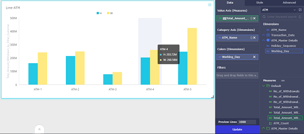
Creating a Chart:
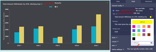
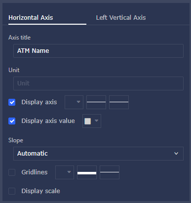
Adjusting a Chart:


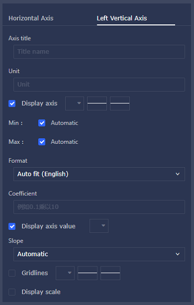
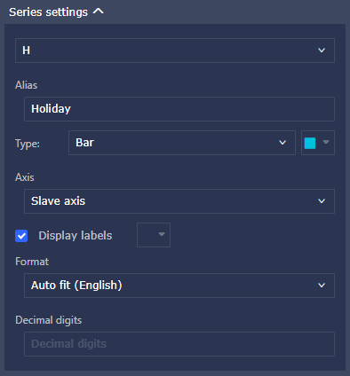

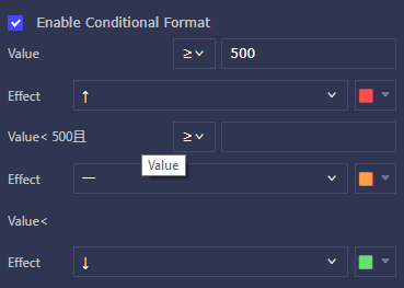
Advanced Options in charts:
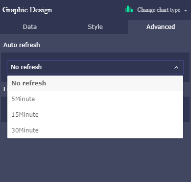
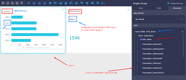
Creating Widgets:
Filter Widget:
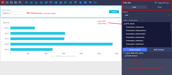
Text Area Widget:

IFrame Widget:

Tab Widget:

Image Widget:

I hope this article helps you to understand the features of Alibaba Cloud's QuickBI data visualization platform. We will analyze and visualize the use case in the next article of this multi-part article.
A General Solution for Publishing Web-Based Services Hosted Overseas in China
Trouble-Free Cloud Migration 1: Migrate Data from On-Premises Systems to the Cloud

2,593 posts | 794 followers
FollowAlibaba Clouder - March 1, 2019
Alibaba Clouder - August 13, 2018
Alibaba Clouder - October 15, 2018
Alibaba Clouder - July 15, 2020
Alibaba Clouder - October 9, 2018
Alibaba Clouder - August 10, 2020

2,593 posts | 794 followers
Follow Quick BI
A new generation of business Intelligence services on the cloud
Learn More MaxCompute
Conduct large-scale data warehousing with MaxCompute
Learn More Data Lake Analytics
A premium, serverless, and interactive analytics service
Learn MoreMore Posts by Alibaba Clouder