Data analysis has become a must for many professions. In this post, a data analyst from wangjubao.com, a leading data-marketing firm in China, shares some advice on making better data insights. We will look at five key elements in user data analysis to help you advance your operation performance.
A key data that is often disregarded is the ration of new and returning customers. This data helps us analyze the effectiveness of marketing campaigns, as well as understanding the behavior of customers based on trends. In the plot below, we can see a large discrepancy between the number of new and returning customers within the period of 2015/01/14 to 2015/01/16.

Horizontal axis (time range): Payment dates (in January 2015)
Vertical axis (Number of members): Number of members
Compared dimensions:
1.The red trend line represents returning customers, which have shopped more than twice
2.The blue trend line represents new customers, which have only shopped once
Analysis:
The following is the derivative of the data analysis in the scenario mentioned above:
During the period from December 2015 to January 2016, the number of returning customers is increasing, while that of new customers is dropping. Why?
Train of thought:
1.Is it due to poor attraction campaigns for new customers?
2.Is it because the Double 11 and Double 12 shopping carnivals have exhausted the market?
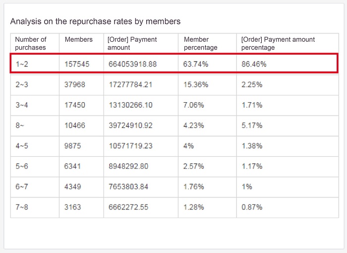
Similar to the first trend, in this section, we analyze the differences between new and returning customers. However, the difference is that we are focused on the actual amount of payment made. As shown in the table below, 86.46% of payment amount originate from new members.

Horizontal axis dimension: Number of members (percentages), sum of payments (percentages)
Vertical axis dimension: Total number of purchases (1/2/3/4/5/6/7)
Time range: January 1, 2014 - February 1, 2016
Analysis:
From the data, we can see that the proportion of customers who have made one purchase is 63.79% and their payment amount accounts for 86%. The per capita contribution of new customers is greater than that of old customers.
Is this data trend positive or negative? Why do customers display this behavior?
Train of thought:
1.Do the products or prices attract the new customers?
2.Why is there a low repurchase rate by old customers? Is it because of the product features or the experience and policy considerations of the old customers?
For this section, we take the idea from the previous section a step further. We analyze the repurchase rates based on specific products. In the table, we can clearly see that Product B is typically bought by new users.

Horizontal axis dimension: Number of members (percentages)
Vertical axis dimension: Total number of purchases (1/2/3/4/5/6/7)
Compared dimensions: Categories
Time range: January 1, 2014 - February 1, 2016
Analysis:
Insights into the data showed that the repurchase rate of buyers of product A is higher than that of products B and C. Different product categories have different repurchase rates. However, if there is a big difference between similar categories, what is the reason? Is it due to the characteristics of the product itself or the operational strategy?
Train of thought:
1.Is it due to the product display arrangements?
2.If member buyers of product B are recommended with a combination (including products B and A), the user will probably buy the combination when he or she returns to repurchase product B, and hence become a user of product A – the high repurchased category. As a result, it improves their repurchase rate.
Similar to the previous section, we analyze the purchase frequency for specific products. The goal here however is to determine a product's suitability based on the customers' journey.

Horizontal axis dimension: Product name
Vertical axis dimension: Number of members (percentages)
Compared dimensions: Total number of purchases (1/2/3/4 and above)
Time range: November 11, 2016 - November 11, 2016
Analysis:
The data allows us to gain insight into our customers' preferences. Which products are suitable for new customers? Which products are suitable recommendations to return customers to achieve a higher conversion? What products do regular customers favor? Based on the results of above analysis, we can adjust the product display layout in the shop and develop marketing and recommendation strategies tailored for different groups of people.
Train of thought:
1.Is it because of the product display layout in the shop?
2.Does the marketing strategy need to be adjusted?
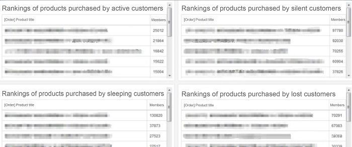
Last but not least, understanding customer activity is an important measure that should not be overlooked. This data can help us understand the effectiveness of marketing efforts, as well as determining the optimal launch dates of campaigns.

Horizontal axis dimension: Product name
Vertical axis dimension: Number of members (percentages)
Categorization condition: The time difference between the payment date and the current time is respectively: 0 – 30 days for active; 30 – 60 days for silent; 60 – 90 days for sleeping; and 90 - 120 days for lost customers.
Analysis:
What products do customers in different degrees of activity buy? Let us take the "sleeping" customers for example; is their last payment time just before the Double 11? That is, the products became "sleeping" after product purchase, and the Double 11 failed to wake them up. Are the last purchased products to blame for the customer churn?
Train of thought:
1.Adjust the product display layout in the shop.
2.Adjust the marketing strategies for different groups of people.
3.Consider eliminating the "sleep-triggering" product.
4.Study the rankings of the goods purchased by members in various cities and rankings of products at various prices purchased by members among other data to develop precise marketing strategies.
Panoramic insight, also known as data visualization, allows for the decentralization of enterprise data assets to middle-level and first-line business personnel. Visualized operations enable non-technical staff to conveniently and quickly carry out business data exploration to form a closed exploration-execution-exploration business loop by connecting the exploration and business execution processes to assist business personnel in business growth.
Differences between Panoramic Insight and Enterprise BI
Panoramic Insight |
Enterprise BI |
|---|---|
| High usage frequency | Low usage frequency |
| Execution operation level | High-level decision-making |
| Online analysis | T+N |
| Coupling capability with the business | Decision-making support |
| Convenient visualized operations | Technical support required |
Enterprise BI still plays an important role in providing strategic decision-making support to top executives. Panorama insight into cloud computing-based data and enterprise BI can complement each other to help companies tap value hidden in data. Since 2016, many companies have applied data visualization to daily business segments. Data visualization is an effective way for enterprises to stay well informed on the value of data assets.
Internet of Vehicles: Window Querying with Alibaba Cloud PostgreSQL

2,593 posts | 793 followers
FollowAlibaba Cloud Native Community - July 19, 2022
Alibaba Cloud Community - May 6, 2022
Alibaba Cloud Community - July 10, 2025
Alibaba Cloud MVP - March 31, 2020
Iain Ferguson - January 26, 2022
Alibaba Cloud Project Hub - November 18, 2021

2,593 posts | 793 followers
Follow Quick BI
A new generation of business Intelligence services on the cloud
Learn More Hologres
A real-time data warehouse for serving and analytics which is compatible with PostgreSQL.
Learn More Data Lake Analytics
A premium, serverless, and interactive analytics service
Learn More Realtime Compute for Apache Flink
Realtime Compute for Apache Flink offers a highly integrated platform for real-time data processing, which optimizes the computing of Apache Flink.
Learn MoreMore Posts by Alibaba Clouder