Quick BI uses Alibaba's Qwen large language model and ChatBI's conversational features to power its intelligent assistant, Q. Q Builder, a core feature of Q, works with Analysis Copilot to provide one-click report generation, conversational chart creation, intelligent beautification, and insight attribution. These features help you build reports and analyze data more efficiently.
This topic describes the features of Q Builder and provides recommended usage instructions. The capabilities of the intelligent assistant, Q, are continuously being upgraded.
Q Builder is a value-added module that requires an additional purchase. To purchase this module, contact our business team.
This feature is currently available only in the China (Hong Kong) and Malaysia regions. Support for other regions will be available soon.
Q Builder is supported only in the Professional and Premium editions. It is not available in the Personal Edition.
Feature Access
On the Create a Dashboard page, click the ![]() icon in the upper-right corner to open the Q Builder dialog box.
icon in the upper-right corner to open the Q Builder dialog box.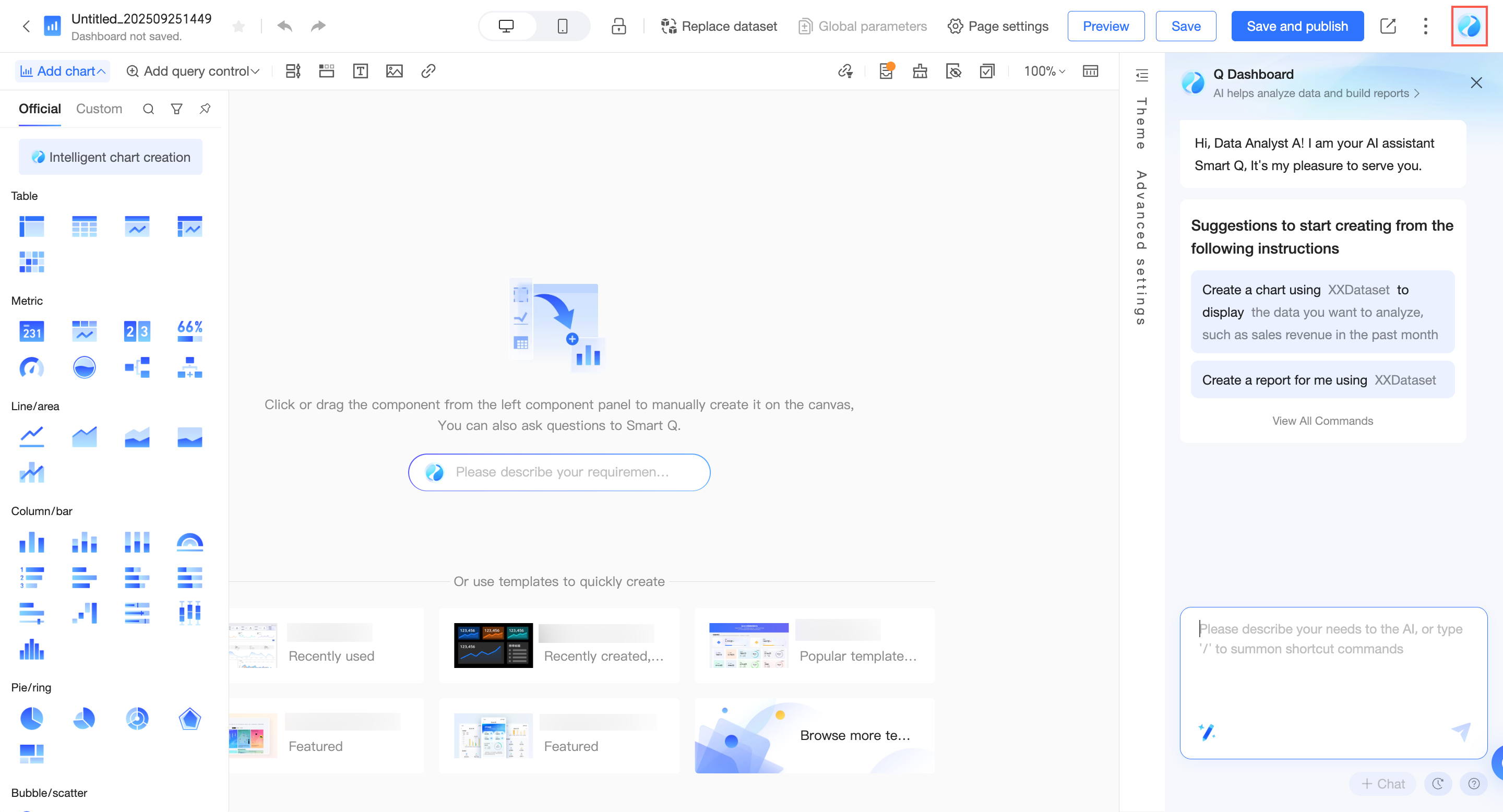
Create from conversation
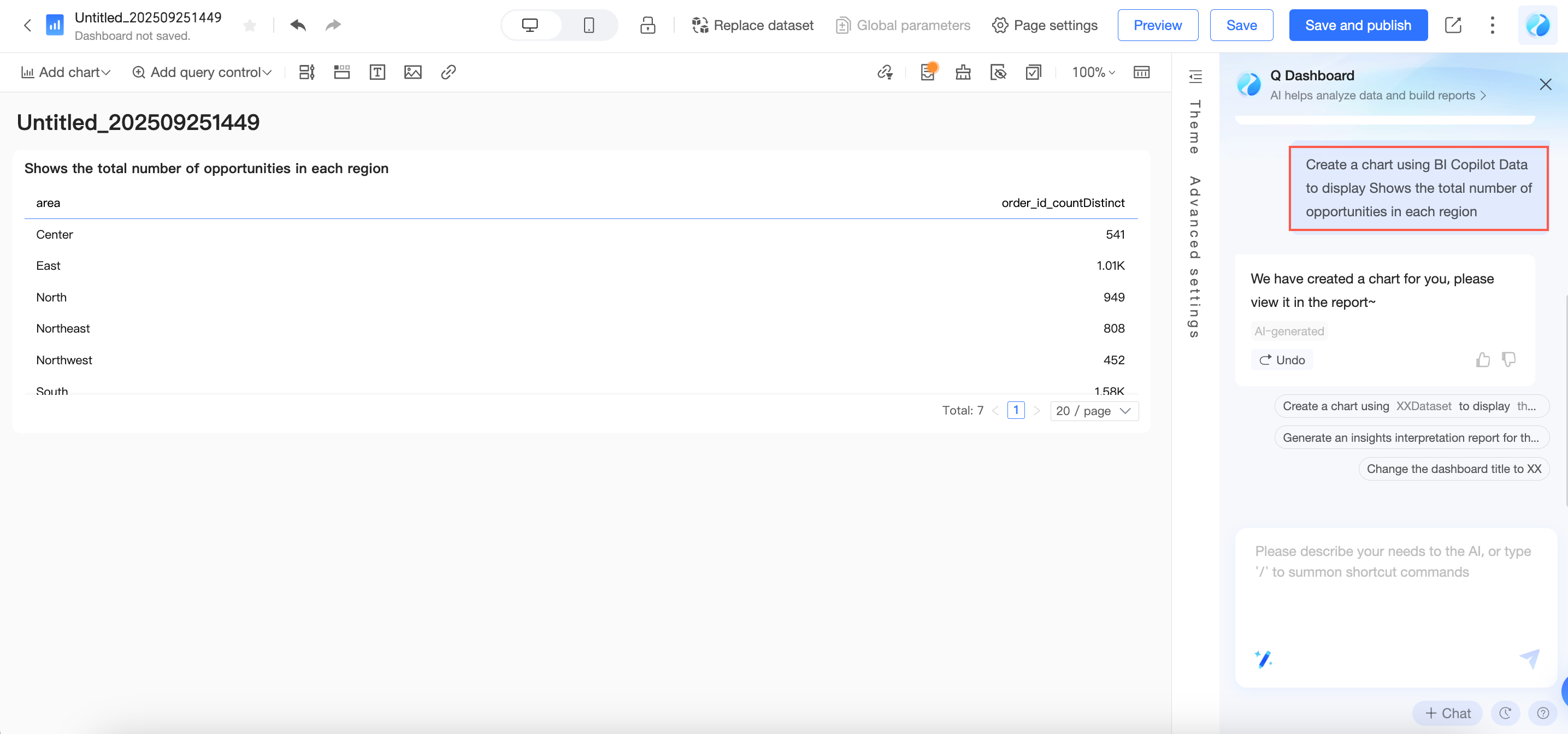
Create charts
Intelligent assistant Q can recognize your natural language input and create charts according to your requirements, making chart creation simpler. To create a chart, you need to input the following information: ① Dataset name ② Data analysis requirements.
You need to first select the dataset you want to use. You can select from the list or directly enter the dataset name to search.
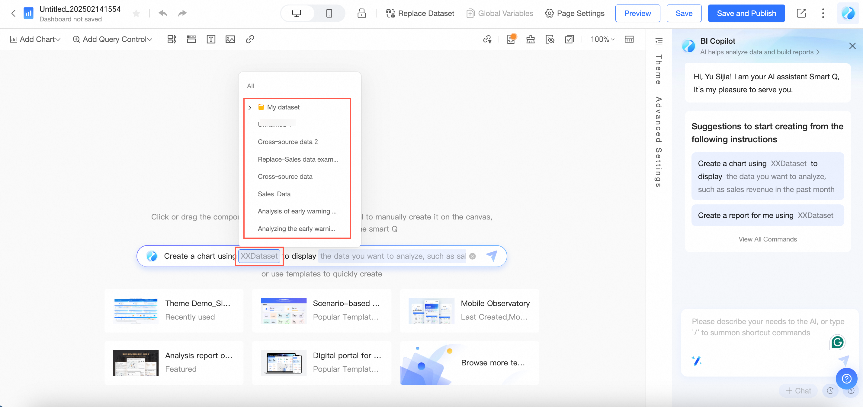
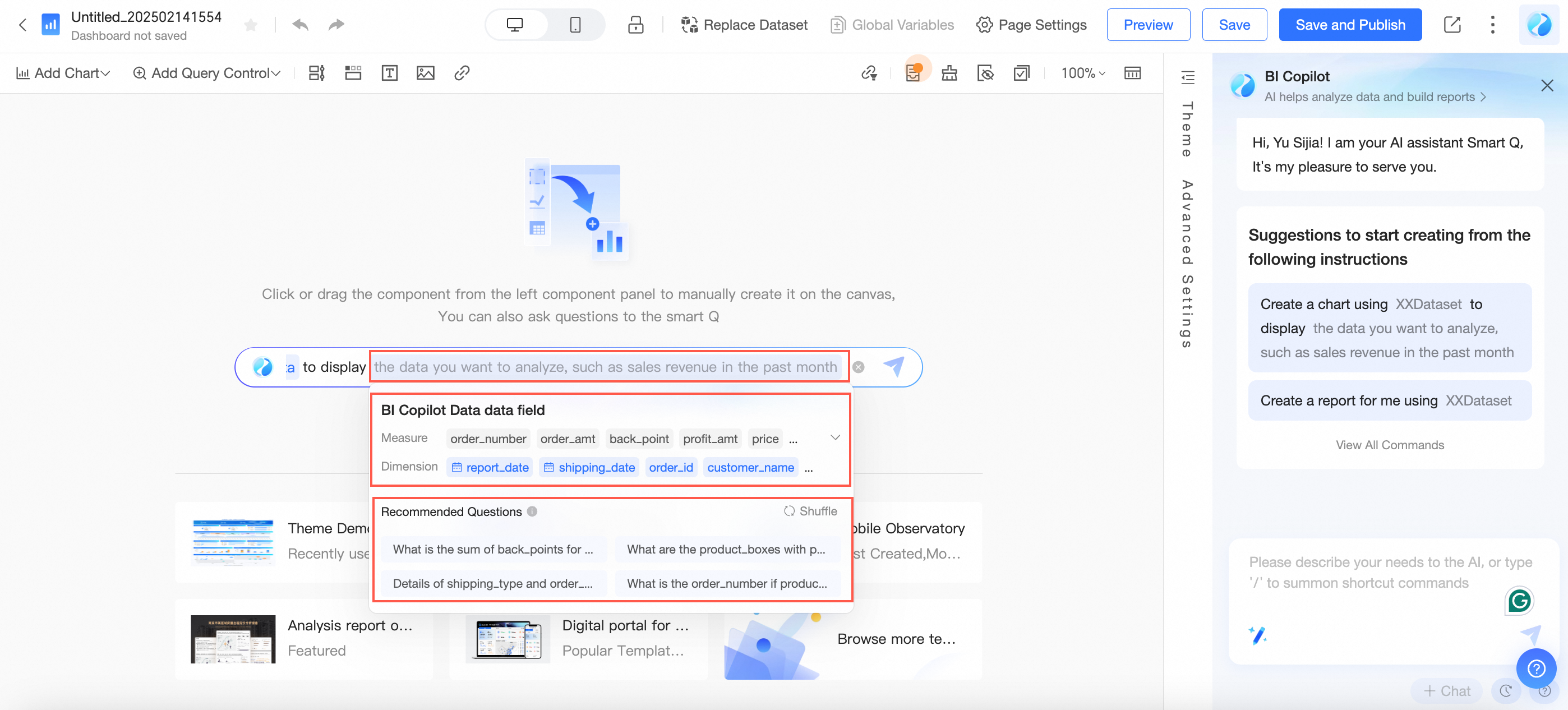
After selecting the dataset, assistant Q will automatically learn your dataset, display the dataset name and data fields, and generate recommended questions. You can select a recommended question for data exploration or directly enter your analysis requirements. For example, you can enter: "Sum of opportunities by region".
After completing the input, click send, and assistant Q will automatically retrieve the data and generate the corresponding chart for you.
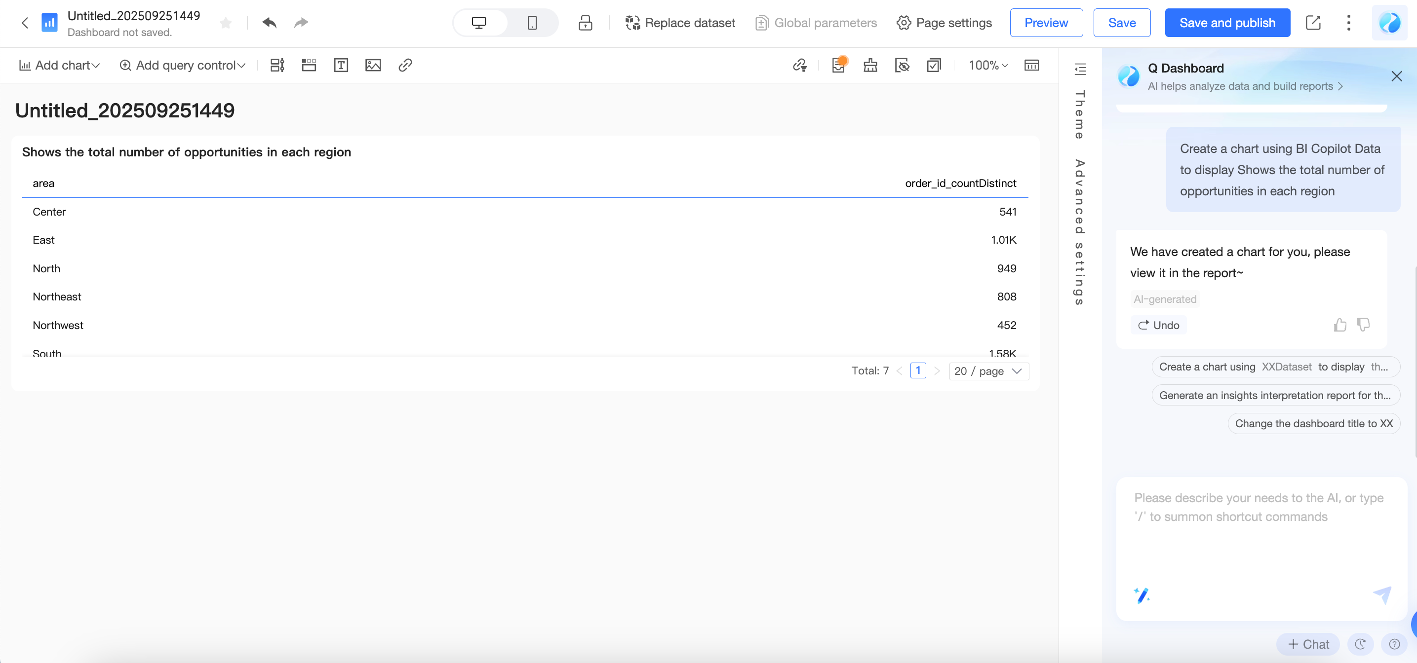
The chart type is automatically generated by the model, and the chart title will default to your input analysis requirements. To modify it, you can do so through conversation. You can refer to:
Feature
Function introduction
Instruction description examples
Modify chart type
Switch the type of chart component
"Help me change the chart type to ranking"
"Help me change all bar charts to line charts"
Modify chart title
Show/hide component title, or modify chart title content
"Show component title"
"Help me change the chart title to Customer Source Channel Analysis"
"Help me hide the titles of all kanbans"
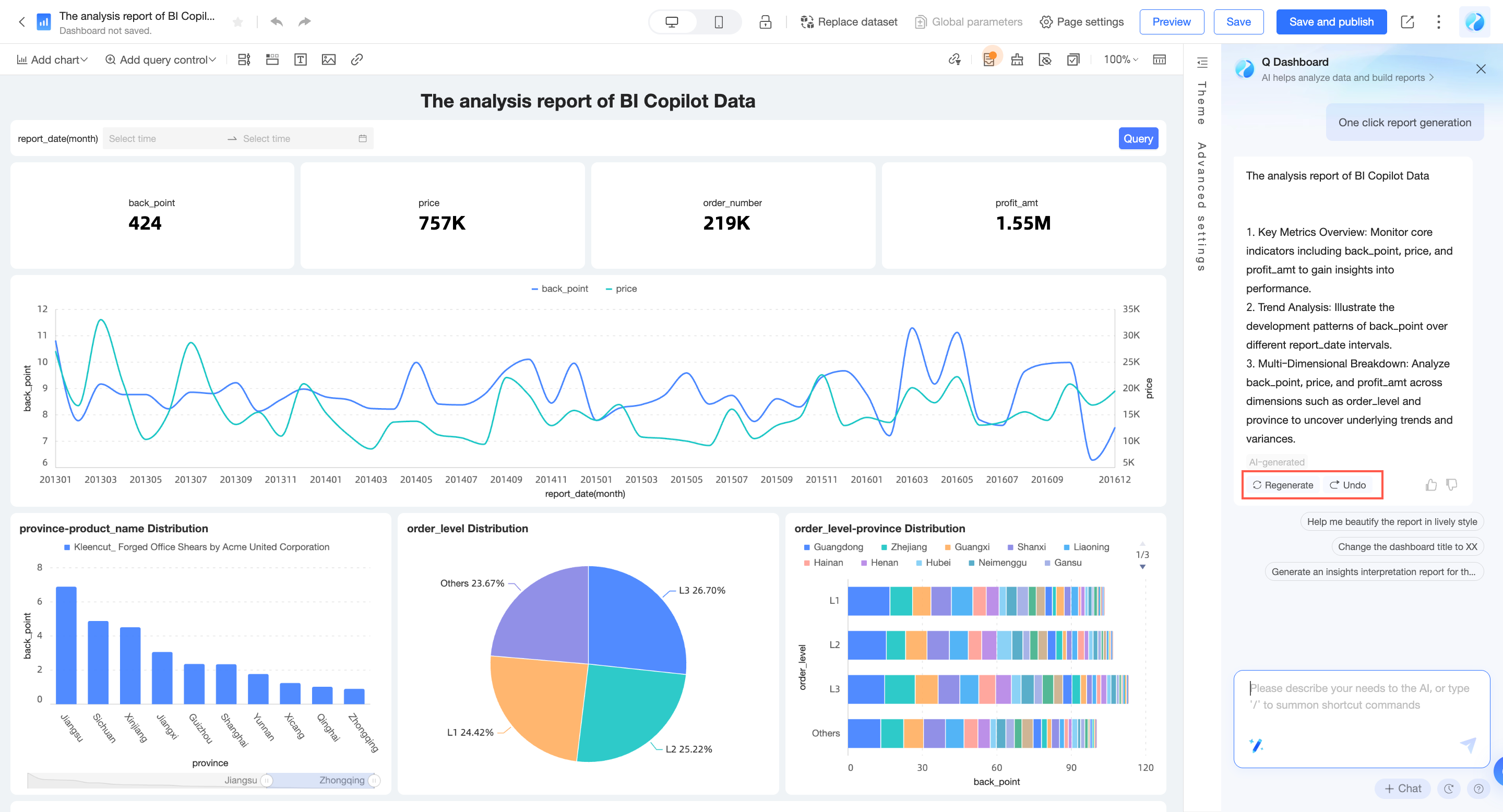
Generate reports
In addition to creating individual charts, assistant Q can also perform data exploration and analysis based on your saved datasets to quickly generate a report. To create a report, you need to input the following information: Dataset name.
You need to first select the dataset you want to use. You can select from the list or directly enter the dataset name to search.

After you make a selection, click Send. Q automatically retrieves the data and generates the corresponding report.
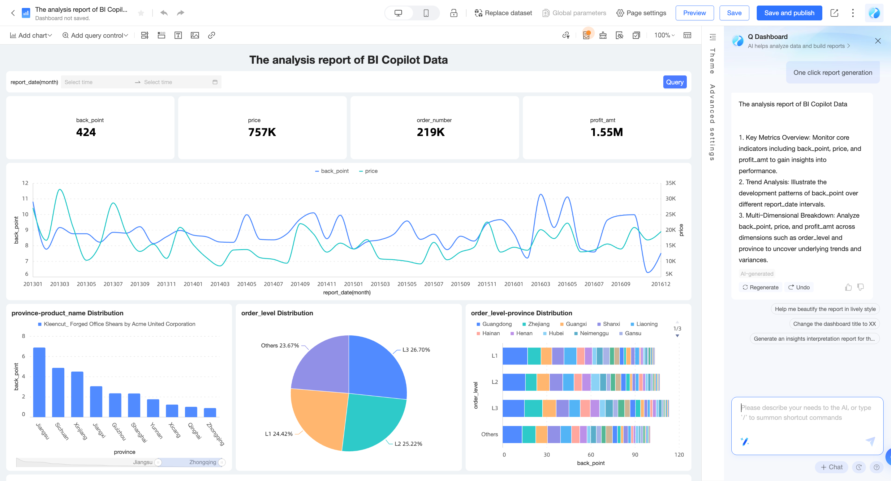
If you are not satisfied with the generated report, you can click Regenerate to change the analysis approach or click Revoke to discard the content.
Input methods
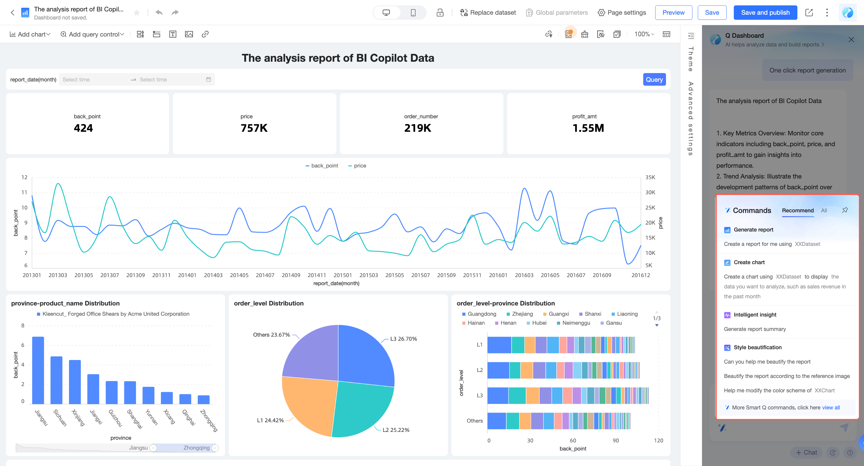
When you create a new dashboard with no content, you can directly enter the required information in the assistant Q dialog box to perform command operations.
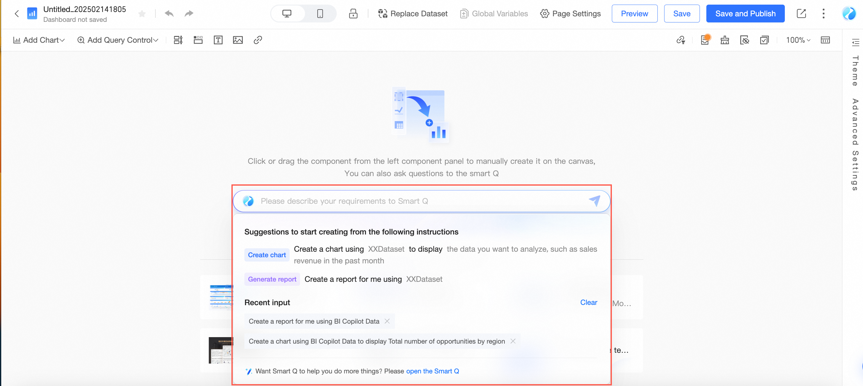
Alternatively, you can open the Q dialog box on the right side of the dashboard and enter natural language commands to create content.
You can also click Command Center in the Q dialog box, select an instruction, and enter the required information to create content.
Adjust and analyze data
You can quickly configure charts and add analysis elements through conversation. The currently supported range is as follows. For detailed usage instructions, please refer to the Instruction support list.
For chart operations, please first select the chart you want to edit, then send instructions to assistant Q.
Adjust data
Feature | Capability introduction | Instruction description examples |
Modify chart fields | Modify the data field content of the chart | "Help me replace signed amount with sales amount" |
Modify field display name | Modify the display name of a field in the current chart without changing the data field content | "Help me rename contact method count to lead count" |
Add field description | Modify the description information of a field in the current chart without changing the data field content | "Help me add a description to business lead count, with the description content as number of effective business opportunities to be followed up" |
Add field suffix | Add suffix information to a field, commonly used to add metric units | "Help me add the suffix $ to signed amount" |
Modify field aggregation method | Modify the statistical method of a field | "Help me change the calculation method of business lead count to count distinct" |
Modify field sorting | Rearrange data according to the required order | "Help me set sales volume to display in descending order" "Help me set the fields of all pie charts to descending order" |
Modify data format | Modify data format according to display requirements | "Help me set the data display format to integer" "Help me set the data display format of all charts to two decimal places" |
Add year-over-year or month-over-month comparison | Observe data changes by viewing year-over-year or month-over-month comparison data | "Help me add a year-over-year field" "Help me add a month-over-month field based on the sales volume field" |
Add total | Display data summary values | "Help me turn on the total" "Help me show the total for all pie charts" |
Add subtotal | Display subtotal data under different categories | "Turn on subtotal, summarize by channel" |
Add target | Add targets for your KPIs to show progress | "Help me add a target of one hundred thousand" "Help me set a target value of one hundred thousand for sales amount" |
Modify combination chart field display style | Modify the display style of fields, can switch between line, column, and area | "Change the growth rate field to display as line type" |
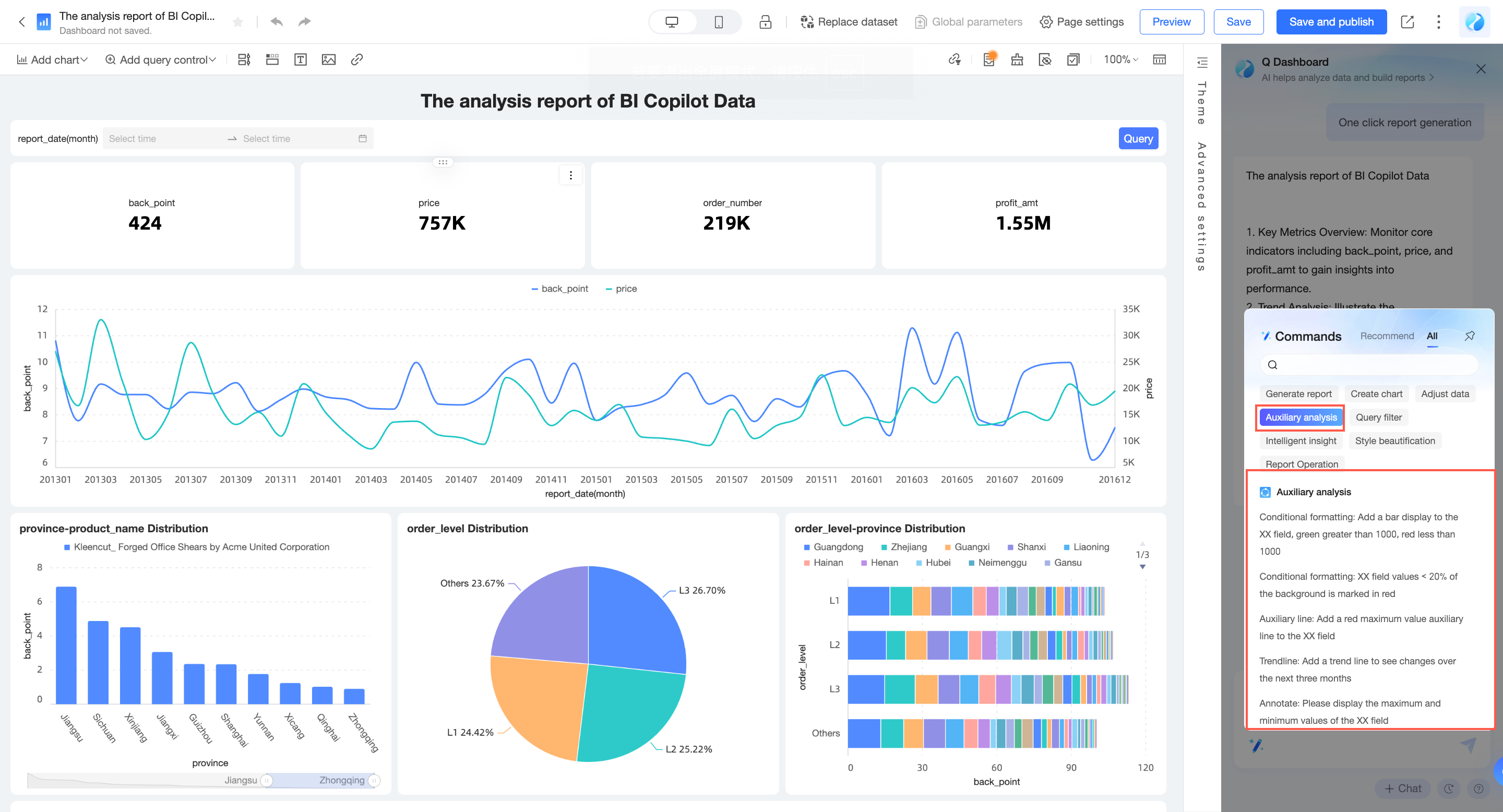
Auxiliary analysis
You can directly enter relevant instructions in the intelligent assistant Q dialog box or select and enter auxiliary analysis in the command center.
Feature | Capability introduction | Instruction description examples |
Conditional format | Highlight abnormal data by setting data ranges to quickly discover business anomalies | "Help me mark in red the data where sales amount is greater than 1000" "Help me mark in green where year-over-year is less than or equal to 30%" |
"Help me add bar display to the sales amount field, green for greater than 1000, red for less than 1000" "Mark the background red for sales amount field values <20%" | ||
Auxiliary line | View the difference between current measure values and reference values | "Help me add an average auxiliary line" "Help me add a red maximum value auxiliary line to the sales amount field" |
Trend line | Predict the overall development trend of data | "Help me add a trend line to see changes over the next three months" "Help me add a yellow trend line to the sales amount field" |
Extreme values | Understand the extreme distribution of data by viewing maximum/minimum values. | "I want to see the boundary values" "Help me display the maximum and minimum values of sales amount" |
Annotate | Highlight focused data content by setting data ranges to grasp data distribution | "Help me display the maximum and minimum values of the sales amount field" "Help me highlight the sales amount field between 100,000 and 150,000" |
Automatic filter interaction | When enabled, all charts under the same dataset in the dashboard will automatically associate with each other. | "Help me turn on automatic filter interaction for charts" "Help me turn off automatic filter interaction" |
Create a filter bar
Feature | Capability introduction | Instruction description examples |
Create a filter bar | Add query controls to filter data under certain conditions for analysis Can add queries based on the entire report or a single chart | "In the report, add a filter bar based on the test dataset to query data for 2023" |
"In the report, add a filter bar based on the test dataset to query data for each channel" | ||
(Select 1 tab) "Add a filter bar based on the test dataset to query data from January to October 2023" | ||
(Select 1 chart) "Add a filter bar to query data for each channel" | ||
(Select 1 chart) "Filter data for the East China region" | ||
Pin filter bar to top | Keep the filter bar pinned to the top | "Keep the filter bar at the top of the report" |
Discover data fluctuations
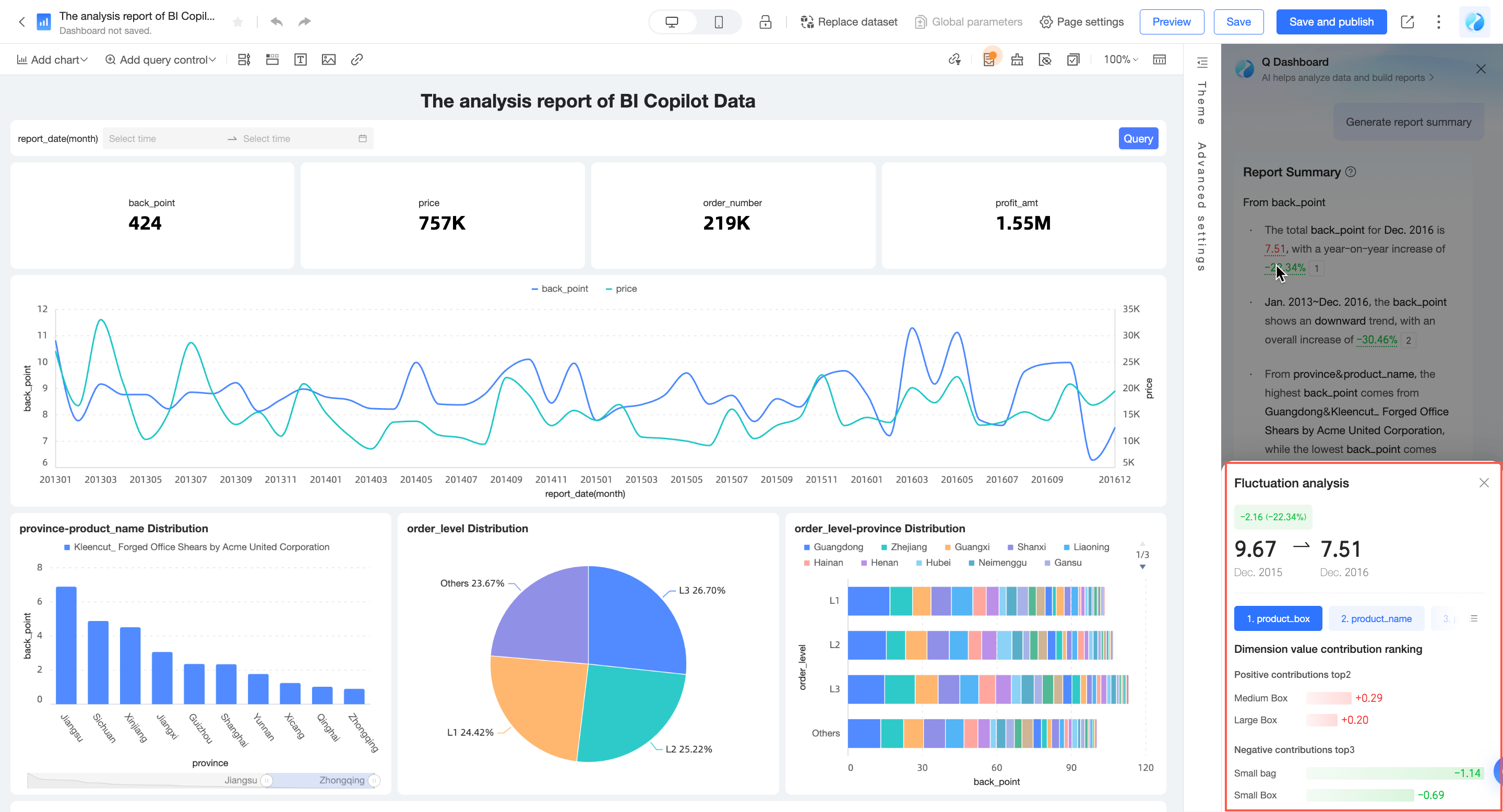
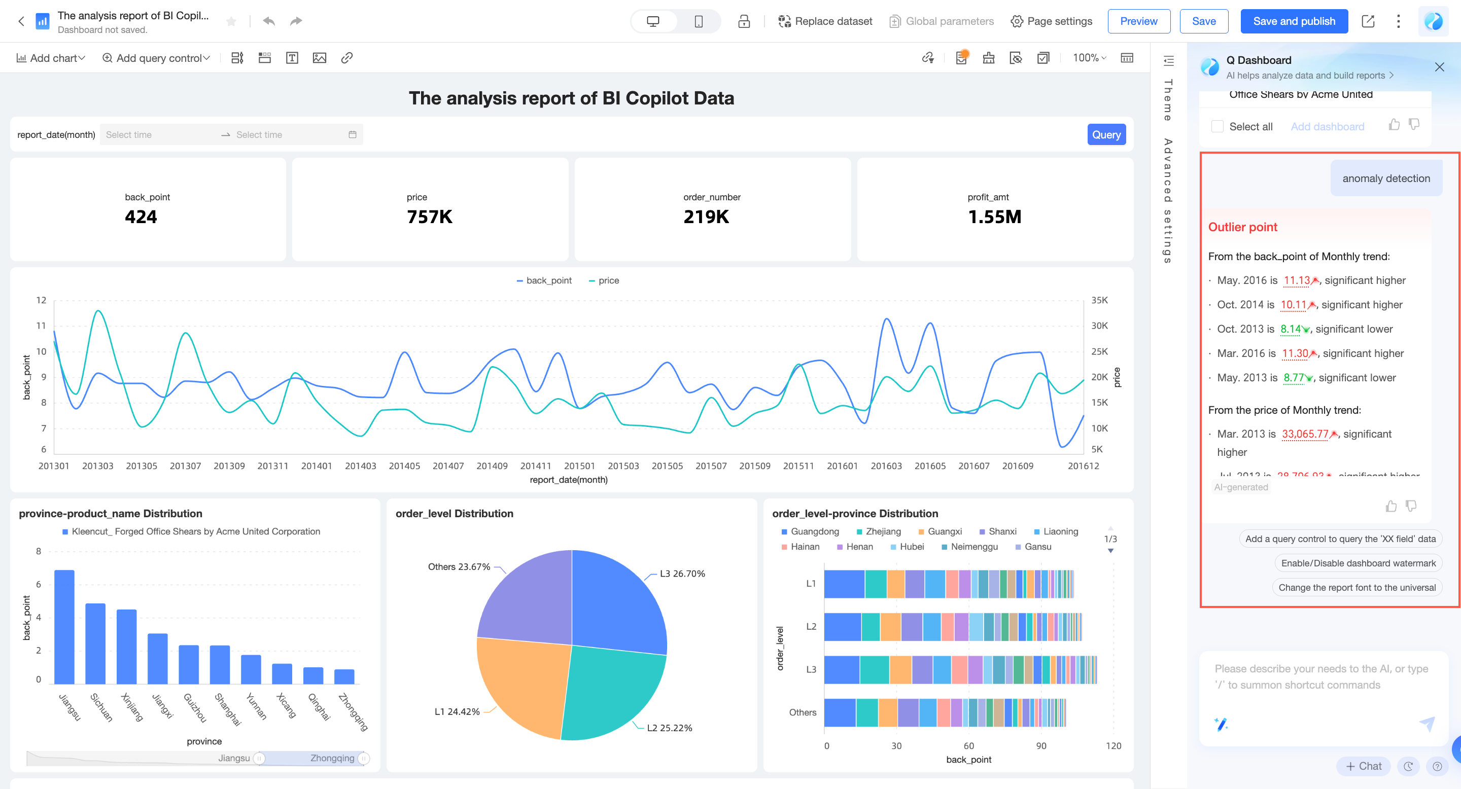
Intelligent assistant Q can automatically generate report summaries, analyze fluctuation causes, detect anomalies, and provide attribution, helping you quickly discover data changes.
You can ask Q to "Help me generate a summary" or click Intelligent Insights > "Help me generate a report summary" in the Command Center.
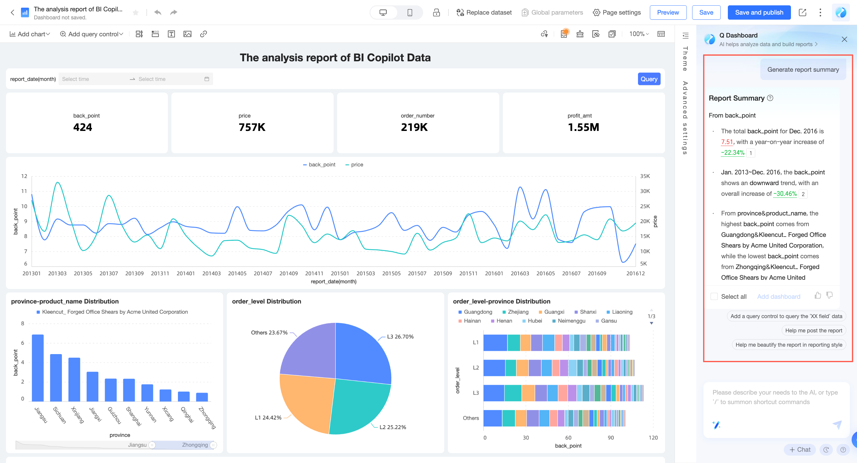
Click the year-over-year or month-over-month data to view the causes of fluctuations.
Enter "anomaly detection" to automatically detect and present anomalies in the report.
Beautify report style
One-click intelligent beautification
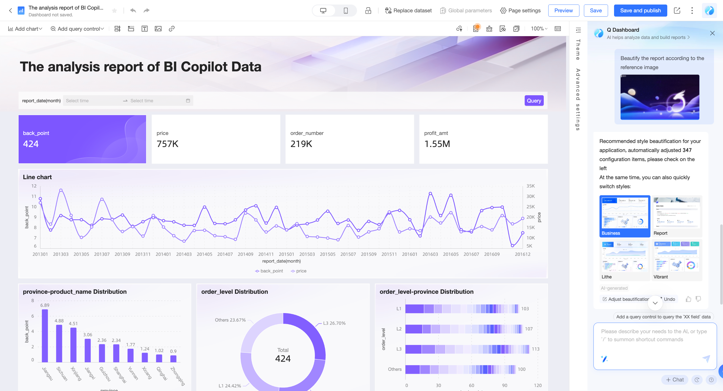
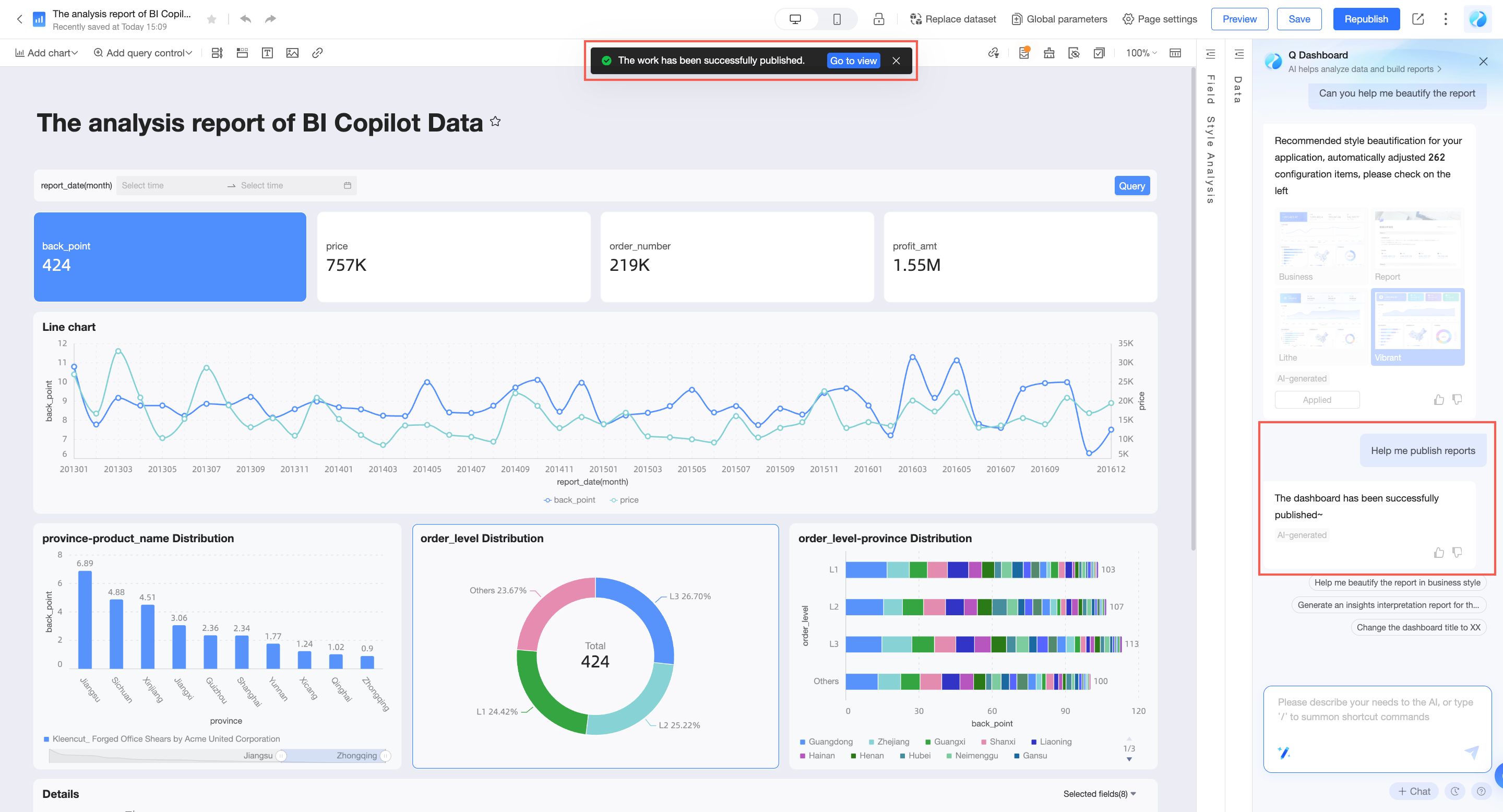
Intelligent assistant Q can automatically beautify your report style. You can choose built-in styles or upload your company logo to reference brand colors for report beautification. No professional designer is needed to quickly build beautiful report styles.
Select a built-in style: You can ask Q to "Help me beautify the report" or click Style Beautification > "Help me beautify the report" in the Command Center.
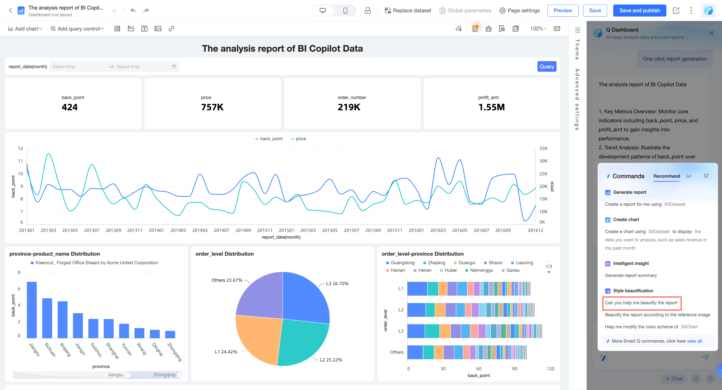
Beautify reports based on corporate branding: You can click Intelligent Beautification > "Beautify the report based on a reference image" in the Command Center, upload an image, and complete the report adjustment.
Beautify the color scheme of a single chart: You can click Intelligent Beautification > "Help me modify the color scheme of the XX chart" in the Command Center and select a chart to beautify.
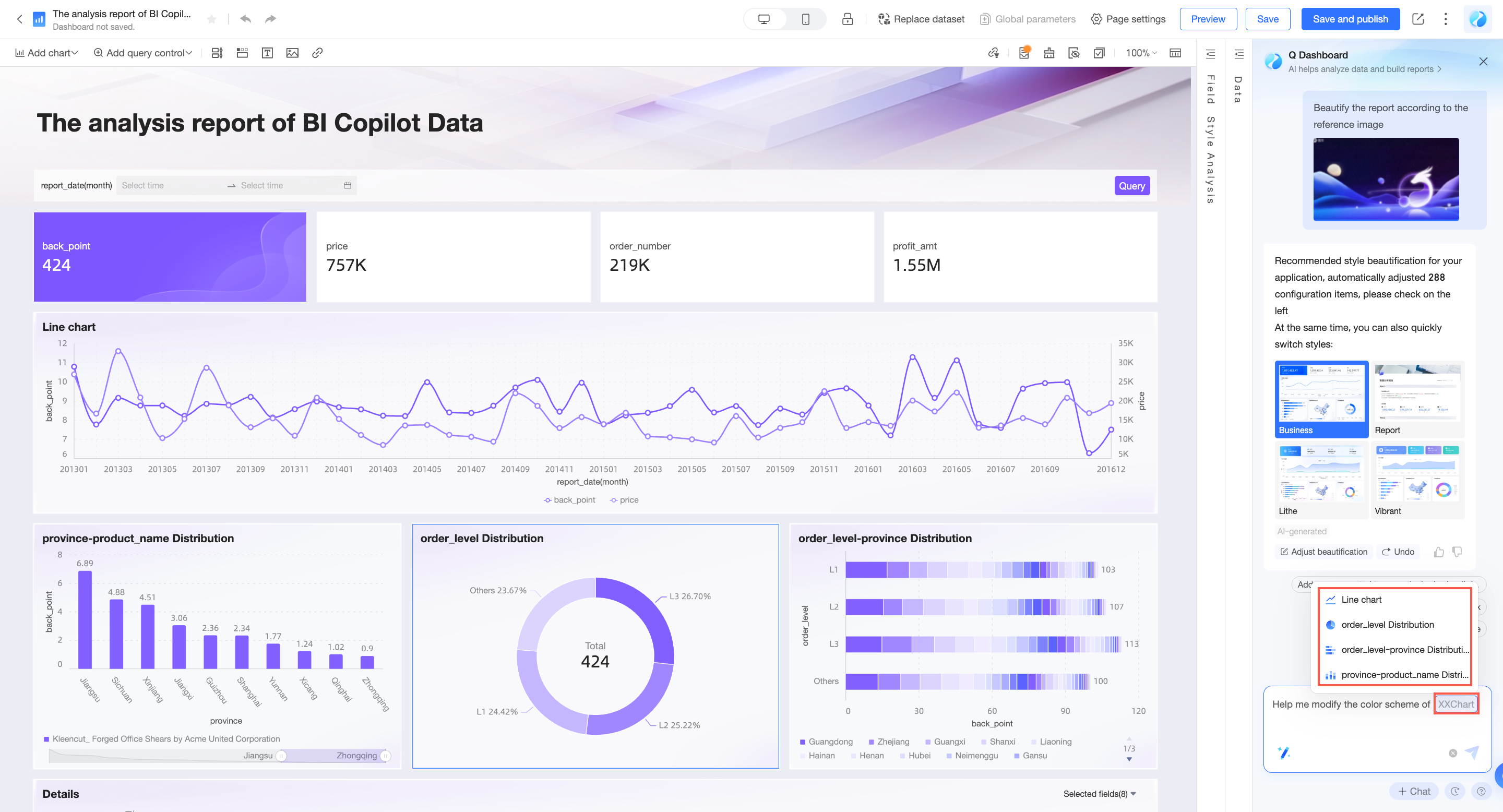
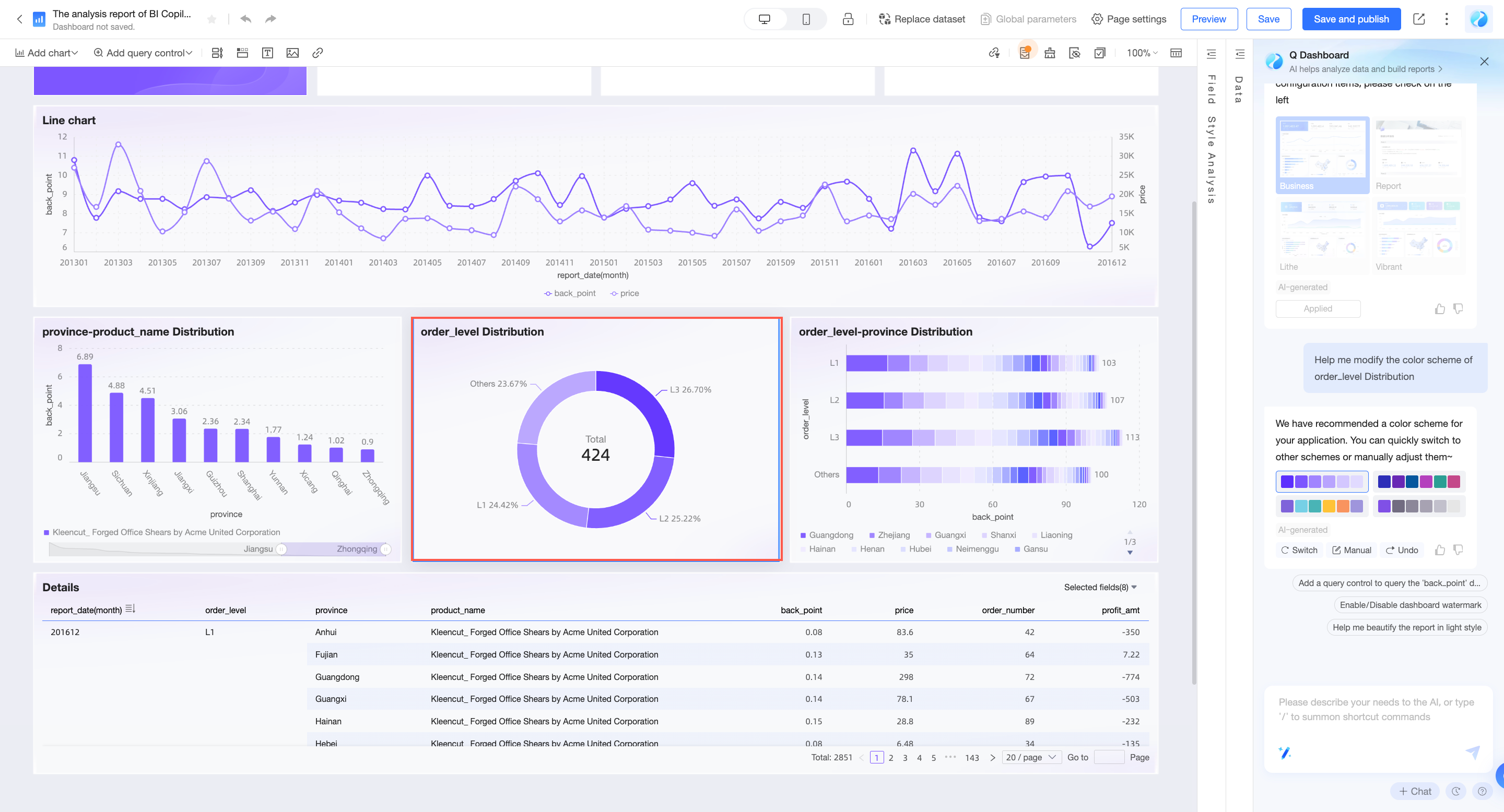
If you are not satisfied with the beautification effect, you can click revoke to discard the changes, or click adjust beautification effect to customize the style you need.
Quickly adjust styles through conversation
You can quickly modify chart/report styles through conversation. The currently supported range is as follows. For detailed usage instructions, please refer to the Instruction support list.
If the function is at the chart level, please first select the chart component you want to configure, then send instructions to assistant Q.
Feature | Capability introduction | Instruction description examples |
Edit report theme | Edit dashboard theme style | "Help me make the dashboard style more minimalist" |
Edit report background color | Edit dashboard background color | "Help me set the dashboard background to light blue" |
Edit report chart spacing | Edit dashboard chart spacing | "Help me make the chart spacing larger" |
Edit report font type | Edit dashboard font type | "Help me set the dashboard font to Song" |
Edit component background color | Edit the background color of components | "Set the card background to red" "Help me set the background of all line charts to blue" |
Edit component visual element colors | Edit the colors of component visual elements, such as line colors in line charts | "Help me modify the color scheme of the Customer Source Channel Analysis chart" |
Turn data labels on/off | Turn data labels on or off | "Help me turn on data labels" "Help me hide data labels for all line charts" |
Switch line display type | Switch line display type, can switch between straight/curved lines | "Help me switch the line type to curved" "Help me change the line type of all line charts to straight" |
Edit column width in bar charts | Edit the column width in bar charts | "Help me set the column width to 50%" "Help me make the column width larger" "Help me make the column width of all bar charts smaller" |
Turn table ordinal number column on/off | Turn table ordinal number column on or off | "Turn on the ordinal number column" "Help me show the ordinal number column for all cross tables" |
Edit field alignment | Edit field alignment, including horizontal and vertical alignment | "Set the sales amount field to align center" |
Show or hide table header | Show or hide table header information | "Help me hide the table header" "Help me show the table header for all cross tables" |
Edit table header font style | Edit table header font style | "Help me set the table header font to red bold" "Help me set the table header font size of all cross tables to 24px" |
Publish and share reports
Publish
After the report is created, you can ask Q to "Help me publish the report" to publish the report with one click.
Share
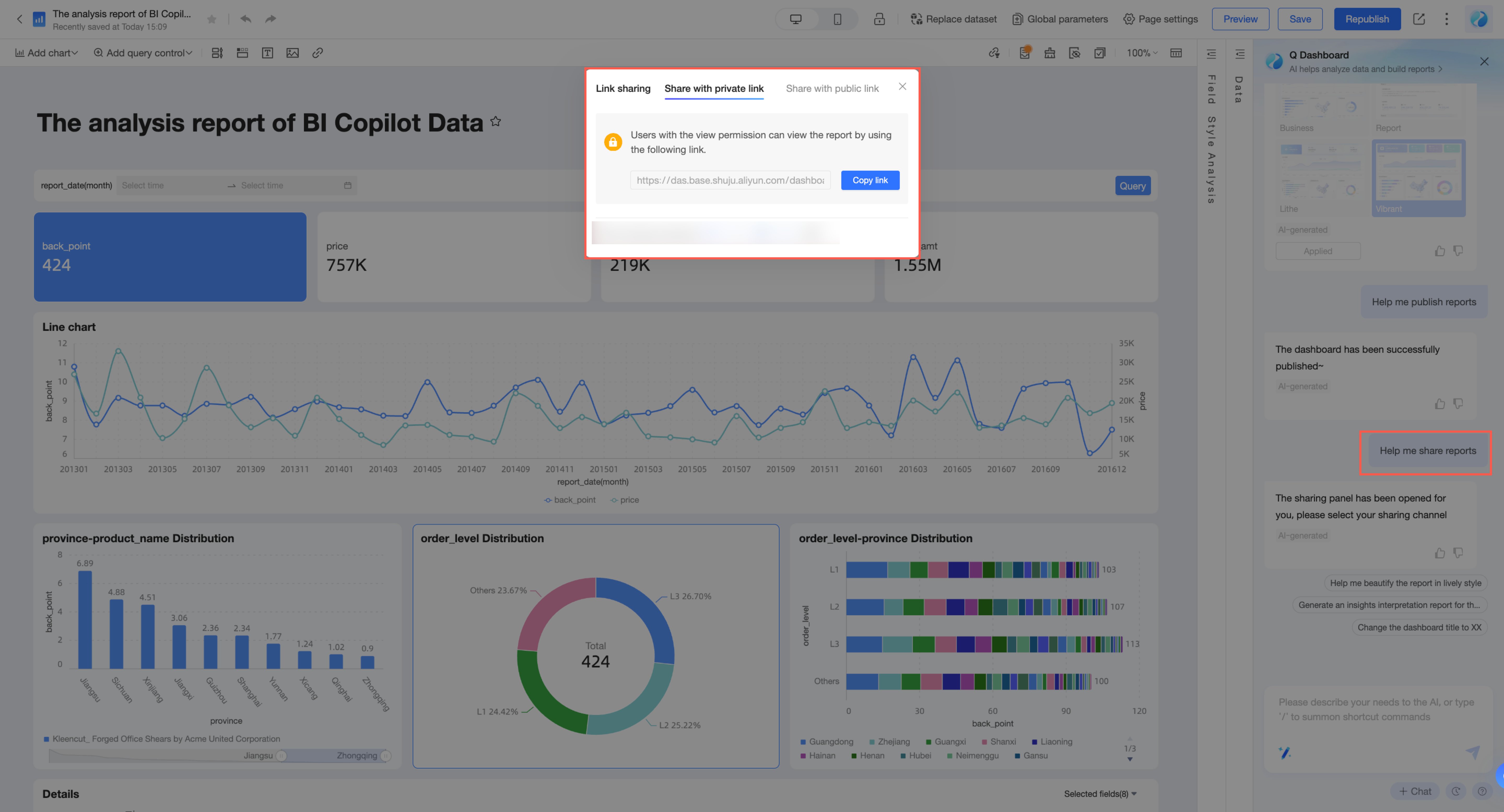
You can also tell intelligent assistant Q: "Help me share the report" to share the report.
Other related operations
You can quickly complete report-related operations through conversation. The currently supported range is as follows. For detailed usage instructions, please refer to the Instruction support list.
Feature
Capability introduction
Instruction description examples
Turn watermark on/off
Turn the dashboard watermark on or off (Note: Limited by the organization's database permission)
"Help me turn off the watermark"
"I want to show the watermark"
Switch between edit/preview mode
Quickly switch dashboard states
"Help me switch to edit mode"
"Help me switch to preview mode"
Save dashboard
Save dashboard content
"Help me save the dashboard"
"Save the dashboard and name it Sales Statistical Analysis"
Publish dashboard
Publish the dashboard. After publishing, visitors can view the dashboard content
"Help me publish this"
Share dashboard
Share the dashboard with others
"Share report"
"Help me share the dashboard to DingTalk"
The Q Builder model supports multi-turn conversation and can automatically associate context information for intention recognition.
If you want to start a new conversation, you can click "New Session" in the bottom right corner of the panel. At this time, the context memory will be cleared simultaneously.