This topic introduces the basic concepts of Quick BI custom components.
Custom components
In Quick BI, a custom component (CustomComponent) is an object with properties such as bootstrap, mount, unmount, and update. These properties encompass the specific implementation logic of the custom component. For more information, see Lifecycle.
Example
// This is a custom component
const CustomComponent = {
    bootstrap: (props) => {},
  mount: (props) => {},
  unmount: (props) => {},
  update: (props) => {},
}Typically, you don't need to manage the lifecycle of custom components. The bi-open-sdk and bi-open-react-sdk provide the createBIComponent function to create custom components, which you can invoke directly.
Custom component metadata
Custom component metadata (ComponentMeta) is an object that includes properties such as propsSchema. Metadata allows you to customize the data panel, style panel, and advanced panel functions of Quick BI custom components. For more information, see ComponentMeta.
Example
const meta = {
    propsSchema: {
      dataSchema: {
        schema: {}
    },
    styleSchema: {
        schema: {}
    },
  }
}
Project structure
The recommended method to create a Quick BI custom component is by using the create-qbi-app command to generate a seed project. You can create it with the npm init qbi-app <project name> command. For more information, see Getting Started.
File directory
Upon generating the seed project, the file directory structure is as follows:
├── build                # Build output directory
├── node_modules         # Project-related package dependencies
├── public               # Local debugging entry
│    └──index.html
├── src                  # Source code
│    ├──index.tsx        # Component entry
│    ├──index.scss       # Component style file
│    └──meta.ts          # Component property configuration, including data, style, and data-to-view mapping relationships.
├── .eslintrc            # ESLint plug-in configuration file
├── config-overrides.js  # Webpack configuration file
├── package.json         # Dependency package management
├── README.md            # Project documentation
└── tsconfig.json        # TypeScript configuration file
Related commands
npm run start: Start local debugging.npm run build: Build the project.npm run pack: Package the build results into a Quick BI deployment package. By default, this command first executesnpm run build.
Src directory
This folder contains the source code for the custom component, which includes:
meta.ts: Metadata for the custom component, used to configure the data and style panels.index.tsx: The custom component itself.index.scss: Style file for the custom component.
Public directory
This folder contains the HTML template and mock data for
devserver.Build directory
This folder holds the build output and packaged results.
After running
npm run build, the following modules will be produced:Filename
Module type
Module name
main.js
umd
BIComponent
meta.js
umd
BIComponentMeta
main.css
-
-
NoteTo ensure the accuracy of the output results, avoid making arbitrary changes to the webpack configuration.
Custom component status
Quick BI custom components feature two status dimensions: running status and visibility status.
Running status
The running status tracks the lifecycle of a custom component, from creation to destruction, and varies based on the component's development mode. Manage the running status of components via the custom component management platform, accessible through Open Platform > Custom Components.
Edit Online
Pending publication - Newly registered or updated information published but not yet synchronized online.
Published - The component is running online.
Professional Mode
In development - Newly registered and awaiting upload of the development package.
Pending publication - Development package uploaded or information adjusted, but not yet synchronized online.
Published - The component is running online.
Register component
To register a component, click Register Component, complete the information fields, and then click the Confirm button.
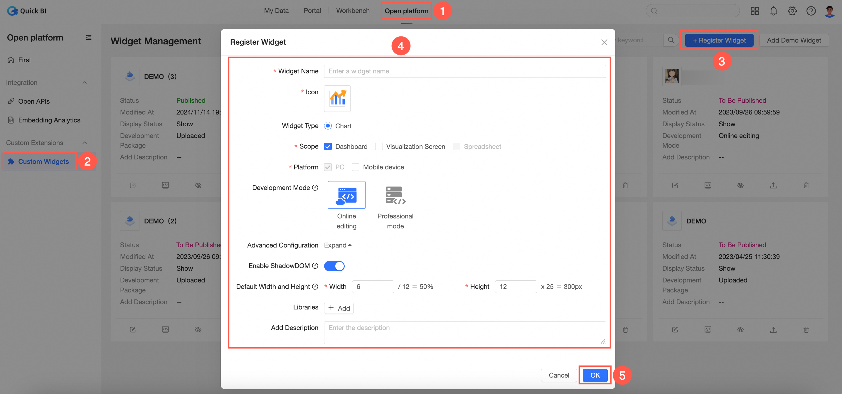
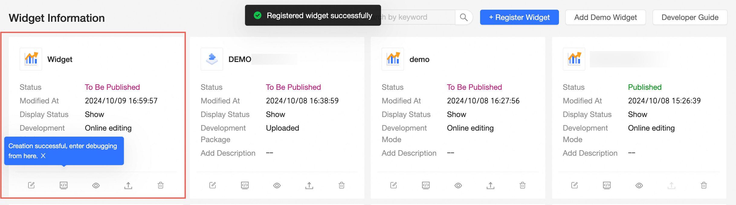
Upon successful registration, the component's card will appear on the page.
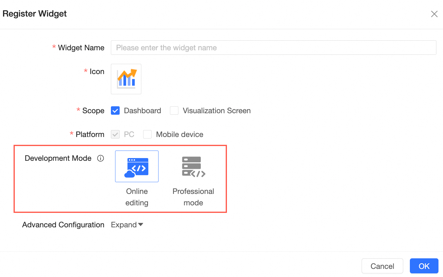
The chosen development mode influences the subsequent development process of the custom component and is not modifiable post-selection. Choose according to your needs.
Edit Online: Edit and debug directly on the page, offering ease of use and convenience. For more information, see Mode 1. Edit Online.
Professional Mode: Utilize the SDK for local debugging, ideal for complex component development. For more information, see Mode 2. Professional Mode.
Debug component
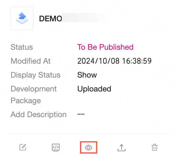
In the component list, click the Debug button on the component card to initiate debugging.
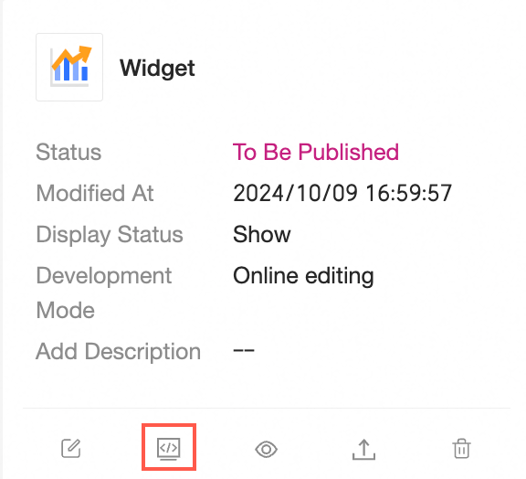
A dialog box for component debugging will appear.
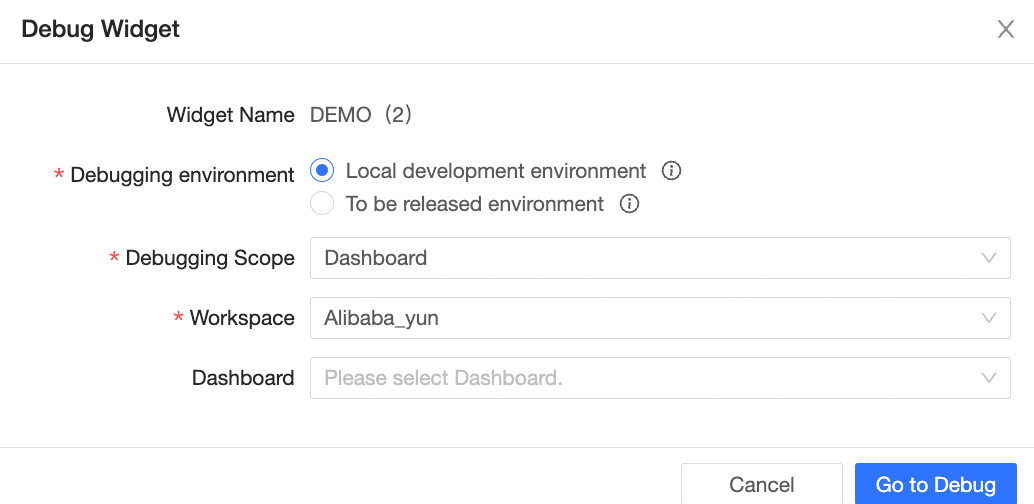
Within Edit Online, there are three debugging environments for components:
Online development environment - Allows for online editing of component source code, with configurations set to the pending publication package.
Pending publication environment - Uses resources from the pending publication package, with configurations set accordingly.
Online environment - Uses resources from the published package, with configurations set accordingly.
Under Professional Mode, there are three debugging environments for components:
Local development environment - Reads component resources from the local service, with configurations set to the pending publication package.
Pending publication environment - Uses resources from the pending publication package, with configurations set accordingly.
Online environment - Uses resources from the published package, with configurations set accordingly.
In the component debugging dialog box, select the debugging scope, workspace, and corresponding dashboard for debugging, then click Go to Debug to navigate to the appropriate dashboard page.
Edit Online
In Edit Online mode, the component's icon is shown in the page material bar, and a code editor appears at the bottom of the page. Select files under src on the left to edit. After code modifications, click the Run button for real-time execution.
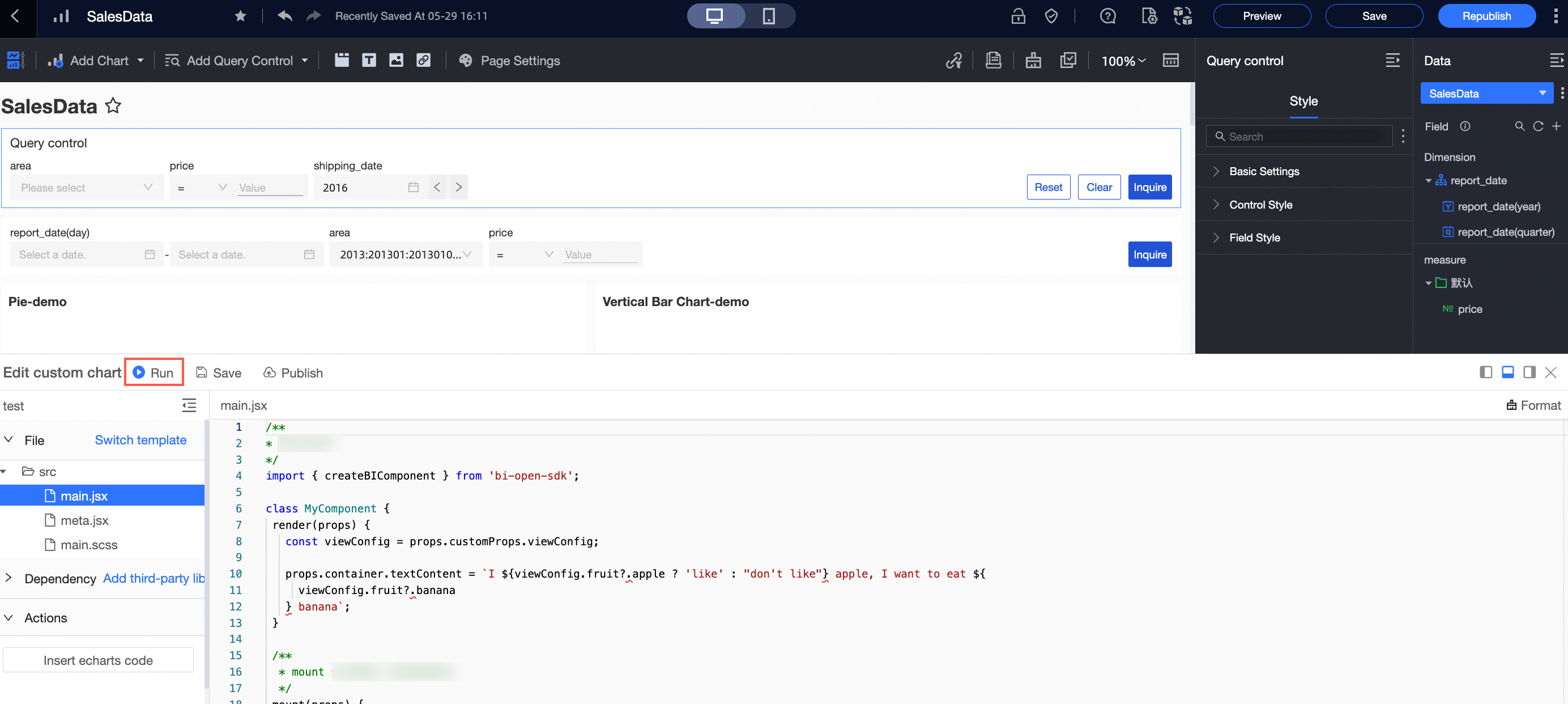
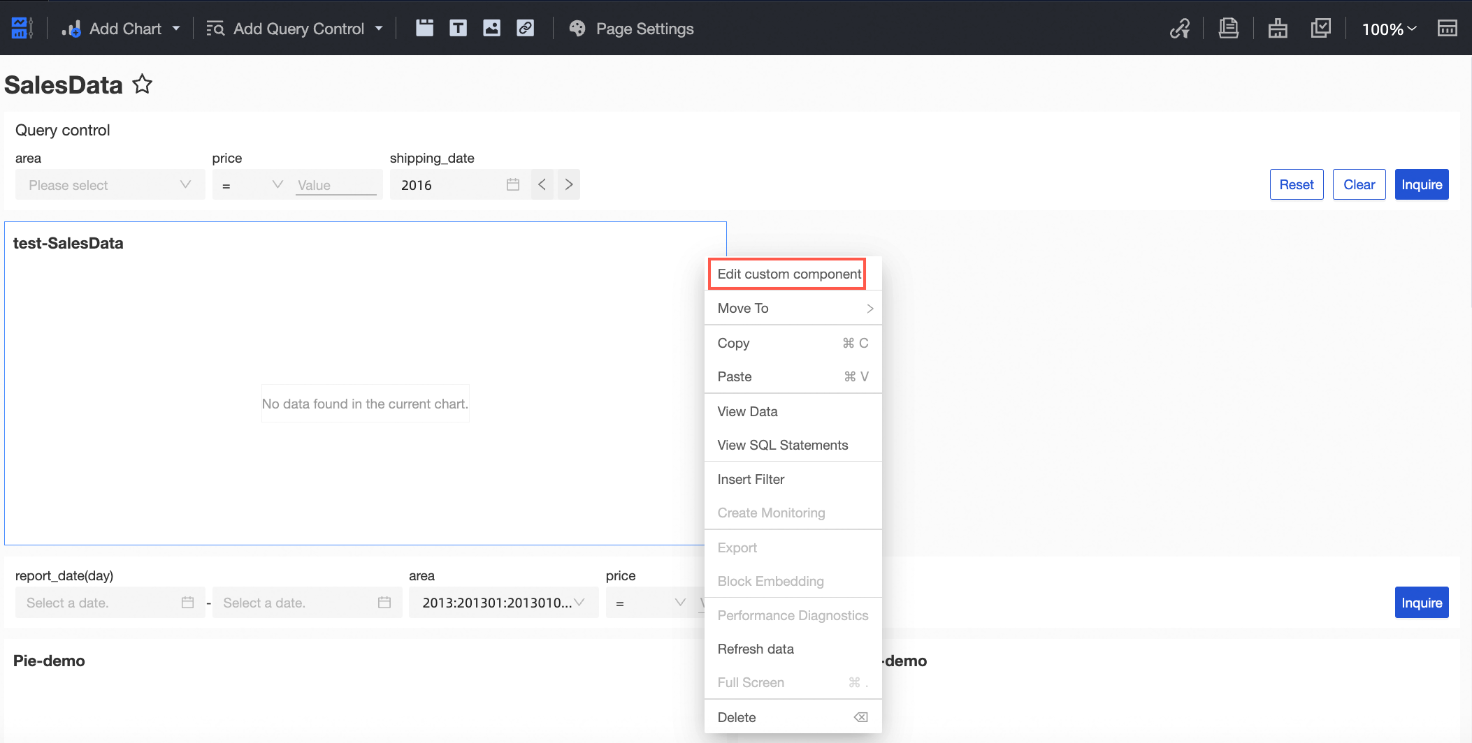
The code editing panel can be closed manually. To re-enter editing mode, click the drop-down menu in the upper right corner of the custom component card and select Edit Custom Component.
Note:
In debug mode, the custom component will always be visible in the material bar, regardless of its visibility status.
While in debug mode, the dashboard can be saved but not published.
After finalizing component development in Edit Online, click the Save button to save the code. The component will then enter the pending publication status.

Professional mode
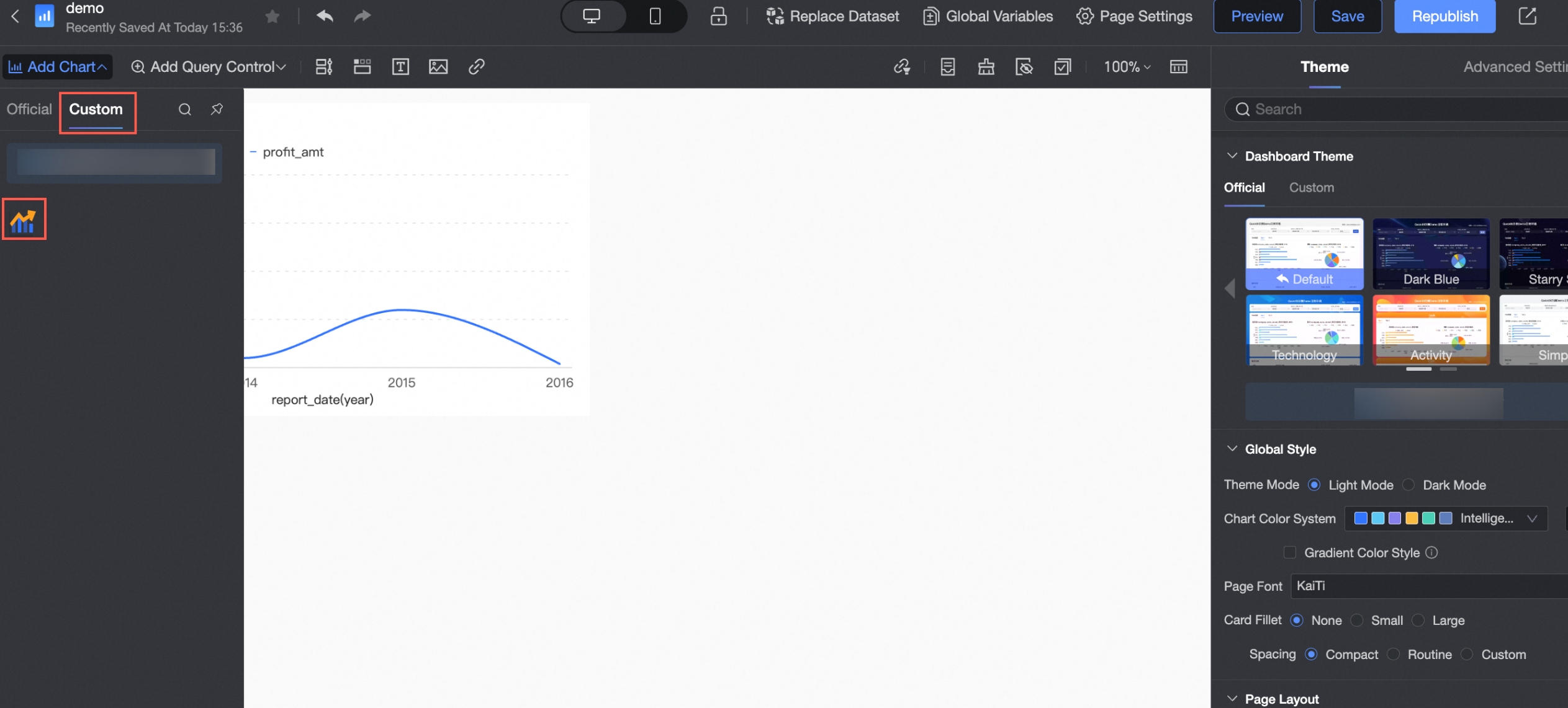
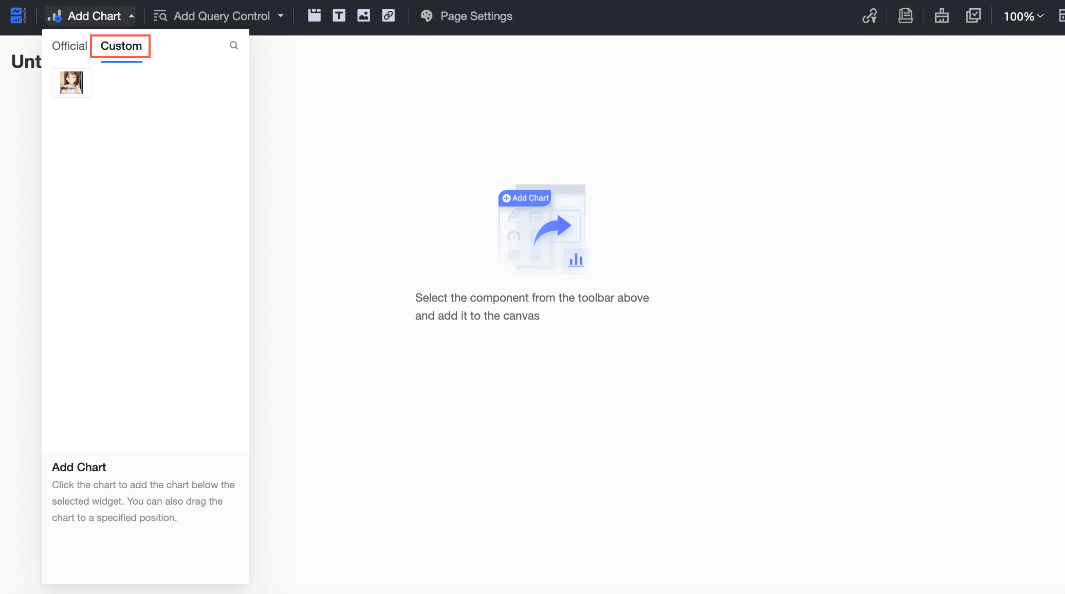
In Professional Mode, select Add Chart > Custom on the dashboard page. The component's icon will appear. Drag it onto the dashboard, configure the data panel, and retrieve data. After local code modifications, refresh the page to continue development and debugging.
Note:
In Professional Mode, ensure the local service for the component is running.
In debug mode, the custom component will always be visible in the material bar, regardless of its visibility status.
While in debug mode, the dashboard can be saved but not published.
After completing development in Professional Mode, package and upload the component via Open Platform > Custom Components.
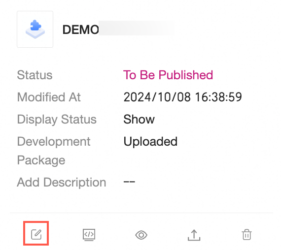
Click the Edit button, and a dialog box for modifying component information will appear.
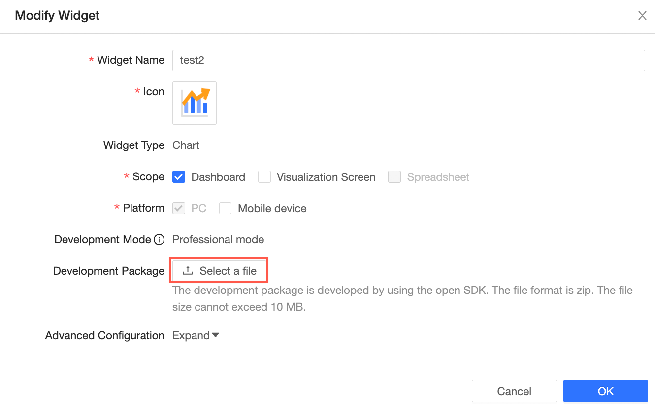
After updating the necessary information, click the Confirm button. The component will then enter the pending publication status.
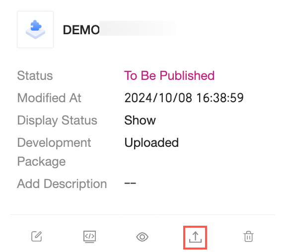
Execute yarn run pack in the seed project to produce the development package.
Publish component
When the component is in the pending publication status, the Publish button on the component card becomes clickable.
Click the Publish button to view the component change details, with modified properties highlighted in red.
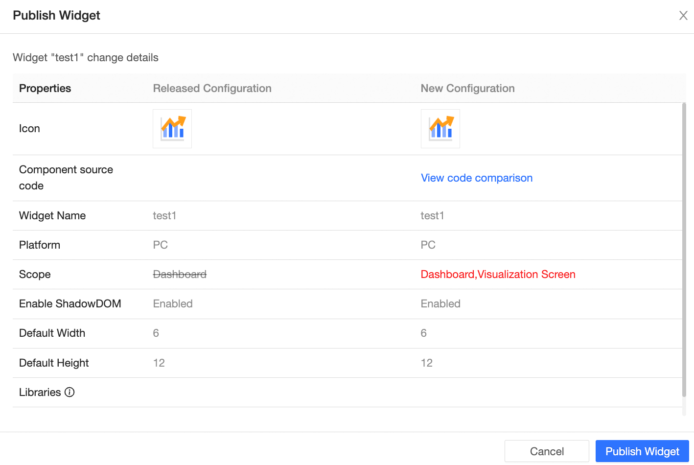
If in Edit Online mode, click View Code Comparison to examine specific code changes.

Select Confirm Publish to officially release the component to the production environment, changing its status to published.
Delete component
To delete a custom component, click the Delete button on the component card within the list.
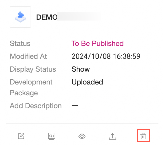
Upon deletion:
The custom component will be removed from the list of addable items.
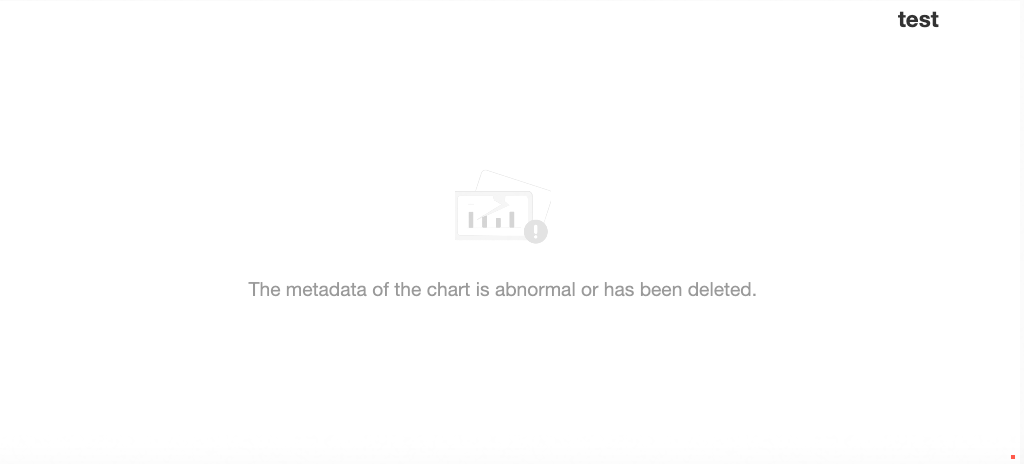
Previously saved charts using the custom component will no longer display it, and a message stating "The chart metadata is abnormal or has been deleted" will appear in its place.
Visibility status
The visibility status determines whether a custom component is displayed on the dashboard, with two settings available:
Hidden: The custom component is not shown in Add Chart->Custom on the dashboard editing page, preventing new chart creation, although previously saved charts remain visible.
Visible: The custom component appears in Add Chart->Custom on the dashboard editing page, enabling chart creation and switching.
Note:
Changing the visibility status of a component does not trigger the Pending Publication status but is immediately effective online.
In development mode, the component is always displayed.
Modify the component's visibility status by clicking the Hide or Show button on the custom component platform.
This change is reflected on the dashboard by the component's entry being either displayed or hidden.