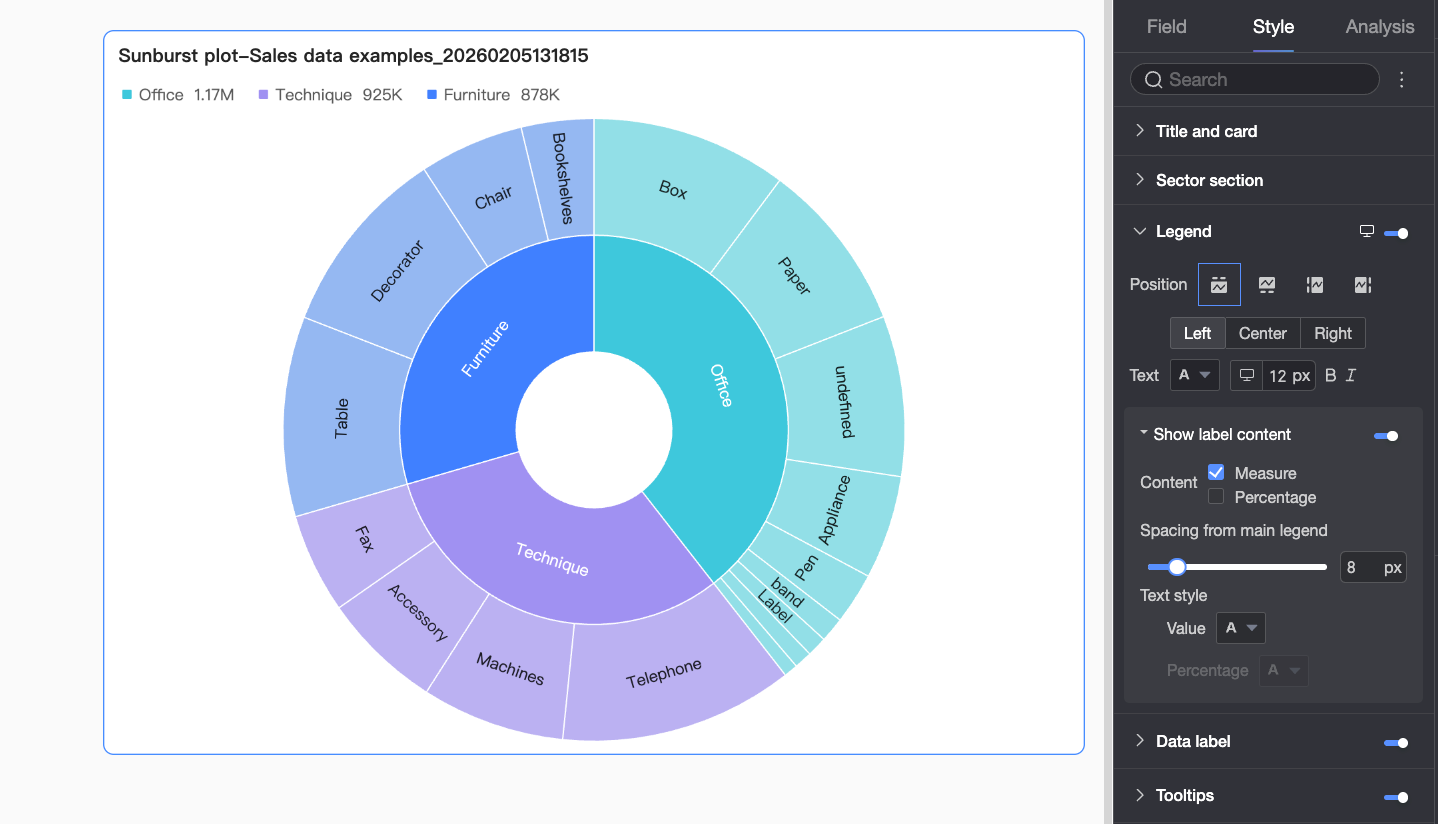
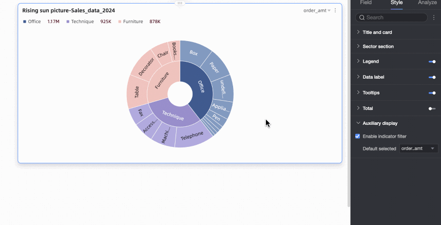
A sunburst chart—also known as a multilayer pie chart—uses concentric, nested rings to visualize hierarchical data. It is ideal for representing complex hierarchies such as organizational structures, departmental budget allocations, or website navigation paths.
Prerequisites
You must have created a dashboard. For more information, see Create a Dashboard.
Chart Overview
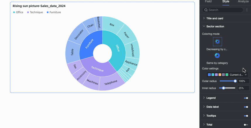
A sunburst chart consists of multiple concentric rings. Each ring represents a level in the hierarchy, and each sector represents a category or subcategory. The innermost sectors represent top-level categories, while outer sectors represent their subcategories. Different colors and text labels clearly show relationships and proportions across levels.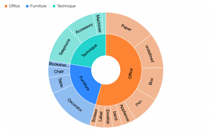
You can analyze the following information from a sunburst chart:
Hierarchy: Each ring represents one level. In the example above, the innermost ring shows product categories, and the outermost ring shows subcategories, clearly illustrating the hierarchical relationship among product types.
Proportional distribution: The size of each sector shows differences and distribution among data categories. For example, the larger outer sectors for tables within the furniture category indicate a higher proportion of table orders.
Scenarios
Common use cases for sunburst charts include the following:
Organizational analysis, such as displaying a company’s structure, reporting lines, and personnel distribution across levels.
Market sales analysis, such as showing sales share and relationships among product categories.
Geographic data analysis, such as displaying regional sales performance and proportions for a specific product.
Key Benefits
Visualization: Customize chart styles for clearer presentation—for example, add legends, data labels, and tooltips.
Annotations: Add custom notes and endnotes, and configure links to external URLs for integration with other systems.
Interactivity: Support filter interaction, navigation, and in-chart filtering.
Field Configuration
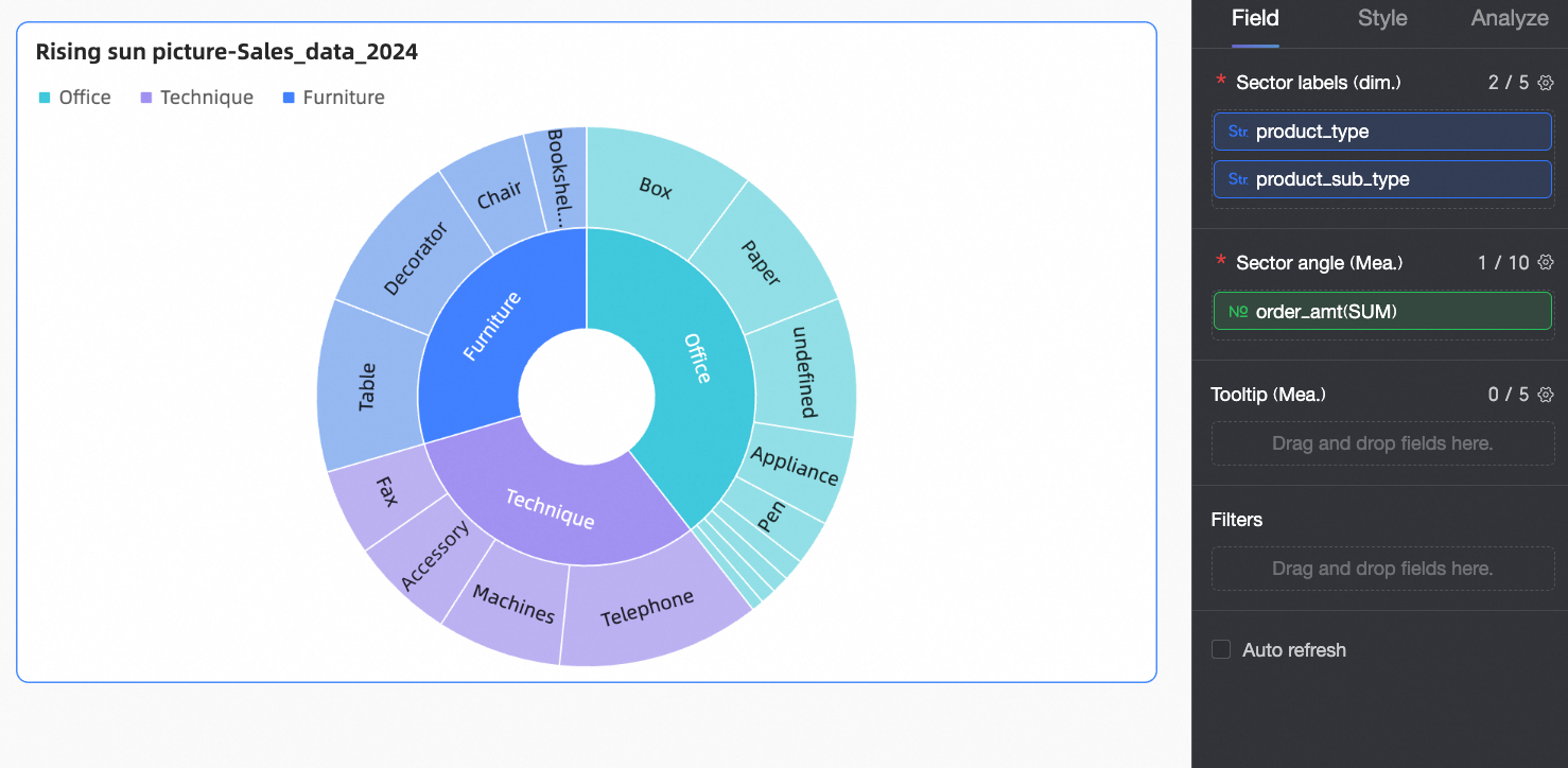
This section explains field configuration using an example that analyzes order counts by product type.
In the Data panel, select the required fields and assign them to the appropriate areas under the Fields tab by double-clicking or dragging.
In the Sector Label/Dimension area, assign fields for top-level categories and their subcategories.
In this example, drag Product Type and Product Subcategory into this area to define the main classification for analysis.
NoteYou can configure up to 5 dimension fields.
List fields in order: parent category first, followed by child categories.
In the Sector Angle/Measure area, assign the primary metric for analysis.
In this example, drag Order Count into this area as the main metric.
NoteYou can configure up to 10 measure fields. After configuration, switch between measures using the metric filter in the upper-right corner.
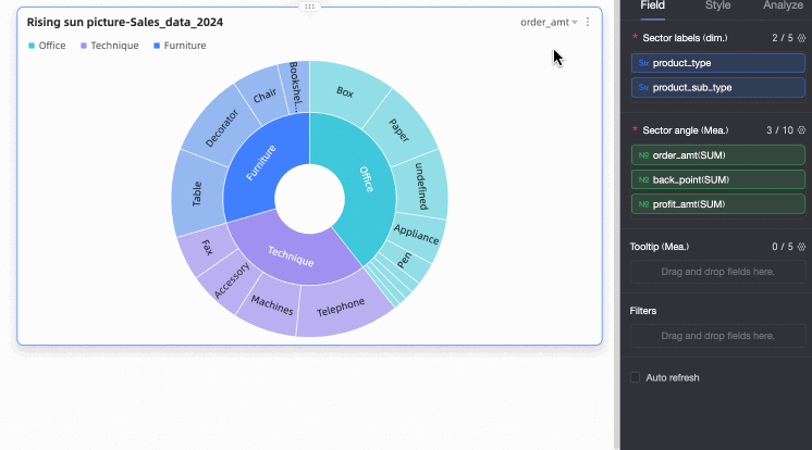
Click Update. The system automatically refreshes the chart.
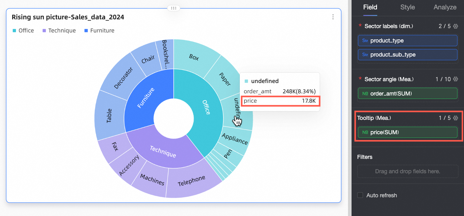
(Optional) To view a measure’s data in tooltips, add that measure to Tooltip/Measure.
(Optional) To filter displayed data, drag the relevant field into the Filter area. For example, to exclude certain regions, drag the Region field into Filter, then click the
 icon to open the Set Filter window and select the desired data.
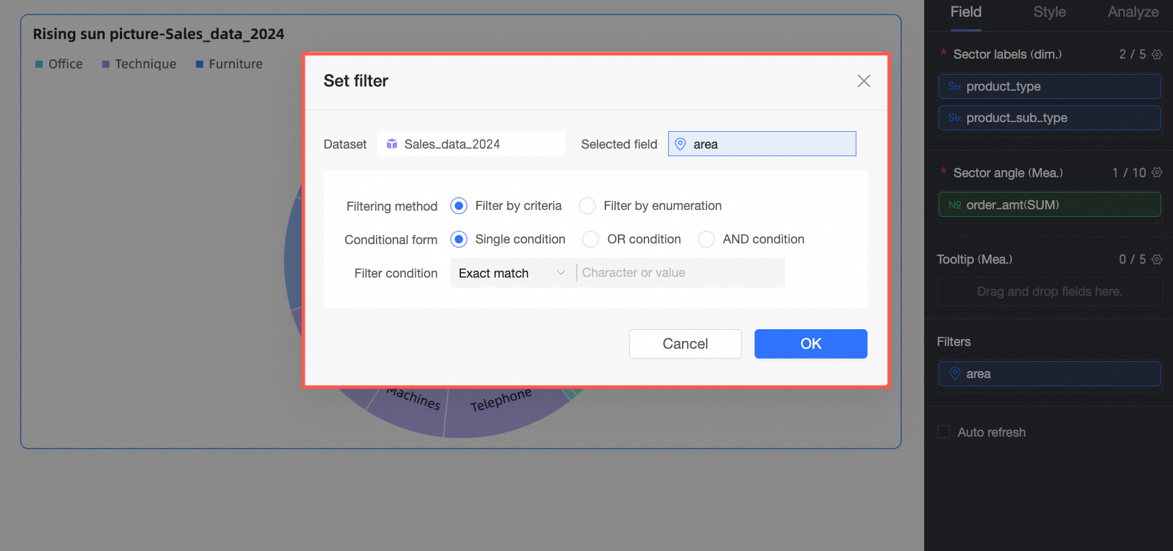
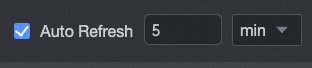
(Optional) Auto-refresh
When enabled, the system automatically refreshes chart data. For example, if you select this option and set the interval to 5 with the unit minutes, the chart updates every 5 minutes.
Style Configuration
The following sections describe style settings for the chart. For general Title and Card configuration, see Configure the Chart Title.
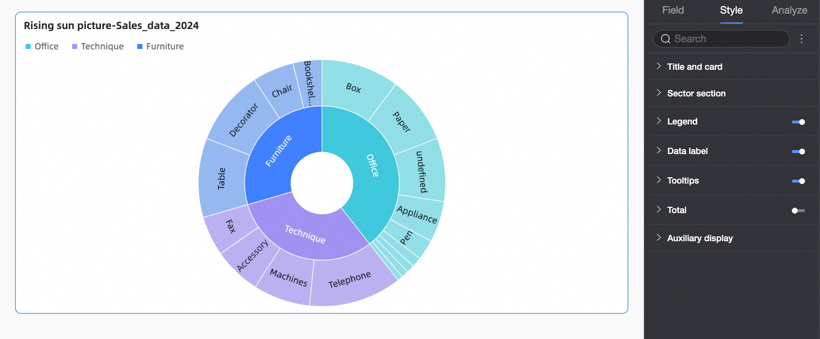
Plot Area
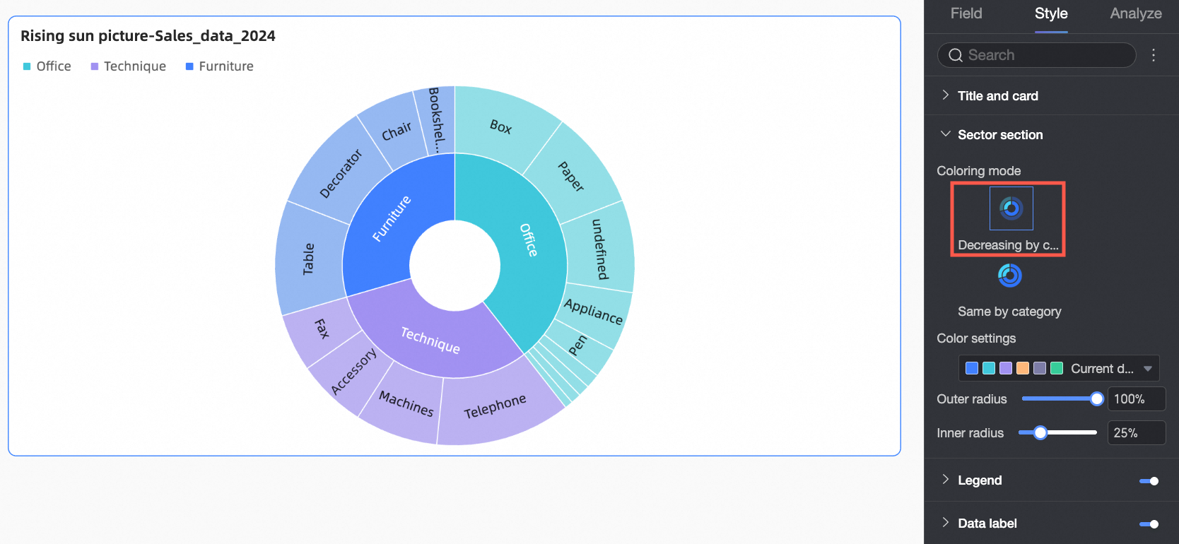
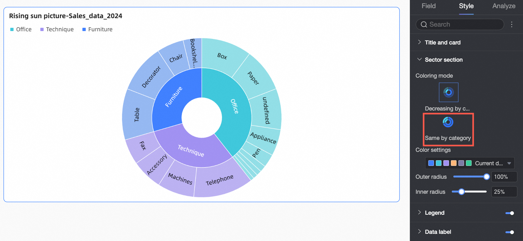
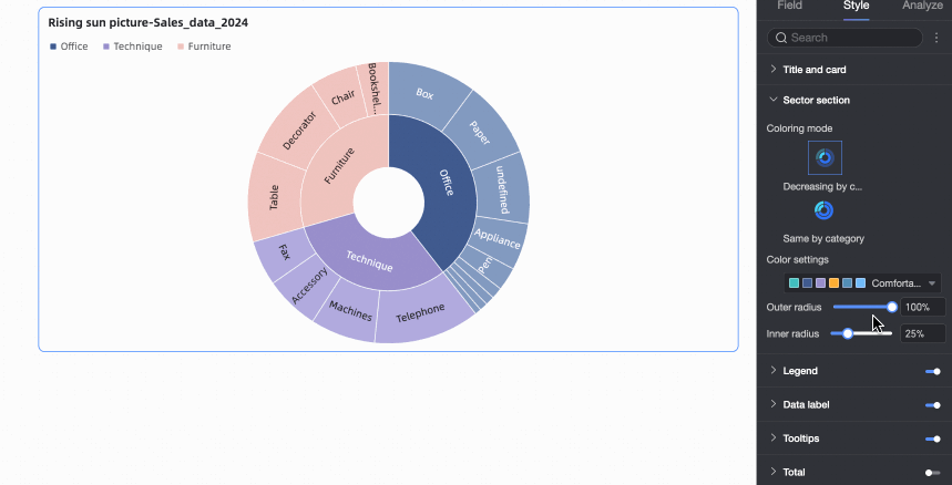
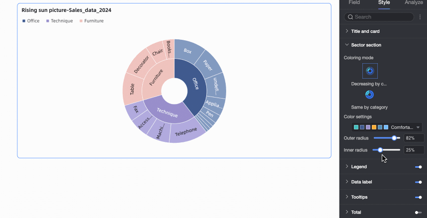
In the Style tab, set the sector style for the sunburst chart in the Sector section.
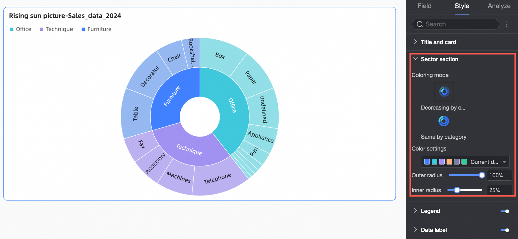
Configuration Item | Parameter descriptions |
Color Mode | Set the color scheme for sectors. Options include Decreasing by Category and Uniform by Category.
|
Color Settings | Define a custom color scheme. Assign specific colors to each top-level category. |
Outer Radius | Set the radius of the outermost ring. |
Inner Radius | Set the radius of the innermost ring. |
Legend
In Legend, click the  icon to enable the legend and customize its style.
Desktop Configuration
Configuration Item
Configuration Parameters
Position
Set the legend’s position and alignment.
If position is Top or Bottom, choose left, center, or right alignment.
If position is Left or Right, choose top, center, or bottom alignment. You can also adjust the distance between the legend and chart content.
Text
Customize font color, size, weight, and italic style for legend text.
Show Label Content
When enabled, display measure values and percentages in the legend. Configure the following:
Content: Choose to show Measure, Percentage, or both.
Spacing from Main Legend: Set the distance between data text and legend text.
Text Style: Customize the appearance of data text in the legend.
Decimal Places for Percentage: Specify decimal precision when Percentage is selected.
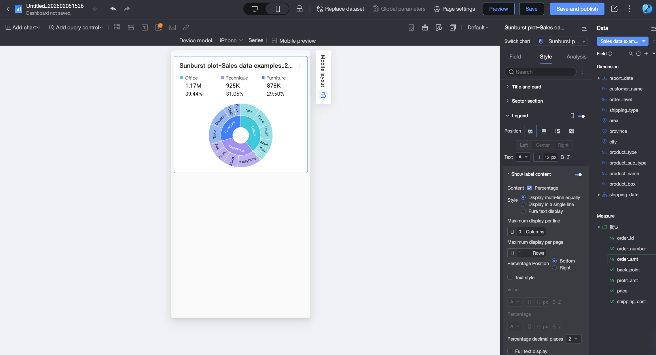
Mobile Configuration
Configuration Item
Description
Position
Set the legend’s position and alignment on mobile.
If position is Top or Bottom, choose left, center, or right alignment.
If position is Left or Right, choose top, center, or bottom alignment. You can also adjust the distance between the legend and chart content.
NoteIf position is set to Top, you can enable the label below the legend. When enabled, custom alignment is not supported.
Text
Customize font color, size, weight, and italic style for measure names in the mobile legend.
Show Label Content
When Position is set to Top, click the
 icon to enable the label below the legend.
Content
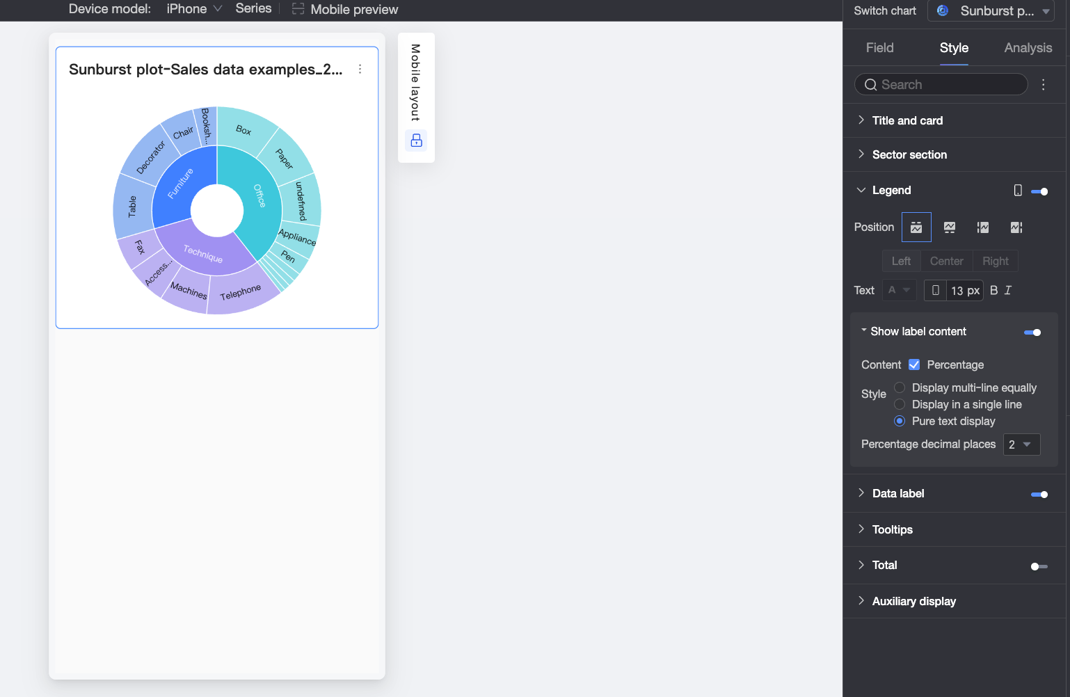
By default, the label shows measure values. You can also choose to show percentage data.
Style
Choose how label text is arranged:
Multi-line Equal Spacing: Labels are evenly spaced based on the number of columns per line and rows per page.

Single-line Tile: All labels appear on one line.
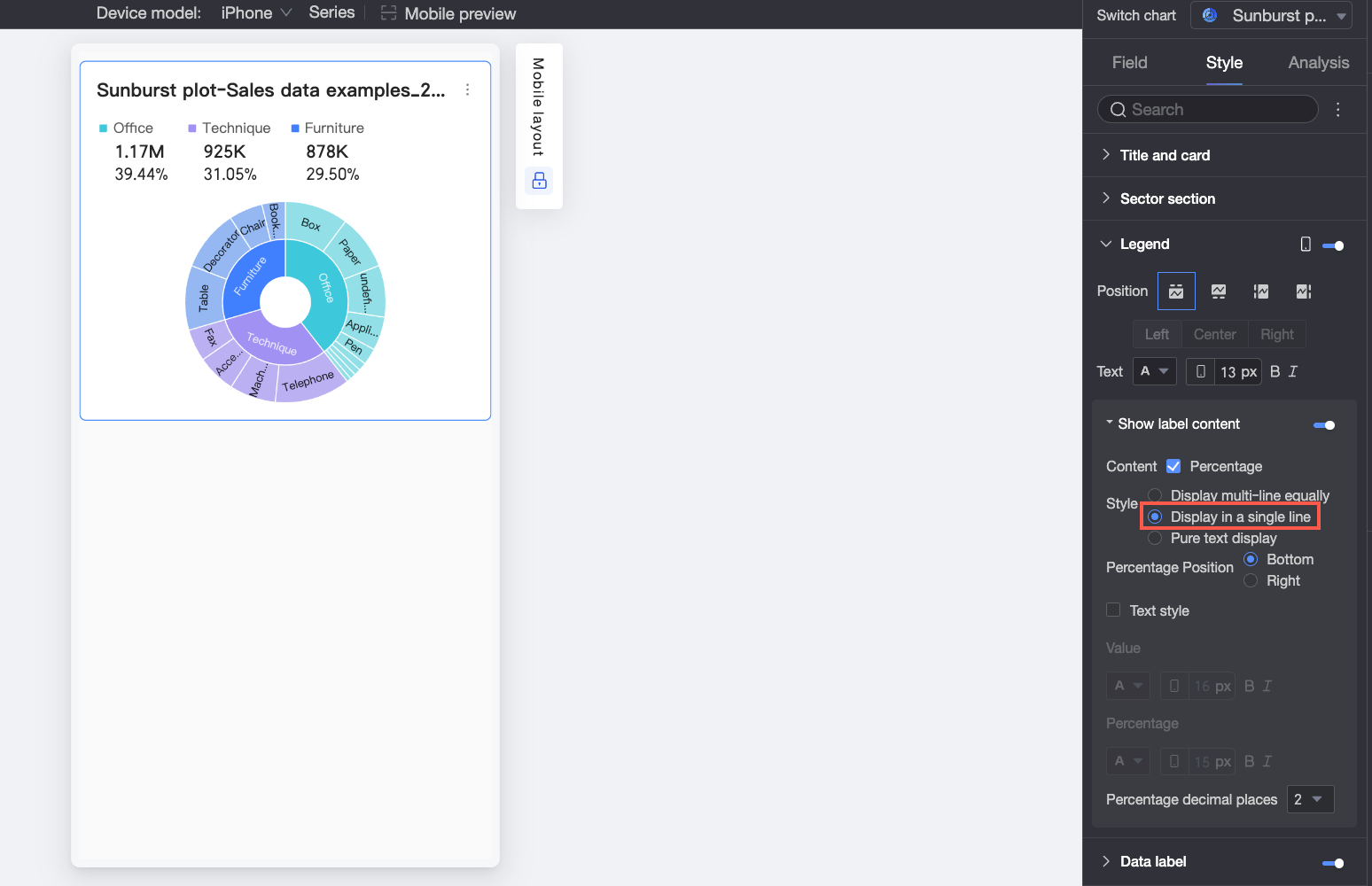
Plain Text: Shows text only (no icons), with text color matching the corresponding measure’s color in the chart.
Percentage Position
If Percentage is selected and style is Multi-line Equal Spacing or Single-line Tile, choose to display percentages Below or Right of the value.
Text Style
If style is Multi-line Equal Spacing or Single-line Tile, customize the appearance of value and percentage text.
Decimal Places for Percentage
Adjust decimal precision for percentage values when Percentage is selected.
Full Text Display
If style is Multi-line Equal Spacing or Single-line Tile, long measure names may be truncated. Select Full Text Display to show complete names.
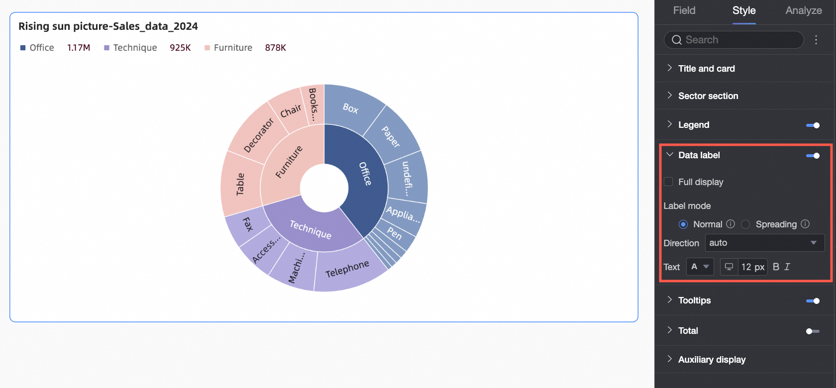
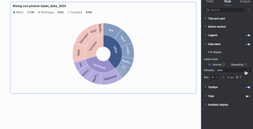
Data Labels
In Data Labels, you can set whether to display data labels and their style.
Configuration Item | Description |
Show All | When labels are enabled, choose whether to display all labels simultaneously. If labels are close together or space is limited, they may overlap. Disable this option for better clarity. |
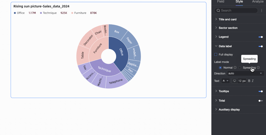
Label Mode | Choose how labels appear: Regular Internal or Outer Radial.
|
Orientation | If label mode is Regular Internal, choose text orientation: Auto, Radial, or Tangential. |
Text | Customize the appearance of label text. |

Tooltip
In Tooltip, click the icon to enable tooltips and customize their style.
Fields shown in tooltips must be configured in the Tooltip/Measure area under the Fields panel.
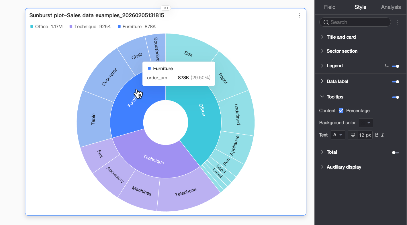
Configuration Item | Description |
Content | Choose whether to show percentage information in tooltips. |
Background Color | Set the tooltip background fill color. |
Text | Customize font color, size, weight, and italic style for tooltip text. |
Mobile Tooltip | Tooltip settings for desktop and mobile are independent. Use the PC/Mobile toggle button ( |
 ) at the top of the dashboard editor to switch to mobile view and edit mobile tooltips. Font size can be set separately for each platform; other styles apply universally.
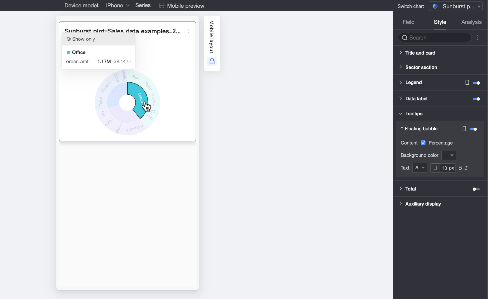
Total
Under the Style tab, in Total, choose whether to display the total value for the current measure.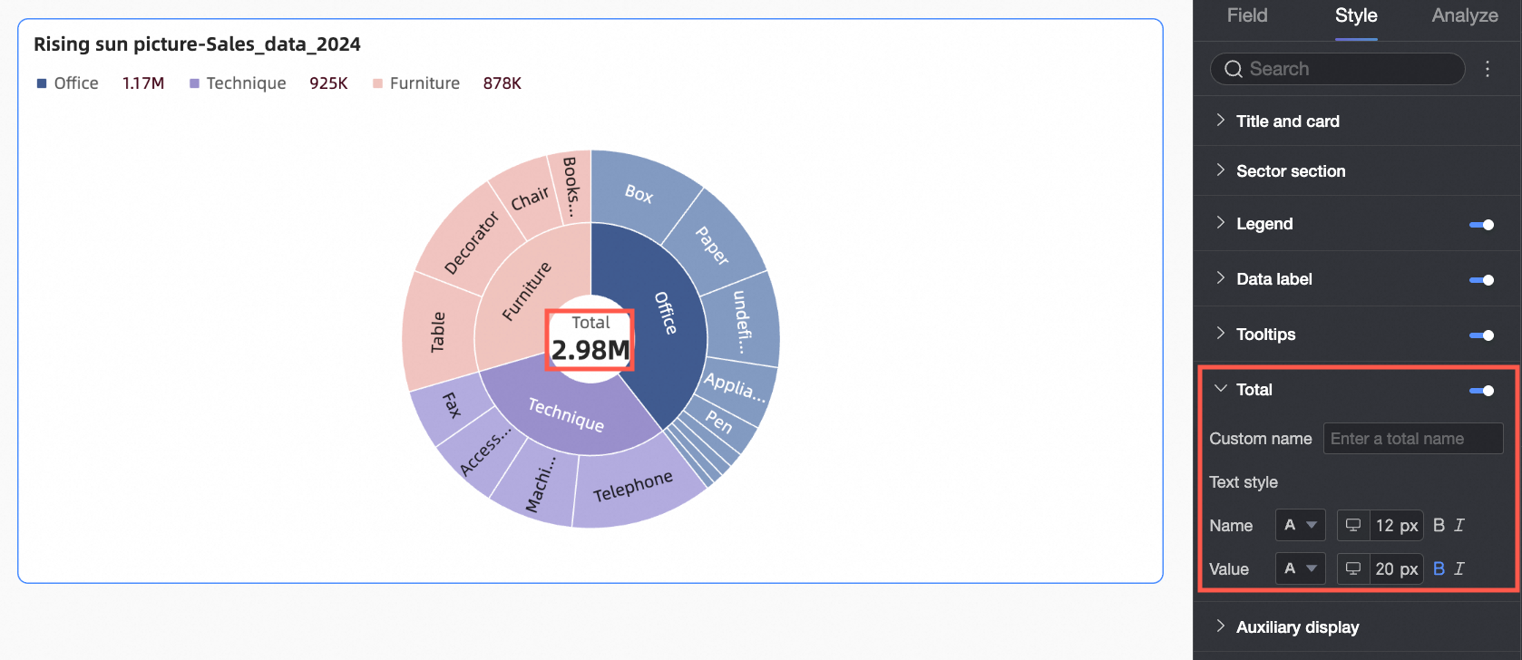
Configuration Item | Description |
Custom Name | Enter a custom name for the total, such as Annual Total or Quarterly Total. |
Text Style | Customize the appearance of the total name and value. |
Auxiliary Display
Under the Style tab, in Auxiliary Display, configure metric filtering display.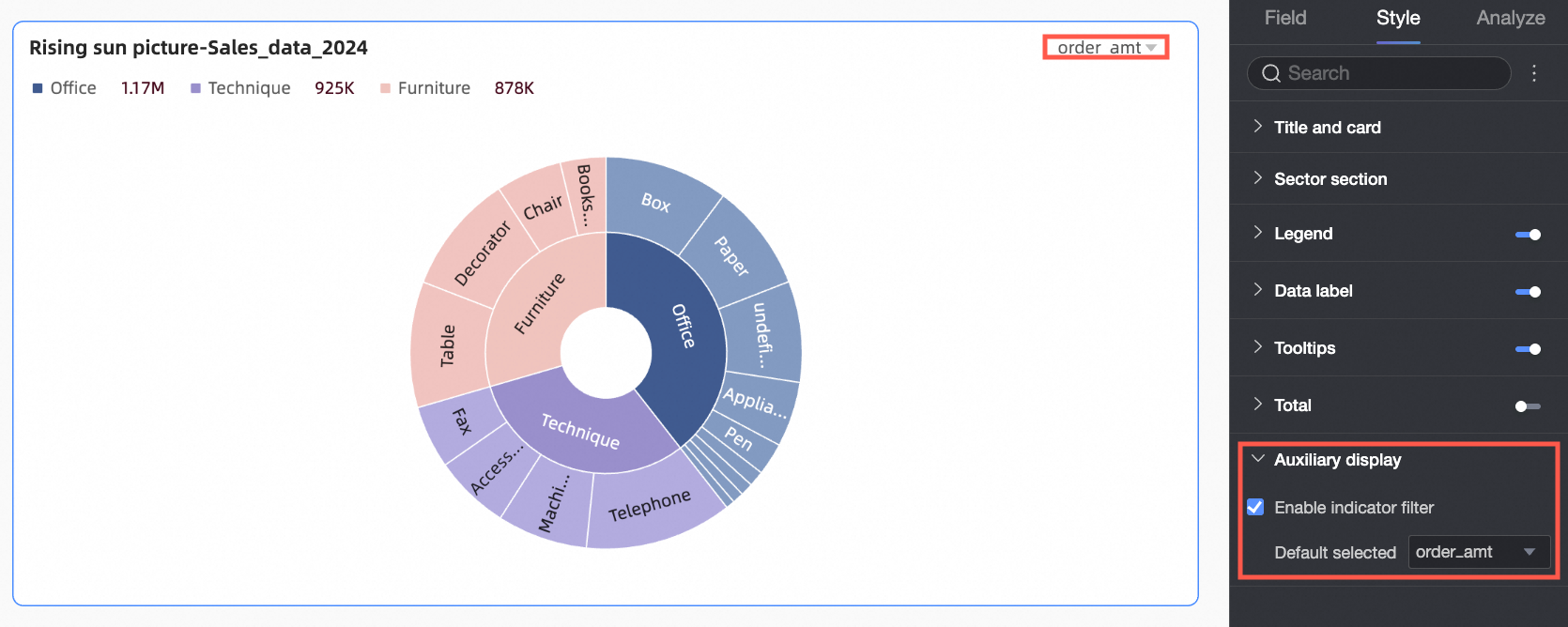
Configuration Item | Description |
Enable Metric Filtering Display | Enable this option to configure default selections in the metric filter. |
Analysis Configuration
Configuration Item | Setting | Configuration Item Descriptions |
Data Interaction | Filter | To view data for a single category, click its sector to isolate that category’s distribution. To exit focus mode, click the blank center area or the cancel button next to the title. |
Filter Interaction | To analyze data across multiple charts, link them using filter interaction. For details, see Filter Interaction. | |
Navigation | To analyze data across multiple dashboards, link them using navigation. Options include In-product Navigation, In-page Component, and External Link. For details, see Navigation. |
What to do next
To let others view your dashboard, share it with specific users. For more information, see Share a Dashboard.
To build a complex, menu-driven analysis portal, integrate your dashboard into a BI portal. For more information, see Create a PC BI Portal.