The filling person is an advanced control, which can be used to enter the user name of the current filling and the user name in the same organization.
Scenarios
The record that applies to the user name at the time of data filling, for example:
When filling in the satisfaction survey, the control can be used to enter the current login user name with one click;
When filling in the activity registration form scene, enter the user name of the filling person through this control;
In the voting activity scenario, you can use this control to count the usernames that participate in this activity.
TensorBoard
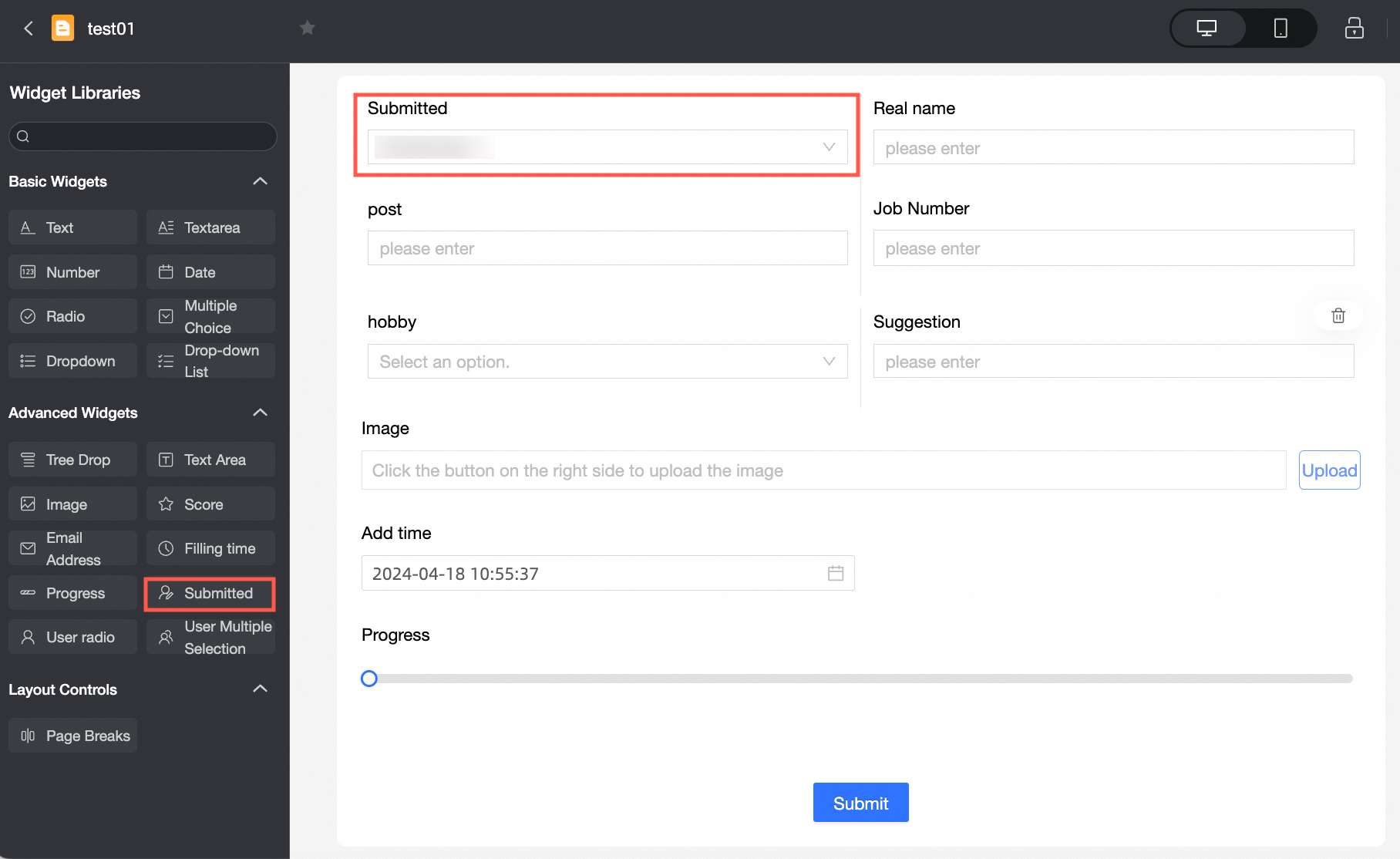
Control configuration
Basic parameters
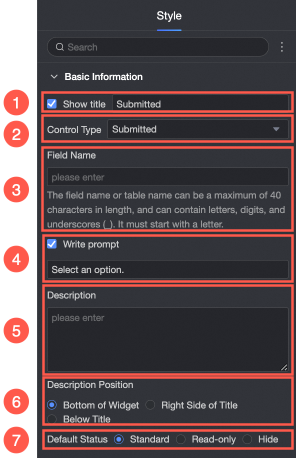
Parameter | Description |
| ① Display Title: Select whether to display the title of the control. You can customize the display name as the column name of the data form. |
② Control type: After you select a control, you can replace the control type. The drop-down options can be replaced with other basic and advanced control types. | |
③ Table Field Name: the name of the corresponding field in the table created based on the data form. Note The field or table name must start with a letter and can contain letters, digits, and underscores (_). The name can be up to 40 characters in length. | |
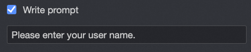
④ Prompt: Set Prompt. For example, enter your user name.
| |
⑤ Description: the description of the custom control. | |
⑥ Description Information Location: Specify the location of the description information. The following options are available: Control Bottom, Title Right, and Title Below. | |
Default State: specifies the default state of the widget. The valid values are Normal, Read-only, and Hidden. | |
Define options for an extension
Parameter | Description |
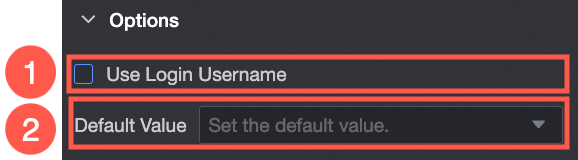
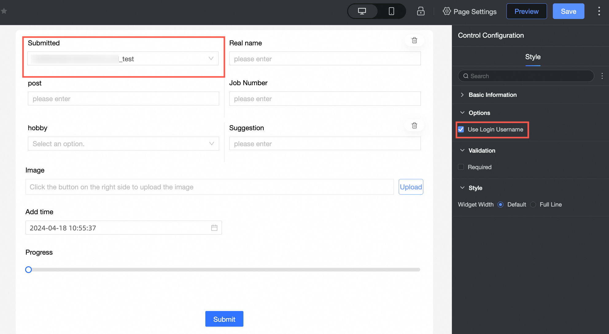
| ① Use Logon Username: If you select this check box, the current logon username is automatically written. |
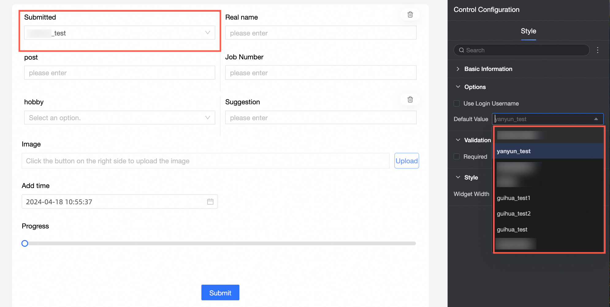
② Default Value: Set the default display value of the control.
|
Yes
Parameter | Description |
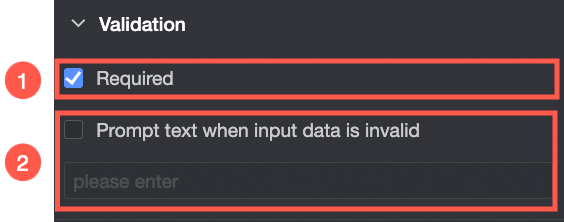
| ① Required: Select whether to set this configuration items. If you select this option, the control is set to Required. |
② Input data invalid prompt text: This configuration items takes effect only when a verification condition takes effect. For example, if Required is selected and no option value is specified, a custom error copy is displayed. |
styles
Parameter | Description |
PC
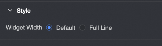
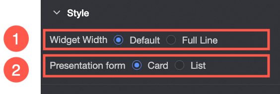
| Widget Width: You can select Default or Whole Line. Note You can also use the Manual Drag Control widget to adjust the border width. |
Mobile platform
| ① Control width: Consistent with PC-side functions. |
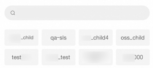
Display form: The list of options can be displayed in two formats: Card and List. Example of the card display effect:
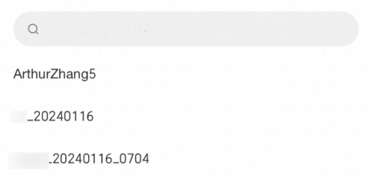
List:
|