A data portal organizes data assets (dashboards, spreadsheets, and data entry) and external links into menu-based navigation for thematic analysis. You can configure basic settings, the navigation framework, and standard controls separately for PC and mobile data portals based on your display requirements.
Configuration Overview
Creating a data portal involves portal settings and menu settings. Some settings are shared between the PC and mobile versions, while others require separate configuration for each platform.
-
Portal configuration:
-
Basic settings and the navigation framework require separate configuration.
-
The configuration for standard controls is shared with the PC version.

-
-
Menu settings:
-
Only the Menu display style requires separate configuration.

-
Portal Configuration
Entry Points
To configure the portal for mobile, switch the device slider at the top of the page to the  icon.
icon.
-
At the top of the page, click the Portal settings icon.

-
While configuring a menu, you can click Portal configuration to open the portal configuration page.

Basic Settings
|
Parameter |
Description |
|
Global logo |
Sets the global logo for the mobile view. You can select from provided materials or upload a custom image. The recommended image size is between 60×60 and 180×60 pixels, and the file size cannot exceed 100 KB. Note
The global logo only applies when the navigation framework mode is set to tiled layout. To style the global logo, adjust the settings in the cover area configuration for the tiled layout. |
|
Main title and subtitle |
Enter the main title and subtitle for the portal. The subtitle cannot exceed 1,000 characters. Note
The subtitle only applies when the navigation framework mode is set to tiled layout. To style the subtitle, adjust the settings in the cover area configuration for the tiled layout. |
|
View mode |
Determines how pages open. You can choose to Open in current page or Open in new window.
|


 For more information, see
 Navigation Framework
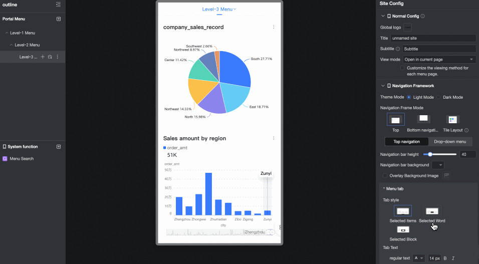
Configure the theme mode and navigation framework mode for the portal.
Theme Mode
Set the theme to light mode or dark mode.
-
Light mode

-
Dark mode

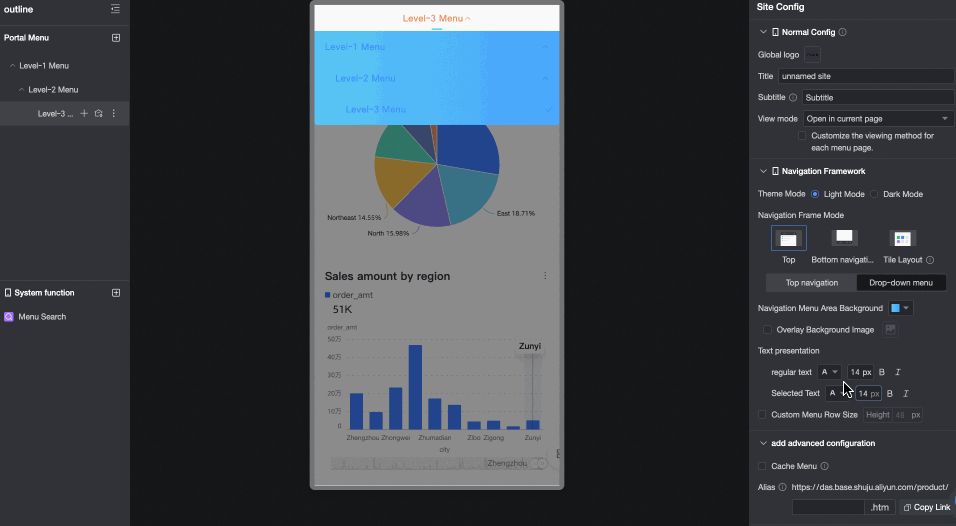
Navigation Framework Mode
Choose from top navigation layout, bottom navigation layout, or tiled layout.

-
Top navigation layout
Parameter
Option
Description
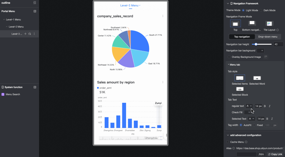
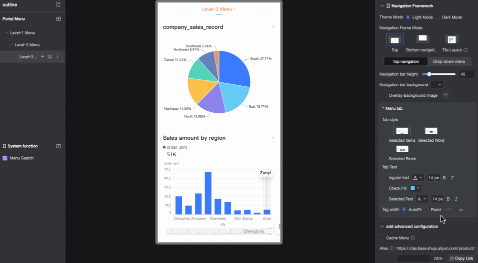
Top navigation
Navigation bar height
Sets the height of the navigation bar.
Navigation bar background
Sets the background color of the navigation bar. You can overlay the background with a custom image. Supported formats are JPG, JPEG, PNG, GIF, and SVG. The image size must be 1 MB or less.
Menu tab
Sets the style, text format, and width of menu tabs.
-
Tab style: Choose from Selected bar, Selected text, or Selected block.
-
Tab text: Sets the format for regular and selected tab text.
-
Tab width: Sets the tab width. You can set it to automatically adjust to the page width or use a fixed width.
Dropdown menu
Navigation menu area background
Sets the background color of the navigation menu area. You can overlay the background with a custom image. Supported formats are JPG, JPEG, PNG, GIF, and SVG. The image size must be 1 MB or less.

Text display
Sets the style for regular and selected text in the navigation menu area. You can also customize the menu row height.
-
-
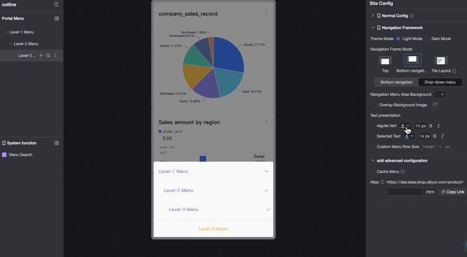
Bottom navigation layout
Parameter
Option
Description
Bottom navigation
Navigation bar height
Sets the height of the navigation bar.
Navigation bar background
Sets the background color of the navigation bar. You can overlay the background with a custom image. Supported formats are JPG, JPEG, PNG, GIF, and SVG. The image size must be 1 MB or less.
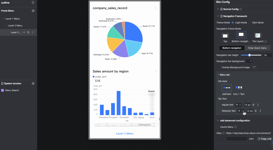
Menu tab
Sets the style and text format of menu tabs.
-
Tab style: You can set it to Text only or Icon + text.
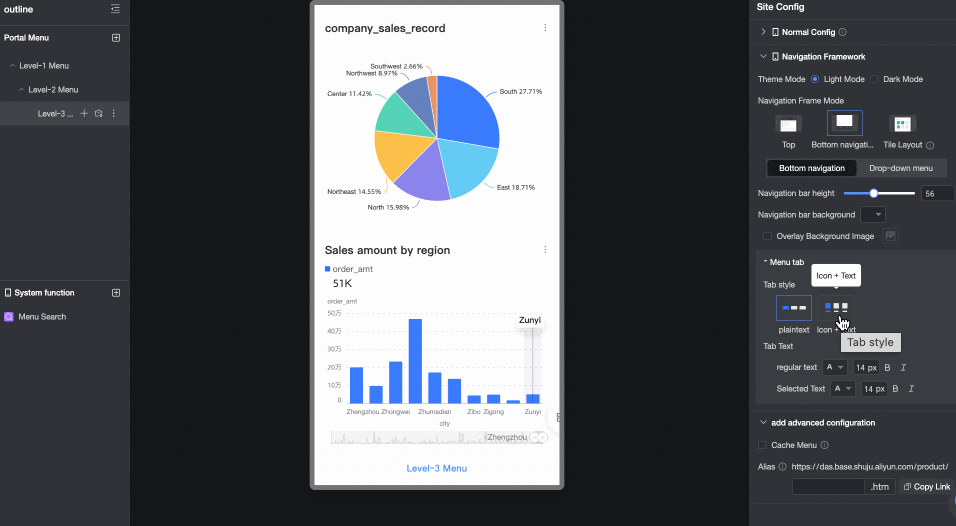
-
Tab text: Sets the style for regular and selected text.
Dropdown menu
Navigation menu area background
Sets the background color of the navigation menu area. You can overlay the background with a custom image. Supported formats are JPG, JPEG, PNG, GIF, and SVG. The image size must be 1 MB or less.
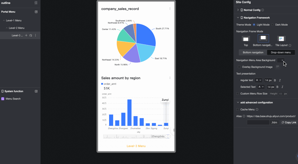
Text display
Sets the style for regular and selected text in the navigation menu area. You can also customize the menu row height.
-
-
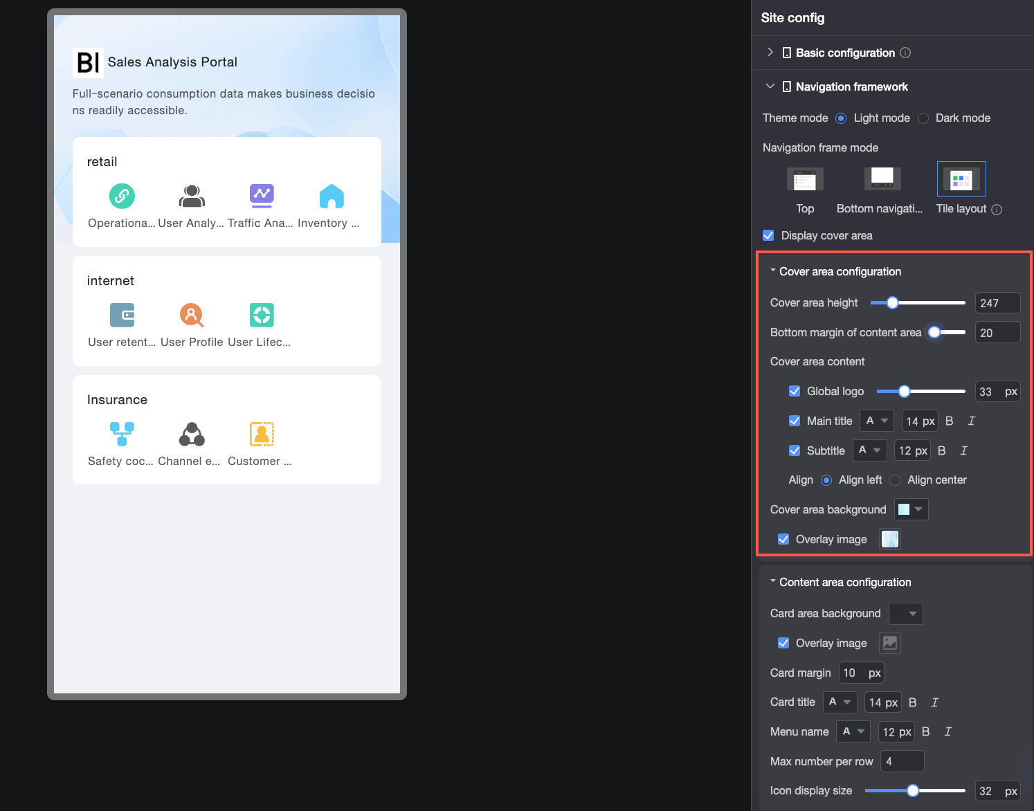
Tiled layout
Parameter
Option
Description
Display cover
Specifies whether to display the cover area at the top of the page.

Cover area configuration
Cover area height
Sets the height of the cover area.

Content area bottom margin
Sets the bottom margin of the content area.
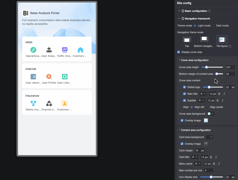
Cover area content
-
Global logo: Sets whether to display the global logo and adjusts its size.
-
Main title and subtitle: Sets whether to display the main title and subtitle and adjusts their font formats.
-
Alignment: Sets the alignment of the main title and subtitle. Options are Align left or Align center.
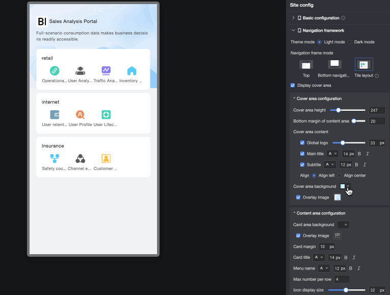
Cover area background
Sets the background color of the cover area. You can overlay the background with system-provided materials or a custom image. Supported formats are JPG, JPEG, PNG, GIF, and SVG. The image size must be 1 MB or less.
Content area configuration
Card area background
Sets the background color of the card area. You can overlay the background with a custom image. Supported formats are JPG, JPEG, PNG, GIF, and SVG. The image size must be 1 MB or less.
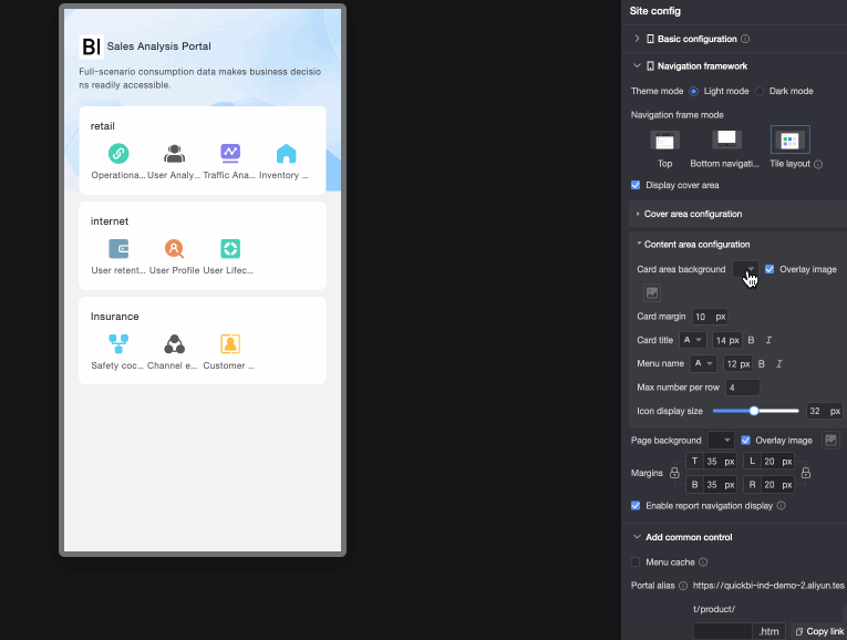
Spacing between cards
Sets the spacing between cards.
Card title
Sets the font format of the card title, including color, size, weight, and whether it is italicized.
Menu name
Sets the font format of the menu name in the card area, including color, size, weight, and whether it is italicized.
Maximum number of items per row
Sets the maximum number of menu items to display per row.

Icon display size
Sets the display size of icons in the menu bar.

Page background
Sets the background color of the page. You can overlay the background with a custom image. Supported formats are JPG, JPEG, PNG, GIF, and SVG. The image size must be 1 MB or less.
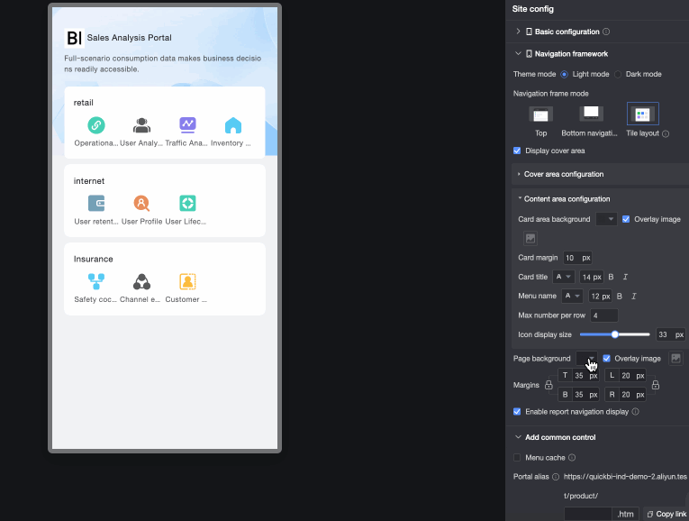
Page margin
Sets the top, bottom, left, and right margins for the page. Click the
 icon on the left to lock the top and bottom margins to the same value. Click the icon on the right to lock the left and right margins to the same value.
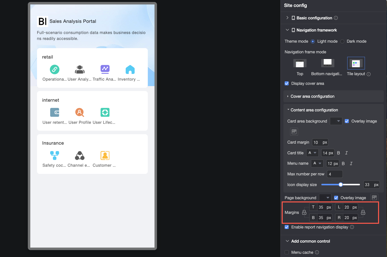
Enable report navigation display
Controls whether report navigation appears at the top of the page. The navigation style is inherited from the top navigation layout settings.
This option is selected by default in tiled layout. When selected, users viewing a report see a breadcrumb navigation path at the top of the page, showing the report's location in the menu hierarchy and enabling quick navigation to parent pages.
In a tiled layout, the homepage displays a maximum of two levels of portal menus. If the menu hierarchy exceeds two levels:

-
If report navigation is enabled, after you click a node, you can use the top navigation bar to switch to the next level and view related content.

-
If report navigation is disabled, after you click a node, a pop-up window appears at the bottom of the page, allowing you to navigate to the next level.

-
Standard Controls
The settings for standard controls are shared with the PC version.
|
Parameter |
Description |
|
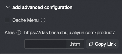
Menu cache |
When this option is selected, switching between open menus does not require a page reload. |
|
Portal alias |
You can enter a custom parameter to append to the URL. For example, if you enter
Note
Ensure your content complies with all applicable laws and regulations. Do not enter any information that is illegal, obscene, subversive, or otherwise inappropriate. |
Menu Settings
For mobile menu configuration, only the Menu display style requires separate configuration. All other settings are shared with the PC configuration.
-
On the data portal editing page, click the target menu to open the Configure menu page.

-
On the Configure menu page, configure the Portal menu, System functions, and Menu settings.

-
Portal menu configuration

① Add a main menu. This adds a top-level menu item.
② Add a second-level or lower-level menu item.
③ Set a menu as the homepage. When the data portal is opened, this page is displayed by default.
④ Delete a menu.
-
System functions settings
Add the Menu search function as shown in the figure.

-
Logic for displaying the More icon:
-
When the total width of the top-level navigation in the top navigation bar (①) exceeds the screen width, the More icon automatically appears.
-
When there are more than five top-level navigation items in the bottom navigation bar (②), the More icon automatically appears.
Click the More icon to open the portal menu list.
-
-
Setting Menu search to Display allows users to search for menu names.
-
Configure the Background fill color, Icon color, Border color, and text styles for the Empty state and Input state of the mobile menu search box.
-
-
Menu settings
Parameter
Description
Menu name
Customizes the menu name.
Allow collapse
Specifies whether the menu can be collapsed.
Collapse by default
Sets the default state of the menu.
NoteThis option is available only if Allow collapse is selected.
Node type
Sets the node type to a content node or an empty node.
-
To use a node as a parent, set it as an empty node.
-
Adding a child node automatically converts the parent node to an empty node. If the parent node previously contained content, that content is cleared.

Content type
Sets the content type to Workspace resource or External link. For a mobile data portal, Workspace resource supports only the following types:
-
dashboard
-
spreadsheet
-
data entry

View mode
Options include Open in current page and Open in new window.
Note-
This option can be set only if the menu is not an empty node.
-
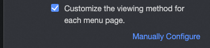
If you have already configured a global view mode in the portal settings, you cannot customize this setting for individual menu pages. To customize the open mode for an individual menu page, change the global setting to customize the view mode for each menu page.

Menu display style
You can enable or hide the Menu display, select Display icon, and configure the icon size, menu icon for normal and selected states, and Spacing between icon and text.

-
You can customize the display state of a menu on PC or mobile. If you hide a menu on mobile, it and its sub-menus will not be displayed. The PC menu display is unaffected. To configure the PC menu display, use the corresponding settings when you create a PC data portal.

-
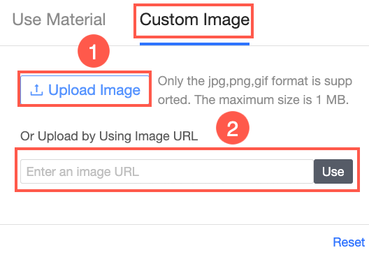
For the menu icon, you can choose to Use material or a Custom image.
-
Use material

-
Custom image
You can upload a local image (①) or upload an image from a link (②).
-
-
-
-
Click Save to complete the menu configuration.
Theme Configuration
-
On the data portal editing page, click the
 icon in the upper-right corner and find the mode switching icon at the bottom to switch the data portal's theme.
 Note
NoteTheme mode switching applies at the account level, not the module level. For example, switching spreadsheets to light mode also switches other modules that support theme switching (such as dashboards and data entry) to light mode.
① Light mode

② Dark mode

③ Follow system
Applies the system style defined in the custom settings.
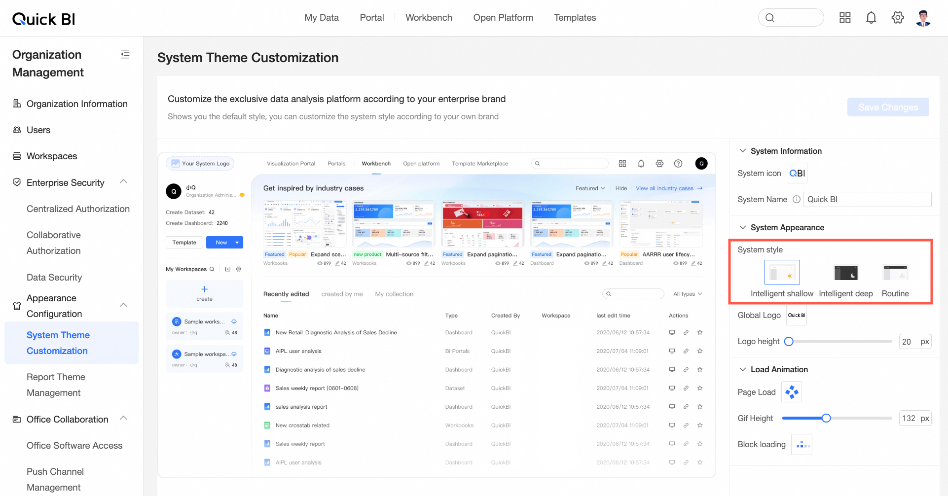
See System Theme Customization.
NoteOnly organization administrators can set the system style in the custom settings. The module-level mode has priority over the organization-level setting.