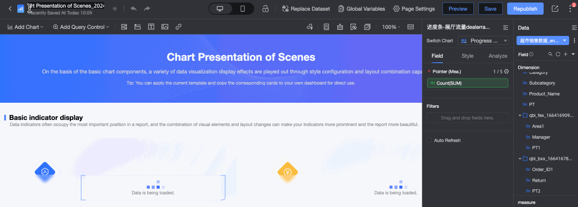
You can use the toolbar configuration area to quickly create dashboards and configure chart styles.
Quick BI supports nearly 40 chart types. Each chart includes a toolbar configuration module with two areas: top menu bar and toolbar.
-
In the top menu bar, you can perform global operations such as favoriting, undoing, configuring global parameters, and replacing datasets. For more information, see Top menu bar in this topic.
-
In the toolbar configuration, you can quickly create dashboards. For more information, see Toolbar configuration in this topic.
Top Menu Bar
Configuration Area Introduction

The configuration area includes 12 items: 1. Return, 2. Edit title, 3. Favorite, 4. Undo and redo, 5. Switch between PC/mobile, 6. Lock, 7. Replace dataset, 8. Global parameters, 9. Page settings, 10. Preview, 11. Share, 12. More operations after editing.
Edit Dashboard Title
Click the dashboard title to edit it and enter a new name.
Favorite Chart
Favorite the current dashboard on the editing page. After favoriting, organization administrators can view and maintain it on the Management of Favorites page in the backend.
The favorite feature is supported only when the dashboard is in the published state.
 Revoke Rollback
To revert to a previous operation during dashboard creation, click the Undo Button in the top menu bar. To redo the undone operation, click the Redo Button.

Mobile Layout Configuration
On the dashboard editing page, click the top menu bar to switch to Mobile mode. Ensure that the mobile layout lock is unlocked, then adjust the layout of charts on mobile devices.

Replace Dataset
On the dashboard editing page, click  in the top menu bar to display all datasets of the current dashboard. The system supports global dataset replacement. For more information, see Create a Dashboard > Replace Dataset.

Used datasets When a dataset in the list (①) needs to be replaced, select an existing dataset (②) in the same workspace from the Replace dataset section on the right. After selection, perform field matching between the two datasets (③).
The field types must be consistent when performing field matching.

Global Parameters
Global parameters can be set only after the dashboard is created and you click Save.
On the dashboard editing page, click the  icon in the top menu bar. In the Parameter Items dialog box, configure global parameters. For detailed configuration, see Configure Global Variables.

Page Settings
On the dashboard editing page, click Page settings in the top menu bar to configure the dashboard theme, filter interaction control, cascade conditions, and global parameters.

-
On the Theme tab, you can set the dashboard theme template, global theme template, and custom dashboard background. For more information, see Theme design.
-
On the Advanced tab, you can configure Basic Settings, Interaction Control, Cascade Conditions, and Global Parameters:

-
Basic Settings: Configure the following settings.
-
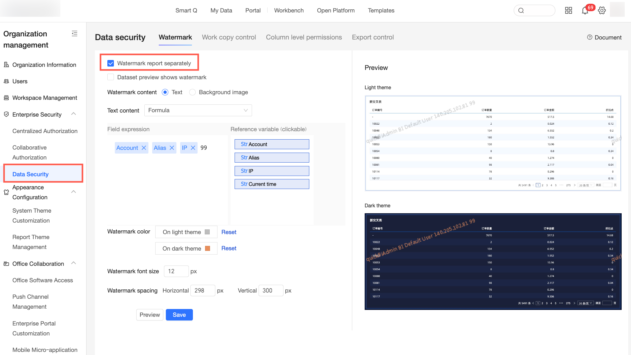
Show Watermark: Specifies whether to display a watermark on the current report.
NoteYou can set the watermark status here only if Allow each report to have its watermark turned on or off individually is selected in the Watermark Settings section of Tennant Management.
-
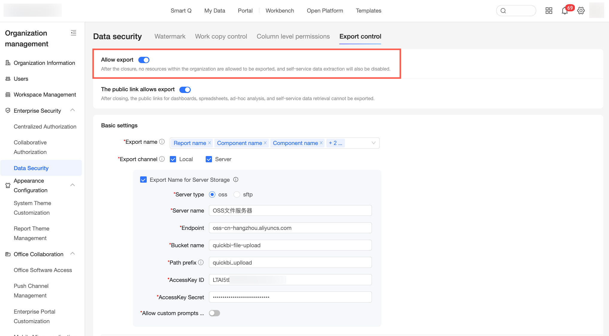
Allow Download: Specifies whether users can download the current report. If you select this option, you can export the entire report and individual charts. You can also hide the Export button for the global report if needed.
 Note
NoteThis option is available only if the Allow Export switch is turned on in both the Export Control section of Tennant Management and the Export Control section of Workspace Management. For more information about the export operation, see Configure the Export Feature in a Workspace and Export Control.

-
Allow Copy Content: Specifies whether users can copy content from charts. If enabled, users can click or select content in a chart and use a keyboard shortcut, such as Ctrl+C on Windows, to copy the data.
-
Remember Query Conditions: Specifies whether the query control remembers entered query conditions, so associated data is displayed immediately the next time the chart loads. For example, if you enter the date range "2020–2025" in the query control and run the query, the report shows data for "2020–2025" the next time you open it.
-
Allow Generate Audience: Specifies whether users can generate an audience. This feature works with Quick Audience. The generated audience package must be managed and used in Quick Audience.
-
Enable Real-time Query: By default, dashboard chart queries have a one-minute cache latency. Enabling this option removes the latency but increases the load on the data source. Enable with caution.
-
Start Auto-refresh Simultaneously: When enabled, all charts configured with auto-refresh start refreshing at the same time, and the lazy loading policy is no longer applied. This increases concurrent API requests, which may affect page loading speed and increase data source load. Enable with caution.
-
Enable Report Comments: Specifies whether viewers can comment on the report. When enabled, all users with view permission, except unauthenticated users, can view and post comments.
-
Set Bottom Canvas to Transparent: Makes the report's bottom canvas background transparent. This is useful for report embedding scenarios.
-
-
Interaction Control: Configure the following settings.
-
Drill Down: Specifies whether a drill-down operation is performed when a user long-presses a data point on a chart on a mobile device.
NoteThis operation is supported only for pie, ring, rose, and treemap charts.
-
Filter Interaction: Enables or disables the global automatic filter interaction feature. You can also configure how global charts initiate and respond to filter interactions. For more information, see Linkage.
-
-
Cascade Conditions: Configure the relationships between query conditions. For more information, see Configure Query Control Cascade.
-
Global Parameters: Support scenarios that require parameter changes by referencing global variables. For more information, see Configure Global Parameters.
-
Preview
Click Preview to enter preview mode, which supports both PC and mobile views. In preview mode, you can Save, Copy Preview Link, and Republish. Click "Continue Editing" to return to the editing page.
Copy Preview Link
Copy preview link lets others verify saved but unpublished content.
-
Private preview link
After clicking the private preview link option, users with view permission can view the most recently saved content.

-
Public preview link
-
After clicking the public preview link option, anyone with the link can view the most recently saved content. Each shared link is valid for 24 hours, and always displays the last saved content during this period.
Enable this feature at both organization and workspace levels to allow public works.

-
The copy preview link feature can be used only after selecting Allow Copy Preview Link in the report configuration.

More Operations After Editing
After completing dashboard editing, click the  icon in the top menu bar to open the More Operations dropdown list.

Auto Save
-
After turning on the Auto Save switch, the system will automatically save the dashboard every 5 minutes during continuous editing.

-
You can also turn on the Auto Save switch when creating a new dashboard.
 Note
NoteThe system retains up to 5 published versions and 15 saved versions from the last three months.
Restore Historical Version
Find the target version in the historical version list and click Restore.

The system retains up to 5 published versions and 15 saved versions from the last three months.
Collaborative Authorization
After editing and saving and publishing the dashboard report, click the  icon in the top menu bar and select Collaborative Authorization from the More Operations dropdown list. For detailed configuration, see Authorization Settings.

Performance Diagnosis
Click Performance Diagnosis to display performance diagnosis details on the right side of the dashboard. This feature helps you identify and resolve performance issues in reports and data analysis operations. For detailed configuration, see Performance Diagnosis.

Unpublish
Click unpublish. A confirmation prompt appears. Click the confirm button to make the report no longer viewable.

Shortcut Keys
Use shortcut keys during dashboard creation to operate charts more efficiently.

Help and Feedback
If you are new to charts, view beginner tutorials through the Beginner's Guide in the Help and Feedback feature.
Toolbar Configuration
Configuration Area Introduction

The configuration area includes 13 items: 1. Add chart, 2. Add query control, 3. Add storyline, 4. Tab, 5. Rich text, 6. Image, 7. Embedded page, 8. Filter interaction panel, 9. Reuse components from other dashboards, 10. Format painter, 11. Hidden charts, 12. Batch operations, 13. Page grid settings.
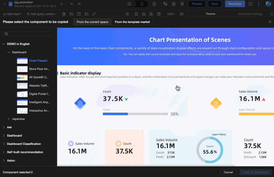
Reuse Other Component Resources
Reuse components from other works in the same workspace, or choose dashboard components from the template marketplace to quickly build reports.
Reuse Limitations
-
You can only reuse components from published works.
-
When selecting components to reuse, cross-dashboard selection is not supported. You need to select and copy components within the same dashboard first, then select and copy them in another dashboard.
-
Currently supported component types for reuse include the following: Control-Tab components, Control-Rich Text, Control-Image, Chart components, and Custom components.
Operation Instructions
-
Click the
 icon in the toolbar of the dashboard editing page.
 -
In the Please select components to copy window, select the dashboard components you need to copy. You can quickly locate the dashboard you want to copy by entering keywords in the search box.

-
Under the From Current Workspace tab, all dashboards in the current workspace are displayed. You can select components from published works and copy them to your dashboard.
-
Under the From Template Marketplace tab, enterprise internal templates and marketplace templates are displayed. You can select components from template works and copy them to your dashboard.
-
-
After selecting the components you want to reuse, click Copy to Dashboard to see the reused components in your current dashboard.
Format Painter
You can use the format painter to quickly apply existing chart styles to other charts for efficient chart editing.
Apply Style to the Same Chart Type
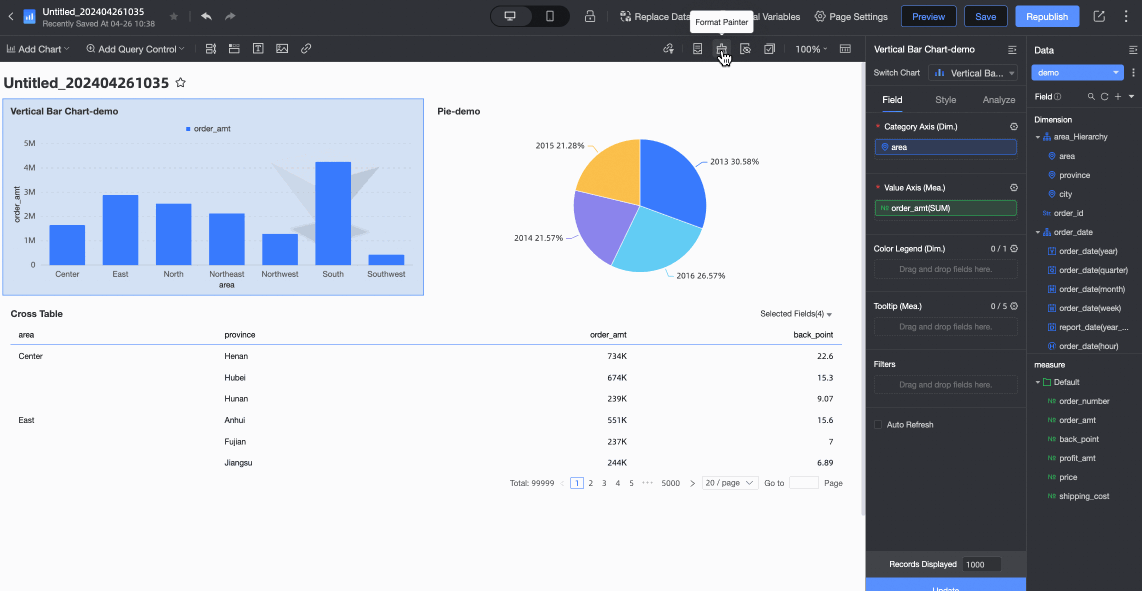
Apply Style to Different Chart Types
Styles can be applied across chart types when both charts share the same style configuration items. For example, if you use the format painter to apply the style of a ticker board to a gauge, the effect depends on each chart type's support for the style parameters. The following table describes the details.
-
The effect after the operation is as follows.
|
Style |
Configuration Item |
Source Chart |
New Chart |
Sync Style |
|
Basic Information |
Displays the main title |
Supported |
Supported |
Synchronization |
|
Remarks |
Supported |
Support |
Synchronization |
|
|
Footer |
Not supported |
Support |
Out of sync |
|
|
Show Link |
Support |
Supported |
Synchronization |
|
|
Custom Background Color |
Supported |
Not supported |
Not in sync |
|
|
Visual Style |
Not supported |
Supported |
Do Not Sync |
|
|
Feature configuration |
Min Value and Max Value |
Not supported |
Supported |
N/A Note
The format painter is used to synchronize only the style of a chart. The configuration items in this section are used for data configuration and do not involve style synchronization. |
|
Style Settings |
Display of data metrics |
Supported |
Supported |
Synchronization |
|
Show Metric Image and Alignment |
Supported |
Not supported |
Out of sync |
|
|
Ranges and color schemes |
Not supported |
Supported |
Out of sync |
|
|
Conditional Formatting |
Custom data styles |
Not supported |
Supported |
N/A Note
The format painter is used to synchronize only the style of a chart. The configuration items in this section are used for data configuration and do not involve style synchronization. |
|
Series Settings |
Custom suffix and prefix of metrics |
Not supported |
Supported |
Component Splicing
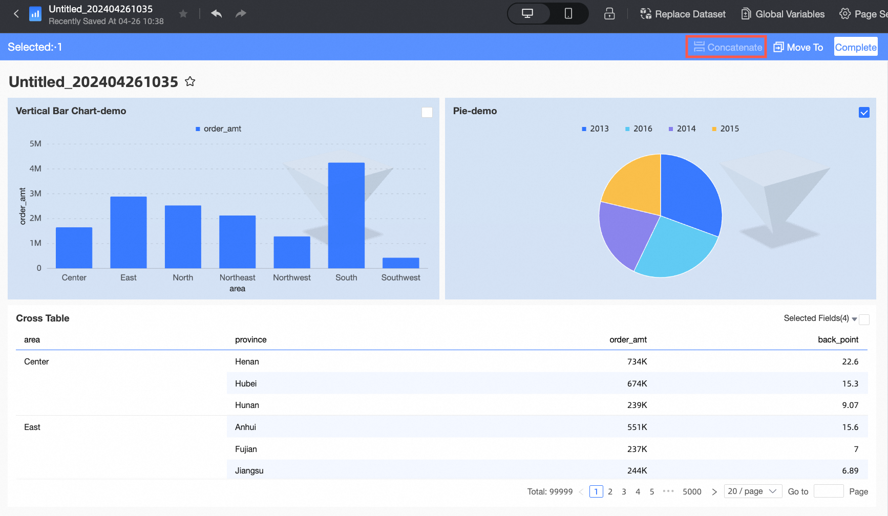
During dashboard creation, click Batch Operations in the top menu bar, select the components to splice, and click Splice to generate a spliced component.
Only PC dashboards are supported. Mobile dashboards are not supported.
Feature Entry
Splicing Operation
Select the components to splice and click Splice to generate a spliced component.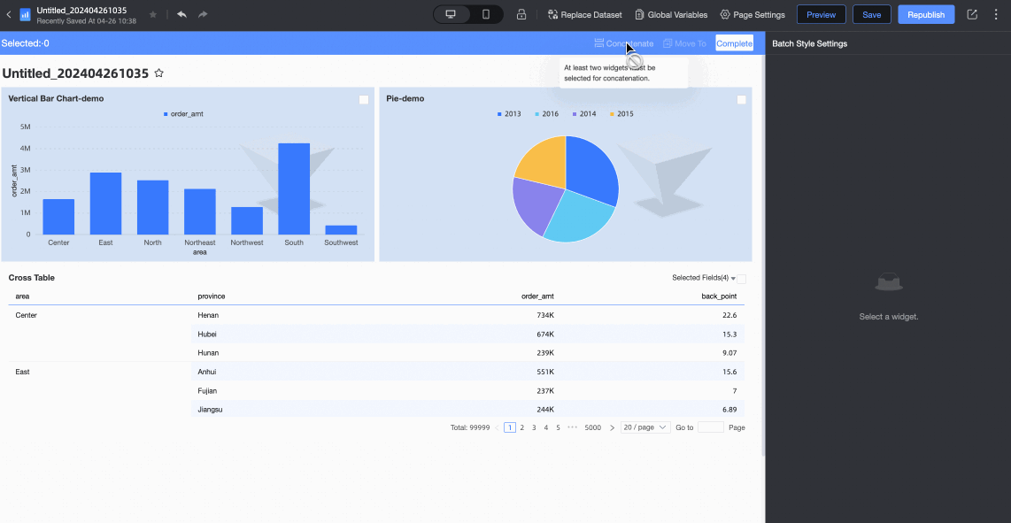
The selected components need to form a square shape to be spliced.
Edit Spliced Component
Spliced components support the following editing operations.
|
Configuration Item |
Description |
|
Unsplice |
Hover your mouse over the target spliced component, and in the toolbar displayed on the right, unsplice the components using either of the following methods:
|
|
Full screen view |
Click the |
|
Drag component |
Hover your mouse over the target spliced component, click and hold the |
|
Adjust size |
Spliced components can be resized as a whole, with internal content scaled proportionally. |
 icon to quickly unsplice.
 icon and select Unsplice from the dropdown list.
 icon in the spliced component toolbar to view the current spliced component in full screen.
 icon to drag the current component. You can also hold down the blank area of the chart to drag the component.

Hidden Charts
If your dashboard has hidden charts, click the  icon to view them.
Click the  button to restore hidden charts.
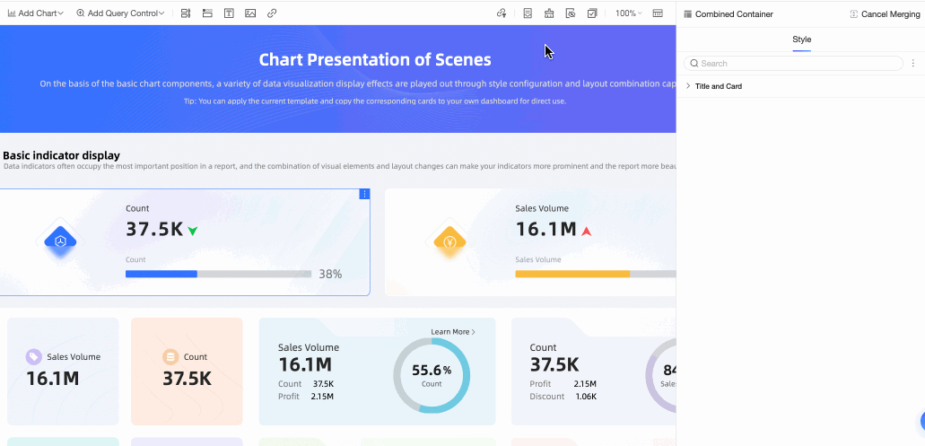
Configure the Style of Multiple Charts in a Dashboard at a Time
Configure the style of multiple charts in a dashboard at once for efficient editing.
When multiple charts are selected, the system displays their shared configuration items by default. Select the configurations as needed, as shown in the following figure.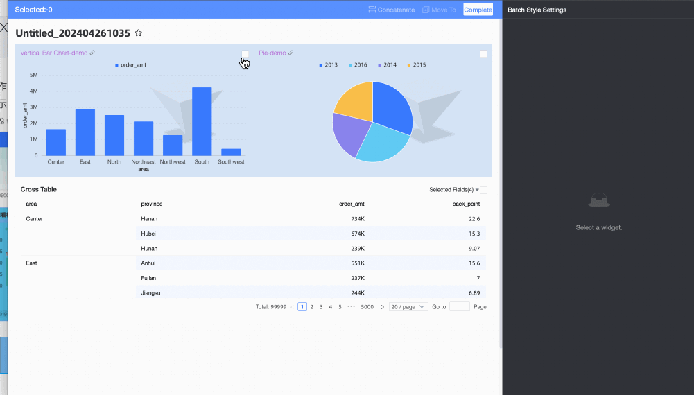
Page Grid Settings
To achieve a layout with multiple cards in one row, adjust the Page Grid Settings.
Feature Entry
Configuration Operation
-
The width of each card is determined by the number of grid columns. When you set more grid columns, the card width can be set with finer granularity. After setting, you can achieve multiple cards in one row by dragging the card width. The column spacing between each card can also be adjusted.
-
You can also set the card unit height. In the grid layout, the height of each card is dragged in units of one unit. The smaller the unit height is set, the smaller the granularity when dragging to set the card height.
