This topic describes the chart style and configuration panel of the stacked donut chart.
Chart Style
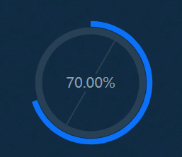
A stacked donut chart chart is a type of pie chart. Compared with a basic pie chart, a stacked donut chart chart can display the actual value of the expected goal and the current progress at the same time, as well as the percentage value of the current progress to the expected goal. It is suitable for displaying the completion status of the current task.
Settings Panel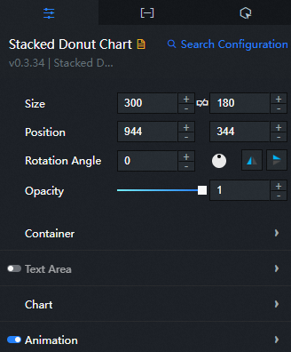
- Search for Configurations: In the right-side panel of Canvas Editor, click the Settings tab, and click Search for Configurations in the upper-right corner. Enter the required configuration item in the search box, and click the search icon to quickly locate the configuration item. Fuzzy match is supported. For more information, see Search for asset configurations.
- Size: indicates the size of a widget, including its pixel width and height. You can click the
 icon to proportionally adjust the width and height of a widget. After you click this icon again, you can adjust the width and height as needed.
 - Position: the position of a widget, which is indicated by pixel X and Y coordinates. X-coordinate indicates the pixel distance between the upper-left corner of the widget and the left border of the canvas. Y-coordinate indicates the pixel distance between the upper-left corner of the widget and the upper border of the canvas.
- Rotation Angle: the angle of a rotation that uses the center point of a widget as the rotation point. The unit is degrees (°). You can use one of the following methods to control the rotation angle of a widget:
- Directly enter the degrees in the Rotation Angle spin box or click the plus sign (+) or minus sign (-) to increase or decrease the value in the Rotation Angle spin box.
- Drag the black dot in the
 icon.
icon. - Click the
 icon to horizontally flip a widget.
 - Click the
 icon to vertically flip a widget.
- Opacity: the opacity of a widget. Valid values: 0 and 1. If this parameter is set to 0, the widget is hidden. If this parameter is set to 1, the widget is completely displayed. Default value: 1.
Container: the container size of the pie chart widget.
Padding: the distance between the lower end of the pie chart and the upper and lower edges of the container.
Text Area: the style of the upper and lower labels in the pie chart. Click the
 icon to turn the text style on or off.
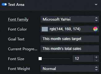
Parameter
Description
Font Family
The font family of all text in the widget. Default value: Microsoft Yahei.
Font Color
The color of the label text above and below the pie chart.
Goal Text
The display text for the label below the pie chart.
Current Progress Text
The display text of the label above the pie chart.
Font Size
The size of the label text above and below the pie chart. Valid values: 12 to 100.
Font Weight
The thickness of the label text above and below the pie chart.
Chart
Parameter
Description
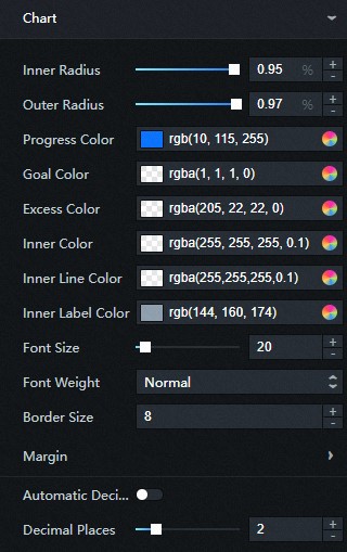
Inner Radius
The radius of the inner edge of the circle in the pie chart.
Outer Radius
The radius of the circle in the pie chart.
Progress Color
The color of the progress ring. Color fill and gradient fill are supported. For more information, see color picker instructions.
Goal Color
The color of the target ring (the bottom ring below the progress ring).
Excess Color
The color of the out-of-bounds ring. When the progress is greater than the target, it will be displayed as a circle of out-of-bounds rings.
Inner Color
The color of the inner ring.
Inner Line Color
Color of the inner slash of the ring.
Inner Lable Color
The color of the indicator text inside the ring.
Font Size
The size of the indicator text in the ring. Valid values: 12 to 100.
Font Weight
The thickness of the indicator text in the ring.
Border Size
The thickness of the inner ring. Unit: px.
Margin
The distance between the upper and lower labels of the outer circle of the pie chart.
Top: the distance between the outer ring of the pie chart and the top label. Unit: pixels.
Bottom: the distance between the outer ring of the pie chart and the lower label. Unit: pixels.
Automatic Decimal Places
If you turn on the switch, you cannot set the number of decimal places. If you turn off the switch, you can customize the number of decimal places.
Decimal Places
The number of decimal places for the target percentage value.
Animation: the animation effect style of the widget. You can click the
icon to enable or disable the animation effect. 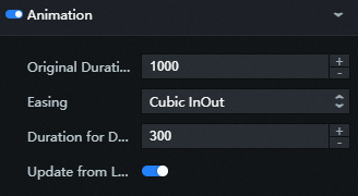
Parameter
Description
Original Duration
The duration of the first animation rendered by the component. Unit: ms.
Easing
The easing effect of animation. The system provides a variety of common easing effects for you to choose from.
Duration for Data Update
The duration of the animation when the widget data is updated. Unit: ms.
Update from Latest Status
If the switch is turned on, the animation starts from the position of the previous data when the component data is updated. If the switch is turned off, the animation starts from the initial position when the component data is updated.
Data Panel
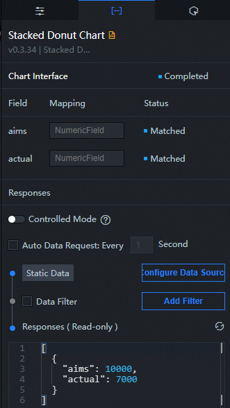
Configuration field description
Parameter | Description |
aims | The expected target value. |
actual | The current progress value. |
The progress value in the preceding figure is greater than the target value. In this case, an out-of-bounds ring is displayed on the visualization application.
| Parameter | Description |
| Controlled Mode | If you turn on the switch, data is not requested when a widget is initialized. Data requests are triggered only based on callback IDs or the method configured in Blueprint Editor. If you turn off the switch, data requests are automatically triggered. By default, the switch is turned off. |
| Auto Data Request | After you select the Auto Data Request check box, you can enable dynamic polling, and manually specify the polling interval. If you do not select this check box, data is not automatically requested. You must manually refresh the page to request data or use Blueprint Editor or callback ID events to trigger data requests. |
| Data Source | In the right-side panel of Canvas Editor, click the Data tab. Click Set next to Static Data. In the Configure Datasource panel, select a data source from the Data Source Type drop-down list. Enter code for data query in the code editor, click Preview Data Response to preview the response of the data source, and then view the response. For more information, see Configure asset data. |
| Data Filter | If you select the Data Filter check box, you can convert the data structure, filter data, and perform simple calculations. If you click the plus sign (+) next to Add Filter, you can configure the script for the data filter in the editor that appears. For more information, see Use the data filter. |
| Data Response Result | The response to a data request. If the data source changes, you can click the  icon next to Data Response Result to view the data response in real time. icon next to Data Response Result to view the data response in real time. |
Interaction Panel
This widget does not support interaction events.
Configure interactions in Blueprint Editor
- In Canvas Editor, right-click a widget in the Layer panel and select Add to Blueprint Editor.
- Click the
 icon in the upper-left corner of the page.
 In Blueprint Editor, click Stacked Donut Chart in the Added Nodes pane. You can view the stacked donut chart parameters in the canvas, as shown in the following figure.
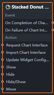
Event
Event
Description
On Completion of Chart Interface Request
The event is triggered with the processed JSON data after a data interface request is responded and processed by a filter. For more information about specific data examples, see the Data Response Result section of the Data tab in the right-side configuration panel of the canvas editor.
On Failure of Chart Interface Request
The event that is returned when a data interface request fails (the request may be due to network problems or interface errors) and is processed by the filter. The event also throws the processed JSON data. For more information about specific data examples, see the Data Response Result section of the Data tab in the right-side configuration panel of the canvas editor.
Action
Action
Description
Request Chart Interface
This action is performed to request the server data again. The data sent by an upstream data processing node or layer node is used as a parameter. For example, stacked donut chart the API data source is configured as
https://api.test, and the data passed to the Request Chart Interface is{ id: '1'}, the final request interface ishttps://api.test?id=1.Import Chart Interface
After data of a widget is processed in accordance with its drawing format, the widget is imported for redrawing. You do not need to request server data again. For more information about specific data examples, see the Data Response Result section of the Data tab in the right-side configuration panel of the canvas editor.
Update Widget Configurations
Style configurations of widgets are dynamically updated. In the Configuration panel, click Copy Configuration to Clipboard to obtain the configuration data of the component. After that, change the style field for the data processing node in Blueprint Editor.
Show
The following example shows the widget.
return{
  "animationType": "",
  "animationDuration": 1000,
  "animationEasing": "linear"
}
Hide
The following example shows the widget.
return{
  "animationType": "",
  "animationDuration": 1000,
  "animationEasing": "linear"
}
Hide/Show
The following example shows whether to show or hide a widget.
return {
  "animationIn": {
    "animationType": "",
    "animationDuration": 1000,
    "animationEasing": "linear"
  },
  "animationOut": {
    "animationType": "",
    "animationDuration": 1000,
    "animationEasing": "linear"
  }
}
Move
Move a widget to a specified location. The following example shows the reference data.
    return{
      // The positioning type. to indicates absolute positioning, whereas by indicates relative positioning. The default value is to.
        "positionType": "to",
      // The location, which is indicated by the x and y coordinates.
      "attr": {
        "x": 0,
        "y": 0
      },
      // The animation type.
      "animation": {
        "enable": false,
        // The duration in which animation is displayed.
        "animationDuration": 1000,
        // The animation curve, which can be set to linear|easeInOutQuad|easeInOutExpo.
        "animationEasing": "linear"
      }
    }