Configure the appearance, data, and interactions of a percentage bar chart widget.
Chart style
A percentage bar chart is a type of column chart that automatically displays the percentage breakdown across multiple series within each data category, making it easy to compare proportional differences. 
Configuration Panel 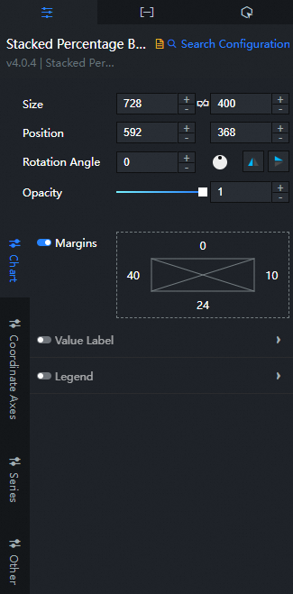
-
Search Configuration: Click Search Configuration in the upper-right corner of the Configuration panel to search for a configuration item by name. Fuzzy match is supported. For more information, see Search for asset configurations.
-
Size: the width and height of the widget in pixels. Click the
 icon to lock the aspect ratio so that width and height scale proportionally. Click again to unlock.
 -
Position: the position of the widget on the canvas, specified by X and Y coordinates in pixels. X-coordinate is the distance from the upper-left corner of the widget to the left edge of the canvas. Y-coordinate is the distance from the upper-left corner of the widget to the top edge of the canvas.
-
Rotation Angle: the rotation angle of the widget around its center point, in degrees (°). You can set the rotation angle by using one of the following methods:
-
Enter a value in the Rotation Angle spin box, or click the plus (+) or minus (-) sign to adjust the value.
-
Drag the
 black dot in the icon to control the rotation angle of the widget.
 -
Click the
 icon to flip the widget style.
 -
Click the
 icon to flip the widget style.
-
-
Opacity: Valid values: 0 to 1. A value of 0 hides the widget, and a value of 1 makes it fully visible. Default value: 1.
-
Chart name
-
Custom Margins: Click the
 icon to set custom margins between the chart area and the widget boundaries. Default unit: px.
 -
Custom Column Width: the width of columns in pixels. Setting an excessively large value causes columns in the same group to overlap. Click the
icon to enable or disable custom column width. -
Value Label: the style of the value label of each column. You can click the
icon to display or hide the value label. Parameter
Description
Position
The position of the value label text. You can select Left, Middle, or Right.
Text Style
The font style, text weight, font size, and color of the value label text.
Offset
The offset value of the value label in the horizontal and vertical directions.
Decimal Places
The number of decimal places displayed in the value label.
-
Legend: the legend style of the chart. The legend takes effect when the data contains the s series field. Click the
icon to show or hide the legend. Parameter
Description
Allow Page Turning
Turn on the switch to enable pagination when legends exceed the available display area.
Layout
The position of the legend relative to the widget. Valid values: Top Left, Top Center, Top Right, Bottom Left, Bottom Center, and Bottom Right.
Legend Tags
The style of the legend tag, including the shape style and size of the legend.
Legend Text
The style of the legend text, including the font style, text weight, font size, and color of the legend.
-
-
Axis: You can select x-axis or y-axis.
-
X Axis
-
X Axis Visible: Turn on the switch to show the x-axis. Turn off the switch to hide it.
-
Axis Label: The x-axis label style. Click the
icon to show or hide axis labels. Parameter
Description
Text Style
The font style, weight, font size, and color of the x-axis label text.
Custom Quantity
The number of labels on the x-axis. Click the
icon to enable a custom label count. -
Axis Title: the x-axis title style. Click the
icon to show or hide the x-axis title. Parameter
Description
Title Content
The text content of the x-axis title.
Offset
The offset value of the x-axis title. Unit: px.
Text Style
The font style, text weight, font size, and color of the x-axis title text.
-
Axis: the x-axis line style. Click the
icon to show or hide the x-axis line. Color: the color of the x-axis.
-
Tick mark: the x-axis tick mark style, including length, thickness, and color. Click the
 icon to show or hide tick marks on the x-axis.
 -
Gridlines: the x-axis gridline style. Click the
icon to show or hide x-axis gridlines. Color: the color of the x-axis grid lines.
-
-
Y Axis
-
Y Axis Visible: Turn on the switch to show the y-axis. Turn off the switch to hide it.
-
Data Type: the type of the y-axis data.
Parameter
Description
Numerical Type
Numeric data, such as integers and floating-point numbers.
Category Type
Category data, such as characters and strings.
Time Type
Time-based data. You must configure a data format when using this type.
-
Axis Label: the y-axis label style. Click the
icon to show or hide axis labels. Parameter
Description
Display Format
The display format for axis label values. Valid only for time-based and numeric data. Use
YYYY/MM/DD HH:mm:ssfor time,dfor integers, and.1ffor floating-point numbers.Text Style
The font style, text weight, font size, and color of the y-axis label text.
Custom Quantity
The number of labels on the y-axis. Click the
icon to enable a custom label count. -
Axis Title: the y-axis title style. Click the
icon to show or hide the y-axis title. Parameter
Description
Title Content
The text content of the y-axis title.
Offset
The offset value of the y-axis title. Unit: px.
Text Style
The font style, text weight, font size, and color of the title text on the y-axis.
-
Axis: the y-axis line style. Click the
icon to show or hide the y-axis line. Color: the color of the y-axis.
-
Tick mark: the y-axis tick mark style. Click the
icon to show or hide tick marks on the y-axis. Color: the color of the tick mark on the y-axis.
-
Gridlines: the y-axis gridline style. Click the
icon to show or hide y-axis gridlines. Color: the color of the grid lines on the y-axis.
-
-
-
RDS edition
-
CSV Data: Turn on the switch to use column mapping and data series from a CSV data file. When turned off, the series mapping settings take effect instead. Click the
icon to toggle the CSV data switch. Parameter
Description
Automatic field parsing
Turn on the switch to automatically parse and display fields from CSV data.
Only numeric fields
Turn on the switch to parse only numeric fields from CSV data. Turn off the switch to parse all fields.
-
data series: Click the
 or
or  icon on the right to add or delete a data series. Click the
  or
or  icon to configure the arrangement style of multiple data series. Click the
  icon to copy the selected data series configurations and add a data series with the same configurations.
 Parameter
Description
Mapping Field
Column Name /Field Name and Series Name configuration items. This parameter takes effect only when you turn on CSV Data and turn off Auto Parse Field configuration items.
-
Column Name /Field Name: the data series field value. You can customize the field value. If the field is empty, the system displays s field values in the widget data as series field values.
-
Series Name: the display name of the data series, which can be customized.
Series S Value and Series Display configuration items take effect only when CSV Data is hidden and the Series Mapping configuration items switch is turned on.
-
Series s Value: the data series mapping value, which can be customized. If you do not specify this parameter, the system displays s field values in the component data as series field mapping values.
-
Series Display: the display name of the data series, which can be customized.
Fill Color
The fill color of the column chart under this series.
-
-
Series Mapping: Turn on the switch to map series s values to specific colors and names by using the Mapping Field parameter. Turn off the switch to disable the Mapping Field settings.
-
-
Remarks
-
Interaction Enhancement for Massive Data: Improves navigation when the chart contains large amounts of data. Click the
icon to enable or disable this feature. Parameter
Description
How to run the commands
The method of data interaction. The default value is Scroll Bar.
Direction
The direction in which the scroll bar is arranged, including Horizontal and Vertical.
Type Width
The width of the data category column.
-
dialog box: The tooltip that appears when you hover over or click a bar on the preview or published page. Click the
icon to enable or disable the tooltip. Figure 1. The dialog box panel

Figure 2. dialog box example

Parameter
Description
Text Style
The style of the text in the dialog box, including the font style, weight, font size, and color.
Indicator
The indicator style, including width, line type, and color. Click the
icon to show or hide the indicator. Background Box Style
The background box style of the dialog box.
-
Background Color: the background color of the dialog box.
-
Padding: the inner margin of the dialog box. Unit: pixels.
-
Borders
-
Border Width: the border thickness of the dialog box. Unit: pixels.
-
Border Color: The border color of the dialog box.
-
-
-
Data Panel 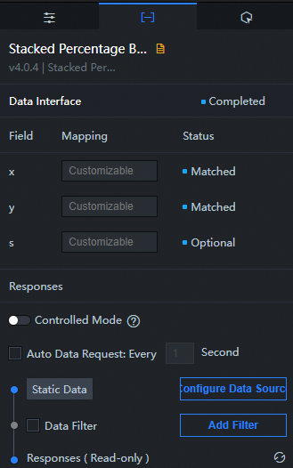
Configuration field description
|
Field |
Description |
|
x |
The category of each column in the column chart. |
|
y |
The value of each column in the column chart. |
|
s |
Optional. The data of the corresponding series. |
|
Configuration item |
Section |
|
Controlled Mode |
When turned on, the asset does not request data on initialization. Data is fetched only through a callback ID or a method configured in Blueprint Editor. Default: off. |
|
Auto Data Request |
Select the check box to enable dynamic polling and specify a polling interval. If cleared, data is not automatically updated. You must manually refresh the page or use Blueprint Editor and callback ID events to trigger an update. |
|
Data Source |
Click Configure Data Source. In the Configure Data Source panel, modify the data source type and query code, preview the response of the data source, and view the response results. For more information, see Configure asset data. |
|
Data Filter |
Select the check box to convert the data structure, filter data, and perform simple calculations. Click Add Filter. In the Set Data Source panel, configure a data filter script. For more information, see How to use. |
|
Data Response Result |
The response to a data request. Click the |
 icon to refresh and view the latest response.
 Interactive Panel 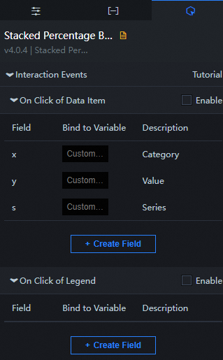
|
Interaction Event |
Description |
|
When a data item is clicked |
Select the Enable check box to enable interactions between widgets. When you click a bar of a percentage bar chart, a data request is triggered, a callback value is thrown, and data of different bars is dynamically loaded. By default, the x, y, and s values in the data are returned. For more information, see How to configure a callback ID for a ticker board widget. |
|
When you click the legend |
Select the Enable check box to enable interactions between widgets. When you click the legend of a percentage bar chart, a data request is triggered, a callback value is thrown, and data of different bars is dynamically loaded. By default, the x, y, and s values are returned. For more information, see How to configure a callback ID for a ticker board widget. |
Configure interactions in Blueprint Editor
-
In Canvas Editor, right-click a widget in the Layer panel and select Add to Blueprint Editor.
-
Click the
 icon in the upper-left corner.
 -
In Blueprint Editor, click the Percentage Bar Chart widget in the Added Nodes pane. On the canvas, you can configure the parameters for the percentage bar chart, as shown in the following figure.

-
Event
Event
Description
When the percentage bar chart interface request is completed
The event is triggered with the processed JSON data after a data interface request is responded and processed by a filter. For more information about specific data examples, see the Data Response Result section of the Data tab in the right-side configuration panel of the canvas editor.
When the percentage bar chart interface request fails
The event that is returned when a data interface request fails (such as network problems or interface errors) and is processed by the filter. The event also throws the processed JSON data. For more information about specific data examples, see the Data Response Result section of the Data tab in the right-side configuration panel of the canvas editor.
When a data item is clicked
The event that is raised when a bar of a percentage bar chart is clicked, along with the data item corresponding to the bar.
When you click the legend
The event that is raised when the legend of a percentage bar chart is clicked, along with the data item corresponding to the legend.
-
Action
Action
Description
Request percentage bar chart interface
This action is performed to request the server data again. The data sent by an upstream data processing node or layer node is used as a parameter. For example, if the API data source is set to
https://api.testand the data transferred to the Request Percentage Bar Chart interface is set to{ id: '1'}, the final request interface ishttps://api.test?id=1.Import Percentage Bar Chart
After data of a widget is processed in accordance with its drawing format, the widget is imported for redrawing. You do not need to request server data again. For more information about specific data examples, see the Data Response Result section of the Data tab in the right-side configuration panel of the canvas editor.
Highlight
Highlight the element corresponding to the data item. Examples of reference data are as follows.
{
  data: {
    x: 'Shanghai' // You can list multiple highlight conditions, similar to filter.
  },
  options: {
    style: {
      fill: 'red'
    },
    selectMode: 'single',
    cancelHighlightFirst: true
  }
}
Unhighlight
Cancels the highlighting of the element corresponding to the data item. Examples of reference data are as follows.
{
  data: {
    x: 'Shanghai'
  },
  options: {
    mode: 'single' // If the value is single, only one highlight is canceled when multiple data items are hit. If the value is multiple, all highlights are canceled when multiple data items are hit.
  }
}
Clear components
Clear component data. No parameters are required.
Update component configurations
Style configurations of widgets are dynamically updated. Before this action is executed, you must click the widget in Canvas Editor, click the Settings tab in the right-side panel, and click Copy Configurations to... to obtain widget configurations. After that, change the style field for the data processing node in Blueprint Editor.
Display
A widget is shown without the need to specify parameters.
Hide
A widget is hidden without the need to specify parameters.
Switch to the implicit state
A widget is hidden or shown. Examples of reference data are as follows.
    {
      //true indicates that a widget is shown, whereas false indicates that a widget is hidden.
      "status": true,
      // Animation is displayed.
      "animationIn": {
        // The animation type, which can be set to fade. If it is not specified, no animation is displayed.
        "animationType": "fade",
        // The duration in which animation is displayed. It is in the unit of milliseconds.
        "animationDuration": 1000,
        // The function that is used to display animation. You can set this parameter to linear|easeInOutQuad|easeInOutExpo.
        "animationEasing": "linear"
      },
      // Animation is hidden.
      "animationOut": {
        // The animation type, which can be set to fade. If it is not specified, no animation is displayed.
        "animationType": "fade",
        // The duration in which animation is hidden. It is in the unit of milliseconds.
        "animationDuration": 1000,
        // The function that is used to hide animation. You can set this parameter to linear|easeInOutQuad|easeInOutExpo.
        "animationEasing": "linear"
      }
    }
Move
A widget is moved to a specified location. Examples of reference data are as follows.
    {
      // The positioning type. to indicates absolute positioning, whereas by indicates relative positioning. The default value is to.
        "positionType": "to",
      // The location, which is indicated by the x and y coordinates.
      "attr": {
        "x": 0,
        "y": 0
      },
      // The animation type.
      "animation": {
        "enable": false,
        // The duration in which animation is displayed.
        "animationDuration": 1000,
        // The animation curve, which can be set to linear|easeInOutQuad|easeInOutExpo.
        "animationEasing": "linear"
      }
    }
-