This topic describes the chart style and configuration panel of a radar chart for Double 11.
Chart Style
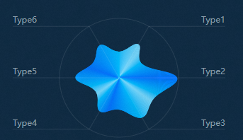
The Double 11 radar chart is a type of other basic charts. Compared with the basic radar chart, the Double 11 radar chart only supports data display in a single dimension. It is suitable for displaying the quantity of products sold in each region during the Double 11 period. For example, it displays the quantity of products sold in regions such as North China and East China.
Settings Panel 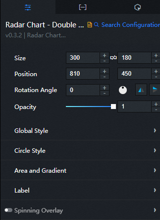
- Search for Configurations: In the right-side panel of Canvas Editor, click the Settings tab, and click Search for Configurations in the upper-right corner. Enter the required configuration item in the search box, and click the search icon to quickly locate the configuration item. Fuzzy match is supported. For more information, see Search for asset configurations.
- Size: indicates the size of a widget, including its pixel width and height. You can click the
 icon to proportionally adjust the width and height of a widget. After you click this icon again, you can adjust the width and height as needed.
 - Position: the position of a widget, which is indicated by pixel X and Y coordinates. X-coordinate indicates the pixel distance between the upper-left corner of the widget and the left border of the canvas. Y-coordinate indicates the pixel distance between the upper-left corner of the widget and the upper border of the canvas.
- Rotation Angle: the angle of a rotation that uses the center point of a widget as the rotation point. The unit is degrees (°). You can use one of the following methods to control the rotation angle of a widget:
- Directly enter the degrees in the Rotation Angle spin box or click the plus sign (+) or minus sign (-) to increase or decrease the value in the Rotation Angle spin box.
- Drag the black dot in the
 icon.
icon. - Click the
 icon to horizontally flip a widget.
 - Click the
 icon to vertically flip a widget.
- Opacity: the opacity of a widget. Valid values: 0 and 1. If this parameter is set to 0, the widget is hidden. If this parameter is set to 1, the widget is completely displayed. Default value: 1.
Global
Top Offset: the distance between the radar chart and the top of the widget.
Outer Style
Parameter
Description
Edge Color
Please refer to the color picker description to modify the color of the outer edge.
Edge line width
The width of the outer edge.
Radar area
Parameter
Description
Default Maximum Value
The maximum preset value for the radar area zone. When the preset maximum value is greater than the maximum value value of the data, the larger the preset maximum value is, the smaller the radar area proportion is.
Color
The gradient color of the radar chart. Click the
 or
or  icon on the right to add or delete a color area. Click the
  or
or  icon to configure the arrangement style of multiple color series. Click the
  icon to copy the current color series configuration and add a new color series with the same configuration.
 Position: the position of each color in the gradient band.
Color: the color of each location.
Edge line width
The width of the region edge. Unit: pixels.
Edge Style
The style of the region edge. Valuable values: Curve and Line.
Curve Radian
The radian when the edge is a curve, ranging from 0 to 1. When the value is 1, the edge becomes a straight line.
Text Box and Connection
Parameter
Description
Text box distance from line
The vertical distance between the text box and the line. Unit: pixels.
Font
The font family of all text in the widget. Default value: Microsoft Yahei.
Font Color
The font color of all text in the component.
Font Size
The font size of all text in the component.
Font weight
The font weight of all text in the widget.
Line Color
The color of the line.
Connection Width
The width of the line. Unit: pixels.
Sweep: the style of the sweep effect. You can click the
 icon to enable or disable the sweep effect.
 Image: the image used for the sweep effect. Enter the URL of the image.
Animation Duration: the duration of the sweep animation. Unit: seconds.
Data Panel 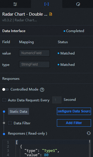
Configuration field description
Parameter | Description |
type | The category value, which corresponds to the specific text content. |
value | A numeric value that corresponds to the specific data in the radar area in the chart. The larger the value, the closer to the outer circle. |
| Parameter | Description |
| Controlled Mode | If you turn on the switch, data is not requested when a widget is initialized. Data requests are triggered only based on callback IDs or the method configured in Blueprint Editor. If you turn off the switch, data requests are automatically triggered. By default, the switch is turned off. |
| Auto Data Request | After you select the Auto Data Request check box, you can enable dynamic polling, and manually specify the polling interval. If you do not select this check box, data is not automatically requested. You must manually refresh the page to request data or use Blueprint Editor or callback ID events to trigger data requests. |
| Data Source | In the right-side panel of Canvas Editor, click the Data tab. Click Set next to Static Data. In the Configure Datasource panel, select a data source from the Data Source Type drop-down list. Enter code for data query in the code editor, click Preview Data Response to preview the response of the data source, and then view the response. For more information, see Configure asset data. |
| Data Filter | If you select the Data Filter check box, you can convert the data structure, filter data, and perform simple calculations. If you click the plus sign (+) next to Add Filter, you can configure the script for the data filter in the editor that appears. For more information, see Use the data filter. |
| Data Response Result | The response to a data request. If the data source changes, you can click the  icon next to Data Response Result to view the data response in real time. icon next to Data Response Result to view the data response in real time. |
Interaction Panel
This widget does not support interaction events.
Configure interactions in Blueprint Editor
- In Canvas Editor, right-click a widget in the Layer panel and select Add to Blueprint Editor.
- Click the
 icon in the upper-left corner of the page.
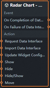
 In Blueprint Editor, click the Radar Chart Double 11 widget in the Import Nodes pane. On the canvas, you can view the parameters in Blueprint Editor, as shown in the following figure.
Event
Event
Description
When the data interface request is completed
The event is triggered with the processed JSON data after a data interface request is responded and processed by a filter. For more information about specific data examples, see the Data Response Result section of the Data tab in the right-side configuration panel of the canvas editor.
When a data interface request fails
The event that is returned when a data interface request fails (the request may be due to network problems or interface errors) and is processed by the filter. The event also throws the processed JSON data. For more information about specific data examples, see the Data Response Result section of the Data tab in the right-side configuration panel of the canvas editor.
Action
Policy Action
Description
Request Data Interface
This action is performed to request the server data again. The data sent by an upstream data processing node or layer node is used as a parameter. For example, if the API data source is
https://api.testand the data passed to the request data interface is{ id: '1'}, the final request interface ishttps://api.test?id=1.Import data
After data of a widget is processed in accordance with its drawing format, the widget is imported for redrawing. You do not need to request server data again. For more information about specific data examples, see the Data Response Result section of the Data tab in the right-side configuration panel of the canvas editor.
Update component configurations
Style configurations of widgets are dynamically updated. In the Configuration panel, click Copy Configuration to Clipboard to obtain the configuration data of the component. After that, change the style field for the data processing node in Blueprint Editor.
Display
The following example shows the widget.
return{
  "animationType": "",
  "animationDuration": 1000,
  "animationEasing": "linear"
}
Hide
The following example shows how to hide a widget:
return{
  "animationType": "",
  "animationDuration": 1000,
  "animationEasing": "linear"
}
Switch to the implicit state
The following example shows whether to show or hide a widget.
return {
  "animationIn": {
    "animationType": "",
    "animationDuration": 1000,
    "animationEasing": "linear"
  },
  "animationOut": {
    "animationType": "",
    "animationDuration": 1000,
    "animationEasing": "linear"
  }
}
Move
Move a widget to a specified location. The following example shows the reference data.
    return{
      // The positioning type. to indicates absolute positioning, whereas by indicates relative positioning. The default value is to.
        "positionType": "to",
      // The location, which is indicated by the x and y coordinates.
      "attr": {
        "x": 0,
        "y": 0
      },
      // The animation type.
      "animation": {
        "enable": false,
        // The duration in which animation is displayed.
        "animationDuration": 1000,
        // The animation curve, which can be set to linear|easeInOutQuad|easeInOutExpo.
        "animationEasing": "linear"
      }
    }