このトピックでは、タブリストの使用方法について説明します。
コンポーネントの概要
タブリストは複数のタブで構成されており、他のウィジェットと連携するようにインタラクティブな設定で構成できます。 これにより、関連情報をタブにグループ化して、異なるビューまたは機能を簡単に切り替えることができます。
シナリオ
タブリストは、情報の整理、コンテンツの分類、データの提示に最適で、必要な情報にすばやくアクセスできます。 例は次のとおりです。
情報組織: 「個人情報」や「アカウント設定」などのタブで関連するコンテンツをグループ化します。
コンテンツ分類: タブを使用して、eコマースプラットフォームの「電子機器」や「家庭用品」などのコンテンツカテゴリを区別します。
データの表示: タブを使用して、「地域の小学校」や「地域の高校」など、さまざまなデータビューを表示します。
エフェクト表示
例としては、タブリスト内のさまざまなタブの下に表示されるさまざまなチャートがあります。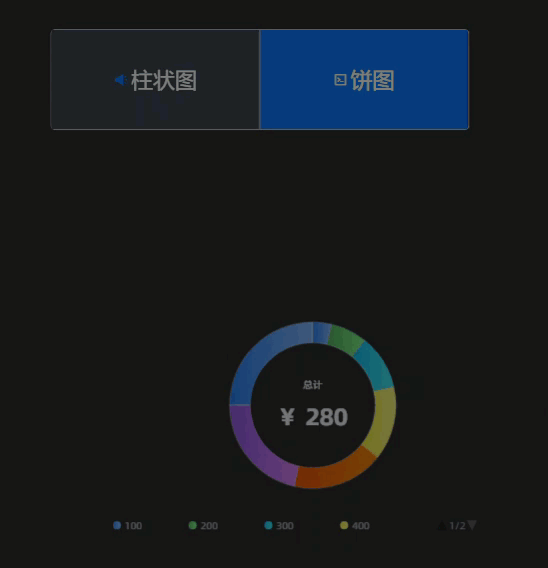
前提条件
タブリストの追加
DataVコンソールにアクセスします。
に移動し、目的のダッシュボードを選択し、キャンバス編集ページに移動します。
左側のナビゲーションウィンドウで、 リストの下にある [タブリスト] を選択してウィジェットをキャンバスに追加します。
説明プラットフォームには、すぐに使用できる複数の組み込みタブリストスタイル (クイックスタイル) があります。 必要に応じて、
 ウィジェットのアイコンにカーソルを合わせて選択します。 これらのスタイルが要件を満たしていない場合は、追加後にウィジェットのスタイルをカスタマイズできます。 詳細については、「スタイル設定」をご参照ください。
グローバル検索を使用して、関連するウィジェットを追加することもできます。
ビジネスデータの統合
ウィジェットを追加したら、準備したビジネスデータを統合して表示できます。 タブリストをクリックし、右側の [データソース] タブで、表示するウィジェットのデータを選択します。 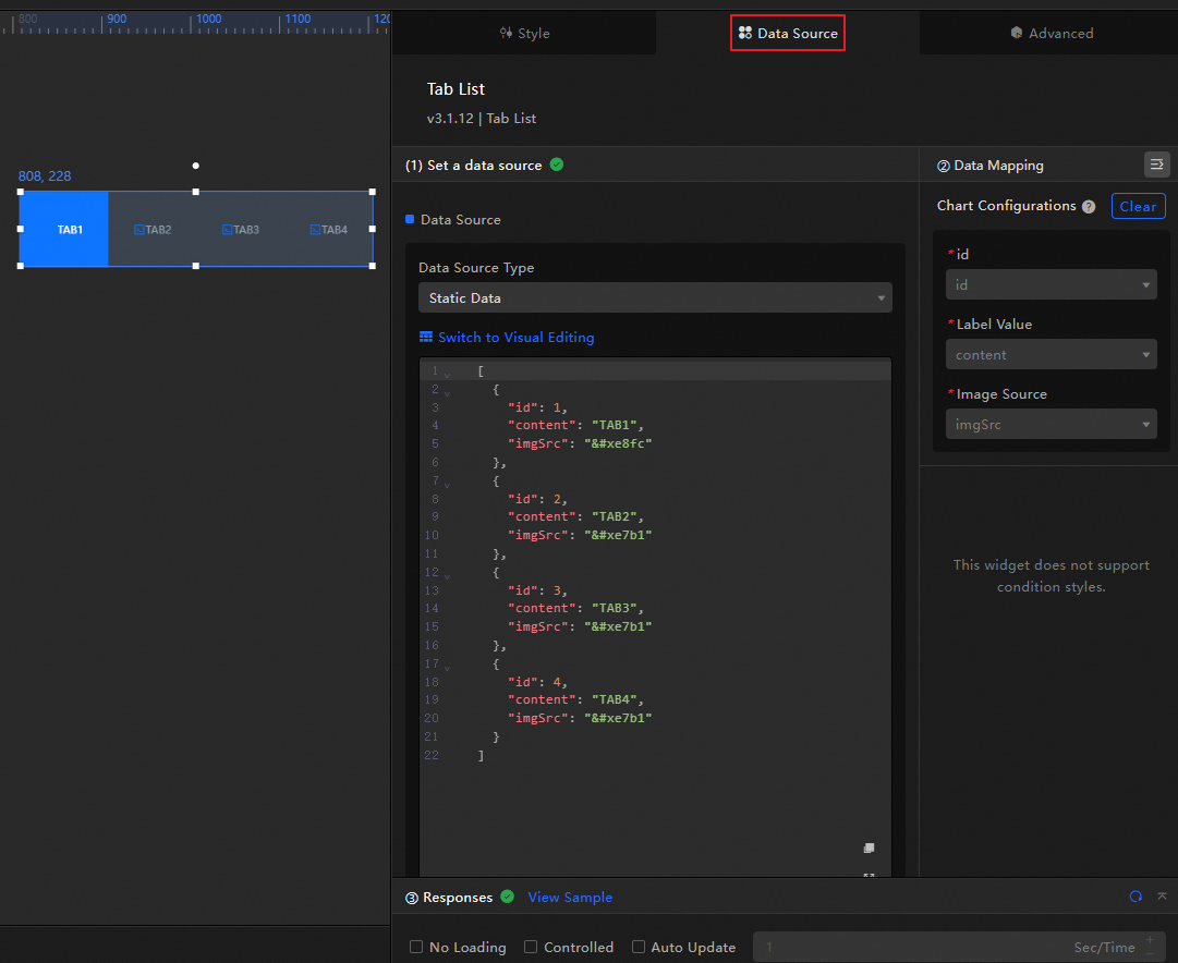
タブリストによって受け入れられるデータフィールドの概要を以下に示します。
項目
説明
idタブリスト内のタブのID。 スタイルパネルの 設定項目では、ウィジェットの初期化時に選択するタブを定義するために、この変数値が必要です。
コンテンツタブリスト内のタブの名前。
imgSrcタブリスト内のタブのアイコンのURLアドレス。 ここでアイコンを設定したら、スタイルパネルの セクションで画像のサイズ、位置、その他の情報を変更できます。
[ { "id": 1, "content": "Sales Data", "imgSrc": "" }, { "id": 2, "content": "Customer Data", "imgSrc": "" }, { "id": 3, "content": "Market Data", "imgSrc": "" }, { "id": 4, "content": "Production Data", "imgSrc": "" } ]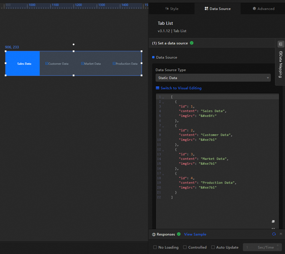
データソースの主要な構成項目については、以下で詳しく説明します。
設定アイテム
説明
データソースの設定
タブリストは、CSVファイル、API、データベースなどのさまざまな種類のデータの統合をサポートしています。 詳細については、「サポートされているデータソースの種類」をご参照ください。 ビジュアルテーブルまたはコードを使用してデータフィールドを編集できます。
フィルターの設定 (オプション)
データ構造変換、フィルタリング、表示、および簡単な計算のためのフィルタコードをカスタマイズするために使用されます。 詳細については、「データフィルターの管理」をご参照ください。
データマッピングの設定
選択したデータソースのフィールドをウィジェットの対応するフィールドにマッピングし、リアルタイムのデータマッチングを実現します。 アイコンをクリックし
 て、フィールドスタイルを設定します。
レスポンス結果の表示
ウィジェットに統合されたデータをリアルタイムで表示するために使用されます。 ウィジェットのデータソースが変更されると、最新のデータがここに表示されます。
データ応答結果をクリックして、データフィールドのコードを表示します。
[例の表示] をクリックして、データソースが受信した配列タイプとコード例を表示します。 この例を参照して、関連フィールドを記述できます。
その他のデータ要求設定:
読み込み状態を無効にする: を選択すると、ウィジェットの初期化中の読み込みコンテンツは、ウィジェットの更新時またはデータダッシュボードのプレビュー時に表示されません。
制御モード: 選択すると、ウィジェットは初期化状態のデータを要求しません。 現時点では、データ要求は、ブループリントエディタまたはグローバル変数イベントを介してのみ開始できます。
自動更新リクエスト: 選択すると、プラットフォームは設定したポーリング時間に基づいてデータを動的にポーリングおよび更新します。 選択しない場合は、手動でページを更新するか、ブループリントエディターとグローバル変数イベントを使用してリクエストの更新をトリガーする必要があります。
タブリストの設定
タブリストウィジェットを設定するには、タブリストウィジェットをクリックし、右側のパネルを使用して、基本スタイル、グローバル変数、インタラクションの発生、詳細設定、およびブループリントのインタラクション設定を設定します。
スタイル設定
スタイルパネルでは、タブリストのテキストサイズ、背景、アニメーション効果などのスタイルを調整できます。 設定項目は次のとおりです。
アイコンを使用する と、ファジーマッチングをサポートするキーワード検索で設定項目をすばやく見つけることができます。 詳細については、「検索設定項目」をご参照ください。
設定アイテム | 説明 | イラスト |
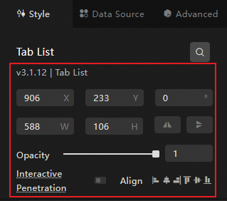
グローバル設定 | データダッシュボードでのウィジェットの位置分布、透明度、およびインタラクションの浸透度を定義します。
|
|
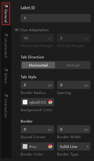
一般的な設定 | タブコンテナの背景と枠、タブのサイズ、配置位置など、タブリストの全体的な表示スタイルを定義します。
|
|
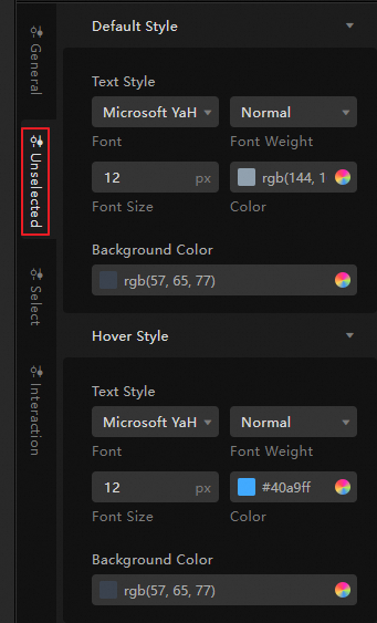
未選択の設定 | タブリストをプレビューすると、タブを選択すると、そのタブに関連するコンテンツが表示されますが、他のタブは未選択と見なされます。 このセクションは、選択されていないタブの表示スタイルを定義します。
説明 ローカル画像は背景としてアップロードできます。 |
|
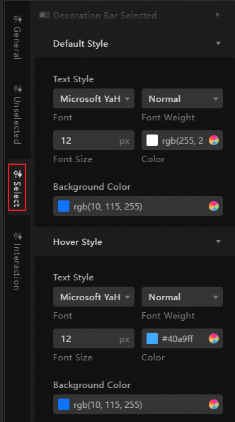
選択した設定 | タブリストをプレビューすると、タブを選択すると、そのタブに関連するコンテンツが表示されますが、他のタブは未選択と見なされます。 このセクションは、選択したタブの表示スタイルを定義するために使用します。
説明 ローカル画像は背景としてアップロードできます。 |
|
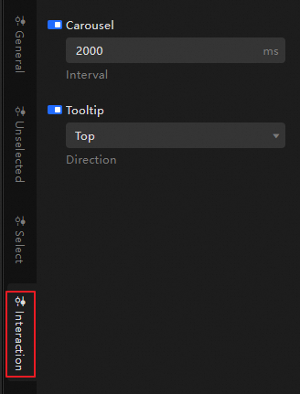
インタラクションの設定 | タブリストのカルーセル間隔の長さと、各タブのツールチップの相対位置を設定します。 |
|
高度な設定
タブリストと他のウィジェット間のインタラクションとデータ送信の関係を定義します。 設定項目は次のとおりです。
設定アイテム | 説明 | イラスト |
インタラクションの発生 | 他のウィジェットとのインタラクション動作を定義して、ウィジェットの連携を実現します。 たとえば、タブリストと折れ線グラフを使用して、会社の稼働状況を表示できます。 さまざまなタブをクリックすると、売上データ、顧客データ、市場データ、および生産データの変動を表示できます。 アイコンをクリックして、 |
|
グローバル変数の関連付け | ウィジェットでグローバルパラメータを関連付けることで、パラメータの送信とウィジェットインタラクションを実現できます。 グローバル変数の詳細については、「グローバル変数」をご参照ください。 アイコンをクリックして、 |
 関連するインタラクションの発生とインタラクションアクションを定義します。
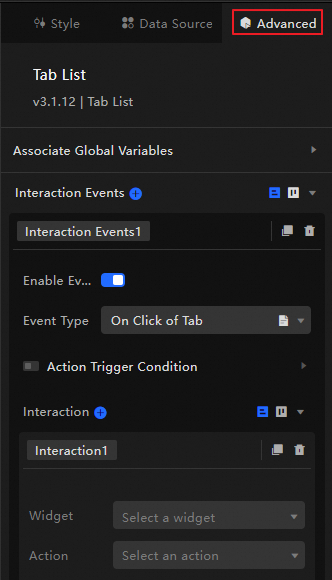
 対応する指示を有効にします。 タブをクリックすると、データ要求がトリガーされ、一時変数がスローされてタブのコンテンツが動的に読み込まれます。 デフォルトでは、データ内の
ブループリントの相互作用
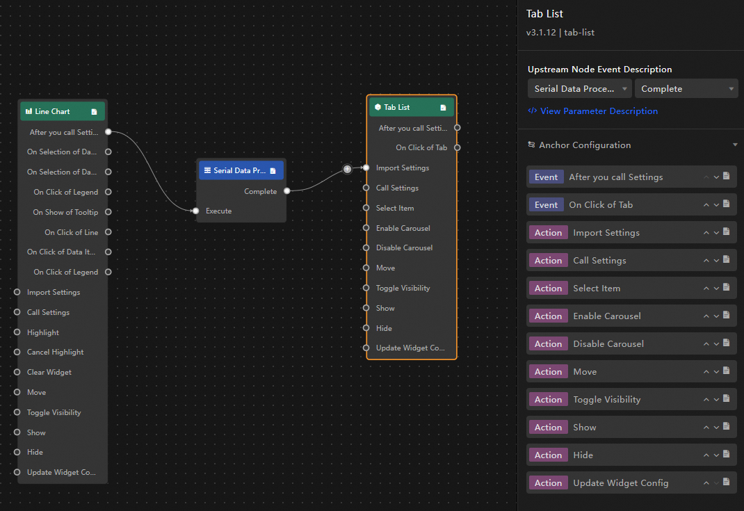
Blueprint Editorを使用して、ウィジェット間のインタラクション関係と動作ロジックを視覚的に定義します。
手順
キャンバス編集ページの上部のメニューバーの左側にある
 アイコンをクリックして、ブループリントエディタに入ります。
レイヤーノードリストで、タブリストウィジェットにカーソルを合わせ、アイコンをクリックして
 メインキャンバスに追加します。
必要に応じてウィジェットを接続し、ブループリントのインタラクション効果を設定します。
例を以下に示す。
設定アイテムの説明
インタラクションの発生およびアクションについては、以下で説明する。
ブループリント設定インターフェイスの イベントまたはアクションの横にあるアイコンをクリックして、パラメーターの詳細を説明します。
カテゴリ | サブカテゴリ | 説明 |
イベント | データの更新 | ウィジェットデータが更新されたときにトリガーされます。 |
データ要求ステータスが変更された場合 | データ要求のステータスが変更されたときにトリガーされます。 ステータス値には、Loading、Success、およびErrorが含まれます。 | |
タブをクリックするとき | タブがクリックされたときにトリガーされ、タブに対応するデータ項目がスローされます。 データの例は次のとおりです。 | |
Action | データのインポート | ウィジェットのレンダリング形式に従ってデータを処理し、再レンダリングのためにウィジェットにインポートします。 サーバーデータを再要求する必要はありません。 データの例は次のとおりです。 |
リクエストデータ | サーバーデータを再要求します。 上流のコンバーターまたはレイヤーノードによってスローされたデータは、パラメーターとして使用されます。 たとえば、タブリストにAPIデータソース | |
セット選択 | 1つ以上のタブオプションを選択します。 これは、配列または単一のオブジェクトにすることができます。 データの例は次のとおりです。 | |
カルーセルの有効化 | タブリストの自動カルーセルを有効にします。 データの例は次のとおりです。 | |
カルーセルの無効化 | タブリストのカルーセルスタイルを無効にします。 パラメータは必要ありません。 | |
移動 | ウィジェットを指定した位置に移動します。 データの例は次のとおりです。 | |
表示の切り替え | 表示または非表示にするウィジェットを切り替えます。 データの例は次のとおりです。
| |
表示 | ||
非表示 | ||
ウィジェット設定の更新 | ウィジェットのスタイル設定を動的に更新します。
|
ケースデモンストレーション
このケースでは、タブリスト内のカルーセルとグループの表示を制御することにより、ウィジェットの動的効果を示します。
DataVコンソールにアクセスします。
データダッシュボードを選択し、[編集] をクリックして、キャンバスエディターページに移動します。
列グラフ、折れ線グラフ、進行状況ドーナツグラフ、および2つのタブリストウィジェットをキャンバスに追加します。
縦棒グラフ、折れ線グラフ、およびドーナツグラフをグループ化し、カルーセルコンテナのトリガーモードをイベントトリガーに設定します。
タブリストウィジェットを選択し、データソースパネルにアクセスし、静的データを変更し、名前を [表示 /非表示] に同期します。
[ { "id": 1, "content": "Show" }, { "id": 2, "content": "Hide" } ]他のタブリストの名前をカルーセル制御に変更します。
左上隅のアイコンをクリックして
 ブループリントページに入ります。
[レイヤーノード] タブで、カルーセルコンテナ、表示 /非表示、およびカルーセルコントロールをメインキャンバスに追加します。
[ロジックノード] タブで、シリアルデータ処理ノードと2つの条件判定ノードをメインキャンバスに追加します。
図のようにウィジェットを接続します。
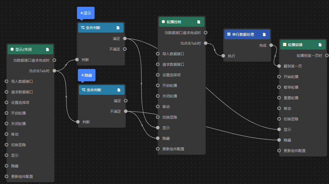
処理方法を設定します。
表示
return data.id == 1;非表示
return data.id == 2;シリアルデータ処理
return {
  index: data.id - 1
};
ページの右上隅にある [プレビュー] をクリックして、表示結果をプレビューします。