The circle selection feature enables the simultaneous selection of multiple data points and cells for interactive analysis tasks, including viewing, annotating, filter interaction, and drilling. Utilizing circle selection within a field area allows you to break down the field hierarchy and adjust the granularity of your analysis. By selecting the filter interaction feature, you can link other charts. This topic illustrates how to leverage circle selection in combination with other operations to expand your analysis from single to multiple dimension values.
Limits
Circle selection is currently supported by the following chart types:
Trend charts: line charts, area charts, stacked area charts, 100% stacked area charts, combination charts
Comparison charts: column charts, stacked column charts, 100% stacked column charts, bar charts, stacked bar charts, 100% stacked bar charts, ranking charts
Relationship charts: scatter charts, bubble charts
Distribution charts: word clouds, treemap charts
Detail table charts (supporting view only, excluding, copying): cross tables, detail tables
Circle Selection Operation Instructions
Circle selection allows you to select multiple dimension values and perform operations such as:
View only: Isolate locally selected data using circle selection.
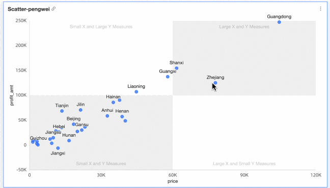
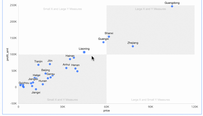
For example, with a scatter chart:
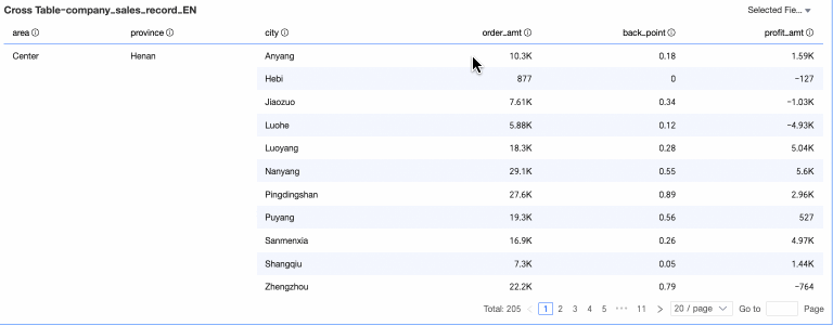
For example, with a cross table:
Exclude: Remove outliers or noise points using circle selection.
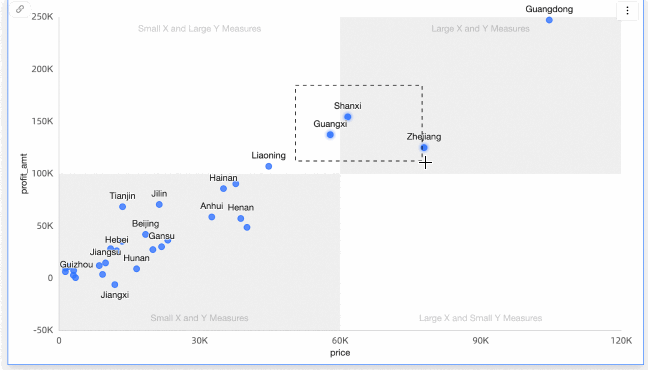
For example, with a scatter chart:
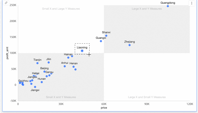
View data: Examine detailed data by selecting a specific area with circle selection.
Annotation: Add notes to targeted locations. For more information, see Annotation.
 Note
NoteAnnotation is currently supported by the following chart types:
Trend charts: line charts, area charts, stacked area charts, 100% stacked area charts, combination charts
Comparison charts: column charts, stacked column charts, 100% stacked column charts, bar charts, stacked bar charts, 100% stacked bar charts, ranking charts
Relationship charts: scatter charts, bubble charts
Maps: colored maps, bubble maps
Distribution charts: word clouds, treemap charts
The drilling feature with circle selection allows you to simultaneously select multiple dimension values and examine data at both secondary and tertiary levels.
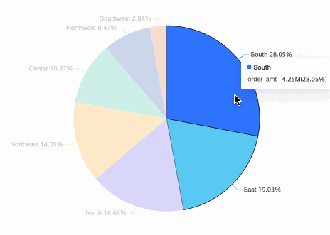
For example, with the sales data dataset, configure the drilling effect for the pie chart. For more information, see Drilling.
The filter interaction feature with circle selection enables you to simultaneously select multiple dimension values and apply them across various charts for data analysis.
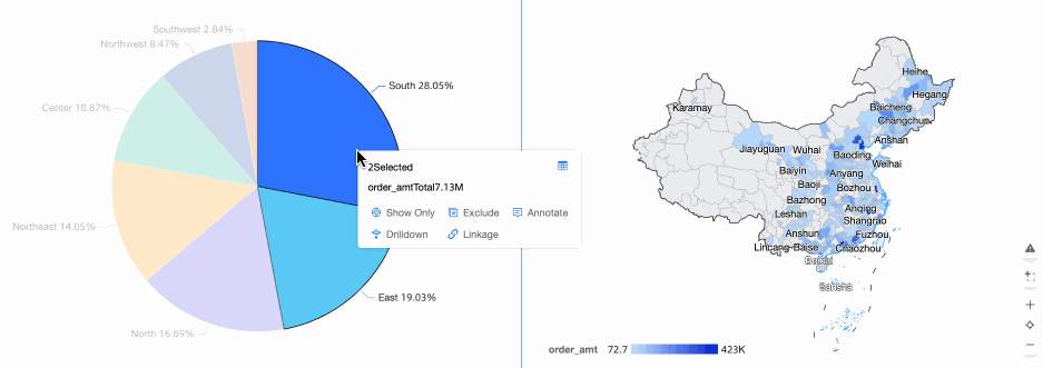
For example, with the sales data dataset, set up the filter interaction effect between the pie chart and colored map. For more information, see Filter Interaction.
The drilling feature with circle selection allows you to simultaneously select multiple dimension values and carry them over to subsequent reports during the transition.
For example, with the sales data dataset, configure the jump effects for Company Dashboard Data and Order Profit Details. For more information, see Jump.
