排行榜反映指标在维度中的分布及排名顺序,简洁地展示TOP N的降序排行。例如,排行榜根据销售额从大到小的顺序展示TOP 10城市。本文为您介绍如何为排行榜添加数据并配置样式。
前提条件
已创建仪表板,请参见新建仪表板。
使用限制
排行榜由类别/维度、指标/度量和辅助指标/度量组成:
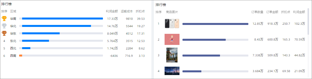
类别由数据的维度决定,最多选择1个维度。例如区域或产品类型。
指标由数据的度量决定,最多选择1个度量。例如订单数量或利润金额。
辅助指标由数据的度量决定,最多选择3个度量。例如折扣点或运输成本。
默认预览行数20条数据,最多显示500条数据。
图表概述
使用场景
比较类组件可以显示不同维值的数据聚合结果情况,适用于不同维度结果的对比、排行。
优势简介
计算能力:一键配置同环比、累计计算。
备注能力:可配置指标等备注、尾注信息,可配置跳转链接至外部系统进行操作交互。
效果图示例
图表字段配置
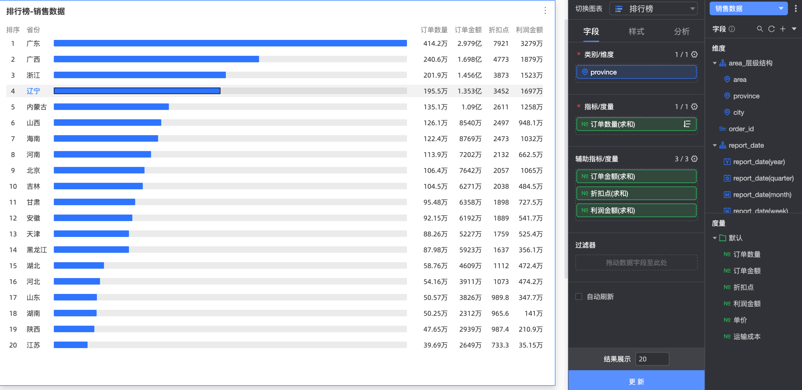
在数据标签页,选择需要的维度字段和度量字段:
在维度列表中,找到省份,双击或拖动至类别/维度区域。
在度量列表中,找到订单数量,双击或拖动至主指标/度量区域。
在度量列表中,找到订单金额、折扣点和利润金额,依次拖动至副指标/度量区域。
单击更新,系统自动更新图表。
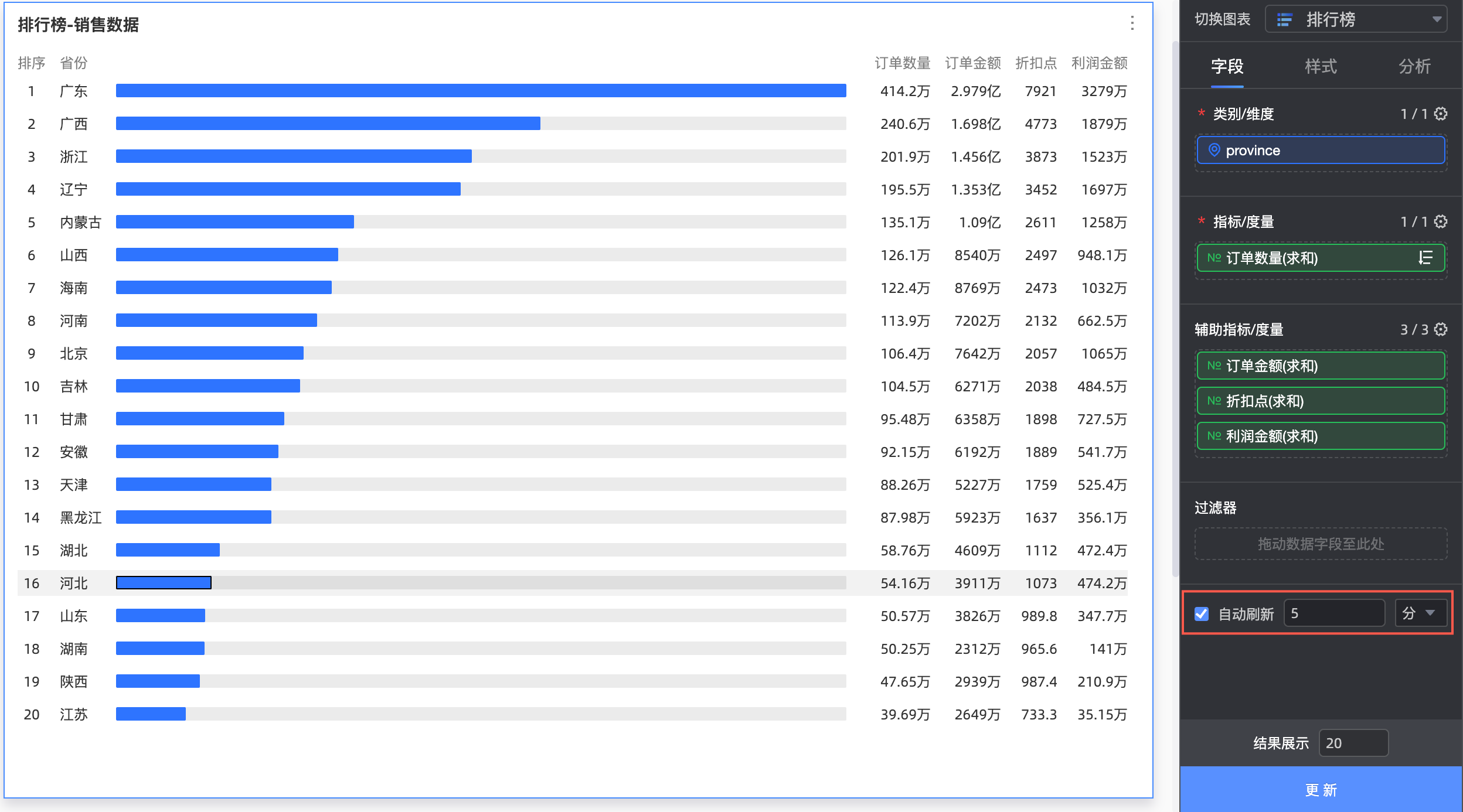
自动刷新
设置该选项后,系统自动刷新图表数据。例如,选中该选项并设置时长为5,单位选择分。则每间隔5分钟,系统自动刷新该图表。
图表样式配置
下面为您介绍图表的样式配置,图表通用的样式配置请参见配置图表标题区。
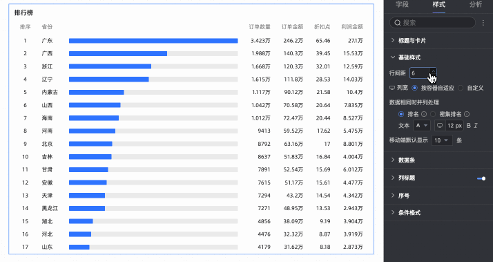
基础样式
在基础样式中,可自定义设置图表样式。

图表配置项 | 配置项说明 |
行间距 | 调整各行排名间的间距,上限为50px。 |
列宽 | 调整图表中每列元素的宽度,支持选择按容器自适应、自定义。
|
数据相同时并列处理 | 设置数据相同时的排名处理方式,支持选择排名、密集排名。您还可以在此自定义排名数据的文本样式。
|
移动端默认显示 | 设置移动端图表默认展示的数据排名条数,默认为10条。 |
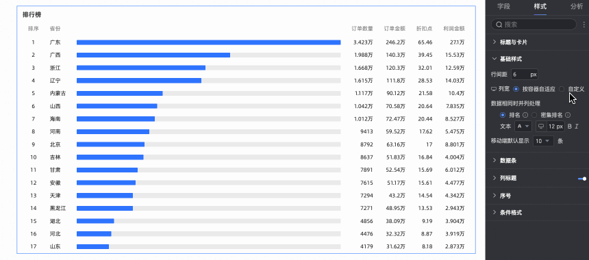
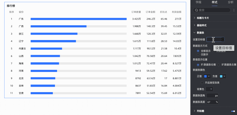
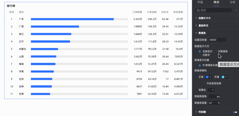
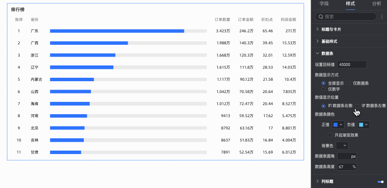
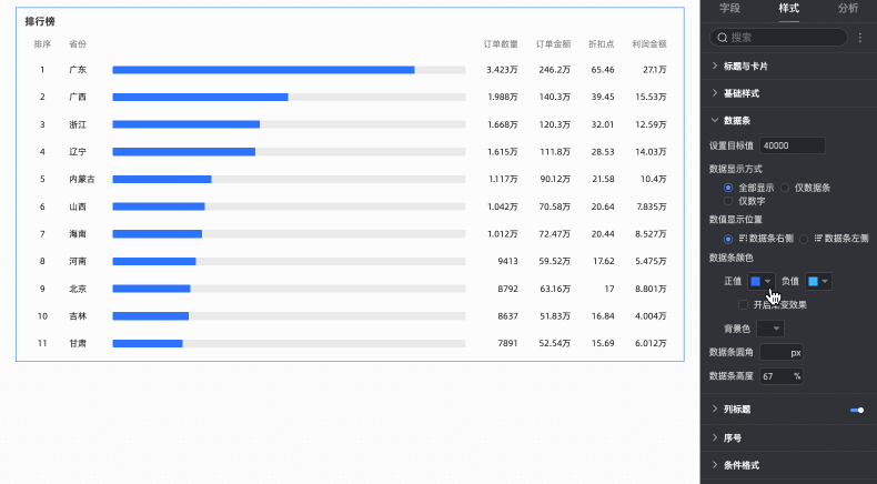
数据条
在数据条中,设置排名数据条的展示样式。

图表配置项 | 配置项说明 |
设置目标值 | 支持数据条的自定义设置,当您未设置目标值时,数据条将按照排名第一的数据显示百分百占比,其他维度的数据根据第一位进行占比展示。当您已设置目标值时,将按照指标值/目标值方式展示数据条占比,如下:
|
数据显示方式 | 支持选择全部显示、仅数据条和仅数字三种方式。
|
数据显示位置 | 仅当数据显示方式选择为全部显示时,支持选择数据条左侧、数据条右侧两种方式。 说明 仅指标/度量数据位置进行改变。
|
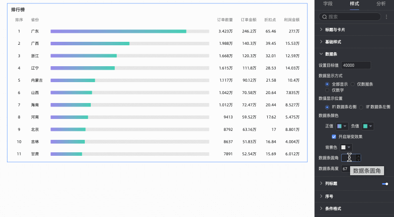
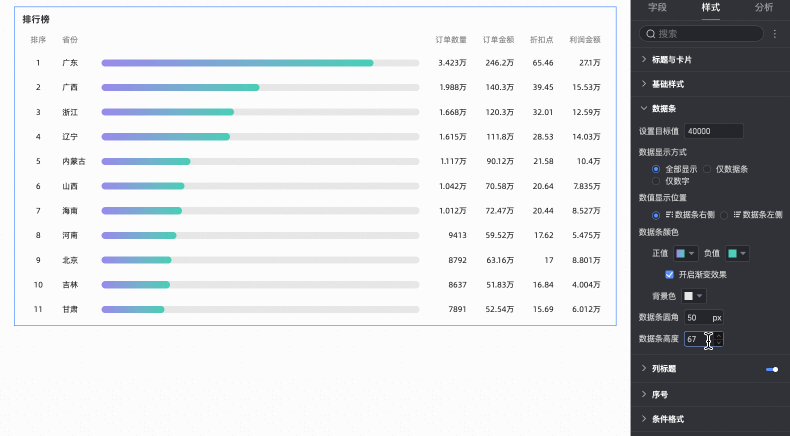
数据条颜色 | 设置数据条正负值及背景的颜色,支持开启数据条颜色渐变效果。
|
数据条圆角 | 支持调整数据条的直角修改为圆角。 |
数据条高度 | 支持自定义修改数据条高度,峰值为100%,谷值为10%,默认值为67%。 |
列标题
在列标题中设置是否显示列标题,支持设置列标题的名称、To3样式以及列标题的文本样式。

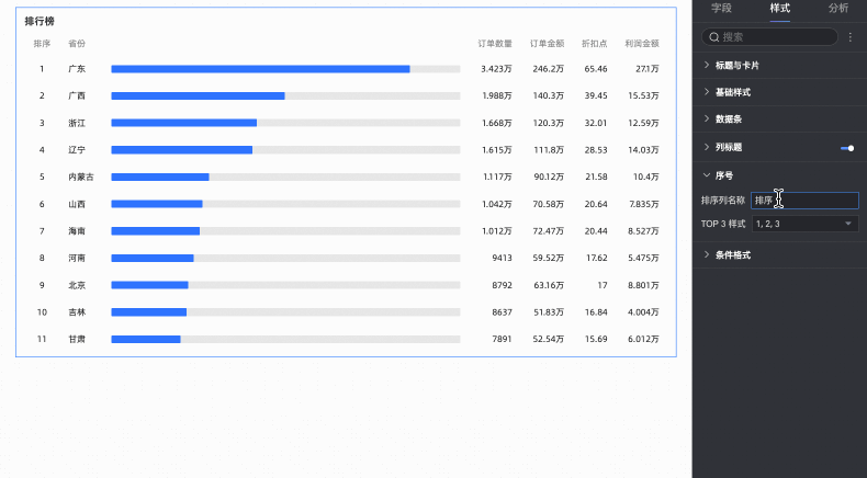
序号
在序号中支持设置排序名称的自定义和TOP3的排序标签样式。
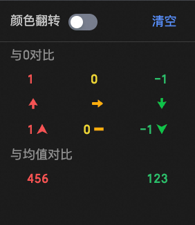
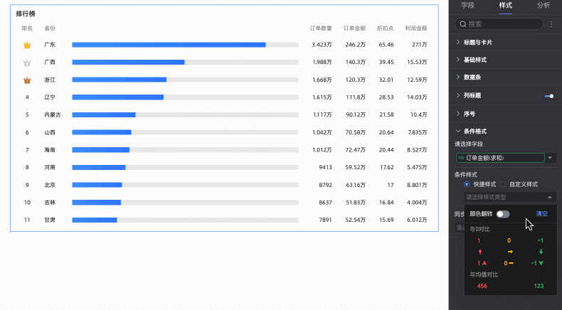
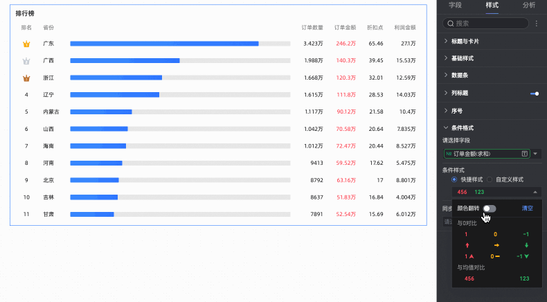
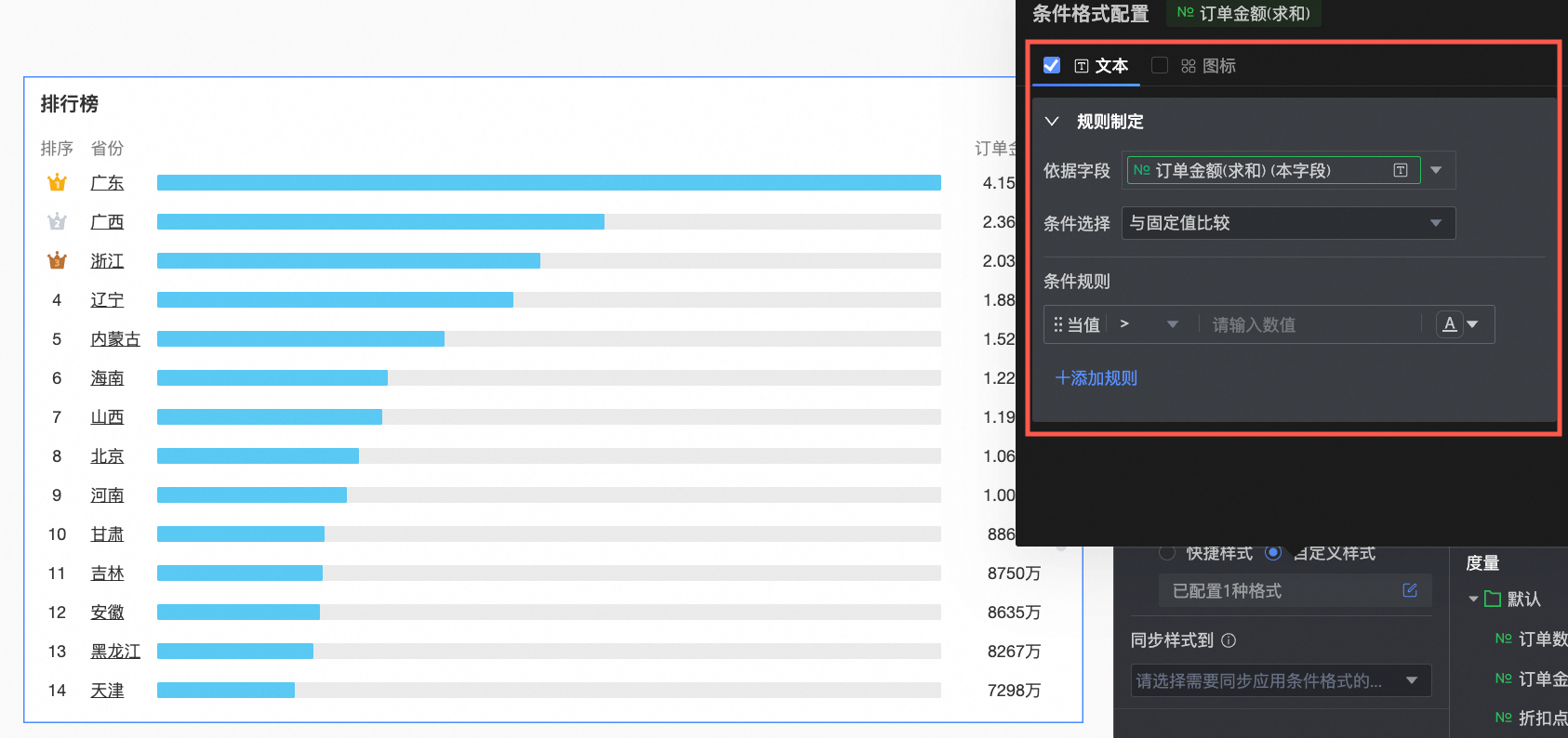
条件格式
在条件格式中,设置度量数据的条件格式。

图表配置项 | 配置项说明 |
请选择系字段 | 选择需要配置条件格式的度量字段,度量项均可选择。 |
快捷样式 | 从系统提供的样式中,设置当前度量字段的标记图标或字体显示颜色。
|
自定义样式 | 除了系统提供的快捷样式外,您还可以按需为当前度量字段配置自定义样式。
|
同步样式到 | 同步当前的条件格式到其他度量指标中。 说明 同步样式仅单次生效,调整样式后需再次同步。 |
 您需要在此配置以下信息。
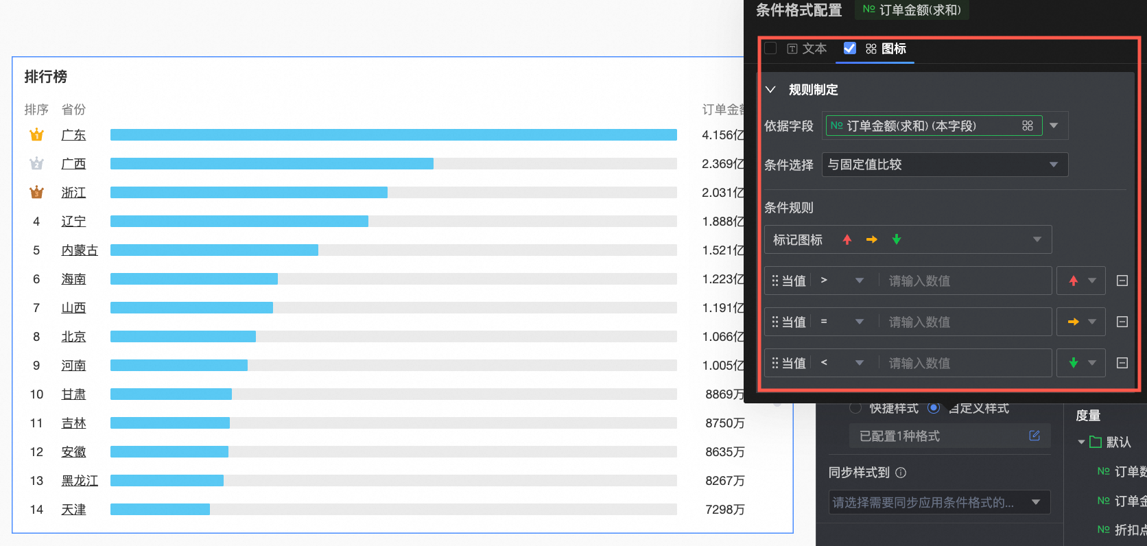 您需要在此配置以下信息。
辅助展示
在辅助展示中,设置滚动条的显示方式及粗细尺寸。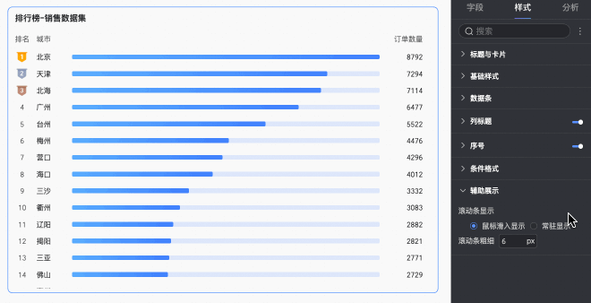
提示标签
将鼠标悬浮至数据条,即可显示当前数据条的提示标签,标签中展示了数据条对应的维度值及度量值。
当进行了高亮联动操作时,被联动图表的提示标签中还可以展示数据的原始值。
例如下图所示:点击地图中的华北区域,排行榜即高亮显示华北区域下各产品类型的订单金额情况,并在提示标签中展示订单金额被联动前的原始值。

图表分析配置
模块 | 名称 | 说明 |
数据交互 | 钻取 | 当您已在字段面板设置完成钻取字段时,可以在此处设置钻取层级行展示样式。具体设置请参见钻取。 |
联动 | 当需要分析的数据存在于不同的图表,您可以通过图表联动,把多个图表关联起来,形成联动进行数据分析。具体设置请参见联动。 | |
跳转 | 当需要分析的数据存在于多个仪表板时,您可以通过仪表板跳转,把多个仪表板关联起来,进行数据分析。跳转包含参数跳转和外部链接两种方式,具体设置请参见跳转。 | |
分析预警 | 辅助线 | 通过辅助线可以查看当前度量值与辅助线设定值之间的差异。辅助线设定值分为固定值和计算值两种。计算值包含平均值、最大值、最小值和中位数四类。具体设置请参见分析预警。 |
标注 | 当图表中的数据存在异常或需要重点关注时,支持使用颜色高亮、图标、注释或数据点的方式进行标注,帮助您识别异常并采取相应的行动。具体设置请参见标注。 | |