
As the concept of "micro frontends" continuously develops, an increasing number of teams begin to split their businesses into different components and orchestrate the components to a business page. As such, component maintenance becomes increasingly important. Focusing on most component development issues and pain points at the frontend, this article shares the author's thinking on component development and the method for maintaining a component library.
Around June 2019, I published an article titled "First Experience on Using Bit". When arranging that article, I engaged with the concepts and practices proposed by Bit. Bit was like a seed planted in my mind, although I thought Bit was nothing special at first.
I still remember what my colleague said after I first shared Bit with him. He said:
"Hmm... Although you have talked so much about it, I think it seems not so... Make sense?"
"Feels like useless?"
"Ah, hmm, since you have said it, it's like what you said. I doubt whether introducing Bit now will incur much extra workloads to our daily work."
Such a reaction is understandable. The first time I came across Bit was when I visited the official website of Vue at the beginning of 2018. At that time, I clicked a link to roughly browse the details about Bit. I felt that Bit was useless and nothing more than "Git in the vertical field of frontend products." Bit was rarely supported in China and there were no decent Chinese articles about it.
It was unrealistic to switch our team's work to a Bit-based workflow all of a sudden because so many infrastructure engineers did not know what Bit was at all.
However, the practices and concepts of Bit are very valuable and worth referencing.
Therefore, I want to do something to introduce and extend the usage of Bit in familiar ways step by step so everyone can see its benefits and value.
As the concept of "micro frontends" continuously develops in recent years, an increasing number of teams begin to split their businesses into different components and orchestrate the components to a business page according to some practices of micro frontends.
As such, component maintenance becomes increasingly important. To begin, let's take a look at how most teams maintain components. The following lists common types of components:
The preceding components are what I can think of for the time being. If your team is also maintaining a component library, you may easily understand what I said above.
I believe that there must be reasons and benefits for doing so. After all, no one will look for trouble for themselves. So, what are the benefits and pain points of these practices? I will carry out analysis from several perspectives.
It is better that components can run at a high speed and we can view the results conveniently. In this regard, is there any method better than directly deploying components in a business project?
Now, we can deploy a component in the component directory and display the component on a display panel.
Where is the data? Don't you have a data store? You can directly import the data.
What you see is what you get. Now, you can modify the data and immediately view the results on the panel. There is no way you can deny it.
From this perspective, it is indeed very fast to develop this component. However, is it the fastest way from the perspective of the implementation of the entire business requirements? If this method is the quickest, why do so many teams emphasize iteration, encapsulation, and abstraction?
In fact, many components seem to be used only once throughout their lifecycle and therefore do not need to be encapsulated. However, when you receive a requirement document, you usually find that you have seen similar styles before. If you search various business projects for the styles and copy the found results, a lot of warnings are reported. After a closer look at the warnings, you will find that all the results are from the data store.
Smart teams have already had insight into these rules and therefore let their teams store components at the same location for maintenance. Engineers write documents for the components, so their teams can retrieve the components from the library when required. If bugs occur, the teams can fix the bugs at the same location. What a great idea!
Engineers started the huge project of abstracting and rectifying components.
At first, an engineer with reliable and outstanding abilities on the team (Eh? Why me?) is usually selected to sort out Webpack, Babel, TypeScript, Syntactically Awesome Stylesheets (SASS), Leaner CSS (LESS), the directory structure, the unit test structure, code specifications, review specifications, and release specifications and write standard components. Lastly, the team stresses that all engineers must carefully maintain the components, develop documents, and write unit test code according to the specifications.
Engineers write components and save them in one library. Then, they can directly reference desired components in a specific project when required. Therefore, in terms of maintainability, business problems are gradually divided into component problems and project problems. For some requirements, if any component in the component library can meet similar requirements, you can directly use the component and reject the proposed product and design 😏.
Just when everyone was happy about this, one day we found that our component library took up 10 MB after packaging 😱!
An engineer with reliable and outstanding abilities (yes, it is me again) is asked to answer the following questions: Who introduced this library? Isn't there already such a component? Lodash is not used in this way! What does this component do? Why aren't there any documents written for it?
After facing hundreds of business components, I can only lament the fast iteration of businesses.
Large libraries have inherent benefits and applicable scenarios in terms of maintenance. Having such abstract thinking is already a technical breakthrough. Now, we have simply encountered another problem. We just need to resolve it!
Tools related to Webpack, such as an analyzer, can easily find out specific packages that "dominate" much traffic.
We found that some components in the original component package should not be maintained in large libraries, such as one-time components and secondary packaging components.
These components may bring a large third-party dependency, such as a video player and banner swipers.
The best solution for such components is to create an independent library for them, package them well, write a readme file, and publish the readme file to the Node Package Manager (NPM) in internal networks for use by business projects.
However, as you know, this solution requires excessively high costs. If time permits, I will definitely... (In most cases, if you propose a better solution to a programmer, the programmer's reply sounds like this, unless the programmer participated in the design. 🙄)
Certainly, the component size can also be minimized in many other ways. For example, you can implement asynchronous loading or on-demand loading or introduce NPM. Now, let's talk about another part that is very important but is easily overlooked.
"Boss, we have accumulated more than 200 components this year. Several components are very well written and are used in more than 20 projects."
"Wow, that's great! Let me see what the components you wrote look like."
"Ah, let's take a look at this page we made. These components are used on this page..."
Design Team:
"I heard that you have accumulated more than 200 components. Can you show us the components? We can refer to these components in the next design to reduce communication costs."
Frontend Team:
"@All Does this component exist in our library?"
"Yes. It's named
CascadeSelect.""Oh, how do we use it? Do you have any documents? Let me take a look at the source code."
"Well..."
The description and indexability of components are second only to the availability of components. Sometimes, this may be ranked first.
Imagine that you wrote an awesome component with excellent reusability, UI design, and interactive design today. Do you have any channel to publicize it to everyone at once? Do you have to hold a meeting for this purpose? "Today, I will take an hour of your precious time to introduce an excellent component I wrote today."
On the contrary, when I was writing a component, sometimes I may think that the component is nothing special and other people may not use it in the future. Therefore, I thought there was no need to write a document for it, as no one will see it. Ultimately, it turned out to be the wrong decision.
Let me share a picture of an index component to you.
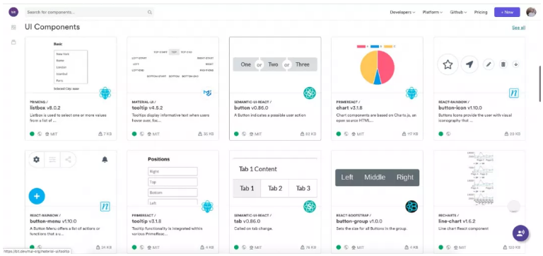
"If someday your team develops a component library that is visualized like this, it will be a happy and enjoyable day."
"I certainly know this is great! Everybody knows! If I have time, I will definitely..."
"So, you mean when we write a component, we not only need to write a document, but we also need to supplement usage descriptions and take screenshots?"
"Yes. In addition, you must create a separate library and consider configuring Webpack, Babel, TypeScript, SASS, LESS, a directory structure, a unit test structure, code specifications, review specifications, and release specifications."
With all that said, I mainly want to lead you to think with us. This is also my writing style. I like telling stories. Most of the content is about problems that frontend engineers encountered.
Now, let's get down to business. We have talked about a lot of problems, and now we have to find some way to resolve them.
Let's see how Bit resolves the problems. Bit has its own compilation capability. Built-in Webpack and some plug-in loaders are used to resolve the compilation problems of React and Vue.
Our team mainly uses React. So, let's start with a command line interface (CLI) for compiling React.
If you publish each component as a separate NPM project, you must first consider a series of frontend compilation environments. If I have N frontend component projects and need to repeatedly configure Webpack and Babel for each frontend component library, it will be nerve-wracking. Why do I have to consider this stuff when I just want to write a component? Therefore, our CLI must first have some basic compilation commands.
Ah, by the way, the CLI has no name yet. Let's call it comp for the time being. 😷
comp new: creates a standard component based on a template.

Initializes a standard component project structure to allow access to all comp commands.

Initializes the Git repository.

Initializes the cloud configurations of continuous integration and continuous delivery (CI/CD).

comp start: handles daily development work and displays and debugs single components.

comp watch: listens to and compiles Babel and SCSS code in NPM link scenarios.

comp babel: compiles NPM packages.

comp dev: listens to and compiles UMD packages to be debugged by proxies.

comp build: handles the final compilation process.

Uses Webpack to compile UMD packages

Babel packages

The component that automatically takes snapshots during CI/CD.

Automatically generates a readme file during CI\CD.

Other hooks

comp test: processes unit tests by using Jest.
After the components are initialized, the directory structure is:
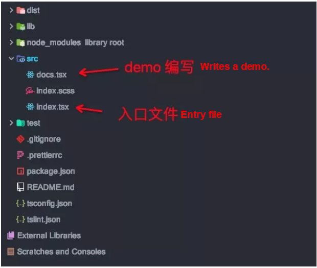
No Webpack or Babel configurations exist in the project structure. Certainly, if you have special configuration requirements, you can create a comp.config.js file to modify the configurations. In this example, many existing processing methods of CLIs are referenced.
After the project is initialized, the directory structure is very clear. The compilation environment for all components can be basically unified.
These features are essential and fundamental. I am not going to describe these basic commands here in detail. Instead, let's focus on the following content.
To help you better understand the features, I will describe them using questions and answers.
Generally, businesses are split into components based on the design.
Then, create components, import the desired components into a specific project, and develop the components while viewing the results.
The simplest way is to carry out a mock trial to see the results.
Alternatively, you can write a unit test case.
Sort of. The mock data is scattered in various projects. Some mock data is deleted after verification.
No one will bother to add the mock data to the readme file during development.
Undoubtedly, they are lazy.
"Then, why don't you write it?" Hmm, that's because... Writing documents is time-consuming. However, it's likely that nobody reads the documents you write. In addition, we still have many business requirements to meet. If I have time, I will definitely...
OK, let's continue with the next question.
Component development background and precautions are not necessary for all components. You can supplement them only when required.
The descriptions of usage and props are required. It is best that screenshots are provided. It will be perfect if a demo is provided as well.
In addition, descriptions of installation, development, and compilation commands are required.
It is better that several badges, the source code TypeScript, and the amount of downloads are described.
However, it is tedious to supplement these documents because you have to sort them out one by one. Users can directly find the information about props and the like within the component. I have already provided some comments and defined the types within the component.
After a series of questions and answers, you will find that the reason why a developer is so clear about the component in the entire component development process is that the developer has "written" a readme file.
With these four parts of the most important descriptions, I believe that most developers already know details about the component.
Therefore, if we can collect all the preceding data, can we use the script to automatically generate a readme file?
It is very easy to collect usage data. If a component can be developed independently, we can retain the mock data of the usage.
Some people may not understand what I mean by saying that "a component can be developed independently". Let me explain: In normal cases when we develop a component, we usually put this component on a page and then debug the page while debugging the component. In contrast, if a component can be developed independently, you can directly start a page to view the component. This page shows all the information about the component.
Therefore, a CLI page can display a component provided that the mock data related to the component that needs to be debugged is written in docs.ts. In addition, the mock data can be retained as the data of a readme file.
export default function(Component: typeof IComponent, mountNode) {
  /** DOCS_START Writes the method for generating a demo in the following block to generate a readme file and Riddle. **/
  ReactDOM.render(
    <Component
      navigation={true}
      pagination={true}
      autoplay={true}
      dataSource={[
        {
          href: 'http://xxxxxxxx',
          image: 'https://xxxxxxx.cdn.com/tfs/TB1jHkBmNv1gK0jSZFFXXb0sXXa-1440-343.png',
        },
        {
          image: 'https://xxxxxxx.cdn.com/tfs/TB1Y_XacrY1gK0jSZTEXXXDQVXa-1416-813.png',
        },
      ]}
    />,
    mountNode,
  );
  /** DOCS_END **/
}
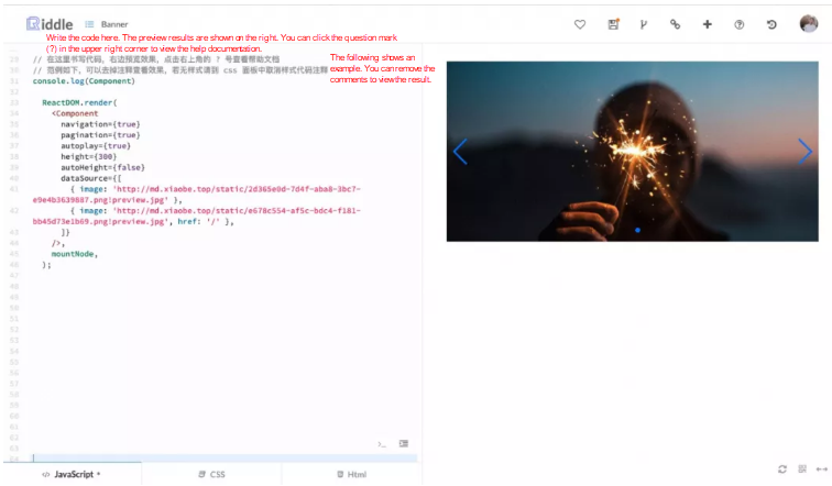
In addition, if the interface outputs of this demo comply with the unified specifications, you can also directly generate code content in online editors, such as CodePen and Riddle.
Imagine that your readme file contains a line saying "Click to use it now," which redirects users to an online editor to view the results in real-time. This will be a great pleasure for anyone who views your component.
Collecting this part of data is complex. We need to carry out an in-depth analysis of the TypeScript AST syntax tree to extract the types of the component's props and the comments for the interfaces.
After searching GitHub for some time, we finally found a niche library that can resolve this issue: the react-docgen-typescript can be found at this link.
In the development process, some comments and type outputs are not as I expected, and therefore I made some modifications. In this way, I have analyzed the props of the complete component and output a typefile.json file.
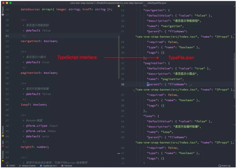
Similarly, based on this capability, you can perform secondary development on the Webpack plug-in react-docgen-typescript-loader. (For more information, you can visit this link.)
Add the __docInfo property to the static properties of the component to claim the details about the property. In this way, the following results can be achieved in the component development process:
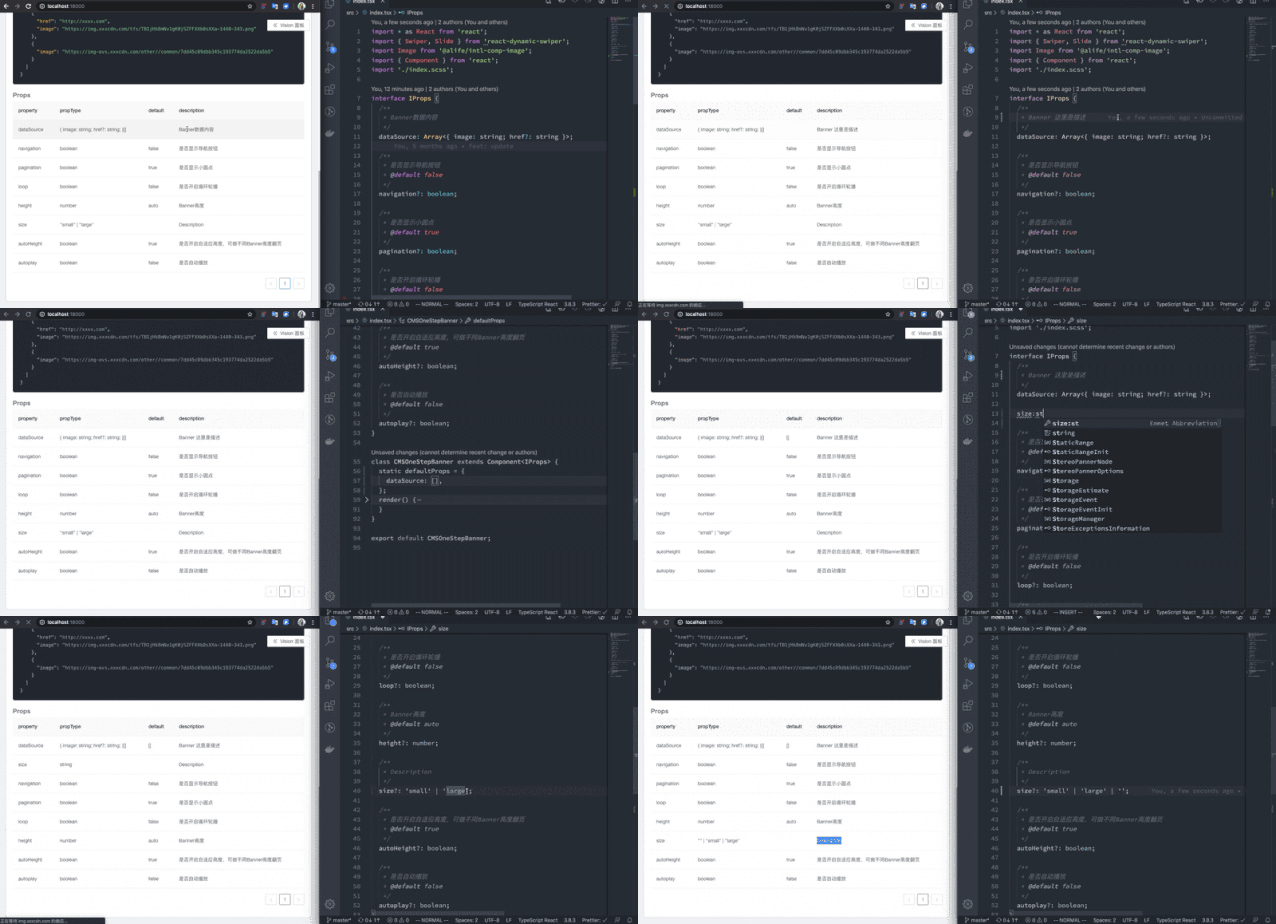
Snapshot of the Preview Page
With a component and a demo, you do not need to worry about screenshots.
You can directly use Puppeteer in the creation process to read and run the docs.ts file, obtain the component through rendering, and take snapshots. Then, you can send the snapshots to the CDN in the CD process. That's all.
Lastly, you can add some special tags to the readme file. In the CD process, you can update the content with the special tags to the readme file to generate a new readme file. This will not affect the original required content of the readme file.
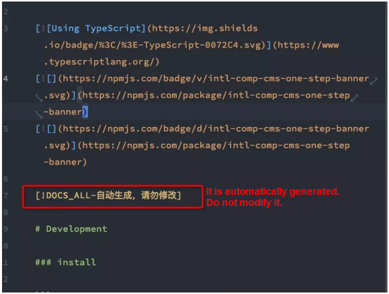
Finally, a complete, neat, and detailed file is generated. Throughout the whole process, we did not specifically write anything about a readme file but were outputting everything very easily in a standard mode.

In the preceding complex process, it seems that I have only developed a feature of automatically generating a readme file. The readme file is only an accompanying product.
In the whole process, I have got all the data I wanted for this component, including the component's props, usage, preview, version information, and package name. I can release both the UMD CDN package and the NPM package of the component in the CD process.
Next, we can develop and extend many features and platforms based on these data and tools.
The following are some examples:
So far, our team has used this tool to produce more than 100 available components, and the published components have been connected to our existing visual editor.
Let's take a look at the results displayed on the visual panel:
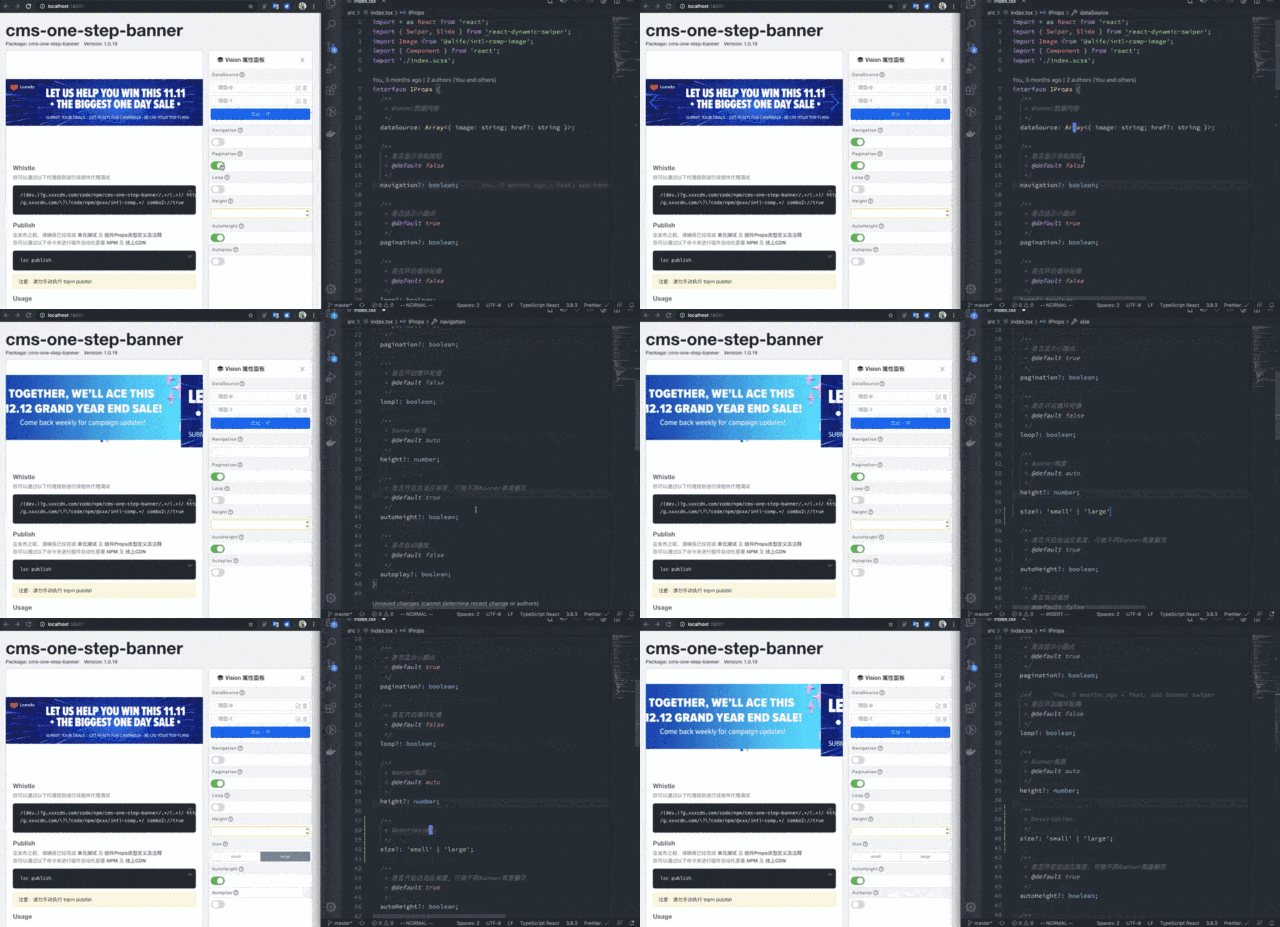
I've found that developers are glad to explain and modify these props, provided that the implementation process does not incur too much workload to developers, and allows developers to view the results in real-time.
The components produced by our team now look explicit, neat, and clear.
I am a frontend engineer who loves life! Yeah!
Alibaba Cloud Native Community - March 8, 2021
Yee - August 16, 2021
Alibaba Cloud Community - June 6, 2022
Alibaba Clouder - April 10, 2020
Alibaba Clouder - July 25, 2019
XianYu Tech - August 10, 2021
 YiDA Low-code Development Platform
A low-code development platform to make work easier
Learn More mPaaS
mPaaS
Help enterprises build high-quality, stable mobile apps
Learn More Super App Solution for Telcos
Alibaba Cloud (in partnership with Whale Cloud) helps telcos build an all-in-one telecommunication and digital lifestyle platform based on DingTalk.
Learn More EMAS Superapp
Build superapps and corresponding ecosystems on a full-stack platform
Learn More