By Yunlei Ma, from Alibaba Cloud Storage Team
When investigating problems or building monitoring systems through logs, O&M engineers need to view the original logs and process and analyze the logs through multiple depths, such as calculating the latency and monitoring the traffic per minute. If these digital indicators can be displayed through visual means, the monitoring data will be understood more directly and effectively. Today, we will introduce a relatively simple and cool visualization method to visually analyze logs directly through the command line on the terminal.
The benefits of this approach are listed below:
What? Visualization in the command line? Yes, it can be realized!
The implementation is listed below:
Connect to the SLS service through the MySQL client, use the color function in SQL, and directly analyze on the terminal. Then, we will use the Nginx access log as an example to demonstrate how to visualize the analysis on a terminal.
First, look at the effect diagram. The color bar is displayed on the terminal:

This figure shows the bar charts of the method, pv, proportion, and size. Isn't that cool? We can visualize the size of the data directly on the terminal. How can we do that?
First, connect to SLS through the MySQL protocol and 10005 port. The user name is accessKeyid. The password is accessKeySecret. The SLS project is used as a database. Please refer to this link for more information:
mysql -hcn-hangzhou-intranet.log.aliyuncs.com -P10005 -u******** -p********* projec_nameThen, enter the following SQL in the MySQL command line:
select *, bar(percent, 40) from(select *, pv*1.0 / (sum(pv) over()) as percent from(select method ,count(1) pv from access-log where __time__ between to_unixtime(now())- 600 and to_unixtime(now()) group by method order by pv ));The SQL above is mainly used to:
1. Calculate the pv of each method based on the method group by
2. Make an outer nested query to calculate the sum of the pv of all methods through sum(pv) over(). Window functions are used here.
Please refer to this documentation for more information about the semantics of window functions. In short, the window function is an aggregate function in calculation and a conversion function in the result. This means the aggregate result of all rows in the window is calculated. Then, the result is written back to each row. Therefore, after the window function performed calculations, the total number of rows has not changed. It is still three rows.
3. Calculate the ratio of pv of each method to the total pv, pv*1.0 / (sum(pv) over()).
4. Render the column chart according to the percentage, bar(percent,40).
The semantics of the bar function contains two parameters: the percentage and the maximum length. The maximum length specifies the maximum length of the column chart. In this example, it has 40 characters. Then, the column chart is displayed in equal proportion according to the percentage.
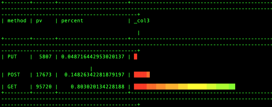
We have used the length of the column to represent the size of the pv. Is there another way? Should we use color to express it?

In the figure above, the more green part, the higher the percentage is. The more red part, the lower the percentage is. Is it cooler? How can we do that? The other parts of the SQL above do not need to be changed. Only the call of the bar function needs to be changed:
bar(40, 40,color(percent, 0,1 , rgb(255,0,0), rgb(0,255,0)), rgb(0,255,0))The bar function adds two parameters, which are the initial color and the ending color. Then, we can customize the color of the initial position. Here, a dynamic color can be used to represent: color(percent, 0,1 , rgb(255,0,0, 0), rgb(0,255,0)). That means the value of the percent is between 0 and 1. If the percent is close to 0, the color will be close to rgb(255,0,0, 0) red. If the percent is close to 1, the color will be close to rgb(0,255,0) green. The output of the dynamic color is based on the location of the percent.
The upper boundary is a static color (green). Therefore, if the percent is small, the color of the bars will be more. If the percent is larger, the strip will be closer to green. We can also set the upper boundary to a dynamic color. What is the result? Have a try by yourself!
However, using color to represent the column chart is not as visual as using length to express in terms of semantics. In the first example, there are colors and lengths to express information. This way, we can know the size and information of numbers more quickly.
This article describes how to use the MySQL protocol for visualized analysis of logs. When the log data volume is relatively large, the query may be incomplete, or the latency may become high. You can learn more about SLS that enhances SQL, which is a real-time computing engine with hundreds of billions of log analyses.
SLS Plug-In in Alibaba Cloud Toolkit Helps Troubleshoot Online Services

1,397 posts | 492 followers
FollowDavidZhang - July 5, 2022
Alibaba Clouder - August 31, 2018
Alibaba Cloud Native - August 14, 2024
Alibaba F(x) Team - February 25, 2021
Alibaba Cloud Serverless - September 29, 2022
OpenAnolis - May 8, 2023

1,397 posts | 492 followers
Follow Simple Log Service
An all-in-one service for log-type data
Learn More Data Lake Storage Solution
Build a Data Lake with Alibaba Cloud Object Storage Service (OSS) with 99.9999999999% (12 9s) availability, 99.995% SLA, and high scalability
Learn More Quick BI
A new generation of business Intelligence services on the cloud
Learn More Storage Capacity Unit
Plan and optimize your storage budget with flexible storage services
Learn MoreMore Posts by Alibaba Cloud Community